
You should be asking yourself, "I thought that we should first do the layout in mobile and then go to the desktop version. Why are we in the opposing way?"
Sorry, you are right! We should always go mobile-first. We went the opposite direction just for learning purposes and now we are going to fix it.
In the current chapter, we will focus on mobile design and site responsiveness with the help of the Bootstrap framework by learning how to change the page layout for different viewports, changing the content, and more. The key points of the chapter are as follows:
- Mobile-first development
- Debugging for any device
- Bootstrap grid system for different resolutions
To figure out what, we will continue with the landing page that we developed in the last chapter.
Maybe you have asked yourself (or even searched for) the reason for the mobile-first paradigm trend. It is simple and makes complete sense for speeding up your development.
The main argument for the mobile-first paradigm is that it is easier to make it than to shrink it. In other words, if you make a desktop version of the web page (known as responsive design or mobile last) first and then adjust the website for mobile, it has a 99 percent probability of breaking the layout at some point and you will have to fix a lot of things.
On the other hand, if you create the mobile version first, naturally the website will use (or show) less content than the desktop version. So, it will be easier to just add the content, place the things in the right places, and create the fully responsiveness stack.
The following figure tries to illustrate this concept. Going mobile last, you will get a degraded, sharped, and crappy layout and you will get a progressively enhanced, future-friendly, awesome web page if you go mobile first. The following figure tries to illustrate the design flow of each paradigm. You can see what happens to the poor elephant… Mobile-first naturally grows the elephant instead of adjusting it:

In the beginning of Bootstrap, there was no concept of mobile-first. It was first used for responsive design web pages. With the Version 3 of the framework, the concept of mobile-first became very solid in the community.
The whole code of the scaffolding system was rewritten to become mobile-first from the start. They decided to reformulate how to set the grid instead of just adding mobile styles. This made a great impact in compatibility between versions older than v3, but was crucial for making the framework even more popular.
As we saw in the first chapter, to ensure the proper rendering of the page, set the correct viewport at the <head> tag:
<meta name="viewport" content="width=device-width, initial-scale=1">
Let's see how to debug different viewports using the Google Chrome web browser. Even if you already know that you can skip this section, it is important to refresh the steps for doing that.
First of all, open the current landing page project that we will continue working with in this chapter in the Google Chrome browser. In the page, you need to select the Developer tools option. There are many ways to open this menu:
- Right-click at any place on the page and click on the last option Element inspector
- Go to the setting (the sandwich button at the top-right of the address bar), click on More tools, and select Developer tools
- The shortcut to open it is Ctrl + Shift + I (cmd for OS X users)
- F12 in Windows also works (this is an Internet Explorer legacy)
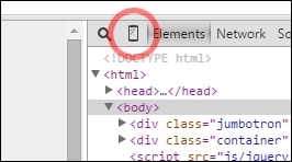
In the Developer tools, click in the mobile phone on the left of a magnifier, as shown in the following screenshot:
It will change the display of the viewport to a certain device and you can also set a specific network usage to limit the data bandwidth. Chrome will show a message telling you that for properly visualization you may need to reload the page to get the correct rendering.

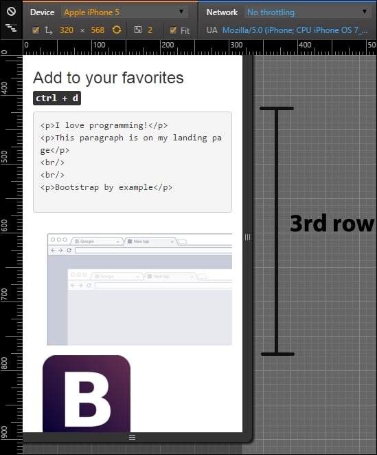
As shown in the next screenshot, we have activated the Device mode for an iPhone 5 device. When we set this viewport, problems started appearing because we did not make the landing page with mobile-first methodology.

The first problem is in the second row of our layout. See how Ctrl + D breaks to a new line. That is not supposed to happen.
Another problem is that we have a horizontal scroll for this device due to some unknown reason. That sucks! We will have more work than with the opposite direction that starts with the mobile page. Keep it as a lesson for not repeating the same mistake.
Now, we can debug our website in different devices with different resolutions. You may see that the mouse cursor has changed to a gray circle. Also, the click actions have changed to tap actions. With that, you can fully test the website without the physical device.
Let's first clean out the messy parts in the layout before playing some tricks with the mobile version.
First, we will stop the line from breaking in the Ctrl + D text in the second row of our design. For fixing this issue, we will create our first line of CSS code. Add the <head> tag to a custom CSS file. Remember to place it below the bootstrap.css import line:
<link rel="stylesheet" href="css/base.css">
In the base.css file, create a helper class rule for .nowrap:
.nowrap {
    white-space: nowrap;
}
In the HTML file, add the created class to the <kbd> element (line 43):
<kbd class="nowrap"><kbd>ctrl</kbd> + <kbd>d</kbd></kbd>
Reload the page and you'll see that one problem is solved. Now, let's fix the horizontal scroll. Can you figure out what is making the unintended horizontal scroll? A tip, the problem is in the table!
The problem is caused by the buttons with the display block that make the content of each column larger than intended. To fix this, we will create our first CSS media query:
@media (max-width: 48em) {
    table .btn {
        font-size: 0.75rem;
        font-size: 3.5vw;
    }
}
Breaking down each line, first we see the current media query. The rule is that for max-width of 48em (defined in Bootstrap as small devices), apply the following rules. If the view port is greater than 48em, the rule will not be applied.
For the .btn elements inside the table element, we changed the font size (this was causing the horizontal overflow). We used a new way to set the font size based on the viewport with the 3.5vw value. Each 1vw corresponds to 1 percent of the total viewport. If we change the viewport, we will change the font size dynamically without breaking the layout.
Since it is a new property, nowadays just Chrome 20-34 and Safari 6 or higher have this rendering feature. For this reason, we added the other line with font-size: 0.75rem as a fallback case. If the browser can't handle the viewport font size, it will already had decreased the font to 12px, which is a font that does not break the layout.
Now that we have fixed everything and learned some things about media queries and CSS3 properties, let's play with our layout and change it a bit for different devices. We will be starting with mobile and go further until we reach large desktops.
To do so, we must apply the column class for the specific viewport, as we did for medium displays using the .col-md-* class. The following table was presented in the previous chapter to show the different classes and the resolutions applicable for specific classes:
|
Extra small devices (phones < 544px / 34em) |
Small devices (tablets ≥ 544px / 34em and < 768px / 48em) |
Medium devices (desktops ≥ 768px /48em < 900px / 62em) |
Large devices (desktops ≥ 900px / 62em < 1200px 75em) |
Extra-large devices (Desktops ≥ 1200px / 75em) | |
|---|---|---|---|---|---|
|
Grid behavior |
Horizontal lines at all times |
Collapse at start and fit column grid | |||
|
Container fixed width |
Auto |
|
|
|
|
|
Class prefix |
|
|
|
|
|
|
Number of columns |
12 columns | ||||
|
Column fixed width |
Auto |
|
|
|
|
To adapt our landing page to mobile devices, we will be using the Chrome mobile debug tool with the device iPhone 5 set and no network throttling.
You might have noticed that for small devices, Bootstrap just stacks each column without the referring for different rows. Some of our rows seem fine in this new grid, like the header and the second one. In the third row, it is a bit strange that the portion of code and the image are not in the same line, as shown in the following screenshot:
For doing that, we need to add the class columns prefix for extra small devices, which is .col-xs-*, where * is the size of the row from 1 to 12. Add the class .col-xs-5 and .col-xs-7 for the columns of the respective row (near line 49). Refresh the page and you will see now how the columns are side-by-side. The code is as follows:
<div class="row">
<!-- row 3 -->
<div class="col-md-3 col-xs-5">
<pre><p>I love programming!</p>
<p>This paragraph is on my landing page</p>
<br/>
<br/>
<p>Bootstrap by example</p>
</pre>
</div>
<div class="col-md-9 col-xs-7">
<img src="imgs/center.png" class="img-responsive">
</div>
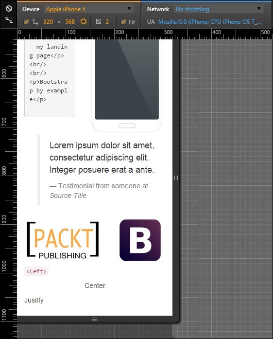
</div>Although the image of the web browser is too small on the right, it would be better if it was a more vertical stretched image, such a mobile phone (what a coincidence!). To make it, we need to hide the browser image in extra small devices and display an image of a mobile device. Add the new mobile image below the old one, as shown in the code:
<img src="imgs/mobile.png" class="img-responsive">
You will see both images stacked up vertically in the right column. Then, we need to use a new concept of availability classes. We need to hide the browser image and display the mobile image just for this kind of viewport, which is extra small. For that, add the class .hidden-xs in the browser image and add the class .visible-xs in the mobile image:
<div class="row">
<!-- row 3 -->
<div class="col-md-3 col-xs-5">
<pre><p>I love programming!</p>
<p>This paragraph is on my landing page</p>
<br/>
<br/>
<p>Bootstrap by example</p>
</pre>
</div>
<div class="col-md-9 col-xs-7">
<img src="imgs/center.png" class="img-responsive hidden-xs">
<img src="imgs/mobile.png" class="img-responsive visible-xs">
</div>
</div>Now this row seems nice! The browser image was hidden in extra small devices and the mobile image is shown only for this viewport in question. The following screenshot shows the final display of this row:
Moving on to the next row, the fourth one, it is the testimonial row surrounded by two images. It would be nicer if the testimonial appeared first and both of the images were displayed after it, splitting the same row. For this, we will repeat almost the same techniques presented in the previous row. Let's do it again for practice.
The first change is to hide the Bootstrap image with the class .hidden-xs. After that, create another image tag with the Bootstrap image in the same column of the PACKT image. The final code of the row should be like this:
<div class="row">
  <!-- row 4 -->
  <div class="col-md-3 hidden-xs">
    <img src="imgs/bs.png" class="img-responsive">
  </div>
  <div class="col-md-6 col-xs-offset-1 col-xs-11">
    <blockquote>
      <p>Lorem ipsum dolor sit amet, consectetur adipiscing elit. Integer posuere erat a ante.</p>
      <footer>Testimonial from someone at <cite title="Source Title">Source Title</cite></footer>
    </blockquote>
  </div>
  <div class="col-md-3 col-xs-7">
    <img src="imgs/packt.png" class="img-responsive">
  </div>
  <div class="col-xs-5 visible-xs">
    <img src="imgs/bs.png" class="img-responsive">
  </div>
</div>
We made plenty of things now and they are highlighted in bold. First is the .hidden-xs in the first column of Bootstrap image, which hid the column for this viewport.
Afterwards, in the testimonial, we changed the grid for mobile, adding a column offset with size 1 and making the testimonial fill the rest of the row with the class .col-xs-11.
Finally, as we said, we want to split in the same row both images from PACKT and Bootstrap. For that, make the first image column fill seven columns with the class .col-xs-7.
The other image column is a little more complicated. Since it is just visible for mobile devices, we add the class .col-xs-5. This will make the element span five columns in extra small devices. Moreover, we hide the column for other viewports with the class .visible-xs.
As we can see, this row has more than 12 columns (1 offset, 11 testimonial, 7 PACKT image, 5 Bootstrap image). This process is called column wrapping, and it happens when you put more than 12 columns in the same row so the groups of extra columns will wrap to the next lines.
Tip
Availability classes
Just like the .hidden-*, there are the .visible-*-* classes for each variation of display and column from 1 to 12. There is also a way to change the display CSS property using the class .visible-*-*, where the last * means block, inline, or inline-block. Use this to set the properly visualization for different visualizations.
The following screenshot shows the result of the changes. As you can see, we made the testimonial appears first, with one column of offset and both images appearing below it:
After completing the mobile visualizations, let's go further to tablets and small devices, which are devices from 48em to 62em. Most of this these devices are tablets or old desktop monitors. For this example, we are using the iPad Mini in the portrait position with a resolution of 768 x 1024 pixels.
For this resolution, Bootstrap handles the rows just like extra small devices by just stacking up each one of the columns, making them fill the total width of the page. So if we do not want that to happen, we have to manually set the column fill for each element with the class .col-sm-*.
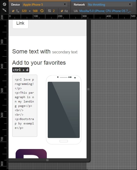
If you see how our example is presented now, there are two main problems. The first one is the second row, where the headings are in separated lines when they could be in the same. So, we just need to apply the grid classes for small devices with the class .col-sm-6 for each column, splitting them into equal sizes:
<div class="row">
  <div class="col-md-offset-4 col-md-4 col-sm-6">
    <h3>
      Some text with <small>secondary text</small>
    </h3>
  </div>
  <div class="col-md-4 col-sm-6">
    <h3>
      Add to your favorites
      <small>
        <kbd class="nowrap"><kbd>ctrl</kbd> + <kbd>d</kbd></kbd>
      </small>
    </h3>
  </div>
</div>
The result should be as shown in the following screenshot:

The second problem in this viewport is again the testimonial row! Because of the classes that we have added for mobile viewport, now the testimonial has an offset column and different column span. We must add the classes for small devices and make this row with the Bootstrap image on the left, the testimonial in the middle, and the PACKT image at the right position:
<div class="row">
  <div class="col-md-3 hidden-xs col-sm-3">
    <img src="imgs/bs.png" class="img-responsive">
  </div>
  <div class="col-md-6 col-xs-offset-1 col-xs-11 col-sm-6 col-sm-offset-0">
    <blockquote>
      <p>Lorem ipsum dolor sit amet, consectetur adipiscing elit. Integer posuere erat a ante.</p>
      <footer>Testimonial from someone at <cite title="Source Title">Source Title</cite></footer>
    </blockquote>
  </div>
  <div class="col-md-3 col-xs-7 col-sm-3">
    <img src="imgs/packt.png" class="img-responsive">
  </div>
  <div class="col-xs-5 hidden-sm hidden-md hidden-lg">
    <img src="imgs/bs.png" class="img-responsive">
  </div>
</div>
As you can see, we had to reset the column offset in the testimonial column. It happened because it kept the offset that we added for extra small devices. Moreover, we are just ensuring that the images columns had to fill just three columns. Here's the result:

Everything else seems fine! These viewport was easier to setup. See how Bootstrap helps us a lot? Let's move to the final viewport: desktop or large devices.
Last but not least, we enter the grid layout for desktop and large devices. We skipped medium devices, because we first coded for that viewport.
Deactivate the device mode in Chrome and put your page in a viewport with a width larger or equal to 1200 pixels or 75em.
The grid prefix that we will be using is .col-lg-*. If you take a look at the landing page, you will see that everything is well placed and we don't need to make changes! However, we would like to make some tweaks to make our layout fancier and learn some stuffs of Bootstrap grid.
We want to touch upon column ordering. It is possible to change the order of column in the same row by applying the classes .col-lg-push-* and .col-lg-pull-* (note that we are using the large devices prefix, but any other grid class prefix can be used).
The .col-lg-push-* means that the column will be pushed to the right by the * columns, where * is the number of columns pushed. On the other hand, .col-lg-pull-* will pull the column in the left direction by *, where * is the number of columns as well. Let's test this trick in the second row by changing the order of both columns:
<div class="row">
  <div class="col-md-offset-4 col-md-4 col-sm-6 col-lg-push-4">
    <h3>
      Some text with <small>secondary text</small>
    </h3>
  </div>
  <div class="col-md-4 col-sm-6 col-lg-pull-4">
    <h3>
      Add to your favorites
      <small>
        <kbd class="nowrap"><kbd>ctrl</kbd> + <kbd>d</kbd></kbd>
      </small>
    </h3>
  </div>
</div>
We just added the class .col-lg-push-4 to the first column and .col-lg-pull-4 to the other one to get this result. By doing this, we changed the order of both columns in second row, as shown in the following screenshot:

Mobile and extra small devices
To adapt our landing page to mobile devices, we will be using the Chrome mobile debug tool with the device iPhone 5 set and no network throttling.
You might have noticed that for small devices, Bootstrap just stacks each column without the referring for different rows. Some of our rows seem fine in this new grid, like the header and the second one. In the third row, it is a bit strange that the portion of code and the image are not in the same line, as shown in the following screenshot:
For doing that, we need to add the class columns prefix for extra small devices, which is .col-xs-*, where * is the size of the row from 1 to 12. Add the class .col-xs-5 and .col-xs-7 for the columns of the respective row (near line 49). Refresh the page and you will see now how the columns are side-by-side. The code is as follows:
<div class="row">
<!-- row 3 -->
<div class="col-md-3 col-xs-5">
<pre><p>I love programming!</p>
<p>This paragraph is on my landing page</p>
<br/>
<br/>
<p>Bootstrap by example</p>
</pre>
</div>
<div class="col-md-9 col-xs-7">
<img src="imgs/center.png" class="img-responsive">
</div>
</div>Although the image of the web browser is too small on the right, it would be better if it was a more vertical stretched image, such a mobile phone (what a coincidence!). To make it, we need to hide the browser image in extra small devices and display an image of a mobile device. Add the new mobile image below the old one, as shown in the code:
<img src="imgs/mobile.png" class="img-responsive">
You will see both images stacked up vertically in the right column. Then, we need to use a new concept of availability classes. We need to hide the browser image and display the mobile image just for this kind of viewport, which is extra small. For that, add the class .hidden-xs in the browser image and add the class .visible-xs in the mobile image:
<div class="row">
<!-- row 3 -->
<div class="col-md-3 col-xs-5">
<pre><p>I love programming!</p>
<p>This paragraph is on my landing page</p>
<br/>
<br/>
<p>Bootstrap by example</p>
</pre>
</div>
<div class="col-md-9 col-xs-7">
<img src="imgs/center.png" class="img-responsive hidden-xs">
<img src="imgs/mobile.png" class="img-responsive visible-xs">
</div>
</div>Now this row seems nice! The browser image was hidden in extra small devices and the mobile image is shown only for this viewport in question. The following screenshot shows the final display of this row:
Moving on to the next row, the fourth one, it is the testimonial row surrounded by two images. It would be nicer if the testimonial appeared first and both of the images were displayed after it, splitting the same row. For this, we will repeat almost the same techniques presented in the previous row. Let's do it again for practice.
The first change is to hide the Bootstrap image with the class .hidden-xs. After that, create another image tag with the Bootstrap image in the same column of the PACKT image. The final code of the row should be like this:
<div class="row">
  <!-- row 4 -->
  <div class="col-md-3 hidden-xs">
    <img src="imgs/bs.png" class="img-responsive">
  </div>
  <div class="col-md-6 col-xs-offset-1 col-xs-11">
    <blockquote>
      <p>Lorem ipsum dolor sit amet, consectetur adipiscing elit. Integer posuere erat a ante.</p>
      <footer>Testimonial from someone at <cite title="Source Title">Source Title</cite></footer>
    </blockquote>
  </div>
  <div class="col-md-3 col-xs-7">
    <img src="imgs/packt.png" class="img-responsive">
  </div>
  <div class="col-xs-5 visible-xs">
    <img src="imgs/bs.png" class="img-responsive">
  </div>
</div>
We made plenty of things now and they are highlighted in bold. First is the .hidden-xs in the first column of Bootstrap image, which hid the column for this viewport.
Afterwards, in the testimonial, we changed the grid for mobile, adding a column offset with size 1 and making the testimonial fill the rest of the row with the class .col-xs-11.
Finally, as we said, we want to split in the same row both images from PACKT and Bootstrap. For that, make the first image column fill seven columns with the class .col-xs-7.
The other image column is a little more complicated. Since it is just visible for mobile devices, we add the class .col-xs-5. This will make the element span five columns in extra small devices. Moreover, we hide the column for other viewports with the class .visible-xs.
As we can see, this row has more than 12 columns (1 offset, 11 testimonial, 7 PACKT image, 5 Bootstrap image). This process is called column wrapping, and it happens when you put more than 12 columns in the same row so the groups of extra columns will wrap to the next lines.
Tip
Availability classes
Just like the .hidden-*, there are the .visible-*-* classes for each variation of display and column from 1 to 12. There is also a way to change the display CSS property using the class .visible-*-*, where the last * means block, inline, or inline-block. Use this to set the properly visualization for different visualizations.
The following screenshot shows the result of the changes. As you can see, we made the testimonial appears first, with one column of offset and both images appearing below it:
After completing the mobile visualizations, let's go further to tablets and small devices, which are devices from 48em to 62em. Most of this these devices are tablets or old desktop monitors. For this example, we are using the iPad Mini in the portrait position with a resolution of 768 x 1024 pixels.
For this resolution, Bootstrap handles the rows just like extra small devices by just stacking up each one of the columns, making them fill the total width of the page. So if we do not want that to happen, we have to manually set the column fill for each element with the class .col-sm-*.
If you see how our example is presented now, there are two main problems. The first one is the second row, where the headings are in separated lines when they could be in the same. So, we just need to apply the grid classes for small devices with the class .col-sm-6 for each column, splitting them into equal sizes:
<div class="row">
  <div class="col-md-offset-4 col-md-4 col-sm-6">
    <h3>
      Some text with <small>secondary text</small>
    </h3>
  </div>
  <div class="col-md-4 col-sm-6">
    <h3>
      Add to your favorites
      <small>
        <kbd class="nowrap"><kbd>ctrl</kbd> + <kbd>d</kbd></kbd>
      </small>
    </h3>
  </div>
</div>
The result should be as shown in the following screenshot:
The second problem in this viewport is again the testimonial row! Because of the classes that we have added for mobile viewport, now the testimonial has an offset column and different column span. We must add the classes for small devices and make this row with the Bootstrap image on the left, the testimonial in the middle, and the PACKT image at the right position:
<div class="row">
  <div class="col-md-3 hidden-xs col-sm-3">
    <img src="imgs/bs.png" class="img-responsive">
  </div>
  <div class="col-md-6 col-xs-offset-1 col-xs-11 col-sm-6 col-sm-offset-0">
    <blockquote>
      <p>Lorem ipsum dolor sit amet, consectetur adipiscing elit. Integer posuere erat a ante.</p>
      <footer>Testimonial from someone at <cite title="Source Title">Source Title</cite></footer>
    </blockquote>
  </div>
  <div class="col-md-3 col-xs-7 col-sm-3">
    <img src="imgs/packt.png" class="img-responsive">
  </div>
  <div class="col-xs-5 hidden-sm hidden-md hidden-lg">
    <img src="imgs/bs.png" class="img-responsive">
  </div>
</div>
As you can see, we had to reset the column offset in the testimonial column. It happened because it kept the offset that we added for extra small devices. Moreover, we are just ensuring that the images columns had to fill just three columns. Here's the result:
Everything else seems fine! These viewport was easier to setup. See how Bootstrap helps us a lot? Let's move to the final viewport: desktop or large devices.
Last but not least, we enter the grid layout for desktop and large devices. We skipped medium devices, because we first coded for that viewport.
Deactivate the device mode in Chrome and put your page in a viewport with a width larger or equal to 1200 pixels or 75em.
The grid prefix that we will be using is .col-lg-*. If you take a look at the landing page, you will see that everything is well placed and we don't need to make changes! However, we would like to make some tweaks to make our layout fancier and learn some stuffs of Bootstrap grid.
We want to touch upon column ordering. It is possible to change the order of column in the same row by applying the classes .col-lg-push-* and .col-lg-pull-* (note that we are using the large devices prefix, but any other grid class prefix can be used).
The .col-lg-push-* means that the column will be pushed to the right by the * columns, where * is the number of columns pushed. On the other hand, .col-lg-pull-* will pull the column in the left direction by *, where * is the number of columns as well. Let's test this trick in the second row by changing the order of both columns:
<div class="row">
  <div class="col-md-offset-4 col-md-4 col-sm-6 col-lg-push-4">
    <h3>
      Some text with <small>secondary text</small>
    </h3>
  </div>
  <div class="col-md-4 col-sm-6 col-lg-pull-4">
    <h3>
      Add to your favorites
      <small>
        <kbd class="nowrap"><kbd>ctrl</kbd> + <kbd>d</kbd></kbd>
      </small>
    </h3>
  </div>
</div>
We just added the class .col-lg-push-4 to the first column and .col-lg-pull-4 to the other one to get this result. By doing this, we changed the order of both columns in second row, as shown in the following screenshot:
Tablets and small devices
After completing the mobile visualizations, let's go further to tablets and small devices, which are devices from 48em to 62em. Most of this these devices are tablets or old desktop monitors. For this example, we are using the iPad Mini in the portrait position with a resolution of 768 x 1024 pixels.
For this resolution, Bootstrap handles the rows just like extra small devices by just stacking up each one of the columns, making them fill the total width of the page. So if we do not want that to happen, we have to manually set the column fill for each element with the class .col-sm-*.
If you see how our example is presented now, there are two main problems. The first one is the second row, where the headings are in separated lines when they could be in the same. So, we just need to apply the grid classes for small devices with the class .col-sm-6 for each column, splitting them into equal sizes:
<div class="row">
  <div class="col-md-offset-4 col-md-4 col-sm-6">
    <h3>
      Some text with <small>secondary text</small>
    </h3>
  </div>
  <div class="col-md-4 col-sm-6">
    <h3>
      Add to your favorites
      <small>
        <kbd class="nowrap"><kbd>ctrl</kbd> + <kbd>d</kbd></kbd>
      </small>
    </h3>
  </div>
</div>
The result should be as shown in the following screenshot:
The second problem in this viewport is again the testimonial row! Because of the classes that we have added for mobile viewport, now the testimonial has an offset column and different column span. We must add the classes for small devices and make this row with the Bootstrap image on the left, the testimonial in the middle, and the PACKT image at the right position:
<div class="row">
  <div class="col-md-3 hidden-xs col-sm-3">
    <img src="imgs/bs.png" class="img-responsive">
  </div>
  <div class="col-md-6 col-xs-offset-1 col-xs-11 col-sm-6 col-sm-offset-0">
    <blockquote>
      <p>Lorem ipsum dolor sit amet, consectetur adipiscing elit. Integer posuere erat a ante.</p>
      <footer>Testimonial from someone at <cite title="Source Title">Source Title</cite></footer>
    </blockquote>
  </div>
  <div class="col-md-3 col-xs-7 col-sm-3">
    <img src="imgs/packt.png" class="img-responsive">
  </div>
  <div class="col-xs-5 hidden-sm hidden-md hidden-lg">
    <img src="imgs/bs.png" class="img-responsive">
  </div>
</div>
As you can see, we had to reset the column offset in the testimonial column. It happened because it kept the offset that we added for extra small devices. Moreover, we are just ensuring that the images columns had to fill just three columns. Here's the result:
Everything else seems fine! These viewport was easier to setup. See how Bootstrap helps us a lot? Let's move to the final viewport: desktop or large devices.
Last but not least, we enter the grid layout for desktop and large devices. We skipped medium devices, because we first coded for that viewport.
Deactivate the device mode in Chrome and put your page in a viewport with a width larger or equal to 1200 pixels or 75em.
The grid prefix that we will be using is .col-lg-*. If you take a look at the landing page, you will see that everything is well placed and we don't need to make changes! However, we would like to make some tweaks to make our layout fancier and learn some stuffs of Bootstrap grid.
We want to touch upon column ordering. It is possible to change the order of column in the same row by applying the classes .col-lg-push-* and .col-lg-pull-* (note that we are using the large devices prefix, but any other grid class prefix can be used).
The .col-lg-push-* means that the column will be pushed to the right by the * columns, where * is the number of columns pushed. On the other hand, .col-lg-pull-* will pull the column in the left direction by *, where * is the number of columns as well. Let's test this trick in the second row by changing the order of both columns:
<div class="row">
  <div class="col-md-offset-4 col-md-4 col-sm-6 col-lg-push-4">
    <h3>
      Some text with <small>secondary text</small>
    </h3>
  </div>
  <div class="col-md-4 col-sm-6 col-lg-pull-4">
    <h3>
      Add to your favorites
      <small>
        <kbd class="nowrap"><kbd>ctrl</kbd> + <kbd>d</kbd></kbd>
      </small>
    </h3>
  </div>
</div>
We just added the class .col-lg-push-4 to the first column and .col-lg-pull-4 to the other one to get this result. By doing this, we changed the order of both columns in second row, as shown in the following screenshot:
Desktop and large devices
Last but not least, we enter the grid layout for desktop and large devices. We skipped medium devices, because we first coded for that viewport.
Deactivate the device mode in Chrome and put your page in a viewport with a width larger or equal to 1200 pixels or 75em.
The grid prefix that we will be using is .col-lg-*. If you take a look at the landing page, you will see that everything is well placed and we don't need to make changes! However, we would like to make some tweaks to make our layout fancier and learn some stuffs of Bootstrap grid.
We want to touch upon column ordering. It is possible to change the order of column in the same row by applying the classes .col-lg-push-* and .col-lg-pull-* (note that we are using the large devices prefix, but any other grid class prefix can be used).
The .col-lg-push-* means that the column will be pushed to the right by the * columns, where * is the number of columns pushed. On the other hand, .col-lg-pull-* will pull the column in the left direction by *, where * is the number of columns as well. Let's test this trick in the second row by changing the order of both columns:
<div class="row">
  <div class="col-md-offset-4 col-md-4 col-sm-6 col-lg-push-4">
    <h3>
      Some text with <small>secondary text</small>
    </h3>
  </div>
  <div class="col-md-4 col-sm-6 col-lg-pull-4">
    <h3>
      Add to your favorites
      <small>
        <kbd class="nowrap"><kbd>ctrl</kbd> + <kbd>d</kbd></kbd>
      </small>
    </h3>
  </div>
</div>
We just added the class .col-lg-push-4 to the first column and .col-lg-pull-4 to the other one to get this result. By doing this, we changed the order of both columns in second row, as shown in the following screenshot:
We have completed another chapter. Here, we discussed why we should always go mobile-first if we want to make a web page for every viewport, from mobile to large desktop. Making things bigger is always easier and causes less issues, so start small with mobile devices and evolve the web page until it reaches large desktop resolutions.
We saw how to debug different devices using our browser and set the right classes for each viewport. We now have our example of a landing page with full stack responsiveness, working well in any device.
We covered the grid options for various devices resolutions using the mobile-first methodology—starting with mobile and going further until the large desktop version.
The main lesson of this chapter was that we always should go mobile-first. We did not follow this approach at first and because of that, we faced some problems that we could have eliminated if we had started mobile-first.
It was not mentioned before, but going mobile-first helps the whole team. The designer will have a bigger picture of what he or she needs to reach and what information is important from the beginning. The backend developer can focus on the main features and optimize them for mobile before moving on to the rest of the page content delivery. Mobile-first is also part of the development strategy.
At this point, we have our landing page fully set at all resolutions. Using Bootstrap, we took a shortcut towards responsivity, doing all the groundwork with a few lines of code in HTML and some more in CSS.
In the next chapter, we will apply some customizable styles to make the page a little less like a Bootstrap page. We will also see how to create landing pages for different uses by customizing the components.