
The last chapter was tough! Although the dashboard is not ready yet, following our layout, we must create three more cards in the main, while fixing issues regarding visualization for multiple viewports. After that, we will move on to creating more components for our dashboard. Let's proceed towards this new challenge!
In this chapter, we will cover the following topics:
- A custom checkbox
- External plugin integration
- Advanced Bootstrap media queries
- The viewport's advanced adjustments
- The Bootstrap Carousel plugin
- The Bootstrap Scrollspy plugin
Taking a look at our layout, we must create three more cards. The first of them is the hardest one, so let's face it!
The following .card is composed of an area chart with two series and some iOS-styled checkboxes. This screenshot reminds us of what the card must look like:

For the chart area, we will again use the highcharts library, while for the checkbox, we will use a plugin called switchery (https://github.com/abpetkov/switchery). After we've considered the documentation, let's create the following HTML:
<div class="card" id="ration-stock">
  <div class="card-block">
    <h2>Ration stock info</h2>
    <div class="stacked-area"></div>
    <div class="switch">
      View main stocks
      <input type="checkbox" class="swithcery" checked />
      <div class="clearfix"></div>
    </div>
    <div class="switch">
      Hide empty stocks
      <input type="checkbox" class="swithcery" />
      <div class="clearfix"></div>
    </div>
  </div>
</div>
Breaking the code down, to create the chart, we just have to set the div.stacked-area element. For the checkbox, we must create an input with type="checkbox" and the .switchery class to identify it.
Load the CSS of switchery in <head>, after the Bootstrap CSS:
<link rel="stylesheet" href="css/switchery.min.css">
Also, in the HTML, import the switchery library in the bottom part that contains the JavaScript loads:
<script src="js/switchery.min.js"></script>
We do not need much CSS here, since most of it will be created by JavaScript. So, just add the following rules to specify the height of the chart and the font style for the checkbox text:
#ration-stock .stacked-area {
  height: 200px;
}

#ration-stock .switch {
  font-weight: 300;
  color: #8b91a0;
  padding: 0.5rem 0;
}

#ration-stock .switchery {
  float: right;
}
The JavaScript contains the core portion of this card. First, let's initialize the switchery plugin. In main.js, inside the .ready function, add these lines:
var elems, switcheryOpts;

elems = Array.prototype.slice.call(document.querySelectorAll('.switchery'));

switcheryOpts = {
    color: '#1bc98e'
};

elems.forEach(function(el) {
    var switchery = new Switchery(el, switcheryOpts);
});
In elems, we store the elements that contain the .switchery class. This plugin does not use jQuery, so we must create a query using native JavaScript. The query needed to select the elements follows the one provided in the documentation, and I recommend that you check it out for further information, since this is not the main focus of the book.
The query is performed by document.querySelectorAll('.switchery'). Array is a global JavaScript object used to create high-level list objects present in most recent browsers.
The slice function chops the array using a shallow copy into another array. In summary, we are getting an array of elements with the .switchery class.
Next, we set the options for the plugin, in this case just the background color, using the color property in the switcheryOpts variable. Finally, we start each Switchery object inside the forEach loop.
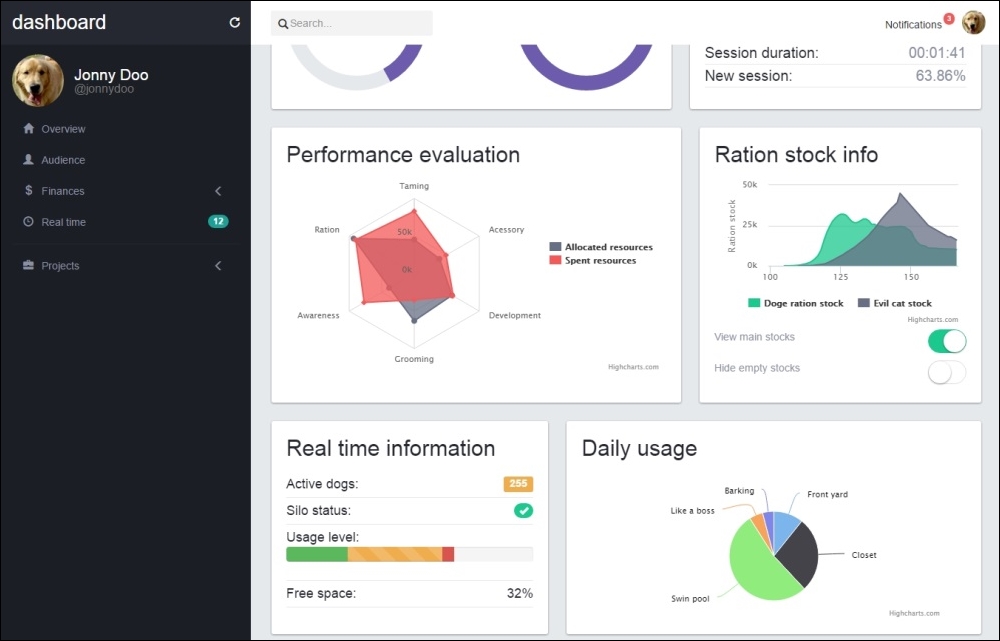
Refresh the web page and the new card should appear as what is shown in the following screenshot:

To create the next card, we will use the Bootstrap progress bar component, labels, and badges. This card represents some kind of real-time information, and we will create it using the progress bar and make it animated through JavaScript.
First, let's create this new card identified by #real-time in the HTML. Place the code after the last card, #ration-stock:
<div class="card" id="real-time">
  <div class="card-block">
  <h2>Real time information</h2>
  </div>
</div>
After <h2>, we must create a list containing each item of the information. A label, a badge, a progress bar, and a piece of sample text compose the list. Create it like the highlighted HTML code shown here:
<div class="card" id="real-time">
  <div class="card-block">
  <h2>Real time information</h2>
    <ul class="list-unstyled">
      <li>
        Active dogs:
        <span class="label label-warning pull-right">255</span>
      </li>
      <li>
        Silo status:
        <span class="badge ok pull-right">
          <span class="glyphicon glyphicon-ok" aria-hidden="true"></span>
        </span>
      </li>
      <li>
        Usage level:
        <div class="progress">
          <div class="progress-bar progress-bar-success" role="progressbar" aria-valuenow="25" aria-valuemin="0" aria-valuemax="100" style="width: 25%">
            <span class="sr-only">25%</span>
          </div>
          <div class="progress-bar progress-bar-warning progress-bar-striped active" role="progressbar" aria-valuenow="38" aria-valuemin="0" aria-valuemax="100" style="width: 38%">
            <span class="sr-only">38% alocated</span>
          </div>
          <div class="progress-bar progress-bar-danger" role="progressbar" aria-valuenow="5" aria-valuemin="0" aria-valuemax="100" style="width: 5%">
            <span class="sr-only">5% reserved</span>
          </div>
        </div>
      </li>
      <li>
        Free space:
        <span id="free-space" class="pull-right">
          32%
        </span>
      </li>
    </ul>
  </div>
</div>
Because we are mostly using only Bootstrap elements and components, we do not need too much CSS but just the following:
#real-time li {
  font-size: 1.8rem;
  font-weight: 300;
  border-bottom: 0.1rem solid #e5e9ec;
  padding: 0.5rem 0;
}

#real-time .badge.ok {
  background-color: #1bc98e;
}

#real-time .badge span,
#real-time .label {
  color: #FFF;
}

#real-time .badge,
#real-time .label {
  margin-top: 0.25rem;
}
This CSS will change the font size of the text in the card and the borders from one to another item in the list. Also, for the badge and the labels, we've customized the colors and margins.
Refresh the page and it should look like this:

The new card looks nice! Now let's create some CSS to animate it. Let's change the free space percentage periodically. To do this, create the following JavaScript function:
changeMultiplier = 0.2;
window.setInterval(function() {
  var freeSpacePercentage;

  freeSpacePercentage = $('#free-space').text();
  freeSpacePercentage = parseFloat(freeSpacePercentage);

  delta = changeMultiplier * (Math.random() < 0.5 ? -1.0 : 1.0);

  freeSpacePercentage = freeSpacePercentage + freeSpacePercentage * delta;
  freeSpacePercentage = parseInt(freeSpacePercentage);

  $('#free-space').text(freeSpacePercentage + '%');
}, 2000);
With this JavaScript code, we are executing a function every 2 seconds. We did this because of the usage of the setInterval function, and we call it every 2,000 ms (or 2 seconds).
What is done first is just a parse of the text inside the #free-space percentage element. Then we create a delta that could be 20 percent positive or negative, randomly generated by using the changeMultiplier parameter.
Finally, we multiply the delta by the current value and update the value in the element. To update the value in the element, we use the .text() function from jQuery. This function sets the content for the element to the specified text passed as a parameter; in this case, it's the percentage change in freeSpacePercentage that we randomly generated.
Refresh the page and see the number update every 2 seconds.
The last card in the main content is another plot, this time a pie chart. Just like the last charts, let's again use the Highcharts library. Remember that we must first create a simple HTML card, placed after the last #real-time card:
<div class="card" id="daily-usage">
  <div class="card-block">
    <h2>Daily usage</h2>
    <div class="area-chart"></div>
  </div>
</div>
In the CSS, just set the height of the plot:
#daily-usage .area-chart {
  height: 200px;
}
To complete it—the most important part for this card—create the function calls in the JavaScript:
$('#daily-usage .area-chart').highcharts({
    title: {
        text: '',
    },
    tooltip: {
        pointFormat: '{series.name}: <b>{point.percentage:.1f}%</b>'
    },
    plotOptions: {
        pie: {
            dataLabels: {
                enabled: true,
                style: {
                    fontWeight: '300'
                }
            }
        }
    },
    series: [{
        type: 'pie',
        name: 'Time share',
        data: [
            ['Front yard', 10.38],
            ['Closet', 26.33],
            ['Swim pool', 51.03],
            ['Like a boss', 4.77],
            ['Barking', 3.93]
        ]
    }]
});
As you can see in the preceding code, we set the graph to be of the pie type and create the share for each segment in the data array.
The following screenshot shows how the last card must be displayed on the web browser:
And we are done! The main page of the dashboard is complete. Now let's proceed to the next pages in this component.
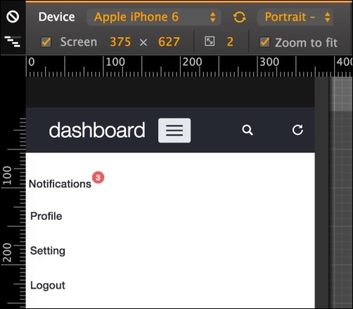
If you resize the dashboard to a mobile visualization (treated as an extra-small viewport in Bootstrap,) you should see some problems with the elements that are not appearing correctly. As shown in the next screenshot, note that the search appears and the card with the round chart is completely unaligned.
In this visualization mode, we are using the viewport of iPhone 6 in portrait orientation in the Chrome developer inspector:

Regarding the search bar, it will be better if this bar appears just when required, for example, when clicking on a button. So, next to the refresh button, let's create another icon to toggle the search bar.
The HTML for this section must be like the following code:
<div class="col-sm-3 top-left-menu">
  <div class="navbar-header">
    <a class="navbar-brand" href="dashboard.html">
      <h1>dashboard</h1>
    </a>

    <button type="button" class="navbar-toggle collapsed" data-toggle="collapse" data-target="#nav-menu" aria-expanded="false">
      <span class="sr-only">Toggle navigation</span>
      <span class="icon-bar"></span>
      <span class="icon-bar"></span>
      <span class="icon-bar"></span>
    </button>
  </div>
  <a href="#" id="search-icon" data-toggle="tooltip" data-placement="bottom" data-delay="500" title="Display search bar" class="header-buttons pull-right visible-xs">
    <span class="glyphicon glyphicon-search" aria-hidden="true"></span>
  </a>
  <a href="#" data-toggle="tooltip" data-placement="bottom" data-delay="500" title="Refresh data" class="header-buttons pull-right">
    <span class="glyphicon glyphicon-repeat" aria-hidden="true"></span>
  </a>
</div>
Let's discuss this code. First, we made a change in the class name. The link in the refresh icon was a .header-refresh. Now, since we have multiple header buttons, we changed it to a .header-button class for generalization.
We also added the Bootstrap tooltip for this button, just as we did for the refresh icon, displaying the message: "Display search bar".
To complete the changes, replace the class names in the CSS as well:
nav .header-buttons {
  margin-left: auto;
  color: #FFF;
}
Then the header should look like this:

Now we have to fix the search bar. Let's change the classes on the form#search. Replace the classes from .hidden-sm.col-md-3 to just .col-sm-3 for better visualization.
Now, let's hide the form using a media query in CSS for extra small viewports:
@media(max-width:48em){
  form#search {
    display: none;
  }
}
To toggle the visualization of the search input, let's add some JavaScript events. The first one is for opening the search when we click on the magnifier icon at the header, identified by #search-icon. So in our main.js file, we add the following function:
$('#search-icon').on('click', function(e) {
    e.preventDefault();
    $('form#search').slideDown('fast');
    $('form#search input:first').focus();
});
What this will do first is prevent the default click action with the e.preventDefault() caller. Then, we use the .slideDown function from jQuery, which slides down an element. In this case, it will toggle form#search.
After toggling the form, we add focus to the input, which will open the keyboard if we are accessing the page from a mobile phone.
To increment that, it would be nice if the search bar can hide when the user blurs the focus on the search input. To do this, add the following event handler to the JavaScript:
$('form#search input').on('blur', function(e) {
    if($('#search-icon').is(':visible')) {
        $('form#search').slideUp('fast');
    }
});
What we are doing here is using the blur event, which is triggered whenever the element loses the focus. The trigger performs a check to find out whether the #search-icon is visible, meaning that we are in the extra small viewport, and then hides the search bar using the slideUp function, doing the opposite of what the slideDown function does.
Click on the collapse toggle navigation (the hamburger button) and you will see how the #nav-menu looks so messy, as shown in the next screenshot. We must fix it just like the way we did in the last web application example:

To do this, we will first need to remove the .pull-right class from #nav-menu. The .pull-* classes add a float to the element by applying the !important flag, which cannot be overridden. In this case, we must override this style rule to remove the .pull-right class and add the float to the current element style rule:
#nav-menu {
  float: right;
}
Create a media query for extra small devices for #nav-menu and remove the float: right:
@media(max-width:48em){
  #nav-menu {
    float: none;
  }
}
After that, we must hide #nav-profile and move its button to the #nav-menu list. First, add the .hidden-xs class to the profile element:
<div id="nav-profile" class="btn-group pull-right hidden-xs">
    …
</div>
This will prevent the element from appearing for extra small devices using the Bootstrap viewport helper class. Then, in #nav-menu > ul, append the options that were in the #nav-profile drop-down button:
<div id="nav-menu" class="collapse navbar-collapse">
  <ul class="nav navbar-nav">
    <li>…</li>
    <li class="visible-xs">
      <a href="#">Profile</a>
    </li>
    <li class="visible-xs">
      <a href="settings.html">Setting</a>
    </li>
    <li class="visible-xs">
      <a href="#">Logout</a>
    </li>
  </ul>
</div>
Note that we make this new item list visible only for extra small viewports with the .visible-xs class.
These new item lists must now look just like the notification one, already present in this list. So, append the selector of the new item list to the current CSS style of #btn-notification:
#btn-notifications .btn-link,
#nav-menu li a {
  padding-top: 1.5rem;
  color: #252830;
  font-weight: 500;
}
The opened list should look like this:
Now, try to change the viewport and see how the elements on the header correctly change its visualization. The #nav-profile will appear only for small-to-large viewports and will shrink into #nav-menu ul in a small visualization for extra small viewports.
If you click on the notification list to open it, you will see three problems: firstly, the badge holding the number of new notifications jumps to the right portion; then the notification button is not filling the entire width; and finally, the notification list can appear a little nicer when opened.
To fix the jumping badge on the notification button, just add the following CSS:
@media(max-width:48em){
  #nav-menu #btn-notifications > .badge {
    right: inherit;
    left: 10rem;
  }
}
Note that we use a media query to change the position of the badge for extra small viewports only.
To modify the notification button's width, we have to create a media query as well. So, add this CSS style to it:
@media(max-width:48em){
  #btn-notifications,
  #btn-notifications > button {
    width: 100%;
    text-align: left;
  }
}
This style will change the width for both the notification button dropdown and the button itself.
Finally, the style for the notification list must be changed. We create the next CSS rule in our main.css file, and it should instantly look good:
@media(max-width:48em){
#notification-list {
margin: 1.25rem;
margin-left: 2rem;
background-color: #e5e9ec;
}
#notification-list a {
background-color: #FFF;
opacity: 1;
}
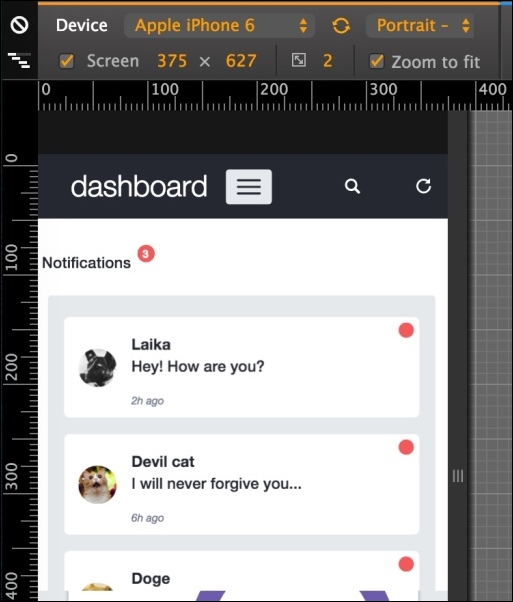
}Awesome! Update your web browser and #notification-list should look like what is shown in this screenshot:
Where are the items of the left menu? If you check out the HTML of #side-menu, you will see that we have added the .hidden-xs class to it. So, we must move the navigation options to another place in this extra small viewport.
Let's add the links to #nav-menu ul just as we did for #nav-profile:
<div id="nav-menu" class="collapse navbar-collapse">
  <ul class="nav navbar-nav">
    <li>…</li>
    <li class="visible-xs">
      <a href="#">Audience</a>
    </li>
    <li class="visible-xs">
      <a href="#">Finances</a>
    </li>
    <li class="visible-xs">
      <a href="#">Realtime</a>
    </li>
    <li class="visible-xs">
      <a href="#">Projects</a>
    </li>

    <li role="separator" class="divider visible-xs"></li>
    …
  </ul>
</div>
Modify the maximum height of #nav-menu when collapse is toggled with the style:
#nav-menu.navbar-collapse {
  max-height: 39rem;
}
For the .divider element in the list, create the following CSS:
#nav-menu .divider {
  height: 0.1rem;
  margin: 0.9rem 0;
  overflow: hidden;
  background-color: #e5e5e5;
}
Notice that in #nav-menu ul, the notification button will appear above the new elements added and the options from #nav-profile will appear below. The next screenshot represents the visualization of the final arrangement of the #nav-menu toggle:

The .round-charts inside the #pie-charts element does not appear correctly aligned. However, we can quickly fix this with two CSS rules using media queries. So, create the following style:
@media(max-width:48em){
  .round-chart,
  .round-chart canvas {
    display: block;
    margin: auto;
  }

  .round-chart + .round-chart {
    margin-top: 2rem;
    float: none;
  }
}
Refresh the web page and see the result, like the following screenshot:

Great! Now we have our dashboard nailed for every viewport and device! That was a thorough task, but with a great payoff, because we have now created a complete dashboard. Let's move forward to some other pages in our example.
Fixing the navigation menu
Click on the collapse toggle navigation (the hamburger button) and you will see how the #nav-menu looks so messy, as shown in the next screenshot. We must fix it just like the way we did in the last web application example:
To do this, we will first need to remove the .pull-right class from #nav-menu. The .pull-* classes add a float to the element by applying the !important flag, which cannot be overridden. In this case, we must override this style rule to remove the .pull-right class and add the float to the current element style rule:
#nav-menu {
  float: right;
}
Create a media query for extra small devices for #nav-menu and remove the float: right:
@media(max-width:48em){
  #nav-menu {
    float: none;
  }
}
After that, we must hide #nav-profile and move its button to the #nav-menu list. First, add the .hidden-xs class to the profile element:
<div id="nav-profile" class="btn-group pull-right hidden-xs">
    …
</div>
This will prevent the element from appearing for extra small devices using the Bootstrap viewport helper class. Then, in #nav-menu > ul, append the options that were in the #nav-profile drop-down button:
<div id="nav-menu" class="collapse navbar-collapse">
  <ul class="nav navbar-nav">
    <li>…</li>
    <li class="visible-xs">
      <a href="#">Profile</a>
    </li>
    <li class="visible-xs">
      <a href="settings.html">Setting</a>
    </li>
    <li class="visible-xs">
      <a href="#">Logout</a>
    </li>
  </ul>
</div>
Note that we make this new item list visible only for extra small viewports with the .visible-xs class.
These new item lists must now look just like the notification one, already present in this list. So, append the selector of the new item list to the current CSS style of #btn-notification:
#btn-notifications .btn-link,
#nav-menu li a {
  padding-top: 1.5rem;
  color: #252830;
  font-weight: 500;
}
The opened list should look like this:
Now, try to change the viewport and see how the elements on the header correctly change its visualization. The #nav-profile will appear only for small-to-large viewports and will shrink into #nav-menu ul in a small visualization for extra small viewports.
If you click on the notification list to open it, you will see three problems: firstly, the badge holding the number of new notifications jumps to the right portion; then the notification button is not filling the entire width; and finally, the notification list can appear a little nicer when opened.
To fix the jumping badge on the notification button, just add the following CSS:
@media(max-width:48em){
  #nav-menu #btn-notifications > .badge {
    right: inherit;
    left: 10rem;
  }
}
Note that we use a media query to change the position of the badge for extra small viewports only.
To modify the notification button's width, we have to create a media query as well. So, add this CSS style to it:
@media(max-width:48em){
  #btn-notifications,
  #btn-notifications > button {
    width: 100%;
    text-align: left;
  }
}
This style will change the width for both the notification button dropdown and the button itself.
Finally, the style for the notification list must be changed. We create the next CSS rule in our main.css file, and it should instantly look good:
@media(max-width:48em){
  #notification-list {
    margin: 1.25rem;
    margin-left: 2rem;
    background-color: #e5e9ec;
  }

  #notification-list a {
    background-color: #FFF;
    opacity: 1;
  }
}
Awesome! Update your web browser and #notification-list should look like what is shown in this screenshot:
Where are the items of the left menu? If you check out the HTML of #side-menu, you will see that we have added the .hidden-xs class to it. So, we must move the navigation options to another place in this extra small viewport.
Let's add the links to #nav-menu ul just as we did for #nav-profile:
<div id="nav-menu" class="collapse navbar-collapse">
  <ul class="nav navbar-nav">
    <li>…</li>
    <li class="visible-xs">
      <a href="#">Audience</a>
    </li>
    <li class="visible-xs">
      <a href="#">Finances</a>
    </li>
    <li class="visible-xs">
      <a href="#">Realtime</a>
    </li>
    <li class="visible-xs">
      <a href="#">Projects</a>
    </li>

    <li role="separator" class="divider visible-xs"></li>
    …
  </ul>
</div>
Modify the maximum height of #nav-menu when collapse is toggled with the style:
#nav-menu.navbar-collapse {
  max-height: 39rem;
}
For the .divider element in the list, create the following CSS:
#nav-menu .divider {
  height: 0.1rem;
  margin: 0.9rem 0;
  overflow: hidden;
  background-color: #e5e5e5;
}
Notice that in #nav-menu ul, the notification button will appear above the new elements added and the options from #nav-profile will appear below. The next screenshot represents the visualization of the final arrangement of the #nav-menu toggle:
The .round-charts inside the #pie-charts element does not appear correctly aligned. However, we can quickly fix this with two CSS rules using media queries. So, create the following style:
@media(max-width:48em){
  .round-chart,
  .round-chart canvas {
    display: block;
    margin: auto;
  }

  .round-chart + .round-chart {
    margin-top: 2rem;
    float: none;
  }
}
Refresh the web page and see the result, like the following screenshot:
Great! Now we have our dashboard nailed for every viewport and device! That was a thorough task, but with a great payoff, because we have now created a complete dashboard. Let's move forward to some other pages in our example.
The notification list needs some style
If you click on the notification list to open it, you will see three problems: firstly, the badge holding the number of new notifications jumps to the right portion; then the notification button is not filling the entire width; and finally, the notification list can appear a little nicer when opened.
To fix the jumping badge on the notification button, just add the following CSS:
@media(max-width:48em){
  #nav-menu #btn-notifications > .badge {
    right: inherit;
    left: 10rem;
  }
}
Note that we use a media query to change the position of the badge for extra small viewports only.
To modify the notification button's width, we have to create a media query as well. So, add this CSS style to it:
@media(max-width:48em){
  #btn-notifications,
  #btn-notifications > button {
    width: 100%;
    text-align: left;
  }
}
This style will change the width for both the notification button dropdown and the button itself.
Finally, the style for the notification list must be changed. We create the next CSS rule in our main.css file, and it should instantly look good:
@media(max-width:48em){
  #notification-list {
    margin: 1.25rem;
    margin-left: 2rem;
    background-color: #e5e9ec;
  }

  #notification-list a {
    background-color: #FFF;
    opacity: 1;
  }
}
Awesome! Update your web browser and #notification-list should look like what is shown in this screenshot:
Where are the items of the left menu? If you check out the HTML of #side-menu, you will see that we have added the .hidden-xs class to it. So, we must move the navigation options to another place in this extra small viewport.
Let's add the links to #nav-menu ul just as we did for #nav-profile:
<div id="nav-menu" class="collapse navbar-collapse">
  <ul class="nav navbar-nav">
    <li>…</li>
    <li class="visible-xs">
      <a href="#">Audience</a>
    </li>
    <li class="visible-xs">
      <a href="#">Finances</a>
    </li>
    <li class="visible-xs">
      <a href="#">Realtime</a>
    </li>
    <li class="visible-xs">
      <a href="#">Projects</a>
    </li>

    <li role="separator" class="divider visible-xs"></li>
    …
  </ul>
</div>
Modify the maximum height of #nav-menu when collapse is toggled with the style:
#nav-menu.navbar-collapse {
  max-height: 39rem;
}
For the .divider element in the list, create the following CSS:
#nav-menu .divider {
  height: 0.1rem;
  margin: 0.9rem 0;
  overflow: hidden;
  background-color: #e5e5e5;
}
Notice that in #nav-menu ul, the notification button will appear above the new elements added and the options from #nav-profile will appear below. The next screenshot represents the visualization of the final arrangement of the #nav-menu toggle:
The .round-charts inside the #pie-charts element does not appear correctly aligned. However, we can quickly fix this with two CSS rules using media queries. So, create the following style:
@media(max-width:48em){
  .round-chart,
  .round-chart canvas {
    display: block;
    margin: auto;
  }

  .round-chart + .round-chart {
    margin-top: 2rem;
    float: none;
  }
}
Refresh the web page and see the result, like the following screenshot:
Great! Now we have our dashboard nailed for every viewport and device! That was a thorough task, but with a great payoff, because we have now created a complete dashboard. Let's move forward to some other pages in our example.
Adding the missing left menu
Where are the items of the left menu? If you check out the HTML of #side-menu, you will see that we have added the .hidden-xs class to it. So, we must move the navigation options to another place in this extra small viewport.
Let's add the links to #nav-menu ul just as we did for #nav-profile:
<div id="nav-menu" class="collapse navbar-collapse">
  <ul class="nav navbar-nav">
    <li>…</li>
    <li class="visible-xs">
      <a href="#">Audience</a>
    </li>
    <li class="visible-xs">
      <a href="#">Finances</a>
    </li>
    <li class="visible-xs">
      <a href="#">Realtime</a>
    </li>
    <li class="visible-xs">
      <a href="#">Projects</a>
    </li>

    <li role="separator" class="divider visible-xs"></li>
    …
  </ul>
</div>
Modify the maximum height of #nav-menu when collapse is toggled with the style:
#nav-menu.navbar-collapse {
  max-height: 39rem;
}
For the .divider element in the list, create the following CSS:
#nav-menu .divider {
  height: 0.1rem;
  margin: 0.9rem 0;
  overflow: hidden;
  background-color: #e5e5e5;
}
Notice that in #nav-menu ul, the notification button will appear above the new elements added and the options from #nav-profile will appear below. The next screenshot represents the visualization of the final arrangement of the #nav-menu toggle:
The .round-charts inside the #pie-charts element does not appear correctly aligned. However, we can quickly fix this with two CSS rules using media queries. So, create the following style:
@media(max-width:48em){
  .round-chart,
  .round-chart canvas {
    display: block;
    margin: auto;
  }

  .round-chart + .round-chart {
    margin-top: 2rem;
    float: none;
  }
}
Refresh the web page and see the result, like the following screenshot:
Great! Now we have our dashboard nailed for every viewport and device! That was a thorough task, but with a great payoff, because we have now created a complete dashboard. Let's move forward to some other pages in our example.
Aligning the round charts
The .round-charts inside the #pie-charts element does not appear correctly aligned. However, we can quickly fix this with two CSS rules using media queries. So, create the following style:
@media(max-width:48em){
  .round-chart,
  .round-chart canvas {
    display: block;
    margin: auto;
  }

  .round-chart + .round-chart {
    margin-top: 2rem;
    float: none;
  }
}
Refresh the web page and see the result, like the following screenshot:
Great! Now we have our dashboard nailed for every viewport and device! That was a thorough task, but with a great payoff, because we have now created a complete dashboard. Let's move forward to some other pages in our example.
Now that we have created the main page of the dashboard example and nailed almost every element, plugin, and component in Bootstrap, let's use some other advanced JavaScript plugins to complete our journey.
For this part, let's create another file named audience.html in the same folder of dashboard.html. In this file, copy the exact same code of dashboard.html, except the HTML inside the div#main element, because that is where we will make some new changes.
Bootstrap provides us with a nice plugin to slideshow components through cycling elements, although it's pretty verbose and a little complicated to understand at first sight.
First of all, we need to create an element inside our div#main:
<div id="main" class="col-sm-offset-3 col-sm-9">
  <div id="carousel-notification" class="carousel" data-ride="carousel">
      …
  </div>
</div>
We must identify this element for the Bootstrap Carousel plugin, so we have called it #carousel-notification at our outmost div of the plugin.
Bootstrap will start a carousel via the data attributes for elements marked with data-ride="carousel", just like our element. In addition, this element must have the .carousel class for the CSS style.
We must create the elements inside the slides for the carousel, so we use the following markup to create the notification slides:
<div id="main" class="col-sm-offset-3 col-sm-9">
  <div id="carousel-notification" class="carousel" data-ride="carousel">
    <div class="carousel-inner" role="listbox">
      <div class="item active">
        <img src="imgs/doge.jpg" width="512">
        <div class="carousel-caption">
          <p>What are you doing? So scare. It's alright now.</p>
        </div>
      </div>
      <div class="item">
        <img src="imgs/cat.jpg" width="512">
        <div class="carousel-caption">
          <p>I will never forgive you...</p>
        </div>
      </div>
      <div class="item">
        <img src="imgs/laika.jpg" width="512">
        <div class="carousel-caption">
          <p>Hey! How are you?</p>
        </div>
      </div>
    </div>
  </div>
</div>
Note that we have created three items. Each item has been created inside the .carousel-inner element. Inside this element, the items have been created with the .item class.
Inside each .item, there is an image followed by another element with the .carousel-caption class, which contains text to be displayed as captions for each slide. Note that the first slide also contains the .active class, which must necessarily be added to one (and only one) of the slides.
At this point, refresh Bootstrap carousel your browser and you should see the page like what is shown in this screenshot:

If you wait 5 seconds, you will see the image and caption change. You can set this interval value by the
data-interval data attribute or through JavaScript, as an initializer parameter, as shown in this example:
$('.carousel').carousel({
  interval: 1000 // value in milliseconds
})
Also observe that there is no animation between the changes of the slides. To add it, put the .slide class into the .carousel element and you will see a left slide of the images.
For each item in the carousel, we just created a simple <p> element inside it. However, you can add other elements, as in the following example, where we are adding a heading 3:
<div class="item">
  <img src="imgs/laika.jpg" width="512">
  <div class="carousel-caption">
    <h3>Laika said:</h3>
    <p>Hey! How are you?</p>
  </div>
</div>The Bootstrap carousel also offers the ability to create bullet slide indicators. To do this, add the following code after the .carousel-inner element:
<div id="carousel-notification" class="carousel slide" data-ride="carousel">
  <div class="carousel-inner" role="listbox">
    …
  </div>

  <!-- Indicators -->
  <ol class="carousel-indicators">
    <li data-target="#carousel-notification" data-slide-to="0" class="active"></li>
    <li data-target="#carousel-notification" data-slide-to="1"></li>
    <li data-target="#carousel-notification" data-slide-to="2"></li>
  </ol>
</div>
We just created an ordered list, <ol>. On each item, we have to say which is the carousel element identifier through data-target (in this case, it is #carousel-notification) and which slide each bullet will correspond to through data-slide-to. To do this, we just create the number of list items from the same size of the image items and enumerate them.
Refresh the browser, and now you should see the carousel with the bullets and all the modifications (the slide transition, the heading on the image item, and the bullet identifier), like this:

Another cool option in the Bootstrap carousel is creating side navigation controls to change slides from left to right.
We add the markup for this after the indicator's one, as shown in the following HTML code:
<div id="carousel-notification" class="carousel slide" data-ride="carousel">
  <div class="carousel-inner" role="listbox">
    …
  </div>

  <!-- Indicators -->
  <ol class="carousel-indicators">
  </ol>

  <!-- Controls -->
  <a class="left carousel-control" href="#carousel-notification" role="button" data-slide="prev">
    <span class="glyphicon glyphicon-chevron-left" aria-hidden="true"></span>
    <span class="sr-only">Previous</span>
  </a>
  <a class="right carousel-control" href="#carousel-notification" role="button" data-slide="next">
    <span class="glyphicon glyphicon-chevron-right" aria-hidden="true"></span>
    <span class="sr-only">Next</span>
  </a>
</div>
As you can see, we created two carousel controls, one to the right and one to the left. Each of them must be inside an <a> tag identified by the .carousel-control class and the class for the action, which is .right or .left.
The href of the element represents the identifier of the carousel, just as data-target in the bullet indicators. The data-slide indicates the action that should be performed by the control, which can be next to move to the next slide or prev to move to the previous slide.
The next screenshot presents the final expected result of the carousel:
Just like every Bootstrap plugin, the carousel offers a set of parameters and methods that can be used. Check out the official documentation for detailed info (http://getbootstrap.com/javascript/#carousel-options).
There are some options that we should be talking about, such as wrap, which defines whether the carousel should be cyclic or not. By default, this option has the value true.
You can also call via JavaScript to the carousel go to a certain slide or just force a slide switch. To go to a certain slide, use this function:
$('.carousel').carousel(2); // which 2 is the slide enumerated as 2 in the data-slide-toTo call the carousel to switch slides, use the same function but pass the prev or next string as the argument:
$('.carousel').carousel('next') // or 'prev'Just like other Bootstrap plugins, the carousel is great for creating slide images on your page. There are a plenty of customizations available to fit the required styles. Always check out the documentation for further information.
You will now learn another Bootstrap plugin—Bootstrap Scrollspy. Scrollspy is a plugin used to automatically update any kind of Bootstrap navigation based on the scroll position. Many sites use it, including the Bootstrap documentation, in the side navigation. There, when you scroll the page, the active elements in the navigation bar change.
To exemplify the utilization of the plugin, let's create a .card on our audience.html page:
<div class="card">
  <div class="card-block">

  </div>
</div>
Inside .card-block, we will create two columns, the left one for the spy navigation and one to the right for the content itself. Remember to always place your .col-*-* inside a .row element:
<div class="card">
  <div class="card-block">
    <div class="row">
      <div class="col-sm-3" id="content-spy"></div>
      <div id="content" class="col-sm-9"></div>
    </div>
  </div>
</div>
We are identifying the navigation column as #content-spy and the content column as just #content.
First, let's create the left navigation using the .nav-pills.nav-stacked Bootstrap component. Do you remember it? Let's refresh your memory by using it again, as follows:
<div class="card">
  <div class="card-block">
    <div class="row">
      <div class="col-sm-3" id="content-spy">
        <ul class="nav nav-pills nav-stacked">
          <li role="presentation" class="active">
            <a href="#lorem">The Lorem</a>
          </li>
          <li role="presentation">
            <a href="#eros">The Eros</a>
          </li>
          <li role="presentation">
            <a href="#vestibulum">The Vestibulum</a>
          </li>
        </ul>
      </div>
      <div id="content" class="col-sm-9"></div>
    </div>
  </div>
</div>
All we need to do is create a <ul> with the .nav, .nav-pills, and .nav-stacked classes. Then we create three item lists, each one with a link inside, referencing an ID in the HTML (#lorem, #eros, and #vestibulum). We will use these IDs later to refer to the Scrollspy.
Now create the content. It must be in the #content three <div>, each one with the ID corresponding to the references in the href of the link in the item list, as shown in this code:
<div class="card">
  <div class="card-block">
    <div class="row">
      <div class="col-sm-3" id="content-spy">
        <ul class="nav nav-pills nav-stacked">
          <li role="presentation" class="active">
            <a href="#lorem">The Lorem</a>
          </li>
          <li role="presentation">
            <a href="#eros">The Eros</a>
          </li>
          <li role="presentation">
            <a href="#vestibulum">The Vestibulum</a>
          </li>
        </ul>
      </div>
      <div id="content" class="col-sm-9">
        <div id="lorem">
          <h2>The Lorem</h2>
          <p>
            Lorem ipsum dolor sit amet… <!-- Rest of the text -->
          </p>
        </div>
        <div id="eros">
          <h2>The Eros</h2>
          <p>
            Curabitur eget pharetra risus… <!-- Rest of the text -->
          </p>
        </div>
        <div id="vestibulum">
          <h2>The Vestibulum</h2>
          <p>
            Integer eleifend consectetur… <!-- Rest of the text -->
            <img src="imgs/jon.png" class="img-responsive">
          </p>
        </div>
      </div>
    </div>
  </div>
</div>
Note the identifiers on each <div> corresponding to the href in the link of the item list. This is used to correlate the scroll with the active item in the nav element.
To activate the plugin, we have two options. Activate it by data attributes or by JavaScript. If you choose JavaScript, place the call function in main.js:
$('#content').scrollspy({
  target: '#content-spy'
})
Refresh the page and see it working. If you want to use data attributes, place a data-spy and a data-target in the #content element:
<div class="card">
  <div class="card-block">
    <div class="row">
      <div class="col-sm-3" id="content-spy">
        <ul class="nav nav-pills nav-stacked">
          <li role="presentation" class="active">
          <a href="#lorem">The Lorem</a>
          </li>
          <li role="presentation">
            <a href="#eros">The Eros</a>
          </li>
          <li role="presentation">
            <a href="#vestibulum">The Vestibulum</a>
          </li>
        </ul>
      </div>
      <div id="content" class="col-sm-9" data-spy="scroll" data-target="#content-spy">
        <div id="lorem">
          <h2>The Lorem</h2>
          <p>
            Lorem ipsum dolor sit amet… <!-- Rest of the text -->
          </p>
        </div>
        <div id="eros">
          <h2>The Eros</h2>
          <p>
            Curabitur eget pharetra risus… <!-- Rest of the text -->
          </p>
        </div>
        <div id="vestibulum">
          <h2>The Vestibulum</h2>
          <p>
            Integer eleifend consectetur… <!-- Rest of the text -->
            <img src="imgs/jon.png" class="img-responsive">
          </p>
        </div>
      </div>
    </div>
  </div>
</div>
The data-spy must have the scroll value in order to identify that the spy must be active for the scrolling action. The data-target works just like the parameter target passed in the activation by JavaScript. It should represent the element that will spy on the element, #content-spy in this case.
To make a final effect for the scrolling, create the following CSS to limit the height and adjust the scroll of the content:
#content {
  height: 30em;
  overflow: auto;
}
Refresh your web browser and the card should appear like what is shown in the next screenshot. Note that here we have scrolled the content to the second item.

Great! Now you have learned another Bootstrap plugin! The Scrollspy plugin is very useful, especially on pages with extensive content, subdivided into sections. Make great use of it.
Using the Bootstrap carousel
Bootstrap provides us with a nice plugin to slideshow components through cycling elements, although it's pretty verbose and a little complicated to understand at first sight.
First of all, we need to create an element inside our div#main:
<div id="main" class="col-sm-offset-3 col-sm-9">
  <div id="carousel-notification" class="carousel" data-ride="carousel">
      …
  </div>
</div>
We must identify this element for the Bootstrap Carousel plugin, so we have called it #carousel-notification at our outmost div of the plugin.
Bootstrap will start a carousel via the data attributes for elements marked with data-ride="carousel", just like our element. In addition, this element must have the .carousel class for the CSS style.
We must create the elements inside the slides for the carousel, so we use the following markup to create the notification slides:
<div id="main" class="col-sm-offset-3 col-sm-9">
  <div id="carousel-notification" class="carousel" data-ride="carousel">
    <div class="carousel-inner" role="listbox">
      <div class="item active">
        <img src="imgs/doge.jpg" width="512">
        <div class="carousel-caption">
          <p>What are you doing? So scare. It's alright now.</p>
        </div>
      </div>
      <div class="item">
        <img src="imgs/cat.jpg" width="512">
        <div class="carousel-caption">
          <p>I will never forgive you...</p>
        </div>
      </div>
      <div class="item">
        <img src="imgs/laika.jpg" width="512">
        <div class="carousel-caption">
          <p>Hey! How are you?</p>
        </div>
      </div>
    </div>
  </div>
</div>
Note that we have created three items. Each item has been created inside the .carousel-inner element. Inside this element, the items have been created with the .item class.
Inside each .item, there is an image followed by another element with the .carousel-caption class, which contains text to be displayed as captions for each slide. Note that the first slide also contains the .active class, which must necessarily be added to one (and only one) of the slides.
At this point, refresh Bootstrap carousel your browser and you should see the page like what is shown in this screenshot:
If you wait 5 seconds, you will see the image and caption change. You can set this interval value by the
data-interval data attribute or through JavaScript, as an initializer parameter, as shown in this example:
$('.carousel').carousel({
  interval: 1000 // value in milliseconds
})
Also observe that there is no animation between the changes of the slides. To add it, put the .slide class into the .carousel element and you will see a left slide of the images.
For each item in the carousel, we just created a simple <p> element inside it. However, you can add other elements, as in the following example, where we are adding a heading 3:
<div class="item">
  <img src="imgs/laika.jpg" width="512">
  <div class="carousel-caption">
    <h3>Laika said:</h3>
    <p>Hey! How are you?</p>
  </div>
</div>The Bootstrap carousel also offers the ability to create bullet slide indicators. To do this, add the following code after the .carousel-inner element:
<div id="carousel-notification" class="carousel slide" data-ride="carousel">
  <div class="carousel-inner" role="listbox">
    …
  </div>

  <!-- Indicators -->
  <ol class="carousel-indicators">
    <li data-target="#carousel-notification" data-slide-to="0" class="active"></li>
    <li data-target="#carousel-notification" data-slide-to="1"></li>
    <li data-target="#carousel-notification" data-slide-to="2"></li>
  </ol>
</div>
We just created an ordered list, <ol>. On each item, we have to say which is the carousel element identifier through data-target (in this case, it is #carousel-notification) and which slide each bullet will correspond to through data-slide-to. To do this, we just create the number of list items from the same size of the image items and enumerate them.
Refresh the browser, and now you should see the carousel with the bullets and all the modifications (the slide transition, the heading on the image item, and the bullet identifier), like this:
Another cool option in the Bootstrap carousel is creating side navigation controls to change slides from left to right.
We add the markup for this after the indicator's one, as shown in the following HTML code:
<div id="carousel-notification" class="carousel slide" data-ride="carousel">
  <div class="carousel-inner" role="listbox">
    …
  </div>

  <!-- Indicators -->
  <ol class="carousel-indicators">
  </ol>

  <!-- Controls -->
  <a class="left carousel-control" href="#carousel-notification" role="button" data-slide="prev">
    <span class="glyphicon glyphicon-chevron-left" aria-hidden="true"></span>
    <span class="sr-only">Previous</span>
  </a>
  <a class="right carousel-control" href="#carousel-notification" role="button" data-slide="next">
    <span class="glyphicon glyphicon-chevron-right" aria-hidden="true"></span>
    <span class="sr-only">Next</span>
  </a>
</div>
As you can see, we created two carousel controls, one to the right and one to the left. Each of them must be inside an <a> tag identified by the .carousel-control class and the class for the action, which is .right or .left.
The href of the element represents the identifier of the carousel, just as data-target in the bullet indicators. The data-slide indicates the action that should be performed by the control, which can be next to move to the next slide or prev to move to the previous slide.
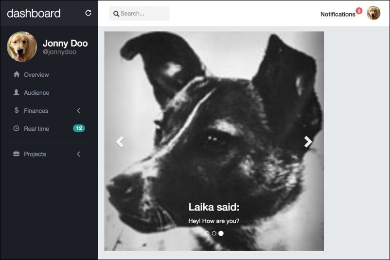
The next screenshot presents the final expected result of the carousel:
Just like every Bootstrap plugin, the carousel offers a set of parameters and methods that can be used. Check out the official documentation for detailed info (http://getbootstrap.com/javascript/#carousel-options).
There are some options that we should be talking about, such as wrap, which defines whether the carousel should be cyclic or not. By default, this option has the value true.
You can also call via JavaScript to the carousel go to a certain slide or just force a slide switch. To go to a certain slide, use this function:
$('.carousel').carousel(2); // which 2 is the slide enumerated as 2 in the data-slide-toTo call the carousel to switch slides, use the same function but pass the prev or next string as the argument:
$('.carousel').carousel('next') // or 'prev'Just like other Bootstrap plugins, the carousel is great for creating slide images on your page. There are a plenty of customizations available to fit the required styles. Always check out the documentation for further information.
You will now learn another Bootstrap plugin—Bootstrap Scrollspy. Scrollspy is a plugin used to automatically update any kind of Bootstrap navigation based on the scroll position. Many sites use it, including the Bootstrap documentation, in the side navigation. There, when you scroll the page, the active elements in the navigation bar change.
To exemplify the utilization of the plugin, let's create a .card on our audience.html page:
<div class="card">
  <div class="card-block">

  </div>
</div>
Inside .card-block, we will create two columns, the left one for the spy navigation and one to the right for the content itself. Remember to always place your .col-*-* inside a .row element:
<div class="card">
  <div class="card-block">
    <div class="row">
      <div class="col-sm-3" id="content-spy"></div>
      <div id="content" class="col-sm-9"></div>
    </div>
  </div>
</div>
We are identifying the navigation column as #content-spy and the content column as just #content.
First, let's create the left navigation using the .nav-pills.nav-stacked Bootstrap component. Do you remember it? Let's refresh your memory by using it again, as follows:
<div class="card">
  <div class="card-block">
    <div class="row">
      <div class="col-sm-3" id="content-spy">
        <ul class="nav nav-pills nav-stacked">
          <li role="presentation" class="active">
            <a href="#lorem">The Lorem</a>
          </li>
          <li role="presentation">
            <a href="#eros">The Eros</a>
          </li>
          <li role="presentation">
            <a href="#vestibulum">The Vestibulum</a>
          </li>
        </ul>
      </div>
      <div id="content" class="col-sm-9"></div>
    </div>
  </div>
</div>
All we need to do is create a <ul> with the .nav, .nav-pills, and .nav-stacked classes. Then we create three item lists, each one with a link inside, referencing an ID in the HTML (#lorem, #eros, and #vestibulum). We will use these IDs later to refer to the Scrollspy.
Now create the content. It must be in the #content three <div>, each one with the ID corresponding to the references in the href of the link in the item list, as shown in this code:
<div class="card">
  <div class="card-block">
    <div class="row">
      <div class="col-sm-3" id="content-spy">
        <ul class="nav nav-pills nav-stacked">
          <li role="presentation" class="active">
            <a href="#lorem">The Lorem</a>
          </li>
          <li role="presentation">
            <a href="#eros">The Eros</a>
          </li>
          <li role="presentation">
            <a href="#vestibulum">The Vestibulum</a>
          </li>
        </ul>
      </div>
      <div id="content" class="col-sm-9">
        <div id="lorem">
          <h2>The Lorem</h2>
          <p>
            Lorem ipsum dolor sit amet… <!-- Rest of the text -->
          </p>
        </div>
        <div id="eros">
          <h2>The Eros</h2>
          <p>
            Curabitur eget pharetra risus… <!-- Rest of the text -->
          </p>
        </div>
        <div id="vestibulum">
          <h2>The Vestibulum</h2>
          <p>
            Integer eleifend consectetur… <!-- Rest of the text -->
            <img src="imgs/jon.png" class="img-responsive">
          </p>
        </div>
      </div>
    </div>
  </div>
</div>
Note the identifiers on each <div> corresponding to the href in the link of the item list. This is used to correlate the scroll with the active item in the nav element.
To activate the plugin, we have two options. Activate it by data attributes or by JavaScript. If you choose JavaScript, place the call function in main.js:
$('#content').scrollspy({
  target: '#content-spy'
})
Refresh the page and see it working. If you want to use data attributes, place a data-spy and a data-target in the #content element:
<div class="card">
  <div class="card-block">
    <div class="row">
      <div class="col-sm-3" id="content-spy">
        <ul class="nav nav-pills nav-stacked">
          <li role="presentation" class="active">
          <a href="#lorem">The Lorem</a>
          </li>
          <li role="presentation">
            <a href="#eros">The Eros</a>
          </li>
          <li role="presentation">
            <a href="#vestibulum">The Vestibulum</a>
          </li>
        </ul>
      </div>
      <div id="content" class="col-sm-9" data-spy="scroll" data-target="#content-spy">
        <div id="lorem">
          <h2>The Lorem</h2>
          <p>
            Lorem ipsum dolor sit amet… <!-- Rest of the text -->
          </p>
        </div>
        <div id="eros">
          <h2>The Eros</h2>
          <p>
            Curabitur eget pharetra risus… <!-- Rest of the text -->
          </p>
        </div>
        <div id="vestibulum">
          <h2>The Vestibulum</h2>
          <p>
            Integer eleifend consectetur… <!-- Rest of the text -->
            <img src="imgs/jon.png" class="img-responsive">
          </p>
        </div>
      </div>
    </div>
  </div>
</div>
The data-spy must have the scroll value in order to identify that the spy must be active for the scrolling action. The data-target works just like the parameter target passed in the activation by JavaScript. It should represent the element that will spy on the element, #content-spy in this case.
To make a final effect for the scrolling, create the following CSS to limit the height and adjust the scroll of the content:
#content {
  height: 30em;
  overflow: auto;
}
Refresh your web browser and the card should appear like what is shown in the next screenshot. Note that here we have scrolled the content to the second item.
Great! Now you have learned another Bootstrap plugin! The Scrollspy plugin is very useful, especially on pages with extensive content, subdivided into sections. Make great use of it.
Customizing carousel items
For each item in the carousel, we just created a simple <p> element inside it. However, you can add other elements, as in the following example, where we are adding a heading 3:
<div class="item">
  <img src="imgs/laika.jpg" width="512">
  <div class="carousel-caption">
    <h3>Laika said:</h3>
    <p>Hey! How are you?</p>
  </div>
</div>The Bootstrap carousel also offers the ability to create bullet slide indicators. To do this, add the following code after the .carousel-inner element:
<div id="carousel-notification" class="carousel slide" data-ride="carousel">
  <div class="carousel-inner" role="listbox">
    …
  </div>

  <!-- Indicators -->
  <ol class="carousel-indicators">
    <li data-target="#carousel-notification" data-slide-to="0" class="active"></li>
    <li data-target="#carousel-notification" data-slide-to="1"></li>
    <li data-target="#carousel-notification" data-slide-to="2"></li>
  </ol>
</div>
We just created an ordered list, <ol>. On each item, we have to say which is the carousel element identifier through data-target (in this case, it is #carousel-notification) and which slide each bullet will correspond to through data-slide-to. To do this, we just create the number of list items from the same size of the image items and enumerate them.
Refresh the browser, and now you should see the carousel with the bullets and all the modifications (the slide transition, the heading on the image item, and the bullet identifier), like this:
Another cool option in the Bootstrap carousel is creating side navigation controls to change slides from left to right.
We add the markup for this after the indicator's one, as shown in the following HTML code:
<div id="carousel-notification" class="carousel slide" data-ride="carousel">
  <div class="carousel-inner" role="listbox">
    …
  </div>

  <!-- Indicators -->
  <ol class="carousel-indicators">
  </ol>

  <!-- Controls -->
  <a class="left carousel-control" href="#carousel-notification" role="button" data-slide="prev">
    <span class="glyphicon glyphicon-chevron-left" aria-hidden="true"></span>
    <span class="sr-only">Previous</span>
  </a>
  <a class="right carousel-control" href="#carousel-notification" role="button" data-slide="next">
    <span class="glyphicon glyphicon-chevron-right" aria-hidden="true"></span>
    <span class="sr-only">Next</span>
  </a>
</div>
As you can see, we created two carousel controls, one to the right and one to the left. Each of them must be inside an <a> tag identified by the .carousel-control class and the class for the action, which is .right or .left.
The href of the element represents the identifier of the carousel, just as data-target in the bullet indicators. The data-slide indicates the action that should be performed by the control, which can be next to move to the next slide or prev to move to the previous slide.
The next screenshot presents the final expected result of the carousel:
Just like every Bootstrap plugin, the carousel offers a set of parameters and methods that can be used. Check out the official documentation for detailed info (http://getbootstrap.com/javascript/#carousel-options).
There are some options that we should be talking about, such as wrap, which defines whether the carousel should be cyclic or not. By default, this option has the value true.
You can also call via JavaScript to the carousel go to a certain slide or just force a slide switch. To go to a certain slide, use this function:
$('.carousel').carousel(2); // which 2 is the slide enumerated as 2 in the data-slide-toTo call the carousel to switch slides, use the same function but pass the prev or next string as the argument:
$('.carousel').carousel('next') // or 'prev'Just like other Bootstrap plugins, the carousel is great for creating slide images on your page. There are a plenty of customizations available to fit the required styles. Always check out the documentation for further information.
You will now learn another Bootstrap plugin—Bootstrap Scrollspy. Scrollspy is a plugin used to automatically update any kind of Bootstrap navigation based on the scroll position. Many sites use it, including the Bootstrap documentation, in the side navigation. There, when you scroll the page, the active elements in the navigation bar change.
To exemplify the utilization of the plugin, let's create a .card on our audience.html page:
<div class="card">
  <div class="card-block">

  </div>
</div>
Inside .card-block, we will create two columns, the left one for the spy navigation and one to the right for the content itself. Remember to always place your .col-*-* inside a .row element:
<div class="card">
  <div class="card-block">
    <div class="row">
      <div class="col-sm-3" id="content-spy"></div>
      <div id="content" class="col-sm-9"></div>
    </div>
  </div>
</div>
We are identifying the navigation column as #content-spy and the content column as just #content.
First, let's create the left navigation using the .nav-pills.nav-stacked Bootstrap component. Do you remember it? Let's refresh your memory by using it again, as follows:
<div class="card">
  <div class="card-block">
    <div class="row">
      <div class="col-sm-3" id="content-spy">
        <ul class="nav nav-pills nav-stacked">
          <li role="presentation" class="active">
            <a href="#lorem">The Lorem</a>
          </li>
          <li role="presentation">
            <a href="#eros">The Eros</a>
          </li>
          <li role="presentation">
            <a href="#vestibulum">The Vestibulum</a>
          </li>
        </ul>
      </div>
      <div id="content" class="col-sm-9"></div>
    </div>
  </div>
</div>
All we need to do is create a <ul> with the .nav, .nav-pills, and .nav-stacked classes. Then we create three item lists, each one with a link inside, referencing an ID in the HTML (#lorem, #eros, and #vestibulum). We will use these IDs later to refer to the Scrollspy.
Now create the content. It must be in the #content three <div>, each one with the ID corresponding to the references in the href of the link in the item list, as shown in this code:
<div class="card">
  <div class="card-block">
    <div class="row">
      <div class="col-sm-3" id="content-spy">
        <ul class="nav nav-pills nav-stacked">
          <li role="presentation" class="active">
            <a href="#lorem">The Lorem</a>
          </li>
          <li role="presentation">
            <a href="#eros">The Eros</a>
          </li>
          <li role="presentation">
            <a href="#vestibulum">The Vestibulum</a>
          </li>
        </ul>
      </div>
      <div id="content" class="col-sm-9">
        <div id="lorem">
          <h2>The Lorem</h2>
          <p>
            Lorem ipsum dolor sit amet… <!-- Rest of the text -->
          </p>
        </div>
        <div id="eros">
          <h2>The Eros</h2>
          <p>
            Curabitur eget pharetra risus… <!-- Rest of the text -->
          </p>
        </div>
        <div id="vestibulum">
          <h2>The Vestibulum</h2>
          <p>
            Integer eleifend consectetur… <!-- Rest of the text -->
            <img src="imgs/jon.png" class="img-responsive">
          </p>
        </div>
      </div>
    </div>
  </div>
</div>
Note the identifiers on each <div> corresponding to the href in the link of the item list. This is used to correlate the scroll with the active item in the nav element.
To activate the plugin, we have two options. Activate it by data attributes or by JavaScript. If you choose JavaScript, place the call function in main.js:
$('#content').scrollspy({
  target: '#content-spy'
})
Refresh the page and see it working. If you want to use data attributes, place a data-spy and a data-target in the #content element:
<div class="card">
  <div class="card-block">
    <div class="row">
      <div class="col-sm-3" id="content-spy">
        <ul class="nav nav-pills nav-stacked">
          <li role="presentation" class="active">
          <a href="#lorem">The Lorem</a>
          </li>
          <li role="presentation">
            <a href="#eros">The Eros</a>
          </li>
          <li role="presentation">
            <a href="#vestibulum">The Vestibulum</a>
          </li>
        </ul>
      </div>
      <div id="content" class="col-sm-9" data-spy="scroll" data-target="#content-spy">
        <div id="lorem">
          <h2>The Lorem</h2>
          <p>
            Lorem ipsum dolor sit amet… <!-- Rest of the text -->
          </p>
        </div>
        <div id="eros">
          <h2>The Eros</h2>
          <p>
            Curabitur eget pharetra risus… <!-- Rest of the text -->
          </p>
        </div>
        <div id="vestibulum">
          <h2>The Vestibulum</h2>
          <p>
            Integer eleifend consectetur… <!-- Rest of the text -->
            <img src="imgs/jon.png" class="img-responsive">
          </p>
        </div>
      </div>
    </div>
  </div>
</div>
The data-spy must have the scroll value in order to identify that the spy must be active for the scrolling action. The data-target works just like the parameter target passed in the activation by JavaScript. It should represent the element that will spy on the element, #content-spy in this case.
To make a final effect for the scrolling, create the following CSS to limit the height and adjust the scroll of the content:
#content {
  height: 30em;
  overflow: auto;
}
Refresh your web browser and the card should appear like what is shown in the next screenshot. Note that here we have scrolled the content to the second item.
Great! Now you have learned another Bootstrap plugin! The Scrollspy plugin is very useful, especially on pages with extensive content, subdivided into sections. Make great use of it.
Creating slide indicators
The Bootstrap carousel also offers the ability to create bullet slide indicators. To do this, add the following code after the .carousel-inner element:
<div id="carousel-notification" class="carousel slide" data-ride="carousel">
  <div class="carousel-inner" role="listbox">
    …
  </div>

  <!-- Indicators -->
  <ol class="carousel-indicators">
    <li data-target="#carousel-notification" data-slide-to="0" class="active"></li>
    <li data-target="#carousel-notification" data-slide-to="1"></li>
    <li data-target="#carousel-notification" data-slide-to="2"></li>
  </ol>
</div>
We just created an ordered list, <ol>. On each item, we have to say which is the carousel element identifier through data-target (in this case, it is #carousel-notification) and which slide each bullet will correspond to through data-slide-to. To do this, we just create the number of list items from the same size of the image items and enumerate them.
Refresh the browser, and now you should see the carousel with the bullets and all the modifications (the slide transition, the heading on the image item, and the bullet identifier), like this:
Another cool option in the Bootstrap carousel is creating side navigation controls to change slides from left to right.
We add the markup for this after the indicator's one, as shown in the following HTML code:
<div id="carousel-notification" class="carousel slide" data-ride="carousel">
  <div class="carousel-inner" role="listbox">
    …
  </div>

  <!-- Indicators -->
  <ol class="carousel-indicators">
  </ol>

  <!-- Controls -->
  <a class="left carousel-control" href="#carousel-notification" role="button" data-slide="prev">
    <span class="glyphicon glyphicon-chevron-left" aria-hidden="true"></span>
    <span class="sr-only">Previous</span>
  </a>
  <a class="right carousel-control" href="#carousel-notification" role="button" data-slide="next">
    <span class="glyphicon glyphicon-chevron-right" aria-hidden="true"></span>
    <span class="sr-only">Next</span>
  </a>
</div>
As you can see, we created two carousel controls, one to the right and one to the left. Each of them must be inside an <a> tag identified by the .carousel-control class and the class for the action, which is .right or .left.
The href of the element represents the identifier of the carousel, just as data-target in the bullet indicators. The data-slide indicates the action that should be performed by the control, which can be next to move to the next slide or prev to move to the previous slide.
The next screenshot presents the final expected result of the carousel:
Just like every Bootstrap plugin, the carousel offers a set of parameters and methods that can be used. Check out the official documentation for detailed info (http://getbootstrap.com/javascript/#carousel-options).
There are some options that we should be talking about, such as wrap, which defines whether the carousel should be cyclic or not. By default, this option has the value true.
You can also call via JavaScript to the carousel go to a certain slide or just force a slide switch. To go to a certain slide, use this function:
$('.carousel').carousel(2); // which 2 is the slide enumerated as 2 in the data-slide-toTo call the carousel to switch slides, use the same function but pass the prev or next string as the argument:
$('.carousel').carousel('next') // or 'prev'Just like other Bootstrap plugins, the carousel is great for creating slide images on your page. There are a plenty of customizations available to fit the required styles. Always check out the documentation for further information.
You will now learn another Bootstrap plugin—Bootstrap Scrollspy. Scrollspy is a plugin used to automatically update any kind of Bootstrap navigation based on the scroll position. Many sites use it, including the Bootstrap documentation, in the side navigation. There, when you scroll the page, the active elements in the navigation bar change.
To exemplify the utilization of the plugin, let's create a .card on our audience.html page:
<div class="card">
  <div class="card-block">

  </div>
</div>
Inside .card-block, we will create two columns, the left one for the spy navigation and one to the right for the content itself. Remember to always place your .col-*-* inside a .row element:
<div class="card">
  <div class="card-block">
    <div class="row">
      <div class="col-sm-3" id="content-spy"></div>
      <div id="content" class="col-sm-9"></div>
    </div>
  </div>
</div>
We are identifying the navigation column as #content-spy and the content column as just #content.
First, let's create the left navigation using the .nav-pills.nav-stacked Bootstrap component. Do you remember it? Let's refresh your memory by using it again, as follows:
<div class="card">
  <div class="card-block">
    <div class="row">
      <div class="col-sm-3" id="content-spy">
        <ul class="nav nav-pills nav-stacked">
          <li role="presentation" class="active">
            <a href="#lorem">The Lorem</a>
          </li>
          <li role="presentation">
            <a href="#eros">The Eros</a>
          </li>
          <li role="presentation">
            <a href="#vestibulum">The Vestibulum</a>
          </li>
        </ul>
      </div>
      <div id="content" class="col-sm-9"></div>
    </div>
  </div>
</div>
All we need to do is create a <ul> with the .nav, .nav-pills, and .nav-stacked classes. Then we create three item lists, each one with a link inside, referencing an ID in the HTML (#lorem, #eros, and #vestibulum). We will use these IDs later to refer to the Scrollspy.
Now create the content. It must be in the #content three <div>, each one with the ID corresponding to the references in the href of the link in the item list, as shown in this code:
<div class="card">
  <div class="card-block">
    <div class="row">
      <div class="col-sm-3" id="content-spy">
        <ul class="nav nav-pills nav-stacked">
          <li role="presentation" class="active">
            <a href="#lorem">The Lorem</a>
          </li>
          <li role="presentation">
            <a href="#eros">The Eros</a>
          </li>
          <li role="presentation">
            <a href="#vestibulum">The Vestibulum</a>
          </li>
        </ul>
      </div>
      <div id="content" class="col-sm-9">
        <div id="lorem">
          <h2>The Lorem</h2>
          <p>
            Lorem ipsum dolor sit amet… <!-- Rest of the text -->
          </p>
        </div>
        <div id="eros">
          <h2>The Eros</h2>
          <p>
            Curabitur eget pharetra risus… <!-- Rest of the text -->
          </p>
        </div>
        <div id="vestibulum">
          <h2>The Vestibulum</h2>
          <p>
            Integer eleifend consectetur… <!-- Rest of the text -->
            <img src="imgs/jon.png" class="img-responsive">
          </p>
        </div>
      </div>
    </div>
  </div>
</div>
Note the identifiers on each <div> corresponding to the href in the link of the item list. This is used to correlate the scroll with the active item in the nav element.
To activate the plugin, we have two options. Activate it by data attributes or by JavaScript. If you choose JavaScript, place the call function in main.js:
$('#content').scrollspy({
  target: '#content-spy'
})
Refresh the page and see it working. If you want to use data attributes, place a data-spy and a data-target in the #content element:
<div class="card">
  <div class="card-block">
    <div class="row">
      <div class="col-sm-3" id="content-spy">
        <ul class="nav nav-pills nav-stacked">
          <li role="presentation" class="active">
          <a href="#lorem">The Lorem</a>
          </li>
          <li role="presentation">
            <a href="#eros">The Eros</a>
          </li>
          <li role="presentation">
            <a href="#vestibulum">The Vestibulum</a>
          </li>
        </ul>
      </div>
      <div id="content" class="col-sm-9" data-spy="scroll" data-target="#content-spy">
        <div id="lorem">
          <h2>The Lorem</h2>
          <p>
            Lorem ipsum dolor sit amet… <!-- Rest of the text -->
          </p>
        </div>
        <div id="eros">
          <h2>The Eros</h2>
          <p>
            Curabitur eget pharetra risus… <!-- Rest of the text -->
          </p>
        </div>
        <div id="vestibulum">
          <h2>The Vestibulum</h2>
          <p>
            Integer eleifend consectetur… <!-- Rest of the text -->
            <img src="imgs/jon.png" class="img-responsive">
          </p>
        </div>
      </div>
    </div>
  </div>
</div>
The data-spy must have the scroll value in order to identify that the spy must be active for the scrolling action. The data-target works just like the parameter target passed in the activation by JavaScript. It should represent the element that will spy on the element, #content-spy in this case.
To make a final effect for the scrolling, create the following CSS to limit the height and adjust the scroll of the content:
#content {
  height: 30em;
  overflow: auto;
}
Refresh your web browser and the card should appear like what is shown in the next screenshot. Note that here we have scrolled the content to the second item.
Great! Now you have learned another Bootstrap plugin! The Scrollspy plugin is very useful, especially on pages with extensive content, subdivided into sections. Make great use of it.
Adding navigation controls
Another cool option in the Bootstrap carousel is creating side navigation controls to change slides from left to right.
We add the markup for this after the indicator's one, as shown in the following HTML code:
<div id="carousel-notification" class="carousel slide" data-ride="carousel">
  <div class="carousel-inner" role="listbox">
    …
  </div>

  <!-- Indicators -->
  <ol class="carousel-indicators">
  </ol>

  <!-- Controls -->
  <a class="left carousel-control" href="#carousel-notification" role="button" data-slide="prev">
    <span class="glyphicon glyphicon-chevron-left" aria-hidden="true"></span>
    <span class="sr-only">Previous</span>
  </a>
  <a class="right carousel-control" href="#carousel-notification" role="button" data-slide="next">
    <span class="glyphicon glyphicon-chevron-right" aria-hidden="true"></span>
    <span class="sr-only">Next</span>
  </a>
</div>
As you can see, we created two carousel controls, one to the right and one to the left. Each of them must be inside an <a> tag identified by the .carousel-control class and the class for the action, which is .right or .left.
The href of the element represents the identifier of the carousel, just as data-target in the bullet indicators. The data-slide indicates the action that should be performed by the control, which can be next to move to the next slide or prev to move to the previous slide.
The next screenshot presents the final expected result of the carousel:
Just like every Bootstrap plugin, the carousel offers a set of parameters and methods that can be used. Check out the official documentation for detailed info (http://getbootstrap.com/javascript/#carousel-options).
There are some options that we should be talking about, such as wrap, which defines whether the carousel should be cyclic or not. By default, this option has the value true.
You can also call via JavaScript to the carousel go to a certain slide or just force a slide switch. To go to a certain slide, use this function:
$('.carousel').carousel(2); // which 2 is the slide enumerated as 2 in the data-slide-toTo call the carousel to switch slides, use the same function but pass the prev or next string as the argument:
$('.carousel').carousel('next') // or 'prev'Just like other Bootstrap plugins, the carousel is great for creating slide images on your page. There are a plenty of customizations available to fit the required styles. Always check out the documentation for further information.
You will now learn another Bootstrap plugin—Bootstrap Scrollspy. Scrollspy is a plugin used to automatically update any kind of Bootstrap navigation based on the scroll position. Many sites use it, including the Bootstrap documentation, in the side navigation. There, when you scroll the page, the active elements in the navigation bar change.
To exemplify the utilization of the plugin, let's create a .card on our audience.html page:
<div class="card">
  <div class="card-block">

  </div>
</div>
Inside .card-block, we will create two columns, the left one for the spy navigation and one to the right for the content itself. Remember to always place your .col-*-* inside a .row element:
<div class="card">
  <div class="card-block">
    <div class="row">
      <div class="col-sm-3" id="content-spy"></div>
      <div id="content" class="col-sm-9"></div>
    </div>
  </div>
</div>
We are identifying the navigation column as #content-spy and the content column as just #content.
First, let's create the left navigation using the .nav-pills.nav-stacked Bootstrap component. Do you remember it? Let's refresh your memory by using it again, as follows:
<div class="card">
  <div class="card-block">
    <div class="row">
      <div class="col-sm-3" id="content-spy">
        <ul class="nav nav-pills nav-stacked">
          <li role="presentation" class="active">
            <a href="#lorem">The Lorem</a>
          </li>
          <li role="presentation">
            <a href="#eros">The Eros</a>
          </li>
          <li role="presentation">
            <a href="#vestibulum">The Vestibulum</a>
          </li>
        </ul>
      </div>
      <div id="content" class="col-sm-9"></div>
    </div>
  </div>
</div>
All we need to do is create a <ul> with the .nav, .nav-pills, and .nav-stacked classes. Then we create three item lists, each one with a link inside, referencing an ID in the HTML (#lorem, #eros, and #vestibulum). We will use these IDs later to refer to the Scrollspy.
Now create the content. It must be in the #content three <div>, each one with the ID corresponding to the references in the href of the link in the item list, as shown in this code:
<div class="card">
  <div class="card-block">
    <div class="row">
      <div class="col-sm-3" id="content-spy">
        <ul class="nav nav-pills nav-stacked">
          <li role="presentation" class="active">
            <a href="#lorem">The Lorem</a>
          </li>
          <li role="presentation">
            <a href="#eros">The Eros</a>
          </li>
          <li role="presentation">
            <a href="#vestibulum">The Vestibulum</a>
          </li>
        </ul>
      </div>
      <div id="content" class="col-sm-9">
        <div id="lorem">
          <h2>The Lorem</h2>
          <p>
            Lorem ipsum dolor sit amet… <!-- Rest of the text -->
          </p>
        </div>
        <div id="eros">
          <h2>The Eros</h2>
          <p>
            Curabitur eget pharetra risus… <!-- Rest of the text -->
          </p>
        </div>
        <div id="vestibulum">
          <h2>The Vestibulum</h2>
          <p>
            Integer eleifend consectetur… <!-- Rest of the text -->
            <img src="imgs/jon.png" class="img-responsive">
          </p>
        </div>
      </div>
    </div>
  </div>
</div>
Note the identifiers on each <div> corresponding to the href in the link of the item list. This is used to correlate the scroll with the active item in the nav element.
To activate the plugin, we have two options. Activate it by data attributes or by JavaScript. If you choose JavaScript, place the call function in main.js:
$('#content').scrollspy({
  target: '#content-spy'
})
Refresh the page and see it working. If you want to use data attributes, place a data-spy and a data-target in the #content element:
<div class="card">
  <div class="card-block">
    <div class="row">
      <div class="col-sm-3" id="content-spy">
        <ul class="nav nav-pills nav-stacked">
          <li role="presentation" class="active">
          <a href="#lorem">The Lorem</a>
          </li>
          <li role="presentation">
            <a href="#eros">The Eros</a>
          </li>
          <li role="presentation">
            <a href="#vestibulum">The Vestibulum</a>
          </li>
        </ul>
      </div>
      <div id="content" class="col-sm-9" data-spy="scroll" data-target="#content-spy">
        <div id="lorem">
          <h2>The Lorem</h2>
          <p>
            Lorem ipsum dolor sit amet… <!-- Rest of the text -->
          </p>
        </div>
        <div id="eros">
          <h2>The Eros</h2>
          <p>
            Curabitur eget pharetra risus… <!-- Rest of the text -->
          </p>
        </div>
        <div id="vestibulum">
          <h2>The Vestibulum</h2>
          <p>
            Integer eleifend consectetur… <!-- Rest of the text -->
            <img src="imgs/jon.png" class="img-responsive">
          </p>
        </div>
      </div>
    </div>
  </div>
</div>
The data-spy must have the scroll value in order to identify that the spy must be active for the scrolling action. The data-target works just like the parameter target passed in the activation by JavaScript. It should represent the element that will spy on the element, #content-spy in this case.
To make a final effect for the scrolling, create the following CSS to limit the height and adjust the scroll of the content:
#content {
  height: 30em;
  overflow: auto;
}
Refresh your web browser and the card should appear like what is shown in the next screenshot. Note that here we have scrolled the content to the second item.
Great! Now you have learned another Bootstrap plugin! The Scrollspy plugin is very useful, especially on pages with extensive content, subdivided into sections. Make great use of it.
Other methods and options for the carousel
Just like every Bootstrap plugin, the carousel offers a set of parameters and methods that can be used. Check out the official documentation for detailed info (http://getbootstrap.com/javascript/#carousel-options).
There are some options that we should be talking about, such as wrap, which defines whether the carousel should be cyclic or not. By default, this option has the value true.
You can also call via JavaScript to the carousel go to a certain slide or just force a slide switch. To go to a certain slide, use this function:
$('.carousel').carousel(2); // which 2 is the slide enumerated as 2 in the data-slide-toTo call the carousel to switch slides, use the same function but pass the prev or next string as the argument:
$('.carousel').carousel('next') // or 'prev'Just like other Bootstrap plugins, the carousel is great for creating slide images on your page. There are a plenty of customizations available to fit the required styles. Always check out the documentation for further information.
You will now learn another Bootstrap plugin—Bootstrap Scrollspy. Scrollspy is a plugin used to automatically update any kind of Bootstrap navigation based on the scroll position. Many sites use it, including the Bootstrap documentation, in the side navigation. There, when you scroll the page, the active elements in the navigation bar change.
To exemplify the utilization of the plugin, let's create a .card on our audience.html page:
<div class="card">
  <div class="card-block">

  </div>
</div>
Inside .card-block, we will create two columns, the left one for the spy navigation and one to the right for the content itself. Remember to always place your .col-*-* inside a .row element:
<div class="card">
  <div class="card-block">
    <div class="row">
      <div class="col-sm-3" id="content-spy"></div>
      <div id="content" class="col-sm-9"></div>
    </div>
  </div>
</div>
We are identifying the navigation column as #content-spy and the content column as just #content.
First, let's create the left navigation using the .nav-pills.nav-stacked Bootstrap component. Do you remember it? Let's refresh your memory by using it again, as follows:
<div class="card">
  <div class="card-block">
    <div class="row">
      <div class="col-sm-3" id="content-spy">
        <ul class="nav nav-pills nav-stacked">
          <li role="presentation" class="active">
            <a href="#lorem">The Lorem</a>
          </li>
          <li role="presentation">
            <a href="#eros">The Eros</a>
          </li>
          <li role="presentation">
            <a href="#vestibulum">The Vestibulum</a>
          </li>
        </ul>
      </div>
      <div id="content" class="col-sm-9"></div>
    </div>
  </div>
</div>
All we need to do is create a <ul> with the .nav, .nav-pills, and .nav-stacked classes. Then we create three item lists, each one with a link inside, referencing an ID in the HTML (#lorem, #eros, and #vestibulum). We will use these IDs later to refer to the Scrollspy.
Now create the content. It must be in the #content three <div>, each one with the ID corresponding to the references in the href of the link in the item list, as shown in this code:
<div class="card">
  <div class="card-block">
    <div class="row">
      <div class="col-sm-3" id="content-spy">
        <ul class="nav nav-pills nav-stacked">
          <li role="presentation" class="active">
            <a href="#lorem">The Lorem</a>
          </li>
          <li role="presentation">
            <a href="#eros">The Eros</a>
          </li>
          <li role="presentation">
            <a href="#vestibulum">The Vestibulum</a>
          </li>
        </ul>
      </div>
      <div id="content" class="col-sm-9">
        <div id="lorem">
          <h2>The Lorem</h2>
          <p>
            Lorem ipsum dolor sit amet… <!-- Rest of the text -->
          </p>
        </div>
        <div id="eros">
          <h2>The Eros</h2>
          <p>
            Curabitur eget pharetra risus… <!-- Rest of the text -->
          </p>
        </div>
        <div id="vestibulum">
          <h2>The Vestibulum</h2>
          <p>
            Integer eleifend consectetur… <!-- Rest of the text -->
            <img src="imgs/jon.png" class="img-responsive">
          </p>
        </div>
      </div>
    </div>
  </div>
</div>
Note the identifiers on each <div> corresponding to the href in the link of the item list. This is used to correlate the scroll with the active item in the nav element.
To activate the plugin, we have two options. Activate it by data attributes or by JavaScript. If you choose JavaScript, place the call function in main.js:
$('#content').scrollspy({
  target: '#content-spy'
})
Refresh the page and see it working. If you want to use data attributes, place a data-spy and a data-target in the #content element:
<div class="card">
  <div class="card-block">
    <div class="row">
      <div class="col-sm-3" id="content-spy">
        <ul class="nav nav-pills nav-stacked">
          <li role="presentation" class="active">
          <a href="#lorem">The Lorem</a>
          </li>
          <li role="presentation">
            <a href="#eros">The Eros</a>
          </li>
          <li role="presentation">
            <a href="#vestibulum">The Vestibulum</a>
          </li>
        </ul>
      </div>
      <div id="content" class="col-sm-9" data-spy="scroll" data-target="#content-spy">
        <div id="lorem">
          <h2>The Lorem</h2>
          <p>
            Lorem ipsum dolor sit amet… <!-- Rest of the text -->
          </p>
        </div>
        <div id="eros">
          <h2>The Eros</h2>
          <p>
            Curabitur eget pharetra risus… <!-- Rest of the text -->
          </p>
        </div>
        <div id="vestibulum">
          <h2>The Vestibulum</h2>
          <p>
            Integer eleifend consectetur… <!-- Rest of the text -->
            <img src="imgs/jon.png" class="img-responsive">
          </p>
        </div>
      </div>
    </div>
  </div>
</div>
The data-spy must have the scroll value in order to identify that the spy must be active for the scrolling action. The data-target works just like the parameter target passed in the activation by JavaScript. It should represent the element that will spy on the element, #content-spy in this case.
To make a final effect for the scrolling, create the following CSS to limit the height and adjust the scroll of the content:
#content {
  height: 30em;
  overflow: auto;
}
Refresh your web browser and the card should appear like what is shown in the next screenshot. Note that here we have scrolled the content to the second item.
Great! Now you have learned another Bootstrap plugin! The Scrollspy plugin is very useful, especially on pages with extensive content, subdivided into sections. Make great use of it.
The Bootstrap spy
You will now learn another Bootstrap plugin—Bootstrap Scrollspy. Scrollspy is a plugin used to automatically update any kind of Bootstrap navigation based on the scroll position. Many sites use it, including the Bootstrap documentation, in the side navigation. There, when you scroll the page, the active elements in the navigation bar change.
To exemplify the utilization of the plugin, let's create a .card on our audience.html page:
<div class="card">
  <div class="card-block">

  </div>
</div>
Inside .card-block, we will create two columns, the left one for the spy navigation and one to the right for the content itself. Remember to always place your .col-*-* inside a .row element:
<div class="card">
  <div class="card-block">
    <div class="row">
      <div class="col-sm-3" id="content-spy"></div>
      <div id="content" class="col-sm-9"></div>
    </div>
  </div>
</div>
We are identifying the navigation column as #content-spy and the content column as just #content.
First, let's create the left navigation using the .nav-pills.nav-stacked Bootstrap component. Do you remember it? Let's refresh your memory by using it again, as follows:
<div class="card">
  <div class="card-block">
    <div class="row">
      <div class="col-sm-3" id="content-spy">
        <ul class="nav nav-pills nav-stacked">
          <li role="presentation" class="active">
            <a href="#lorem">The Lorem</a>
          </li>
          <li role="presentation">
            <a href="#eros">The Eros</a>
          </li>
          <li role="presentation">
            <a href="#vestibulum">The Vestibulum</a>
          </li>
        </ul>
      </div>
      <div id="content" class="col-sm-9"></div>
    </div>
  </div>
</div>
All we need to do is create a <ul> with the .nav, .nav-pills, and .nav-stacked classes. Then we create three item lists, each one with a link inside, referencing an ID in the HTML (#lorem, #eros, and #vestibulum). We will use these IDs later to refer to the Scrollspy.
Now create the content. It must be in the #content three <div>, each one with the ID corresponding to the references in the href of the link in the item list, as shown in this code:
<div class="card">
  <div class="card-block">
    <div class="row">
      <div class="col-sm-3" id="content-spy">
        <ul class="nav nav-pills nav-stacked">
          <li role="presentation" class="active">
            <a href="#lorem">The Lorem</a>
          </li>
          <li role="presentation">
            <a href="#eros">The Eros</a>
          </li>
          <li role="presentation">
            <a href="#vestibulum">The Vestibulum</a>
          </li>
        </ul>
      </div>
      <div id="content" class="col-sm-9">
        <div id="lorem">
          <h2>The Lorem</h2>
          <p>
            Lorem ipsum dolor sit amet… <!-- Rest of the text -->
          </p>
        </div>
        <div id="eros">
          <h2>The Eros</h2>
          <p>
            Curabitur eget pharetra risus… <!-- Rest of the text -->
          </p>
        </div>
        <div id="vestibulum">
          <h2>The Vestibulum</h2>
          <p>
            Integer eleifend consectetur… <!-- Rest of the text -->
            <img src="imgs/jon.png" class="img-responsive">
          </p>
        </div>
      </div>
    </div>
  </div>
</div>
Note the identifiers on each <div> corresponding to the href in the link of the item list. This is used to correlate the scroll with the active item in the nav element.
To activate the plugin, we have two options. Activate it by data attributes or by JavaScript. If you choose JavaScript, place the call function in main.js:
$('#content').scrollspy({
  target: '#content-spy'
})
Refresh the page and see it working. If you want to use data attributes, place a data-spy and a data-target in the #content element:
<div class="card">
  <div class="card-block">
    <div class="row">
      <div class="col-sm-3" id="content-spy">
        <ul class="nav nav-pills nav-stacked">
          <li role="presentation" class="active">
          <a href="#lorem">The Lorem</a>
          </li>
          <li role="presentation">
            <a href="#eros">The Eros</a>
          </li>
          <li role="presentation">
            <a href="#vestibulum">The Vestibulum</a>
          </li>
        </ul>
      </div>
      <div id="content" class="col-sm-9" data-spy="scroll" data-target="#content-spy">
        <div id="lorem">
          <h2>The Lorem</h2>
          <p>
            Lorem ipsum dolor sit amet… <!-- Rest of the text -->
          </p>
        </div>
        <div id="eros">
          <h2>The Eros</h2>
          <p>
            Curabitur eget pharetra risus… <!-- Rest of the text -->
          </p>
        </div>
        <div id="vestibulum">
          <h2>The Vestibulum</h2>
          <p>
            Integer eleifend consectetur… <!-- Rest of the text -->
            <img src="imgs/jon.png" class="img-responsive">
          </p>
        </div>
      </div>
    </div>
  </div>
</div>
The data-spy must have the scroll value in order to identify that the spy must be active for the scrolling action. The data-target works just like the parameter target passed in the activation by JavaScript. It should represent the element that will spy on the element, #content-spy in this case.
To make a final effect for the scrolling, create the following CSS to limit the height and adjust the scroll of the content:
#content {
  height: 30em;
  overflow: auto;
}
Refresh your web browser and the card should appear like what is shown in the next screenshot. Note that here we have scrolled the content to the second item.
Great! Now you have learned another Bootstrap plugin! The Scrollspy plugin is very useful, especially on pages with extensive content, subdivided into sections. Make great use of it.
In this chapter, we greatly finished our dashboard example. We had to create some cards from the last chapter and adjust the visualization for any viewport. The result is a great dashboard that can be used in multiple contexts and web applications.
The user experience and the visuals of the dashboard were impressive in the end, creating a desirable page for this kind of application that works on any device.
Then we moved forward to explain some more Bootstrap plugins. We analyzed Bootstrap Scrollspy, which is a great plugin for you when you are creating pages with large content and need to summarize the sections while the user is scrolling. We used this plugin just with sample content, but remember to use it whenever needed.
We analyzed the Bootstrap carousel as well. The carousel is a great plugin for making slides of images with caption text. In my opinion, the only downside to this plugin is that it is too much typed. Imagine if we could create the same carousel using lines of code. I think we can fix that in the last chapter!
In the next chapter, we will start a plugin customization and use the carousel as an example. We can create a kind of wrapper to reduce typing of the carousel and automate plugin creation. Also, we will go deep into some Bootstrap plugin customizations.
For sure, it will be another challenge to create a plugin for Bootstrap, but I am confident that we can nail that as well.