Book Image

Web Application Development with R Using Shiny - Third Edition

By : Chris Beeley, Shitalkumar R. Sukhdeve
Book Image

Web Application Development with R Using Shiny - Third Edition

By: Chris Beeley, Shitalkumar R. Sukhdeve

Overview of this book

Web Application Development with R Using Shiny helps you become familiar with the complete R Shiny package. The book starts with a quick overview of R and its fundamentals, followed by an exploration of the fundamentals of Shiny and some of the things that it can help you do. You’ll learn about the wide range of widgets and functions within Shiny and how they fit together to make an attractive and easy to use application. Once you have understood the basics, you'll move on to studying more advanced UI features, including how to style apps in detail using the Bootstrap framework or and Shiny's inbuilt layout functions. You'll learn about enhancing Shiny with JavaScript, ranging from adding simple interactivity with JavaScript right through to using JavaScript to enhance the reactivity between your app and the UI. You'll learn more advanced Shiny features of Shiny, such as uploading and downloading data and reports, as well as how to interact with tables and link reactive outputs. Lastly, you'll learn how to deploy Shiny applications over the internet, as well as and how to handle storage and data persistence within Shiny applications, including the use of relational databases. By the end of this book, you'll be ready to create responsive, interactive web applications using the complete R (v 3.4) Shiny (1.1.0) suite.
Table of Contents (11 chapters)

Base graphics and ggplot2

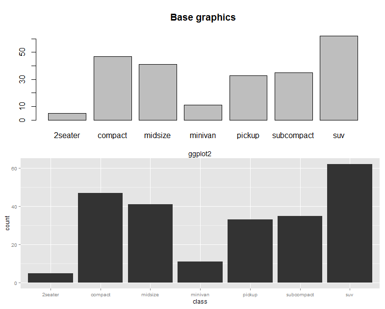
There are lots of user-contributed graphics packages in R that can produce some wonderful graphics. You may wish to take a look for yourself at the CRAN task view at cran.r-project.org/web/views/Graphics.html. We will have a very quick look at two approaches: base graphics, so called because they form the default graphical environment within a vanilla installation of R, and ggplot2, a highly popular user-contributed package produced by Hadley Wickham, which is a little trickier to master than base graphics, but can very rapidly produce a wide range of graphical data summaries. We will cover two graphs that are familiar to everyone: the bar chart and the line chart.

Bar chart

Useful when comparing quantities across categories, bar charts are very simple in base graphics, particularly when combined with the table() command. We will use the mpg dataset, which comes with the ggplot2 package; it summarizes the different characteristics of a range of cars. First, let's install the ggplot2 package. You can do this straight from the console using the following code:

> install.packages("ggplot2")

Alternatively, you can use the built-in package functions in IDEs such as RStudio or RKWard. We'll need to load the package at the beginning of each session in which we want to use this dataset, or in the ggplot2 package itself. From the console, type the following command:

> library(ggplot2)

We will use the table() command to count the number of each type of car featured in the dataset, as shown in the following code:

> table(mpg$class)

This returns a table object (another special object type within R) that contains the columns shown in the following screenshot:

Producing a bar chart of this object is achieved simply using the following code:

> barplot(table(mpg$class), main = "Base graphics")

The barplot function takes a vector of frequencies. Where they are named, as is the case in our example (the table() command returning named frequencies in table form), names are automatically included on the x axis. The defaults for this graph are rather plain. Explore ?barplot and ?par to learn more about fine-tuning your graphics.

We've already loaded the ggplot2 package in order to use the mpg dataset, but if you have shut down R in between these two examples, you will need to reload it by using the following command:

> library(ggplot2)

The same graph is produced in ggplot2 as follows:

> ggplot(data = mpg, aes(x = class)) + geom_bar() + 
ggtitle("ggplot2")

This ggplot call shows the three fundamental elements of ggplot calls: the use of a dataframe (data = mpg); the setup of aesthetics (aes(x = class)), which determines how variables are mapped onto axes, colors, and other visual features; and the use of + geom_xxx(). A ggplot call sets up the data and aesthetics, but does not plot anything. Functions such as geom_bar() (there are many others; see ??geom) tell ggplot what type of graph to plot, as well as instructing it to take optional arguments—for example, geom_bar() optionally takes a position argument, which defines whether the bars should be stacked, offset, or stretched to a common height to show proportions instead of frequencies.

These elements are the key to the power and flexibility that ggplot2 offers. Once the data structure is defined, ways of visualizing that data structure can be added and taken away easily, not only in terms of the type of graphic (bar, line, or scatter graph) but also the scales and coordinates system (log10, polar coordinates, and so on) and statistical transformations (smoothing data, summarizing over spatial coordinates, and so on). The appearance of plots can be easily changed with preset and user-defined themes, and multiple plots can be added in layers (that is, adding them to one plot) or facets (that is, drawing multiple plots with one function call).

The base graphics and ggplot versions of the bar chart are shown in the following screenshot for the purposes of comparison:

Line chart

Line charts are most often used to indicate change, particularly over time. This time, we will use the longley dataset, featuring economic variables from between 1947 and 1962, as shown in the following code:

> plot(x = 1947 : 1962, y = longley$GNP, type = "l",
  xlab = "Year", main = "Base graphics")

The x axis is given very simply by the 1947 : 1962 phrase, which enumerates all the numbers between 1947 and 1962, and the type = "l" argument specifies the plotting of the lines, as opposed to points or both.

The ggplot call looks a lot like the bar chart, except with an x and y dimension in the aesthetics this time. The command looks as follows:

> ggplot(longley, aes(x = 1947 : 1962, y = GNP)) + geom_line() +
      xlab("Year") + ggtitle("ggplot2")