Book Image

RESS Essentials

Book Image

RESS Essentials

Overview of this book

RESS is a new methodology in the world of web design and development. It attempts to solve the problems that accompany the RWD (responsive web design) approach to web design. RESS is still in its infancy, but it is growing at an exponential rate. RESS Essentials shows you how to make server-side applications smarter and more aware of a visitor's environment limitations (device, screen size, and browser). This allows you to create faster and more reliable websites. Through this book, you will build a solid base of knowledge on RESS-related technologies, while the step-by-step tutorials will help you to create your own RESS system. This book is an introduction to RESS alchemy and gives you an incentive to build your own RESS lab. It will give you a broad overview of the multiple techniques used to code responsive websites in responsible ways. Beginning with an overview of RWD, you will learn the steps involved in setting up RWD for client-side development. You will then learn how to scale images using client- and server-side technology. By the end of this book, you will have learned about the implementation of RESS application patterns, browser feature detection, and various RESS architectures. RESS Essentials will also teach you how to use jQuery with some RWD design patterns and how to employ REST API for RWD pages.
Table of Contents (15 chapters)
RESS Essentials
Credits
About the Authors
About the Reviewers
www.PacktPub.com
Preface
Index

Chapter 2. Sample RWD Setup for Client-Side Development

To test and learn RWD and RESS concepts, we will build a demo website. In this chapter we are going to focus on client-side design and development. We will go through the process of implementing a simple design with practical application of RWD concepts such as fluid images, responsive grids, and media queries.
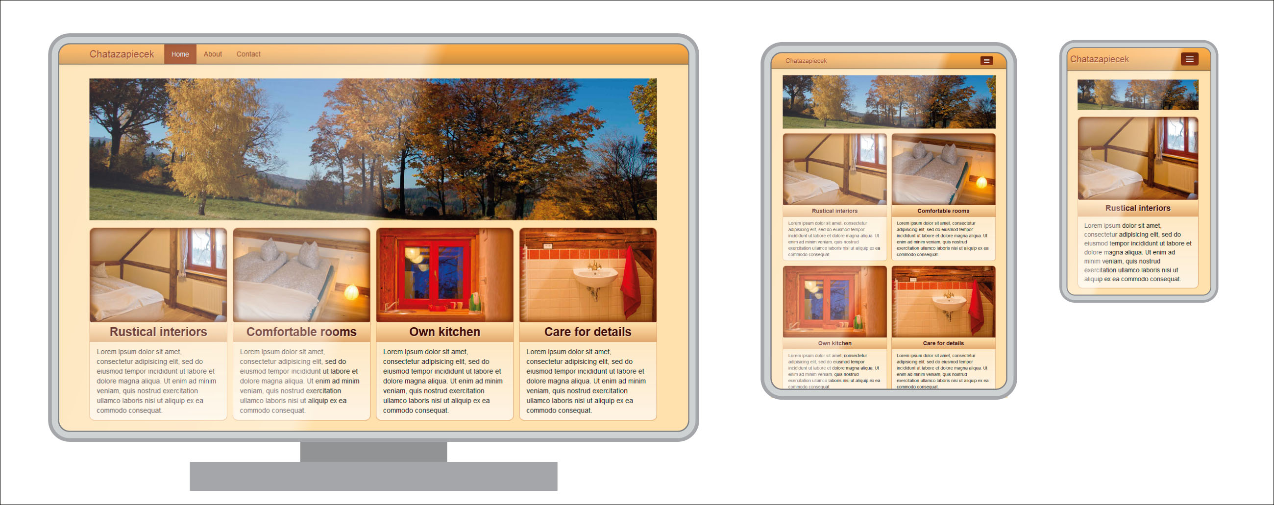
A sample responsive homepage design we are going to build in this chapter

During the process, we are going to look closer at HTML and CSS constructs often used to build responsive web pages. To implement our design, we will employ the often-used frontend framework, Twitter's Bootstrap, based on 12 fluid columns. We don't need most of its components (we are only going to use the responsive navigation bar), but we will seize the opportunity to get acquainted with this useful tool. Our design uses variable column count depending on the screen size. To achieve it, we may use the Gridpak tool, which lets us create complex variable column...