Sign In Start Free Trial
Account

Add to playlist

Create a Playlist

Modal Close icon
You need to login to use this feature.
  • Book Overview & Buying RESS Essentials
  • Table Of Contents Toc
RESS Essentials

RESS Essentials

By : Jerzy Kurowski
4 (1)
close
close
RESS Essentials

RESS Essentials

4 (1)
By: Jerzy Kurowski

Overview of this book

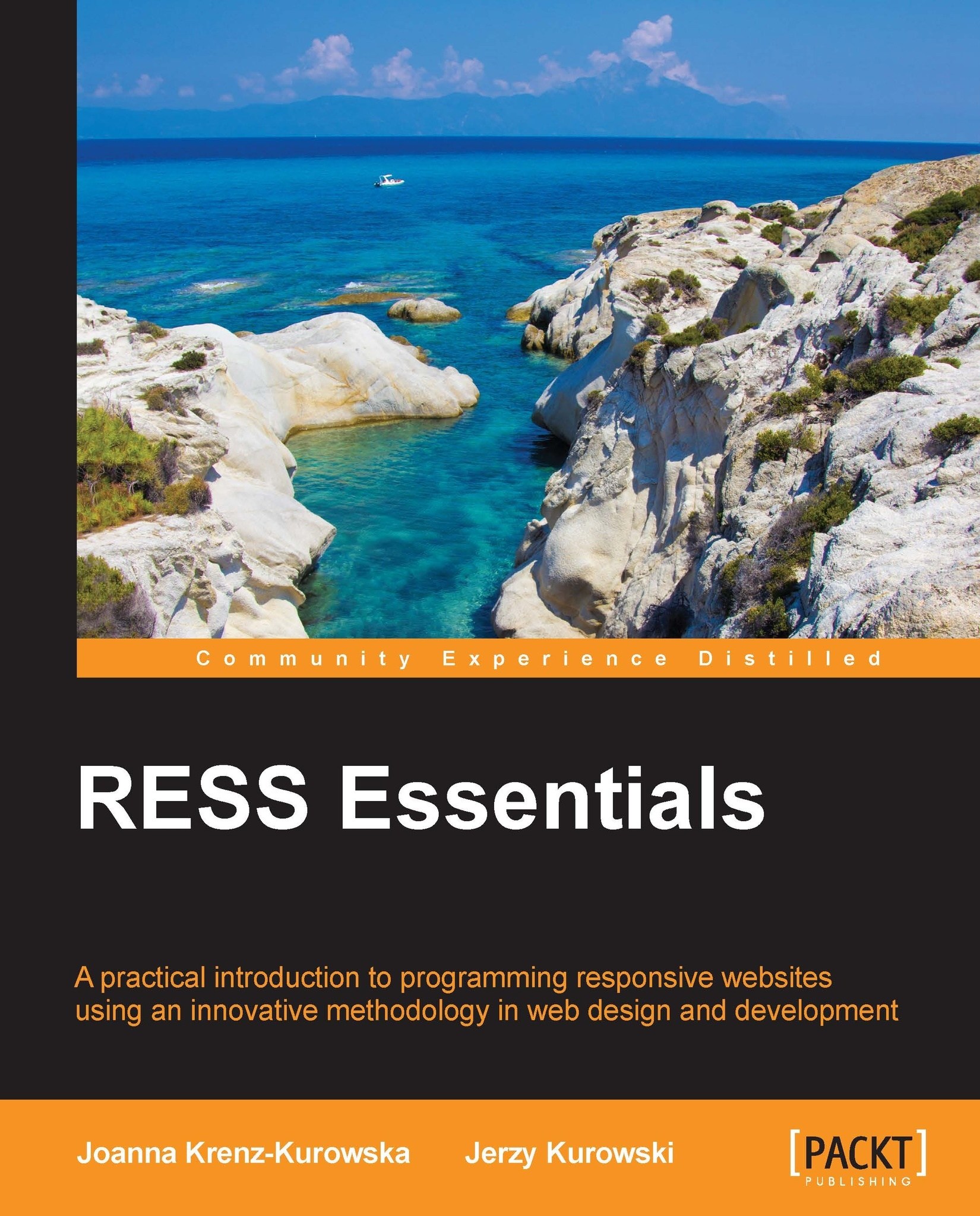
RESS is a new methodology in the world of web design and development. It attempts to solve the problems that accompany the RWD (responsive web design) approach to web design. RESS is still in its infancy, but it is growing at an exponential rate. RESS Essentials shows you how to make server-side applications smarter and more aware of a visitor's environment limitations (device, screen size, and browser). This allows you to create faster and more reliable websites. Through this book, you will build a solid base of knowledge on RESS-related technologies, while the step-by-step tutorials will help you to create your own RESS system. This book is an introduction to RESS alchemy and gives you an incentive to build your own RESS lab. It will give you a broad overview of the multiple techniques used to code responsive websites in responsible ways. Beginning with an overview of RWD, you will learn the steps involved in setting up RWD for client-side development. You will then learn how to scale images using client- and server-side technology. By the end of this book, you will have learned about the implementation of RESS application patterns, browser feature detection, and various RESS architectures. RESS Essentials will also teach you how to use jQuery with some RWD design patterns and how to employ REST API for RWD pages.
Table of Contents (15 chapters)
close
close
RESS Essentials
Credits
About the Authors
About the Reviewers
www.PacktPub.com
Preface
1
Index

Media queries optimization


It is easy to get fooled by myths about media queries optimization. For example, it is a myth that splitting CSS into separate files included via @import statements as follows, reduces bandwidth by loading only necessary CSS code:

@import url("479style.ss")screen and (max-device-width: 479px); @import url("767style.ss")screen and (min-device-width: 480px) and (max-device-width: 767px);

The truth is quite opposite. Such splitting of stylesheets into several files makes CSS easier to maintain but the browser downloads all the files. More HTTP requests certainly add overheads that slow down page loading.

Another myth I encountered is that all background images defined in a stylesheet are downloaded, even if they are inside media queries that do not apply to the current situation. That is not true. In the case of the following code, none of the major browsers download the test1.jpg image:

@media screen and (max-width: 800px)
{
  .photo_block4{background-image:url(test1...
CONTINUE READING
83
Tech Concepts
36
Programming languages
73
Tech Tools
Icon Unlimited access to the largest independent learning library in tech of over 8,000 expert-authored tech books and videos.
Icon Innovative learning tools, including AI book assistants, code context explainers, and text-to-speech.
Icon 50+ new titles added per month and exclusive early access to books as they are being written.
RESS Essentials
notes
bookmark Notes and Bookmarks search Search in title playlist Add to playlist font-size Font size

Change the font size

margin-width Margin width

Change margin width

day-mode Day/Sepia/Night Modes

Change background colour

Close icon Search
Country selected

Close icon Your notes and bookmarks

Confirmation

Modal Close icon
claim successful

Buy this book with your credits?

Modal Close icon
Are you sure you want to buy this book with one of your credits?
Close
YES, BUY

Submit Your Feedback

Modal Close icon
Modal Close icon
Modal Close icon