

When dealing with sequences of events it might even be more interesting to find clusters of sequences. This will always be necessary as the number of possible sequences will be very large.
Clustering sequences with the TraMineR package
Getting ready
In order to run this example, you will need to install the TraMineR package with the install.packages("TraMineR") command.
How to do it...
We will reuse the same example from the previous recipe, and we will find the most representative clusters.
- Import the library:
library(TraMineR)
- This step is exactly the same as we did for the previous exercise. We are just assigning the labels and the short labels for each sequence:
datax <- read.csv("./data__model.csv",stringsAsFactors = FALSE)
mvad.labels <- c("CLOSED","L1", "L2", "L3")
mvad.scode <- c("CLD","L1", "L2", "L3")
mvad.seq <- seqdef(datax, 3:22, states = mvad.scode,labels = mvad.labels)
group__ <- paste0(datax$Sex,"-",datax$Age)
- Calculate the clusters:
dist.om1 <- seqdist(mvad.seq, method = "OM", indel = 1, sm = "TRATE")
library(cluster)
clusterward1 <- agnes(dist.om1, diss = TRUE, method = "ward")
plot(clusterward1, which.plot = 2)
cl1.4 <- cutree(clusterward1, k = 4)
cl1.4fac <- factor(cl1.4, labels = paste("Type", 1:4))
seqrplot(mvad.seq, diss = dist.om1, group = cl1.4fac,border = NA)
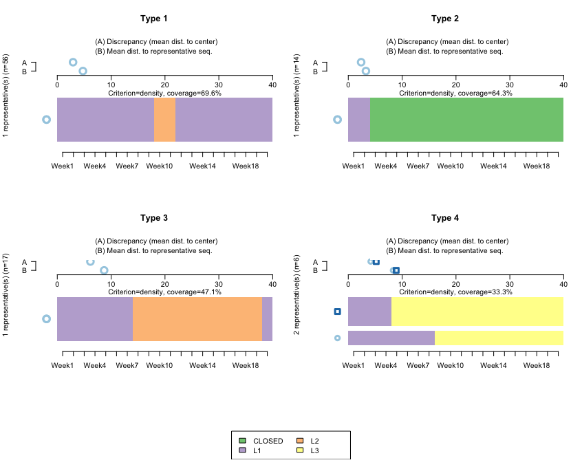
The following screenshot shows the clusters using TraMiner:
How it works...
This algorithm finds representative clusters for our dataset. Note that here, we don't want to do this by cohort (if we wanted to, we would first need to subset the data). The horizontal bars reflect the clusters, and the A-B parts on top are used to calculate the discrepancies between the data and the cluster.
Type 1 and Type 3 refer to sequences starting at L1, then moving to L2 at around Week 9, and then remaining for either a few weeks or for many weeks. Both are quite homogeneous, reflecting that the sequences don't diverge much with respect to the representative ones.
Type 2 relates to sequences starting at L1, and then those accounts closing almost immediately. Here, the mean differences with respect to that sequence are even smaller, which is to be expected: once an account is closed, it is not reopened, so we should expect closed accounts to be quite homogeneous.
Type 4 is interesting. It reflects that after opening an L1 account, those clients jump directly to L3. We have two bars, which reflects that the algorithm is finding two large groups—people jumping to L3 in Week 9, and people jumping to L3 in Week 4.
There's more...
Entropy is a measure of how much disorder exists within a system (its interpretation is similar to entropy in physics). We will calculate it by cohort:
seqHtplot(mvad.seq,group=group__, title = "Entropy index")
The following screenshot shows the entropy for each group/week:
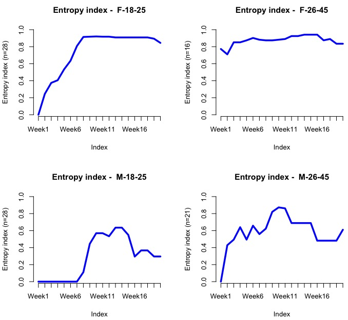
Evidently, the entropy should be low at the beginning as most people are enrolled at L1. We should expect it to go up dramatically after Weeks 7-10, since this company is offering a discount at around that stage, so people might then jump into L2 or L3.