
Designing a book
A book can be a large document, so we can take a similar approach to the previous recipe. Refer to that recipe to see how to split your document into handy files and how to organize the directory structure.
Commonly, books are printed two-sided. In contrast to articles, they are divided into chapters, which start on right-hand pages, have pretty spacy headings, and often a page header showing the current chapter title. Readability and good typography are essential, so you would hardly find books with an A4 paper size, double line space, and similar specs, which some institutes expect of a thesis. That’s why we got dedicated book classes with meaningful default settings and features.
How to do it...
As the Writing a short text recipe explains, our choice will be a KOMA-Script class; this time, it has the name scrbook.
Follow these steps:
- Start with the scrbook class and suitable options for paper and font size:
\documentclass[fontsize=11pt,paper=a5, pagesize=auto]{scrbook} - Choose a font encoding with the following command; use T1, which is good for European, English, or American texts:
\usepackage[T1]{fontenc} - If you want a non-default font, load it; here, we chose Latin Modern:
\usepackage{lmodern} - We will load the blindtext package for getting English dummy texts; it also requires loading the babel package with English settings:
\usepackage[english]{babel} \usepackage{blindtext} - Load the microtype package for better text justification:
\usepackage{microtype} - By running the following command, you can switch off additional space after sentence punctuation:
\frenchspacing
- Begin the document:
\begin{document} - Provide a title, a subtitle, an author name, and a date. You can also set an empty value if you don’t want to have something in that titling field:
\title{The Book} \subtitle{Some more to know} \author{The Author} \date{} - Let LaTeX print the title page:
\maketitle
- Print out the table of contents:
\tableofcontents
- In addition to chapters, we will divide this book into parts, so start one:
\part{First portion} - Start a chapter with a heading. Having text before another heading comes is nice, so let’s have some:
\chapter{The beginning} Some introductory text comes here. - As in our first recipe, add a section and text and another part with a chapter and sections. Using the \Blindtext command, you can generate long dummy text; use the \blindtext command to get shorter dummy text. The \appendix command switches to alphabetic numbering:
\section{A first section} Dummy text will follow. \blindtext \section{Another section} \Blindtext \appendix \part{Appendix} \chapter{An addendum} \section{Section within the appendix} \blindtext - End the document:
\end{document} - Let your editor compile the text to PDF. You will get a 13-page book document with A5 paper size, a title page, part pages, chapter, section headings, and filler text.
Take a look at a sample page:
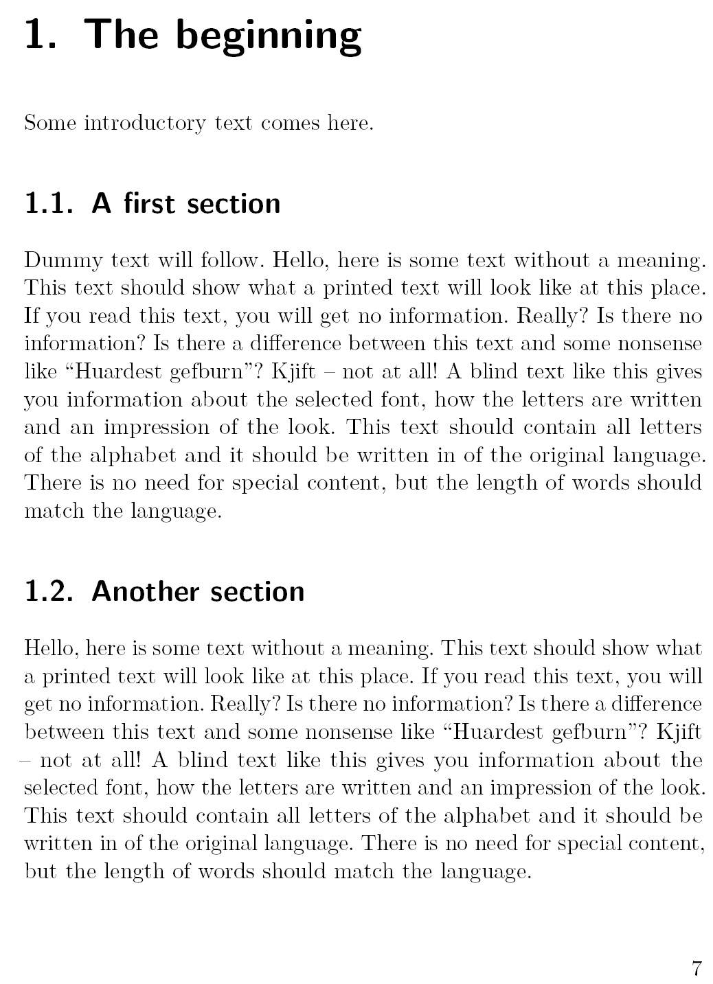
Figure 1.3 – Page 7 of the sample book with chapter and section headings
Note the headings in a sans-serif font. This is an intentional default setting in KOMA-Script classes, which makes the headings lighter than the standard LaTeX big, bold, and serif headings. You know – the traditional look.
Now, you can fill in your own text, add chapters and sections, and add features described later in this recipe.
How it works...
At first, we loaded the scrbook class, made explicitly for writing books. So, it is ready for two-sided printing with meaningful margins and pleasing proportions of headings and text.
Besides the class’s default settings, we chose a font size of 11 pt and A5 paper size, which is handy for a book. The pagesize=auto option is essential here: it ensures that the A5 printing area will be taken over to the PDF page size.
Then, we did the following things, which will be explained in more detail at the beginning of Chapter 2, Tuning the Text:
- Chose the T1 font encoding when loading the fontenc package
- Selected the high-quality Latin Modern T1 supporting font set by loading the lmodern package
- Loaded the babel package with support for English
- Used the microtype package for getting finer typography
The last package we loaded was blindtext. You don’t need it in your final document; here, it will serve us to provide filler text. Using such dummy text, we can get a better idea of the final result already before writing the actual content.
Finally, we switched to the so-called French spacing, which we already saw in the thesis recipe. Remember – this means that after ending a sentence, we will get a standard interword space, not a wider space.
There’s more...
You can change the layout of the book in many ways. Choose your settings at the beginning, or even better: don’t hesitate and start writing your content – once you get a decent amount of text, you can better see the effect of layout changes. You can do that at any time. Let’s take a look at some design ideas.
Changing the page layout
When a book is bound after printing, this binding can cost space; less of the inner margin may be visible. You can specify a binding correction to compensate for and preserve layout proportions. So, if you see 5 mm less of the inner margin after binding, add BCOR=5mm as a class option at the beginning. A similarly produced book may give you an idea about a good value.
The actual text area has the same ratios as the page itself. This is automatically done by a dividing construction, described in the KOMA-Script manual. That’s really worth reading. You can open it by typing texdoc scrguien at Command Prompt or online at https://texdoc.org/pkg/scrguien. This abbreviation comes from scr for the original package name (Script), gui for guide, and en for English, and obviously from the ancient limit of 8 characters per filename in older filesystems.
Besides those page and text area ratios, the result shows a bottom margin twice as high as the top margin, and an outer margin with the double width of the inner margin. Imagine an opened book: the inner margins together appear with the same space as an outer margin. Sometimes, people make the mistake of thinking that the inner margin should be much bigger because of the binding, but that’s done by raising BCOR as previously. In Chapter 2, Tuning the Text, you can use the Visualizing the layout recipe to inspect and understand the margins.
If you want a more extensive text area, which means narrower margins, you can keep the ratios as described. Just raise the division factor of the mentioned internal construction and take a look to see if it would suit you. For example, set the DIV=10 class option. Higher values are possible. That’s a safe and easy way to preserve sane layout proportions.
To sum up, our example with 5 mm binding loss and pretty narrow margins could start like this:
\documentclass[fontsize=11pt,paper=a5,pagesize=auto, BCOR=5mm,DIV=12]{scrbook}
Alternatively, you could freely choose text and margin dimensions when requirements by the publisher or institute need to be met. This can be done by loading the classic geometry package with the desired measurements, as we saw in the Writing a thesis recipe:
\usepackage[inner=1.5cm,outer=3cm,top=2cm,bottom=4cm, bindingoffset=5mm]{geometry}
Designing a title page
You can create your own title page to present more information in a style you desire. Let’s look at an example that shows some handy commands for it.
Remove the \maketitle command. You can do the same with the \title, \subtitle, \author, and \date commands. Instead, put this titlepage environment right after \begin{document}:
\begin{titlepage} \vspace*{1cm} {\huge\raggedright The Book\par} \noindent\hrulefill\par {\LARGE\raggedleft The Author\par} \vfill {\Large\raggedleft Institute\par}\end{titlepage}
The titlepage environment creates a page without a page number on it. We started with some vertical space using the \vspace* command. The \vspace command adds vertical space, which can be of a positive or a negative value. Here, note the star at the end: this way of calling \vspace also works at the beginning of a page, where a simple \vspace instance would be ignored. That default behavior prevents undesired vertical space at the top of a page, which initially may have been intended as space between texts.
We enclosed each line in curly braces. This is also called grouping, and it is used to keep the effect of changes, such as the font size, local within the braces. In each line, we did the following:
- Switched to a specific font size
- Chose left or right alignment
- Wrote out the text
- Ended with a paragraph break
The \par command is equivalent to an empty line in the input. Sometimes, people use it to keep the code compact, such as here. We must end the paragraph before the font size changes because that size defines the space between lines. Hence, we ended the paragraph before we closed the brace group. It’s good to keep this in mind for when texts are longer.
Our only non-text design element is a modest horizontal line with the \hrulefill command. The preceding \noindent command just prevents an undesired paragraph indentation, so the line really starts at the very left.
\vfill inserts stretching vertical space, so we got the last line pushed down to the title page bottom. If you used several \vfill commands on the same page, the available vertical space would be divided and distributed equally between them.
We took this scenario to show some commands for positioning text on a page. You can experiment with the \vspace and \vfill commands and their horizontal companions, \hspace and \hfill. Just avoid using such commands to “fix” local placement issues in the document when it would be better to adjust a class or package setting document-wide. If at all, don’t make such tweaks until the final stage.
Note
The titlepages package provides 40 example title pages in various designs with complete LaTeX source code. You could choose one, use it, and customize it.
Adding a cover page
The title page, which we produced previously, is an inner page. That’s why it follows the standard page layout with the same inner and outer margins as the body text.
The cover is different; for example, it should have symmetric margins and can be designed individually. To get that deviating layout, it’s recommended to use a separate document for it. Another reason is that it will usually be printed on different paper or cardboard.
So, you can start with an article-like class as in our first recipe, Writing a short text, then use options such as twoside=false or the equivalent oneside option to get symmetric margins. Then, you can position your text as we did with the title page.
Changing the document class
A very well-designed book class is memoir. It is pretty complete in itself, so you don’t need to load many packages: it already integrates many features of other packages, providing similar interfaces. memoir has a monolithic, easy-to-use approach, but it needs to take care of package conflicts. It is not as flexible as choosing the package set by yourself. KOMA-Script, in contrast, provides its features mostly in packages that can also be used with other classes.
- Start with memoir by changing the first line to the following:
\documentclass[11pt,a5paper]{memoir} - Remove the \subtitle command, which is not supported.
- To have the title on its own page, surround \maketitle with a titlingpage environment:
\begin{titlingpage} \maketitle \end{titlingpage} - Typeset and compare.
The memoir class provides an extensive manual that can help you to customize your document. It’s split into two parts. Type texdoc memman at Command Prompt to read the actual manual and texdoc memdesign to read the part on book design, which is an excellent resource independent of the class. Alternatively, you can find these manuals at https://texdoc.org/pkg/memman and https://texdoc.org/pkg/memdesign, respectively.
Another great start with a unique beauty is the tufte-latex class. It comes with a sample-book.tex file, which you can also download from https://ctan.org/tex-archive/macros/latex/contrib/tufte-latex. You could open this book file containing some dummy content and fill in your text. One of its outstanding features is a wide margin for extensive use of side notes and small figures in the margin.
See also
A book may contain additional elements such as an index, a glossary, and a bibliography. Refer to Chapter 8, Producing Contents, Indexes, and Bibliographies, which includes such recipes.
The Overleaf book templates collection at https://www.overleaf.com/latex/templates/tagged/book can also give you a head start.