Book Image

Mastering QlikView Data Visualization

By : Karl Pover
Book Image

Mastering QlikView Data Visualization

By: Karl Pover

Overview of this book

Just because you know how to swing a hammer doesn't mean you know how to build a house. Now that you've learned how to use QlikView, it's time to learn how to develop meaningful QlikView applications that deliver what your business users need. You will explore the requirements and the data from several business departments in order to deliver the most amazing analysis and data visualizations. In doing so, you will practice using advanced QlikView functions, chart object property options, and extensions to solve real-world challenges.
Table of Contents (18 chapters)
Mastering QlikView Data Visualization
Credits
About the Author
About the Reviewers
www.PacktPub.com
Preface
Index

Customizing the QlikView User Experience


Much of the QlikView User Experience (UX) is customizable. For example, we can develop ways to guide users through a well-defined series of reports or give them the power to create their own reports. We can also allow them to change the interface's language or the currency. In this section, we will create the following UX components:

  • Quick access to supplementary information

  • Dynamic data visualization

  • Regional settings

Quick access to supplementary information

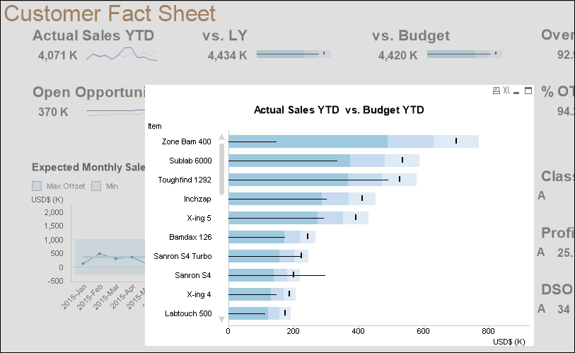
When users notice something interesting in concise visualizations such as numbers, sparklines, and bullet graphs, they often want to take a glance at the details that compose it. For example, in our customer fact sheet, we want to quickly analyze the detail behind the high-level comparison between actual and budget sales. During the design stage we chose to open a detailed comparison by item when the user clicks on vs. Budget, as shown in the following figure:

Exercise 8.4

Let's create the following...