

Here are a few tidbits/tricks that you may find helpful as you venture into the world of calculated fields in Tableau (Conversion error):
One of the most common calculation errors you may encounter will be related to mixing aggregate and non-aggregate arguments in functions:
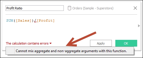
What this simply states is that if one part of the calculation is an aggregation (such as SUM, AVG, MAX, and MIN), all other parts should also be aggregations.
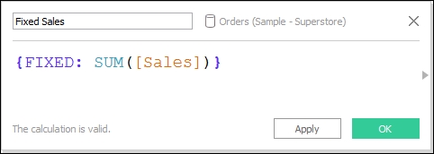
This becomes tricky when working with level of detail calculations. For example, we may have an LOD expression that gets a FIXED sum of sales:
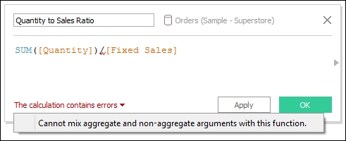
What if we need to use this with another calculated field that is aggregated? In the following example, we are dividing SUM(Quantity) by our fixed LOD calculated field, which is already an aggregated field. However, we are getting the notorious Cannot mix aggregate and non-aggregate… error, as shown in the following screenshot:
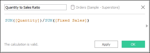
Not to worry. Since LOD expressions are technically treated as row-level values, all we need to do is enclose this field in another aggregation. Putting Fixed Sales in a SUM or MIN or MAX or AVG will not change its value; the SUM of one value is still the same value, but it will help get around the aggregation error:
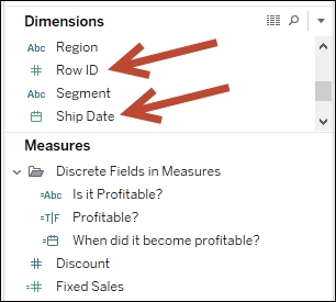
When you first open the sample Superstore Excel file that comes with Tableau, you may have noticed that by default, all the blue (discrete) fields are in the Dimensions section, and the green (continuous) fields are in the Measures section. However, do not assume that only discrete fields can be in Dimensions and continuous fields in Measures.
Numeric and date fields can be converted into Continuous and can still appear in the Dimensions section:
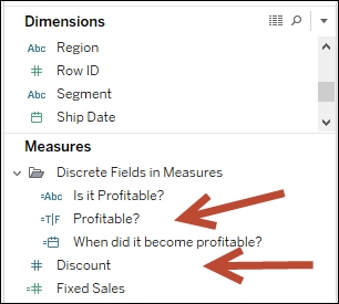
By the same token, measures can be converted to discrete, but they still stay in the Measures section.
Calculated fields that include any aggregation will always appear in the Measures section regardless of the data type. In the following screenshot, you will see different discrete data types in the Measures section as a result of using aggregate functions (such as SUM(Profit)) in the underlying formula:
In Tableau, it is possible to aggregate dimensions too. MIN and MAX are aggregation functions, which can be applied to dimensions. Tableau also has a function called ATTR, which does allow dimension aggregation.
ATTR checks for heterogeneity of values. The ATTR function returns a value if all of that group's values are the same. Otherwise, an asterisk (*) is returned. If we were to convert it to another formula, the ATTR function would be similar to the following expression:
IF MIN(dimension) = MAX(dimension)
THEN "dimension"
ELSE "*"
END
To illustrate, have a look at the following example:
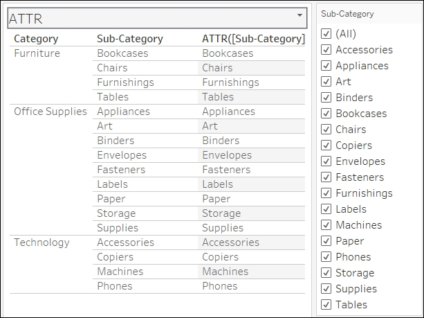
The ATTR([Sub-Category]) field was calculated using the formula ATTR([Sub-Category]). At this point, all the Sub-Category values in every line are uniform; therefore, the ATTR function returns and displays that single value.
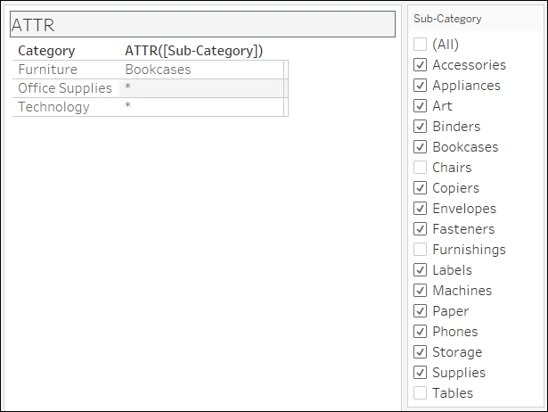
However, once we take the Sub-Category field away and aggregate the dimensions to Category, ATTR([Sub-Category]) should have multiple values and therefore report an asterisk.
In the following screenshot, Bookcases appear only because all the other values in the Furniture group—Chairs, Furnishings, and Tables—have been deselected from the Filter shelf, leaving Bookcases as the only value under that group:
You may see ATTR used a lot when you have blended data. Fields from the secondary data source need to be aggregated, and this is a way to ensure that the returned values from the secondary data source come back as a single label. You may have noticed it before that when you drag dimension fields that produce multiple values, values are displayed as asterisks instead.
Another possible use case is when we want to check whether something or someone has been consistent in behavior. For example, if I want to quickly check whether a students has taken only courses from the Computer Science department, I can use the ATTR() function on Department. All students who have taken only Computer Science courses should reveal Computer Science, while students who have taken from other departments will yield an asterisk (*).