

The human mind is often good at seeing patterns, trends, and outliers in visual representations. The large amount of data present in many data science problems can be analyzed using visualization techniques. Visualization is appropriate for a wide range of audiences, ranging from analysts, to upper-level management, to clientele. In this chapter, we present various visualization techniques and demonstrate how they are supported in Java.
In this chapter, we will illustrate how to create different types of graph, plot, and chart. The majority of the examples use JavaFX, with a few using a free library called GRAphing Library (GRAL). There are several open source Java plotting libraries available. A brief comparison of several of these libraries can be found at https://github.com/eseifert/gral/wiki/comparison. We chose JavaFX because it is packaged as part of Java SE.
GRAL is used to illustrate plots that are not as easily created using JavaFX. GRAL is a free Java library useful for creating a variety of charts and graphs. This graphing library provides flexibility in types of plots, axis formatting, and export options. GRAL resources (http://trac.erichseifert.de/gral/) include example code and helpful how to sections.
Visualization is an important step in data analysis because it allows us to conceive of large datasets in practical and meaningful ways. We can look at small datasets of values and perhaps draw conclusions from the patterns we see, but this is an overwhelming and unreliable process. Using visualization tools helps us identify potential problems or unexpected data results, as well as construct meaningful interpretations of good data.
One example of the usefulness of data visualization comes with the presence of outliers. Visualizing data allows us to quickly see data results significantly outside of our expectations, and we can choose how to modify the data to build a clean and usable dataset. This process allows us to see errors quickly and deal with them before they become a problem later on. Additionally, visualization allows us to easily classify information and help analysts organize their inquiries in a manner best suited to their particular dataset.
There are many types of visual expression available to aid in visualization. We are going to briefly discuss the most common and useful ones, and then demonstrate several Java techniques for achieving these types of expression. The choice of graph, or other visualization tool will depend upon the dataset and application needs and constraints.
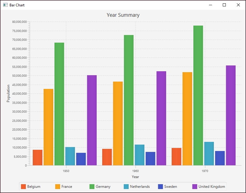
A bar chart is a very common technique for displaying relationships in data. In this type of graph, data is represented in either vertical or horizontal bars placed along an X and Y axis. The data is scaled so the values represented by each bar can be compared to one another. The following is a simple example of a bar chart we will create in the Using country as the category section:

A pie chart is most useful when you want to demonstrate a value in relation to a larger set. Think of this as a way to visualize how large the piece of pie is in relation to the entire pie. The following is a simple example of a pie chart showing the distribution of population for selected European countries:

Time series graphs are a special type of graph used for displaying time-related values. These are most appropriate when the data analysis requires an understanding of how data changes over a period of time. In these graphs, the vertical axis corresponds to the values and the horizontal axis corresponds to particular points in time. In particular, this type of graph can be useful for identifying trends across time,or suggesting correlations between data values and particular events within a given time period.
For example, stock prices and home prices will change, but their rate of change varies. Pollution levels and crime rates also change over time. There are several techniques that visualize this type of data. Often, specific values are not as important as their trend over time.
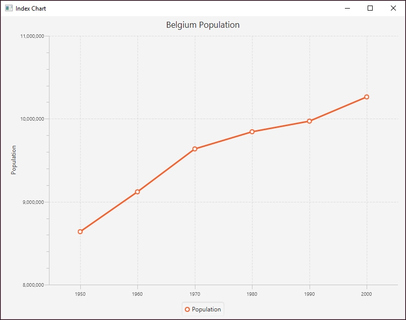
An index chart is also called a line chart. Line charts use the X and Y axis to plot points on a grid. They can be used to represent time series data. These points are connected by lines, and these lines are used to compare values of multiple data at one time. This comparison is usually achieved by plotting independent variables, such as time, along the X axis, and independent variables, such as frequency or percentages, along the Y axis.
The following is a simple example of an index chart showing the distribution of population for selected European countries:
When we wish to arrange larger amounts of data in a compact and useful manner, we may opt for a stem and leaf plot. This type of visual expression allows you to demonstrate the correlation of one value to many values in a readable manner. The stem refers to a data value, and the leaves are the corresponding data points. One common example of this is a train timetable. In the following table, the departure times for a train are listed:
|
|
|
|
|
|
|
|
|
|
|
|
|
|
|
|
|
|
|
|
|
|
|
|
|
|
|
|
|
|
|
|
|
|
|
|
|
However, this table can be hard to read. Instead, in the following partial stem and leaf plot, the stem represents the hours at which a train may depart, while the leaves represent the minutes within each hour:
|
Hour |
Minute |
|
06 |
:15 :20 :25 :30 :40 :45 :55 |
|
07 |
:15 :20 :25 :30 :40 :45 :55 |
|
08 |
:00 :12 :24 :36 :48 |
|
09 |
:00 :12 :24 :36 :48 |
|
10 |
:00 :12 :24 :36 :48 |
This is much easier to read and process.
A very popular form of visualization in statistical analysis is the histogram. Histograms allow you to display frequencies within data using bars, similar to a bar chart. The main difference is that histograms are used to identify frequencies and trends within a dataset while bar charts are used to compare specific data values within a dataset. The following is an example of a histogram we will create in the Creating histograms section:
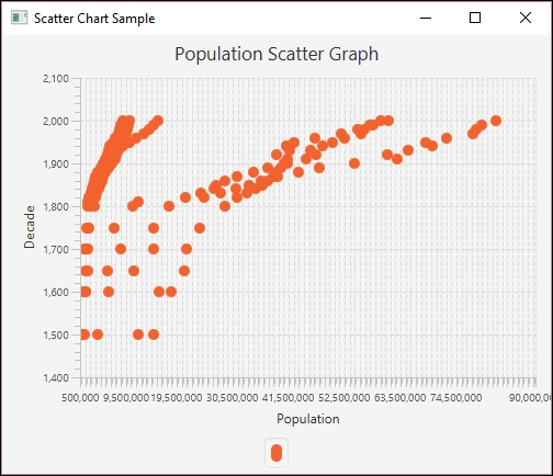
A scatter plot is simply collections of points, and analysis techniques, such as correlation or regression, can be used to identify trends within these types of graph. In the following scatter chart, as developed in Creating scatter charts, the population along the X axis is plotted against the decade along the Y axis:
Each type of visual expression lends itself to different types of data and data analysis purposes. One common purpose of data analysis is data classification. This involves determining which subset within a dataset a particular data value belongs to. This process may occur early in the data analysis process because breaking data apart into manageable and related pieces simplifies the analysis process. Often, classification is not the end goal but rather an important intermediary step before further analysis can be undertaken.
Regression analysis is a complex and important form of data analysis. It involves studying relationships between independent and dependent variables, as well as multiple independent variables. This type of statistical analysis allows the analyst to identify ranges of acceptable or expected values and determine how individual values may fit into a larger dataset. Regression analysis is a significant part of machine learning, and we will discuss it in more detail in Chapter 5, Statisitcal Data Analysis Techniques.
Clustering allows us to identify groups of data points within a particular set or class. While classification sorts data into similar types of datasets, clustering is concerned with the data within the set. For example, we may have a large dataset containing all feline species in the world, in the family Felidae. We could then classify these cats into two groups, Pantherinae (containing most larger cats) and Felinae (all other cats). Clustering would involve grouping subsets of similar cats within one of these classifications. For example, all tigers could be a cluster within the Pantherinae group.
Sometimes, our data analysis requires that we extract specific types of information from our dataset. The process of selecting the data to extract is known as attribute selection or feature selection. This process helps analysts simplify the data models and allows us to overcome issues with redundant or irrelevant information within our dataset.
With this introduction to basic plot and chart types, we will discuss Java support for creating these plots and charts.
An index chart is a line chart that shows the percentage change of something over time. Frequently, such a chart is based on a single data attribute. In the following example, we will be using the Belgian population for six decades. The data is a subset of population data found at https://ourworldindata.org/grapher/population-by-country?tab=data:
|
Decade |
Population |
|
1950 |
8639369 |
|
1960 |
9118700 |
|
1970 |
9637800 |
|
1980 |
9846800 |
|
1990 |
9969310 |
|
2000 |
10263618 |
We start by creating the MainApp class, which extends Application. We create a series of instance variables. The XYChart.Series class represents a series of data points for some plot. In our case, this will be for the decades and population, which we will initialize shortly. The next declaration is for the CategoryAxis and NumberAxis instances. These represent the X and Y axes respectively. The declaration for the Y axis includes range and increment values for the population. This makes the chart a bit more readable. The last declaration is a string variable for the country:
public class MainApp extends Application {
final XYChart.Series<String, Number> series =
new XYChart.Series<>();
final CategoryAxis xAxis = new CategoryAxis();
final NumberAxis yAxis =
new NumberAxis(8000000, 11000000, 1000000);
final static String belgium = "Belgium";
...
}
In JavaFX, the main method usually launches the application using the base class launch method. Eventually, the start method is called, which we override. In this example, we call the simpleLineChart method where the user interface is created:
public static void main(String[] args) {
launch(args);
}
public void start(Stage stage) {
simpleIndexChart (stage);
}
The simpleLineChart follows and is passed an instance of the Stage class. This represents the client area of the application's window. We start by setting a title for the application and the line chart proper. The label of the Y axis is set. An instance of the LineChart class is initialized using the X and Y axis instances. This class represents the line chart:
public void simpleIndexChart (Stage stage) {
stage.setTitle("Index Chart");
lineChart.setTitle("Belgium Population");
yAxis.setLabel("Population");
final LineChart<String, Number> lineChart
= new LineChart<>(xAxis, yAxis);
...
} The series is given a name, and then the population for each decade is added to the series using the addDataItem helper method:
series.setName("Population");
addDataItem(series, "1950", 8639369);
addDataItem(series, "1960", 9118700);
addDataItem(series, "1970", 9637800);
addDataItem(series, "1980", 9846800);
addDataItem(series, "1990", 9969310);
addDataItem(series, "2000", 10263618);
The addDataItem method follows, which creates an XYChart.Data class instance using the String and Number values passed to it. It then adds the instance to the series:
public void addDataItem(XYChart.Series<String, Number> series,
String x, Number y) {
series.getData().add(new XYChart.Data<>(x, y));
}
The last part of the simpleLineChart method creates a Scene class instance that represents the content of the stage. JavaFX uses the concept of a stage and scene to deal with the internals of the application's GUI.
The scene is created using a line chart, and the application's size is set to 800 by 600 pixels. The series is then added to the line chart and scene is added to stage. The show method displays the application:
Scene scene = new Scene(lineChart, 800, 600); lineChart.getData().add(series); stage.setScene(scene); stage.show();
When the application executes the following window will be displayed:

A bar chart uses two axes with rectangular bars that can be either positioned either vertically or horizontally. The length of a bar is proportional to the value it represents. A bar chart can be used to show time series data.
In the following series of examples, we will be using a set of European country populations for three decades, as listed in the following table. The data is a subset of population data found at https://ourworldindata.org/grapher/population-by-country?tab=data:
|
Country |
1950 |
1960 |
1970 |
|
Belgium |
8,639,369 |
9,118,700 |
9,637,800 |
|
France |
42,518,000 |
46,584,000 |
51,918,000 |
|
Germany |
68,374,572 |
72,480,869 |
77,783,164 |
|
Netherlands |
10,113,527 |
11,486,000 |
13,032,335 |
|
Sweden |
7,014,005 |
7,480,395 |
8,042,803 |
|
United Kingdom |
50,127,000 |
52,372,000 |
55,632,000 |
The first of three bar charts will be constructed using JavaFX. We start with a series of declarations for the countries as part of a class that extends the Application class:
public class MainApp extends Application {
final static String belgium = "Belgium";
final static String france = "France";
final static String germany = "Germany";
final static String netherlands = "Netherlands";
final static String sweden = "Sweden";
final static String unitedKingdom = "United Kingdom";
...
}
Next, we declared a series of instance variables that represent the parts of a graph. The first are CategoryAxis and NumberAxis instances:
final CategoryAxis xAxis = new CategoryAxis(); final NumberAxis yAxis = new NumberAxis();
The population and country data is stored in a series of XYChart.Series instances. Here, we have declared six different series, which use a string and number pair. The first example does not use all six series, but later examples will. We will initially assign a country string and its corresponding population to three series. These series will represent the populations for the decades 1950, 1960, and 1970:
final XYChart.Series<String, Number> series1 =
new XYChart.Series<>();
final XYChart.Series<String, Number> series2
new XYChart.Series<>();
final XYChart.Series<String, Number> series3 =
new XYChart.Series<>();
final XYChart.Series<String, Number> series4 =
new XYChart.Series<>();
final XYChart.Series<String, Number> series5 =
new XYChart.Series<>();
final XYChart.Series<String, Number> series6 =
new XYChart.Series<>();
We will start with two simple bar charts. The first one will show the countries as categories where the year changes occur within the category on the X axis and the population along the Y axis. The second shows the decades as categories containing the counties. The last example is a stacked bar chart.
The elements of the bar chart are set up in the simpleBarChartByCountry method. The title of the chart is set and a BarChart class instance is created using the two axes. The chart, its X axis, and its Y axis also have labels that are initialized here:
public void simpleBarChartByCountry(Stage stage) {
stage.setTitle("Bar Chart");
final BarChart<String, Number> barChart
= new BarChart<>(xAxis, yAxis);
barChart.setTitle("Country Summary");
xAxis.setLabel("Country");
yAxis.setLabel("Population");
...
}
Next, the first three series are initialized with a name, and then the country and population data for that series. A helper method, addDataItem, as introduced in the previous section, is used to add the data to each series:
series1.setName("1950");
addDataItem(series1,belgium, 8639369);
addDataItem(series1,france, 42518000);
addDataItem(series1,germany, 68374572);
addDataItem(series1,netherlands, 10113527);
addDataItem(series1,sweden, 7014005);
addDataItem(series1,unitedKingdom, 50127000);
series2.setName("1960");
addDataItem(series2,belgium, 9118700);
addDataItem(series2,france, 46584000);
addDataItem(series2,germany, 72480869);
addDataItem(series2,netherlands, 11486000);
addDataItem(series2,sweden, 7480395);
addDataItem(series2,unitedKingdom, 52372000);
series3.setName("1970");
addDataItem(series3,belgium, 9637800);
addDataItem(series3,france, 51918000);
addDataItem(series3,germany, 77783164);
addDataItem(series3,netherlands, 13032335);
addDataItem(series3,sweden, 8042803);
addDataItem(series3,unitedKingdom, 55632000);
The last part of the method creates a scene instance. The three series are added to the scene and the scene is attached to the stage using the setScene method. A stage is a class that essentially represents the client area of a window:
Scene scene = new Scene(barChart, 800, 600); barChart.getData().addAll(series1, series2, series3); stage.setScene(scene); stage.show();
The last of the two methods is the start method, which is called automatically when the window is displayed. It is passed the Stage instance. Here, we call the simpleBarChartByCountry method:
public void start(Stage stage) {
simpleBarChartByCountry(stage);
}
The main method consists of a call to the Application class's launch method:
public static void main(String[] args) {
launch(args);
}
When the application is executed, the following graph is displayed:

In the following example, we will demonstrate how to display the same information, but we will organize the X axis categories by year. We will use the simpleBarChartByYear method, as shown next. The axis and titles are set up in the same way as before, but with different values for the title and labels:
public void simpleBarChartByYear(Stage stage) {
stage.setTitle("Bar Chart");
final BarChart<String, Number> barChart
= new BarChart<>(xAxis, yAxis);
barChart.setTitle("Year Summary");
xAxis.setLabel("Year");
yAxis.setLabel("Population");
...
}
The following string variables are declared for the three decades:
String year1950 = "1950"; String year1960 = "1960"; String year1970 = "1970";
The data series are created in the same way as before, except the country name is used for the series name and the year is used for the category. In addition, six series are used, one for each country:
series1.setName(belgium); addDataItem(series1, year1950, 8639369); addDataItem(series1, year1960, 9118700); addDataItem(series1, year1970, 9637800); series2.setName(france); addDataItem(series2, year1950, 42518000); addDataItem(series2, year1960, 46584000); addDataItem(series2, year1970, 51918000); series3.setName(germany); addDataItem(series3, year1950, 68374572); addDataItem(series3, year1960, 72480869); addDataItem(series3, year1970, 77783164); series4.setName(netherlands); addDataItem(series4, year1950, 10113527); addDataItem(series4, year1960, 11486000); addDataItem(series4, year1970, 13032335); series5.setName(sweden); addDataItem(series5, year1950, 7014005); addDataItem(series5, year1960, 7480395); addDataItem(series5, year1970, 8042803); series6.setName(unitedKingdom); addDataItem(series6, year1950, 50127000); addDataItem(series6, year1960, 52372000); addDataItem(series6, year1970, 55632000);
The scene is created and attached to the stage:
Scene scene = new Scene(barChart, 800, 600);
barChart.getData().addAll(series1, series2,
series3, series4, series5, series6);
stage.setScene(scene);
stage.show();
The main method is unchanged, but the start method calls the simpleBarChartByYear method instead:
public void start(Stage stage) {
simpleBarChartByYear(stage);
}
When the application is executed, the following graph is displayed:
Using country as the category
The elements of the bar chart are set up in the simpleBarChartByCountry method. The title of the chart is set and a BarChart class instance is created using the two axes. The chart, its X axis, and its Y axis also have labels that are initialized here:
public void simpleBarChartByCountry(Stage stage) {
stage.setTitle("Bar Chart");
final BarChart<String, Number> barChart
= new BarChart<>(xAxis, yAxis);
barChart.setTitle("Country Summary");
xAxis.setLabel("Country");
yAxis.setLabel("Population");
...
}
Next, the first three series are initialized with a name, and then the country and population data for that series. A helper method, addDataItem, as introduced in the previous section, is used to add the data to each series:
series1.setName("1950");
addDataItem(series1,belgium, 8639369);
addDataItem(series1,france, 42518000);
addDataItem(series1,germany, 68374572);
addDataItem(series1,netherlands, 10113527);
addDataItem(series1,sweden, 7014005);
addDataItem(series1,unitedKingdom, 50127000);
series2.setName("1960");
addDataItem(series2,belgium, 9118700);
addDataItem(series2,france, 46584000);
addDataItem(series2,germany, 72480869);
addDataItem(series2,netherlands, 11486000);
addDataItem(series2,sweden, 7480395);
addDataItem(series2,unitedKingdom, 52372000);
series3.setName("1970");
addDataItem(series3,belgium, 9637800);
addDataItem(series3,france, 51918000);
addDataItem(series3,germany, 77783164);
addDataItem(series3,netherlands, 13032335);
addDataItem(series3,sweden, 8042803);
addDataItem(series3,unitedKingdom, 55632000);
The last part of the method creates a scene instance. The three series are added to the scene and the scene is attached to the stage using the setScene method. A stage is a class that essentially represents the client area of a window:
Scene scene = new Scene(barChart, 800, 600); barChart.getData().addAll(series1, series2, series3); stage.setScene(scene); stage.show();
The last of the two methods is the start method, which is called automatically when the window is displayed. It is passed the Stage instance. Here, we call the simpleBarChartByCountry method:
public void start(Stage stage) {
simpleBarChartByCountry(stage);
}
The main method consists of a call to the Application class's launch method:
public static void main(String[] args) {
launch(args);
}
When the application is executed, the following graph is displayed:
In the following example, we will demonstrate how to display the same information, but we will organize the X axis categories by year. We will use the simpleBarChartByYear method, as shown next. The axis and titles are set up in the same way as before, but with different values for the title and labels:
public void simpleBarChartByYear(Stage stage) {
stage.setTitle("Bar Chart");
final BarChart<String, Number> barChart
= new BarChart<>(xAxis, yAxis);
barChart.setTitle("Year Summary");
xAxis.setLabel("Year");
yAxis.setLabel("Population");
...
}
The following string variables are declared for the three decades:
String year1950 = "1950"; String year1960 = "1960"; String year1970 = "1970";
The data series are created in the same way as before, except the country name is used for the series name and the year is used for the category. In addition, six series are used, one for each country:
series1.setName(belgium); addDataItem(series1, year1950, 8639369); addDataItem(series1, year1960, 9118700); addDataItem(series1, year1970, 9637800); series2.setName(france); addDataItem(series2, year1950, 42518000); addDataItem(series2, year1960, 46584000); addDataItem(series2, year1970, 51918000); series3.setName(germany); addDataItem(series3, year1950, 68374572); addDataItem(series3, year1960, 72480869); addDataItem(series3, year1970, 77783164); series4.setName(netherlands); addDataItem(series4, year1950, 10113527); addDataItem(series4, year1960, 11486000); addDataItem(series4, year1970, 13032335); series5.setName(sweden); addDataItem(series5, year1950, 7014005); addDataItem(series5, year1960, 7480395); addDataItem(series5, year1970, 8042803); series6.setName(unitedKingdom); addDataItem(series6, year1950, 50127000); addDataItem(series6, year1960, 52372000); addDataItem(series6, year1970, 55632000);
The scene is created and attached to the stage:
Scene scene = new Scene(barChart, 800, 600);
barChart.getData().addAll(series1, series2,
series3, series4, series5, series6);
stage.setScene(scene);
stage.show();
The main method is unchanged, but the start method calls the simpleBarChartByYear method instead:
public void start(Stage stage) {
simpleBarChartByYear(stage);
}
When the application is executed, the following graph is displayed:
Using decade as the category
In the following example, we will demonstrate how to display the same information, but we will organize the X axis categories by year. We will use the simpleBarChartByYear method, as shown next. The axis and titles are set up in the same way as before, but with different values for the title and labels:
public void simpleBarChartByYear(Stage stage) {
stage.setTitle("Bar Chart");
final BarChart<String, Number> barChart
= new BarChart<>(xAxis, yAxis);
barChart.setTitle("Year Summary");
xAxis.setLabel("Year");
yAxis.setLabel("Population");
...
}
The following string variables are declared for the three decades:
String year1950 = "1950"; String year1960 = "1960"; String year1970 = "1970";
The data series are created in the same way as before, except the country name is used for the series name and the year is used for the category. In addition, six series are used, one for each country:
series1.setName(belgium); addDataItem(series1, year1950, 8639369); addDataItem(series1, year1960, 9118700); addDataItem(series1, year1970, 9637800); series2.setName(france); addDataItem(series2, year1950, 42518000); addDataItem(series2, year1960, 46584000); addDataItem(series2, year1970, 51918000); series3.setName(germany); addDataItem(series3, year1950, 68374572); addDataItem(series3, year1960, 72480869); addDataItem(series3, year1970, 77783164); series4.setName(netherlands); addDataItem(series4, year1950, 10113527); addDataItem(series4, year1960, 11486000); addDataItem(series4, year1970, 13032335); series5.setName(sweden); addDataItem(series5, year1950, 7014005); addDataItem(series5, year1960, 7480395); addDataItem(series5, year1970, 8042803); series6.setName(unitedKingdom); addDataItem(series6, year1950, 50127000); addDataItem(series6, year1960, 52372000); addDataItem(series6, year1970, 55632000);
The scene is created and attached to the stage:
Scene scene = new Scene(barChart, 800, 600);
barChart.getData().addAll(series1, series2,
series3, series4, series5, series6);
stage.setScene(scene);
stage.show();
The main method is unchanged, but the start method calls the simpleBarChartByYear method instead:
public void start(Stage stage) {
simpleBarChartByYear(stage);
}
When the application is executed, the following graph is displayed:
An area chart depicts information by allocating more space for larger values. By stacking area charts on top of each other we create a stacked graph, sometimes called a stream graph. However, stacked graphs do not work well with negative values and cannot be used for data where summation does not make sense, such as with temperatures. If too many graphs are stacked, then it can become difficult to interpret.
Next, we will show how to create a stacked bar chart. The stackedGraphExample method contains the code to create the bar chart. We start with familiar code to set the title and labels. However, for the X axis, the setCategories method FXCollections.<String>observableArrayList instance is used to set the categories. The argument of this constructor is an array of strings created by the Arrays class's asList method and the names of the countries:
public void stackedGraphExample(Stage stage) {
stage.setTitle("Stacked Bar Chart");
final StackedBarChart<String, Number> stackedBarChart
= new StackedBarChart<>(xAxis, yAxis);
stackedBarChart.setTitle("Country Population");
xAxis.setLabel("Country");
xAxis.setCategories(
FXCollections.<String>observableArrayList(
Arrays.asList(belgium, germany, france,
netherlands, sweden, unitedKingdom)));
yAxis.setLabel("Population");
...
}
The series are initialized with the year being used for the series name and the country, and their population being added using the helper method addDataItem. The scene is then created:
series1.setName("1950");
addDataItem(series1, belgium, 8639369);
addDataItem(series1, france, 42518000);
addDataItem(series1, germany, 68374572);
addDataItem(series1, netherlands, 10113527);
addDataItem(series1, sweden, 7014005);
addDataItem(series1, unitedKingdom, 50127000);
series2.setName("1960");
addDataItem(series2, belgium, 9118700);
addDataItem(series2, france, 46584000);
addDataItem(series2, germany, 72480869);
addDataItem(series2, netherlands, 11486000);
addDataItem(series2, sweden, 7480395);
addDataItem(series2, unitedKingdom, 52372000);
series3.setName("1970");
addDataItem(series3, belgium, 9637800);
addDataItem(series3, france, 51918000);
addDataItem(series3, germany, 77783164);
addDataItem(series3, netherlands, 13032335);
addDataItem(series3, sweden, 8042803);
addDataItem(series3, unitedKingdom, 55632000);
Scene scene = new Scene(stackedBarChart, 800, 600);
stackedBarChart.getData().addAll(series1, series2, series3);
stage.setScene(scene);
stage.show();
The main method is unchanged, but the start method calls the stackedGraphExample method instead:
public void start(Stage stage) {
stackedGraphExample(stage);
}
When the application is executed, the following graph is displayed:

The following pie chart example is based on the 2000 population of selected European countries as summarized here:
|
Country |
Population |
Percentage |
|
Belgium |
10,263,618 |
3 |
|
France |
61,137,000 |
26 |
|
Germany |
82,187,909 |
35 |
|
Netherlands |
15,907,853 |
7 |
|
Sweden |
8,872,000 |
4 |
|
United Kingdom |
59,522,468 |
25 |
The JavaFX implementation uses the same Application base class and main method as used in the previous examples. We will not use a separate method for creating the GUI, but instead place this code in the start method, as shown here:
public class PieChartSample extends Application {
public void start(Stage stage) {
Scene scene = new Scene(new Group());
stage.setTitle("Europian Country Population");
stage.setWidth(500);
stage.setHeight(500);
...
}
public static void main(String[] args) {
launch(args);
}
}
A pie chart is represented by the PieChart class. We can create and initialize the pie chart in the constructor by using an ObservableList of pie chart data. This data consists of a series of PieChart.Data instances, each containing a text label and a percentage value.
The next sequence creates an ObservableList instance based on the European population data presented earlier. The FXCollections class's observableArrayList method returns an ObservableList instance with a list of pie chart data:
ObservableList<PieChart.Data> pieChartData =
FXCollections.observableArrayList(
new PieChart.Data("Belgium", 3),
new PieChart.Data("France", 26),
new PieChart.Data("Germany", 35),
new PieChart.Data("Netherlands", 7),
new PieChart.Data("Sweden", 4),
new PieChart.Data("United Kingdom", 25));
We then create the pie chart and set its title. The pie chart is then added to the scene, the scene is associated with the stage, and then the window is displayed:
final PieChart pieChart = new PieChart(pieChartData);
pieChart.setTitle("Country Population");
((Group) scene.getRoot()).getChildren().add(pieChart);
stage.setScene(scene);
stage.show();
When the application is executed, the following graph is displayed:

Scatter charts also use the XYChart.Series class in JavaFX. For this example, we will use a set of European data that includes the previous Europeans countries and their population data for the decades 1500 through 2000. This information is stored in a file called EuropeanScatterData.csv. The first part of this file is shown here:
1500 1400000
1600 1600000
1650 1500000
1700 2000000
1750 2250000
1800 3250000
1820 3434000
1830 3750000
1840 4080000
...
We start with the declaration of the JavaFX MainApp class, as shown next. The main method launches the application and the start method creates the user interface:
public class MainApp extends Application {
@Override
public void start(Stage stage) throws Exception {
...
}
public static void main(String[] args) {
launch(args);
}
}
Within the start method we set the title, create the axes, and create an instance of the ScatterChart that represents the scatter plot. The NumberAxis class's constructors used values that better match the data range than the default values used by its default constructor:
stage.setTitle("Scatter Chart Sample");
final NumberAxis yAxis = new NumberAxis(1400, 2100, 100);
final NumberAxis xAxis = new NumberAxis(500000, 90000000,
1000000);
final ScatterChart<Number, Number> scatterChart = new
ScatterChart<>(xAxis, yAxis);
Next, the axes' labels are set along with the scatter chart's title:
xAxis.setLabel("Population");
yAxis.setLabel("Decade");
scatterChart.setTitle("Population Scatter Graph");
An instance of the XYChart.Series class is created and named:
XYChart.Series series = new XYChart.Series();
The series is populated using a CSVReader class instance and the file EuropeanScatterData.csv. This process was discussed in Chapter 3, Data Cleaning:
try (CSVReader dataReader = new CSVReader(new FileReader("EuropeanScatterData.csv"), ',')) {
String[] nextLine;
while ((nextLine = dataReader.readNext()) != null) {
int decade = Integer.parseInt(nextLine[0]);
int population = Integer.parseInt(nextLine[1]);
series.getData().add(new XYChart.Data(
population, decade));
out.println("Decade: " + decade +
" Population: " + population);
}
}
scatterChart.getData().addAll(series);
The JavaFX scene and stage are created, and then the plot is displayed:
Scene scene = new Scene(scatterChart, 500, 400); stage.setScene(scene); stage.show();
When the application is executed, the following graph is displayed:

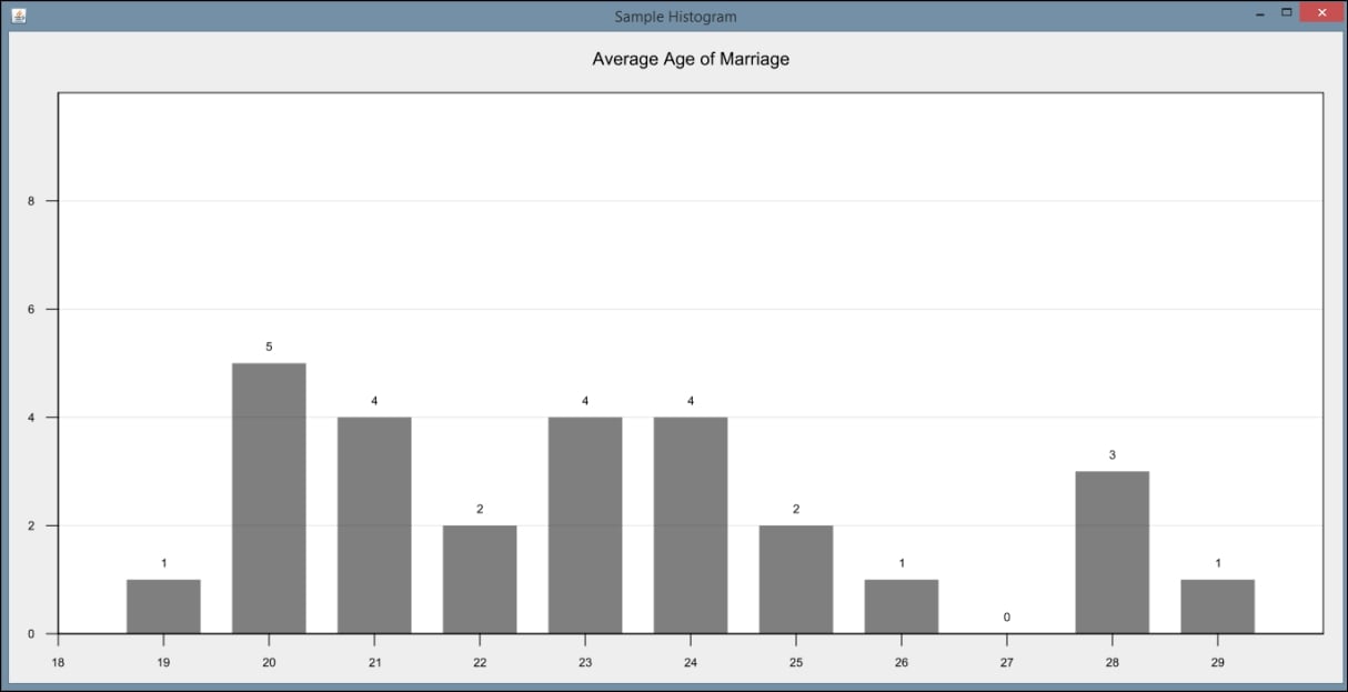
Histograms, though similar in appearance to bar charts, are used to display the frequency of data items in relation to other items within the dataset. Each of the following examples using GRAL will use the DataTable class to initially hold the data to be displayed. In this example, we will read data from a sample file called AgeofMarriage.csv. This comma-separated file holds a list of ages at which people were first married.
We will create a new class, called HistogramExample, which extends the JFrame class and contains the following code within its constructor. We first create a DataReader object to specify that the data is in CSV format. We then use a try-catch block to handle IO exceptions and call the DataReader class's read method to place the data directly into a DataTable object. The first parameter of the read method is a FileInputStream object, and the second specifies the type of data expected from within the file:
DataReader readType=
DataReaderFactory.getInstance().get("text/csv");
String fileName = "C://AgeofMarriage.csv";
try {
DataTable histData = (DataTable) readType.read(
New FileInputStream(fileName), Integer.class);
...
}
Next, we create a Number array to specify the ages for which we expect to have data. In this case, we expect the ages of marriage will range from 19 to 30. We use this array to create our Histogram object. We include our DataTable from earlier and specify the orientation as well. Then we create our DataSource, specify our starting age, and specify the spacing along our X axis:
Number ageRange[] = {19,20,21,22,23,24,25,26,27,28,29,30};
Histogram sampleHisto = new Histogram1D(
histData, Orientation.VERTICAL, ageRange);
DataSource sampleHistData = new EnumeratedData(sampleHisto, 19,
1.0);
We use the BarPlot class to create our histogram from the data we read in earlier:
BarPlot testPlot = new BarPlot(sampleHistData);
The next few steps serve to format various aspects of our histogram. We use the setInsets method to specify how much space to place around each side of the graph within the window. We can provide a title for our graph and specify the bar width:
testPlot.setInsets(new Insets2D.Double(20.0, 50.0, 50.0, 20.0));
testPlot.getTitle().setText("Average Age of Marriage");
testPlot.setBarWidth(0.7);We also need to format our X and Y axes. We have chosen to set our range for the X axis to closely match our expected age range but to provide some space on the side of the graph. Because we know the amount of sample data, we set our Y axis to range from 0 to 10. In a business application, these ranges would be calculated by examining the actual dataset. We can also specify whether we want tick marks to show and where we would like the axes to intersect:
testPlot.getAxis(BarPlot.AXIS_X).setRange(18, 30.0);
testPlot.getAxisRenderer(BarPlot.AXIS_X).setTickAlignment(0.0);
testPlot.getAxisRenderer(BarPlot.AXIS_X).setTickSpacing(1);
testPlot.getAxisRenderer(BarPlot.AXIS_X).setMinorTicksVisible(false );
testPlot.getAxis(BarPlot.AXIS_Y).setRange(0.0, 10.0);
testPlot.getAxisRenderer(BarPlot.AXIS_Y).setTickAlignment(0.0);
testPlot.getAxisRenderer(BarPlot.AXIS_Y).setMinorTicksVisible(false );
testPlot.getAxisRenderer(BarPlot.AXIS_Y).setIntersection(0);
We also have a lot of flexibility with the color and values displayed on the graph. In this example, we have chosen to display the frequency value for each age and set our graph color to black:
PointRenderer renderHist =
testPlot.getPointRenderers(sampleHistData).get(0);
renderHist.setColor(GraphicsUtils.deriveWithAlpha(Color.black,
128));
renderHist.setValueVisible(true);
Finally, we set several properties for how we want our window to display:
InteractivePanel pan = new InteractivePanel(testPlot); pan.setPannable(false); pan.setZoomable(false); add(pan); setSize(1500, 700); this.setVisible(true);
When the application is executed, the following graph is displayed:
Donut charts are similar to pie charts, but they are missing the middle section (hence the name donut). Some analysts prefer donut charts to pie charts because they do not emphasize the size of each piece within the chart and are easier to compare to other donut charts. They also provide the added advantage of taking up less space, allowing for more formatting options in the display.
In this example, we will assume our data is already populated in a two-dimensional array called ageCount. The first row of the array contains the possible age values, ranging again from 19 to 30 (inclusive). The second row contains the number of data values equal to each age. For example, in our dataset, there are six data values equal to 19, so ageCount[0][1] contains the number six.
We create a DataTable and use the add method to add our values from the array. Notice we are testing to see if the value of a particular age is zero. In our test case, there will be zero data values equal to 23. We are opting to add a blank space in our donut chart if there are no data values for that point. This is accomplished by using a negative number as the first parameter in the add method. This will set an empty space of size 3:
DataTable donutData = new DataTable(Integer.class, Integer.class);
for(int Y = 0; Y < ageCount[0].length; y++){
if(ageCount[1][y] == 0){
donutData.add(-3, ageCount[0][y]);
}else{
donutData.add(ageCount[1][y], ageCount[0][y]);
}
}
Next, we create our donut plot using the PiePlot class. We set basic properties of the plot, including specifying the values for the legend. In this case, we want our legend to reflect our age possibilities, so we use the setLabelColumn method to change the default labels. We also set our insets as we did in the previous example:
PiePlot testPlot = new PiePlot(donutData);
((ValueLegend) testPlot.getLegend()).setLabelColumn(1);
testPlot.getTitle().setText("Donut Plot Example");
testPlot.setRadius(0.9);
testPlot.setLegendVisible(true);
testPlot.setInsets(new Insets2D.Double(20.0, 20.0, 20.0, 20.0));
Next, we create a PieSliceRenderer object to set more advanced properties. Because a donut plot is basically a pie plot in essence, we will render a donut plot by calling the setInnerRadius method. We also specify the gap between the pie slices, the colors used, and the style of the labels:
PieSliceRenderer renderPie = (PieSliceRenderer)
testPlot.getPointRenderer(donutData);
renderPie.setInnerRadius(0.4);
renderPie.setGap(0.2);
LinearGradient colors = new LinearGradient(
Color.blue, Color.green);
renderPie.setColor(colors);
renderPie.setValueVisible(true);
renderPie.setValueColor(Color.WHITE);
renderPie.setValueFont(Font.decode(null).deriveFont(Font.BOLD));
Finally, we create our panel and set its size:
add(new InteractivePanel(testPlot), BorderLayout.CENTER); setSize(1500, 700); setVisible(true);
When the application is executed, the following graph is displayed:

Bubble charts are similar to scatter plots except they represent data with three dimensions. The first two dimensions are expressed on the X and Y axes and the third is represented by the size of the point plotted. This can be helpful in determining relationships between data values.
We will again use the DataTable class to initially hold the data to be displayed. In this example, we will read data from a sample file called MarriageByYears.csv. This is also a CSV file, and contains one column representing the year a marriage occurred, a second column holding the age at which a person was married, and a third column holding integers representing marital satisfaction on a scale from 1 (least satisfied) to 10 (most satisfied). We create a DataSeries to represent our type of desired data plot and then create a XYPlot object:
DataReader readType =
DataReaderFactory.getInstance().get("text/csv");
String fileName = "C://MarriageByYears.csv";
try {
DataTable bubbleData = (DataTable) readType.read(
new FileInputStream(fileName), Integer.class,
Integer.class, Integer.class);
DataSeries bubbleSeries = new DataSeries("Bubble", bubbleData);
XYPlot testPlot = new XYPlot(bubbleSeries);
Next, we set basic property information about our chart. We will set the color and turn off the vertical and horizontal grids in this example. We will also make our X and Y axes invisible in this example. Notice that we still set a range for the axes, even though they are not displayed:
testPlot.setInsets(new Insets2D.Double(30.0)); testPlot.setBackground(new Color(0.75f, 0.75f, 0.75f)); XYPlotArea2D areaProp = (XYPlotArea2D) testPlot.getPlotArea(); areaProp.setBorderColor(null); areaProp.setMajorGridX(false); areaProp.setMajorGridY(false); areaProp.setClippingArea(null); testPlot.getAxisRenderer(XYPlot.AXIS_X).setShapeVisible(false); testPlot.getAxisRenderer(XYPlot.AXIS_X).setTicksVisible(false); testPlot.getAxisRenderer(XYPlot.AXIS_Y).setShapeVisible(false); testPlot.getAxisRenderer(XYPlot.AXIS_Y).setTicksVisible(false); testPlot.getAxis(XYPlot.AXIS_X).setRange(1940, 2020); testPlot.getAxis(XYPlot.AXIS_Y).setRange(17, 30);
We can also set properties related to the bubbles drawn on the chart. Here, we set the color and shape, and specify which column of the data will be used to scale the shapes. In this case, the third column, with the marital satisfaction rating, will be used. We set it using the setColumn method:
Color color = GraphicsUtils.deriveWithAlpha(Color.black, 96); SizeablePointRenderer renderBubble = new SizeablePointRenderer(); renderBubble.setShape(new Ellipse2D.Double(-3.5, -3.5, 4.0, 4.0)); renderBubble.setColor(color); renderBubble.setColumn(2); testPlot.setPointRenderers(bubbleSeries, renderBubble);
Finally, we create our panel and set its size:
add(new InteractivePanel(testPlot), BorderLayout.CENTER); setSize(new Dimension(1500, 700)); setVisible(true);
When the application is executed, the following graph is displayed. Notice both the size and color of the points changes depending upon the frequency of that particular data point:

In this chapter, we introduce basic graphs, plots, and charts used to visualize data. The process of visualization enables an analyst to graphically examine the data under review. This is more intuitive, and often facilitates the rapid identification of anomalies in the data that can be hard to extract from the raw data.
Several visual representations were examined, including line charts, a variety of bar charts, pie charts, scatterplots, histograms, donut charts, and bubble charts. Each of these graphical depictions of data provides a different perspective of the data being analyzed. The most appropriate technique depends on the nature of the data being used. While we have not covered all of the possible graphical techniques, this sample provides a good overview of what is available.
We were also concerned with how Java is used to draw these graphics. Many of the examples used JavaFX. This is a readily available tool that is bundled with Java SE. However, there are several other libraries available. We used GRAL to illustrate how to generate some graphs.
With the overview of visualization techniques, we are ready to move on to other topics, where visualization will be used to better convey the essence of data science techniques. In the next chapter, we will introduce basic statistical processes, including linear regression, and we will use the techniques introduced in this chapter.