-
Book Overview & Buying
-
Table Of Contents

SAP BusinessObjects Dashboards 4.1 Cookbook
By :
SAP BusinessObjects Dashboards 4.1 Cookbook
By:
Overview of this book
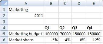
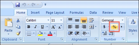
If you are a developer with a good command and knowledge of creating dashboards, but are not yet an advanced user of SAP BusinessObjects Dashboards, then this is the perfect book for you. Prerequisites include a good working knowledge of Microsoft Excel as well as knowledge of basic dashboard practices.
Table of Contents (17 chapters)
Preface

 Free Chapter
1. Staying in Control
2. Data Visualization
3. From a Static to an Interactive Dashboard
4. Dynamic Visibility
5. Using Alerts
6. Advanced Components
7. Dashboard Look and Feel
8. Dashboard Data Connectivity
9. Exporting and Publishing
10. Top Third-party Add-ons
11. Performance Tuning
12. Increasing Productivity
A. Real-world Dashboard Case Studies
B. Additional Resources – Supported Excel Functions and System/Software Requirements
C. The Future of Dashboarding with SAP Design Studio
Index