
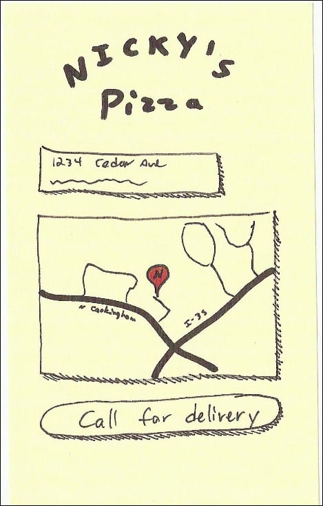
The Map It button will lead the user to this page where we will list the address and have a static Google map. Clicking on either the address or the map will link to the full Google Maps location.
As an added bonus, in case users don't want to go to the physical location, let's throw a telephone link on the button labeled Call for delivery.
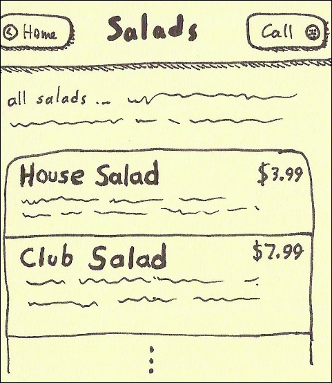
You can see the different thicknesses of lines. Also, a touch of color and our typical drop shadows. Adding these little details is not particularly hard and can make a big difference:
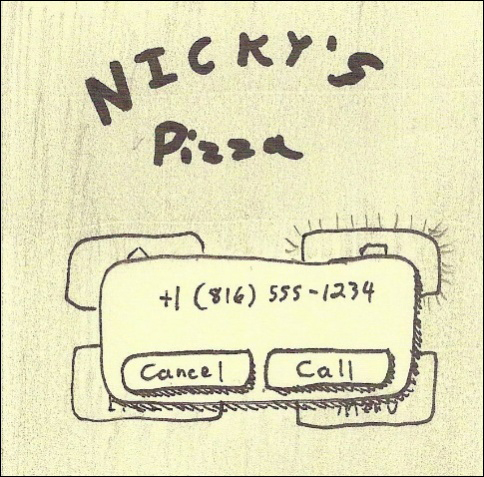
All of the Call buttons throughout the site will launch the native call interface. The next drawing is of the iOS view of a call dialog. Android is pretty similar.
Notice the little shiny lines on the button in the background indicating that it was clicked. Also, we've shaded out the background (pencil work) to indicate its modal status:
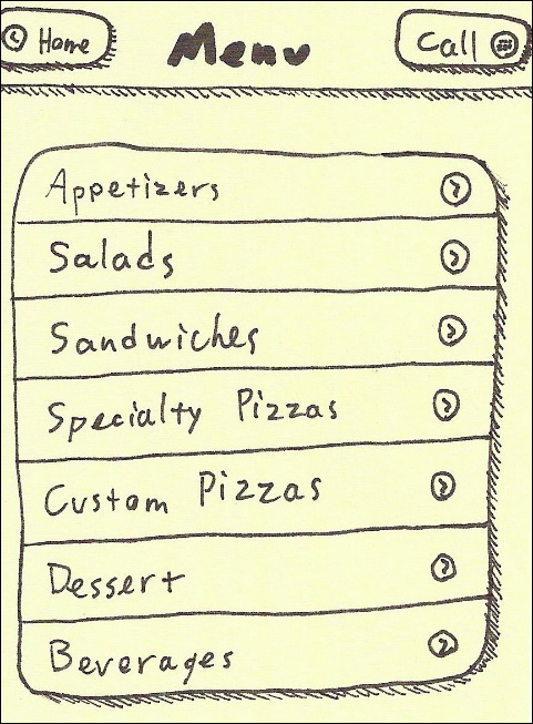
Now, let's consider the menu and what will serve as a global header. The first two links that you put into the global header will be turned into buttons. Let's make our first link Home and the second link Call.
Here we see the detailed view for salads. It's pretty much the same as before but we've done some formatting within the list views. We'll see the actual code for that in the next chapter.
Naturally, we could use a whiteboard and markers to do all this work. We can collaboratively draw our ideas on the board and take snapshots with the very smartphones we intend to target. My recommendation is to use our faithful Post-it notes and simply stick them to the whiteboard and use the markers to indicate screen flows. The following figure shows how my board looked after mapping out the project:
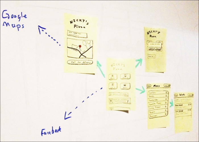
If we need to remap our application flows, all we have to do is shuffle the notes and redraw our lines. It's a lot less work than redrawing everything a few feet farther down the whiteboard.