Book Image

SAP BusinessObjects Dashboards 4.0 Cookbook

Book Image

SAP BusinessObjects Dashboards 4.0 Cookbook

Overview of this book

Xcelsius 2008 was recently included in SAP’s BusinessObjects 4.0 family, rebranding “Xcelsius Enterprise” as “SAP BusinessObjects Dashboards 4.0”. With features like flexible design and what-if scenarios, the powerful dashboarding software allows enterprises to make business decisions at a glance, and this book allows you to go far beyond the basics of these techniques. This cookbook full of practical and applicable recipes will enable you to use the full latest capabilities of Dashboard Design to visually transform your business data. A wide range of recipes will equip you with the knowledge and confidence to perform tasks like configuring charts, creating drill- downs, making component colors dynamic, using alerts in maps, building pop-up screens, setting up What-If scenarios, and many more.The recipes begin by covering best practices for using the Dashboard Design spreadsheet, the data-model, and the connection with the components on the canvas, later moving on to some from-the-trenches tricks for using Excel within Dashboard Design. The book then guides you through the exploration of various data visualization components and dashboard interactivity, as well as offering recipes on using alerts, dashboard connectivity, and making the most of the aesthetics of the dashboard. Finally, the recipes conclude by considering the most important add-ons available for Dashboard Design and enabling you to perform relevant and useful tasks straight away.
Table of Contents (22 chapters)
SAP BusinessObjects Dashboards 4.0 Cookbook
Credits
Foreword
About the Authors
Acknowledgement
Acknowledgement
About the Reviewers
www.PacktPub.com
Preface
Index

Selecting your data from a list


Filtering data into a smaller dataset is a very important feature to implement when building dashboards. The reason being that people want to have a large amount of data available to them, but not to have to see all of it at once, otherwise it will become too overwhelming to the user and will require them to hunt for data, which is not the purpose of a dashboard.

In our example, we will be selecting from a list of regions that will populate a gauge value appropriately.

Getting ready

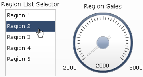
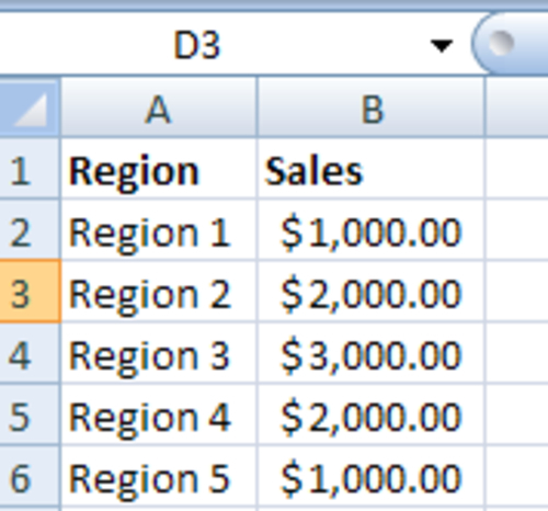
Have your data list set ready. In our example, we will show a simple list of five elements with corresponding values:

How to do it...

  1. Select a List Box selector from the Selectors section of the Components window and drag it onto the canvas.

  2. In the general section of the List Box selector, bind the labels to A2:A6, source data to B2:B6, and destination to D2 as shown on the image below. Select Row as the Insertion Type. The destination cell D2 will be the cell where the gauge is bound...