
In this example, we will utilize many techniques that we have learned in the previous recipes to create a Sales Profit dashboard.
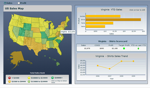
The Sales Profit dashboard displays the sales or profit of each state on the map. From the map, a user can then select a state and then view year to date sales/profit information for products that are sold on the top right. The user can then drill down further by clicking on a product. A detailed scorecard and trend chart will then be shown for the selected state and product.
Techniques from the following chapters and recipes were used to accomplish the example:
Chapter 1, Staying in Control
Adding a line chart to your dashboard
Using a scorecard component
Drilling down from a chart
Using filtered rows
Selecting your data from a list
Using maps to select data of an area or country
Displaying alerts on a map
It is important that you have the Sales_Profit.xlf file as a reference. Please open it before proceeding to the next section as the spreadsheet layout is already completed for your convenience.
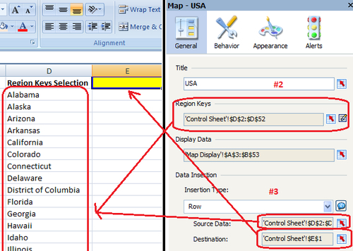
Bind the Region Keys to the State keys on the Control Sheet tab.
On the Data Insertion section, select Row as the Insertion Type and the Source Data will be the keys that we selected in step 2. The destination will be cell E1.
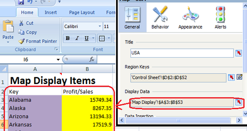
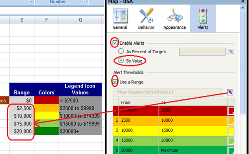
Bind the Display Data to the key value pair items in the Map Display worksheet.
Go to the Alerts properties, check the Enable Alerts checkbox, select By Value, check the Use a Range checkbox, and bind to the range section in the Map Display worksheet. It is important that you bind starting at 2500, otherwise it will add another range starting from the minimum to 0.
The next step is to complete the YTD chart on the top right-hand side. Drag a Bar Chart component onto the top right-hand side of the canvas.
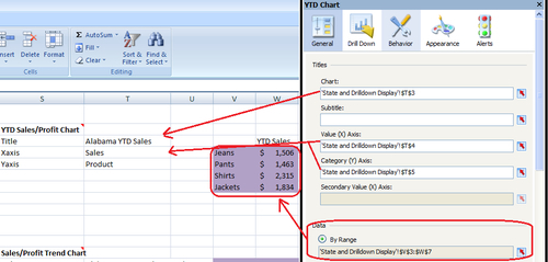
Bind the Titles to the appropriate cells on column T of the State and Drilldown Display Worksheet. Then Bind the Data to the cells in purple. The values in the purple cells are populated depending on whether a user selects Sales or Profit. Note that the cells are pre-populated with test data.
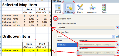
Go to the Drill Down properties of the YTD chart. Check the Enable Drill Down checkbox and select Row as the Insertion Type. Bind the source data to the peach section (columns A to Q) of the State and Drilldown Display worksheet. Bind the destination to the cells in yellow (columns A to Q). Note that the peach and yellow cells are pre-populated with test data.
The next step is to complete the Scorecard on the middle right-hand side of the dashboard. Drag a Scorecard component onto the canvas.
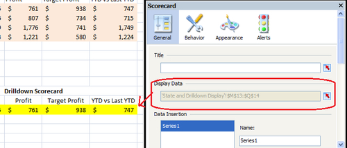
Bind the Display Data to the yellow cells of the Drilldown Scorecard section on the State and Drilldown Display worksheet. These yellow cells are the drilldown values populated from the YTD chart in step 8. Note that the yellow cells are populated with test data.
Go to the Appearance properties of the Scorecard and click on the Text tab. Unselect the Target Profit and YTD vs Last YTD checkboxes. The reason is that we only want to see alert shapes on these cells and not the text value.

Go to the Alerts properties of the Scorecard. Check the Target Profit and YTD vs Last YTD checkboxes. In both cases the Alert Values will be bound to cell O14 of the State and Drilldown Display worksheet. In both the cases, make sure to have As Percent of Target selected. For Target Profit, bind it to cell P14 and for YTD vs Last YTD bind it to cell Q14. In the Alert Thresholds section, we want Min/70%/85%/Max for Target Profit. Set the alert threshold for the YTD vs Last YTD to Min/99.999%/100%/Max.
Note
The reason we have 99.999% is so that the yellow arrow is for anything that has YTD equal to Last YTD.

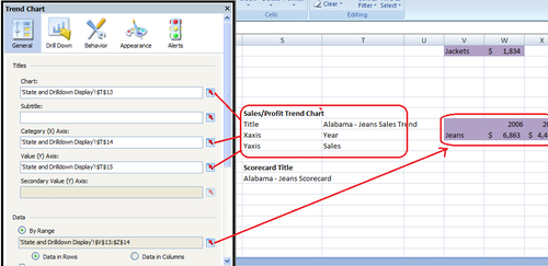
Next we will complete the Trend Line Chart on the bottom right-hand side of the dashboard. Drag a Line Chart component onto the bottom right-hand side of the canvas.
Bind the Titles and Data Range to the appropriate section in the State and Drilldown Display worksheet.
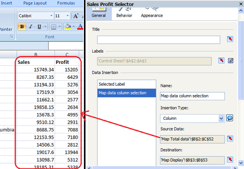
Now that the display elements are in place, we'll move onto the Sales/Profit Radio selector. Drag a Radio Button selector onto the top left-hand side section of the canvas.
There are two sets of data bindings here. First, we will select Label as Insertion Type, and then bind the data to the selected label (Sales or Profit) cell B1. The data is found on columns A and B of the Control Sheet worksheet.

For the next data binding Map data column selection, select Column as the Insertion Type. Bind the Source Data to columns B and C.
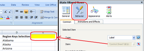
The final interactive component is the hidden State filter, which will select the appropriate data for the State and Product details. Insert a Combo Box selector onto the canvas and make sure it is underneath all of the backgrounds. To make sure it is underneath, right-click on the Combo Box selector on the Object Browser and select Send To Back.
Now we will bind the data from the Product Data worksheet. The labels will be bound to column B, since we are collecting all rows that belong to a state when clicking on a state from the map. Select Filtered Rows as the Insertion Type and bind the Source Data to cells B2:R205. The destination cells will be the peach area in the State and Drilldown Display worksheet.

Go to the Behavior section of the hidden filter and bind the Selected Item to the selected Map item on cell E1 from the Control Sheet worksheet.
Now that our dashboard is complete we want to improve the look a bit. As you can see, there are several layers of background objects that add depth to the dashboard components. Drag a variety of Background and Rectangle components onto the canvas and play around with the look until it becomes something that you desire.
In steps 1-3, we utilize what we learned in the recipe Using maps to select data of an area or country to set up our map display and data on the left-hand side of the dashboard. From our map selection, we then drive the right-hand side of the dashboard.
Steps 4-5 make use of the recipe Displaying alerts on a map to display the different colored states on the map representing the amount of sales/profit each state produced.
In steps 6-8 we use what we learned in the recipes Adding a line chart to your dashboard and Drilling down from a chart, to create a YTD Sales/Profit chart that allows a user to drilldown from the data values to a particular product.
In steps 9-12, the recipes Using the scorecard component and Using alerts in a scorecard are used to show a product’s details and threshold for a selected state.
In steps 13-14, we simply build a Line Chart that takes the trend data from a selected product and state.
In steps 15-17, we use a Combo Selector component to select from two sets of data. The first set of data consists of the label Sales/Profit, which is important because other components in the dashboard drive off the destination of the Sales/Profit label. The second set of data contains the sales/profit data for the map object.
Steps 18-20 utilize what we learned in the Using Filtered Rows recipe to select the appropriate data from the Product Data worksheet. As you can see in the Product Data worksheet, we need to somehow group the states together into a selection. To accomplish this, a Filtered Rows selection is necessary.
The final steps consist of adding backgrounds and providing a uniform aligned look and feel that can be found in the Chapter 1, Staying in Control.