Book Image

SAP BusinessObjects Dashboards 4.0 Cookbook

Book Image

SAP BusinessObjects Dashboards 4.0 Cookbook

Overview of this book

Xcelsius 2008 was recently included in SAP’s BusinessObjects 4.0 family, rebranding “Xcelsius Enterprise” as “SAP BusinessObjects Dashboards 4.0”. With features like flexible design and what-if scenarios, the powerful dashboarding software allows enterprises to make business decisions at a glance, and this book allows you to go far beyond the basics of these techniques. This cookbook full of practical and applicable recipes will enable you to use the full latest capabilities of Dashboard Design to visually transform your business data. A wide range of recipes will equip you with the knowledge and confidence to perform tasks like configuring charts, creating drill- downs, making component colors dynamic, using alerts in maps, building pop-up screens, setting up What-If scenarios, and many more.The recipes begin by covering best practices for using the Dashboard Design spreadsheet, the data-model, and the connection with the components on the canvas, later moving on to some from-the-trenches tricks for using Excel within Dashboard Design. The book then guides you through the exploration of various data visualization components and dashboard interactivity, as well as offering recipes on using alerts, dashboard connectivity, and making the most of the aesthetics of the dashboard. Finally, the recipes conclude by considering the most important add-ons available for Dashboard Design and enabling you to perform relevant and useful tasks straight away.
Table of Contents (22 chapters)
SAP BusinessObjects Dashboards 4.0 Cookbook
Credits
Foreword
About the Authors
Acknowledgement
Acknowledgement
About the Reviewers
www.PacktPub.com
Preface
Index

Adding alerts to a column chart


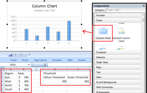
When looking at a bar chart, we may want to see which items are below or above a particular threshold. In this recipe, we will learn how to add alerts to a bar chart. Our example will consist of a column chart with a list of regions and their sales. Each region column will be colored appropriately, depending on their sales value vs. threshold.

Getting ready

Make sure you set up the sales data and threshold values, as shown in the following screenshot. You'll also need to insert a Column Chart component onto the canvas.

How to do it...

  1. First we'll need to bind the sales data to the chart, as shown next:

  2. Go to the Alerts section of the chart properties and ensure that Enable Alerts is checked.

  3. Select alerts By Value as we will be comparing our sales data to the threshold values.

  4. In the Alert Threshold s ection, click on the Use a Range checkbox. Bind the data to the threshold data that was set up in the Getting ready section.

  5. In the Color Order section, select the...