

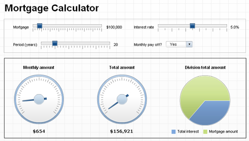
In this recipe, we will create a what-if scenario dashboard. The purpose of the dashboard is to calculate and show the monthly payments and the total costs of the mortgage, based on a set of adjustable variables.
We will use techniques from the following chapters and recipes:
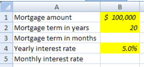
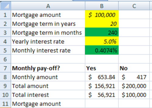
The dashboard will contain four variables—Mortgage amount , Mortgage term in years, Yearly interest rate , and a variable that states if the mortgage will be paid off by equal monthly payments (annuity) or just at the end of the mortgage term, that is the Monthly interest rate.
First, we set up the spreadsheet. Make sure your spreadsheet looks like the following screenshot:
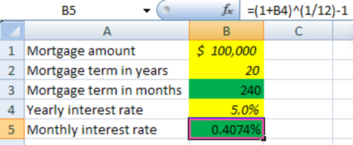
To calculate the monthly and total payments we need the mortgage term in months, which is the number of years multiplied by 12. Add the following Excel formula to cell B3: =B2*12.
To calculate the monthly interest rate we need the following formula: =(1+B4)^(1/12)-1. Enter it in cell B5.
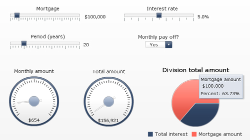
Bind the Data field of the first Horizontal Slider component to cell B1. Also, set the Maximum Limit to 1000000. Enter Mortgage as Title.
Select the second Horizontal Slider component and bind its Data field to cell B4. Set the Maximum Limit to 0.1. As we are dealing with percentages, the maximum limit is now 10% due to this setting. Enter Interest rate as Title.
Go to the Behavior tab and in the Slider Movement section change the Increment to 0.001.
Select the third Horizontal Slider component and bind the Data field of this one to cell B2. Set the Maximum Limit to 30 and enter Period (years) as a Title.

Now we need to add some more logic to our spreadsheet to calculate the monthly payments. Adjust your spreadsheet so it looks like the following screenshot:
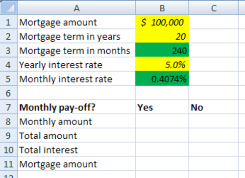
Enter the following formula in cell B8 to calculate the monthly annuity: =B1*(B5/(1-(1+B5)^(-B3))).
Enter the next formula in cell B9 to calculate the total amount: =B3*B8.
Enter the formula =B9-B1 in cell B10 to calculate the total interest amount.
In cell C8 enter formula =B1*(B4^1/12) to calculate the monthly amount, which is only the interest.
Enter formula =B3*C8 in cell C10 and enter formula =B1+C10 in cell C9.
Add a Combo Box component to the canvas. We will use this component to determine if the mortgage will be paid off by monthly installments. Bind the Labels field to cells B7 and C7. Go to the Behavior tab and set Item to Label 1.
Return to the General tab and in the Data Insertion section set the Insertion Type to Column. Bind the Source Data field to cell range B8 until C10. Bind the Destination field to cells D8 until D10.
Finally, enter Monthly pay off? as a Title.
Go back to the spreadsheet and enter formula =B1 in cell D11.

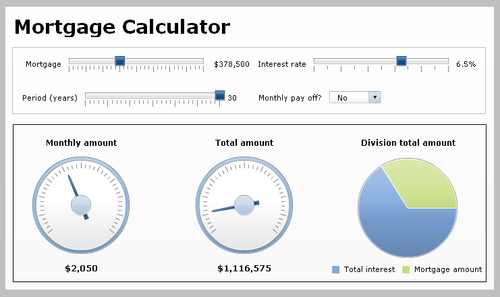
Now our spreadsheet and all the selectors are set up, it is time to show some data in the dashboard. Add a Gauge component to the canvas.
Bind its By Range field to cell D8 and set the Maximum Limit field to 5000. Enter the Monthly amount as a Title.
Add another Gauge component to the canvas and bind its By Range field to cell D9. Set its Maximum Limit field to 10000000. Enter Total amount as a Title.
Drag a Pie Chart component to the canvas. Bind its Values field to cells D10 and D11. Also, bind the Labels field to cells A10 and A11. Enter Division total amount as a Title.
Go to the Appearance tab and deselect Show Chart Background. Set the position of the legend to Bottom.
All right! The what-if section of the dashboard is now in place and ready to be tested. Preview the dashboard and play around with the sliders and selectors to see if everything works.
Leave the preview mode. We will now adjust the layout of the dashboard so it looks a bit smoother.
First select the Phase theme from the Theme selector in the Format menu.
Use the Alignment options from the Format menu to adjust the placement of the three sliders and the selector.
Tip
You can also use the Grid to get the layout right. You can activate the Grid in the Preferences menu in the File menu.
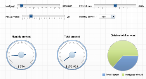
Add a Rectangular component and resize it so it will fit over the sliders and selector. Change the Border Color to color a bit lighter, for example gray.
Add a Label component to the canvas and enter Mortgage Calculator in the Enter Text field. Select the Appearance tab and go to the Text sub-tab. Select Bold and set the Text Size to 28. Make sure you resize the Label component if the text doesn’t fit anymore.

Select the Pie Chart and the Gauge components. Align them by Middle and Space Evenly Across.
As you can see the title of the Pie Chart is placed a bit higher than the titles of the Gauges. Select both Gauge components. Go to the Appearance tab and select the Text sub-tab. Now adjust the Y Offset so all titles will have the same height.
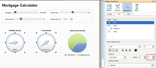
Select Value . In the Format Selected Text section, select Bold and adjust the Y Offset so the values of the Gauge components will be at the same height as the legend of the Pie Chart component.
Go to the Behavior tab and deselect the Enable Interaction option.
Add another Rectangular component to the canvas and place it over the Gauges and Pie Chart.
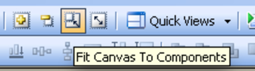
Select Fit the Canvas to Components from the Canvas Sizing options in the View menu. You can also use the buttons from the Standard Toolbar. Select the Increase Canvas option twice.
Your what-if dashboard is finished!
In steps 1-4, 10-15, and 19, we utilize what we learned in the Chapter 1 (Staying in Control) recipes to properly set up the spreadsheet.
In steps 5-9, we set up the sliders like we did in the Using sliders to create a What-If scenario recipe.
In steps 16-18, we use recipe Selecting your data from a list to define the Combo Box component to determine if the mortgage is paid off or not.
Steps 20-24 use recipes illustrating single values and using the pie chart to show the data in two gauges and a pie chart.
In the final steps, we used what we have learned from the Chapter 7, Dashboard Look and Feel recipes to implement a different dashboard theme and fine-tune the look of the dashboard.