Book Image

SAP BusinessObjects Dashboards 4.0 Cookbook

Book Image

SAP BusinessObjects Dashboards 4.0 Cookbook

Overview of this book

Xcelsius 2008 was recently included in SAP’s BusinessObjects 4.0 family, rebranding “Xcelsius Enterprise” as “SAP BusinessObjects Dashboards 4.0”. With features like flexible design and what-if scenarios, the powerful dashboarding software allows enterprises to make business decisions at a glance, and this book allows you to go far beyond the basics of these techniques. This cookbook full of practical and applicable recipes will enable you to use the full latest capabilities of Dashboard Design to visually transform your business data. A wide range of recipes will equip you with the knowledge and confidence to perform tasks like configuring charts, creating drill- downs, making component colors dynamic, using alerts in maps, building pop-up screens, setting up What-If scenarios, and many more.The recipes begin by covering best practices for using the Dashboard Design spreadsheet, the data-model, and the connection with the components on the canvas, later moving on to some from-the-trenches tricks for using Excel within Dashboard Design. The book then guides you through the exploration of various data visualization components and dashboard interactivity, as well as offering recipes on using alerts, dashboard connectivity, and making the most of the aesthetics of the dashboard. Finally, the recipes conclude by considering the most important add-ons available for Dashboard Design and enabling you to perform relevant and useful tasks straight away.
Table of Contents (22 chapters)
SAP BusinessObjects Dashboards 4.0 Cookbook
Credits
Foreword
About the Authors
Acknowledgement
Acknowledgement
About the Reviewers
www.PacktPub.com
Preface
Index

Using sliders to create a what-if scenario


What-if scenarios are very important as they allows users to project what future values will look like, depending on one or more variables.

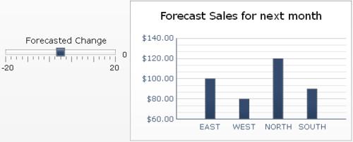
In our recipe, we will reuse the simple what-if scenario from the recipe Inputting data values. The only difference here is that we will use a horizontal slider instead of inputting the values with text.

Getting ready

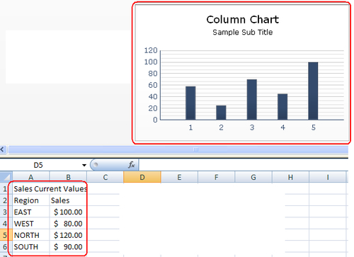
Set up the sales data, as shown circled in red in the following screenshot, and have a column chart ready on the canvas:

How to do it...

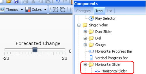
  1. Insert a Horizontal Slider component from the Single Value – Horizontal Slider section of the Components window.

  2. Set the Title text to Forecasted Change. Bind the Data to cell D3 highlighted in yellow. Set the Minimum Limit to -20 and Maximum Limit to 20 on the Scale section.

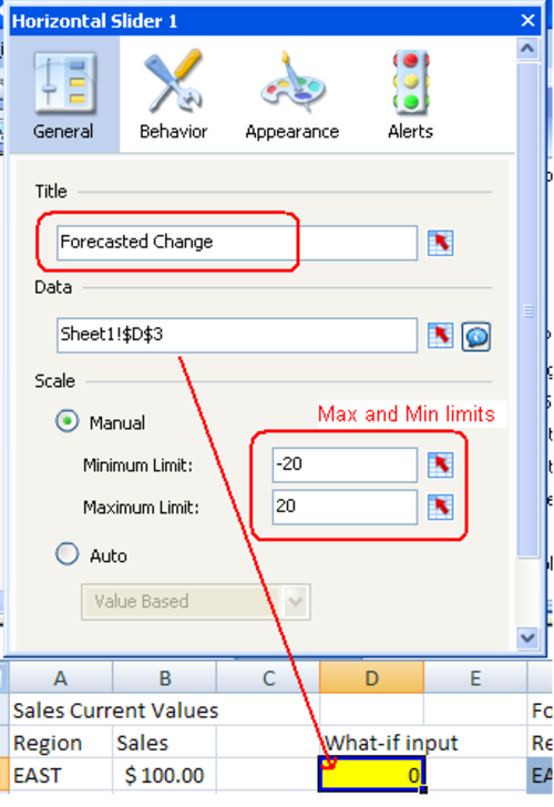
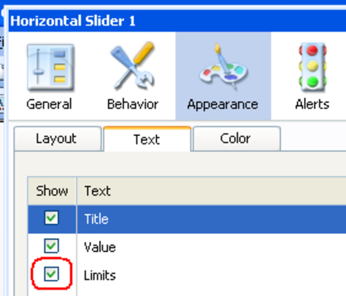
  3. Go to the Appearance section of the slider properties and make sure that the Limits checkbox is checked.

  4. Now in the blue chart data area, each formula will be adding the what-if value D3 to the chart...