
Following a code style guide helps improve code quality. Having high-quality code is important if you want people to easily reproduce your analysis. One way to adhere to a coding standard is to scan your code with static code analyzers. You can use many code analyzers. In this recipe, we will use the pep8 analyzer. In general, code analyzers complement or maybe slightly overlap each other, so you are not limited to pep8.
Convenient data access is crucial for reproducible analysis. In my opinion, the best type of data access is with a specialized API and local data. I will introduce a dautil module I created to load weather data provided by the Dutch KNMI.
Reporting is often the last phase of a data analysis project. We can report our findings using various formats. In this recipe, we will focus on tabulating our report with the tabulate module. The landslide tool creates slide shows from various formats such as reStructured text.
You will need pep8 and tabulate. A quick guide to pep8 is available at https://pep8.readthedocs.org/en/latest/intro.html (retrieved July 2015). I have installed pep8 1.6.2 via Anaconda. You can install joblib, tabulate, and landslide with the pip command.
I have tabulate 0.7.5 and landslide 1.1.3.
Here's an example pep8 session:
$ pep8 --first log_api.py
log_api.py:21:1: E302 expected 2 blank lines, found 1
log_api.py:44:33: W291 trailing whitespace
log_api.py:50:60: E225 missing whitespace around operator
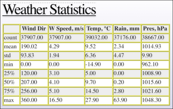
The –-first switch finds the first occurrence of an error. In the previous example, pep8 reports the line number where the error occurred, an error code, and a short description of the error. I prepared a module dedicated to data access of datasets we will use in several chapters. We start with access to a pandas DataFrame stored in a pickle, which contains selected weather data from the De Bilt weather station in the Netherlands. I created the pickle by downloading a zip file, extracting the data file, and loading the data in a pandas DataFrame table. I applied minimal data transformation, including multiplication of values and converting empty fields to NaNs. The code is in the data.py file in dautil. I will not discuss this code in detail, because we only need to load data from the pickle. However, if you want to download the data yourself, you can use the static method I defined in data.py. Downloading the data will of course give you more recent data, but you will get slightly different results if you substitute my pickle. The following code shows the basic descriptive statistics with the pandas.DataFrame.describe() method in the report_weather.py file in this book's code bundle:
from dautil import data
from dautil import report
import pandas as pd
import numpy as np
from tabulate import tabulate


df = data.Weather.load()
headers = [data.Weather.get_header(header)
           for header in df.columns.values.tolist()]
df = df.describe()
Then, the code creates a slides.rst file in the reStructuredText format with dautil.RSTWriter. This is just a matter of simple string concatenation and writing to a file. The highlighted lines in the following code show the tabulate() calls that create table grids from the pandas.DataFrame objects:
writer = report.RSTWriter()
writer.h1('Weather Statistics')
writer.add(tabulate(df, headers=headers,
        tablefmt='grid', floatfmt='.2f'))
writer.divider()
headers = [data.Weather.get_header(header)
           for header in df.columns.values.tolist()]
builder = report.DFBuilder(df.columns)
builder.row(df.iloc[7].values - df.iloc[3].values)
builder.row(df.iloc[6].values - df.iloc[4].values)
df = builder.build(['ptp', 'iqr'])]

writer.h1('Peak-to-peak and Interquartile Range')

writer.add(tabulate(df, headers=headers,
        tablefmt='grid', floatfmt='.2f'))
writer.write('slides.rst')
generator = report.Generator('slides.rst', 'weather_report.html')
generator.generate()
I use the dautil.reportDFBuilder class to create the pandas.DataFrame objects incrementally using a dictionary where the keys are columns of the final DataFrame table and the values are the rows:
import pandas as pd

class DFBuilder():
    def __init__(self, cols, *args):
        self.columns = cols
        self.df = {}

        for col in self.columns:
            self.df.update({col: []})

        for arg in args:
            self.row(arg)

    def row(self, row):
        assert len(row) == len(self.columns)

        for col, val in zip(self.columns, row):
            self.df[col].append(val)

        return self.df

    def build(self, index=None):
        self.df = pd.DataFrame(self.df)

        if index:
            self.df.index = index

        return self.df
I eventually generate a HTML file using landslide and my own custom CSS. If you open weather_report.html, you will see the first slide with basic descriptive statistics:
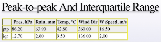
The second slide looks like this and contains the peak-to-peak (difference between minimum and maximum values) and the interquartile range (difference between the third and first quartile):
The tabulate PyPi page at https://pypi.python.org/pypi/tabulate (retrieved July 2015)
The landslide Github page at https://github.com/adamzap/landslide (retrieved July 2015)