Book Image

Tableau 2019.x Cookbook

By : Dmitry Anoshin, Teodora Matic, Slaven Bogdanovic, Tania Lincoln, Dmitrii Shirokov
Book Image

Tableau 2019.x Cookbook

By: Dmitry Anoshin, Teodora Matic, Slaven Bogdanovic, Tania Lincoln, Dmitrii Shirokov

Overview of this book

Tableau has been one of the most popular business intelligence solutions in recent times, thanks to its powerful and interactive data visualization capabilities. Tableau 2019.x Cookbook is full of useful recipes from industry experts, who will help you master Tableau skills and learn each aspect of Tableau's ecosystem. This book is enriched with features such as Tableau extracts, Tableau advanced calculations, geospatial analysis, and building dashboards. It will guide you with exciting data manipulation, storytelling, advanced filtering, expert visualization, and forecasting techniques using real-world examples. From basic functionalities of Tableau to complex deployment on Linux, you will cover it all. Moreover, you will learn advanced features of Tableau using R, Python, and various APIs. You will learn how to prepare data for analysis using the latest Tableau Prep. In the concluding chapters, you will learn how Tableau fits the modern world of analytics and works with modern data platforms such as Snowflake and Redshift. In addition, you will learn about the best practices of integrating Tableau with ETL using Matillion ETL. By the end of the book, you will be ready to tackle business intelligence challenges using Tableau's features.
Table of Contents (18 chapters)

Adding color

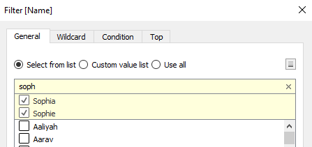
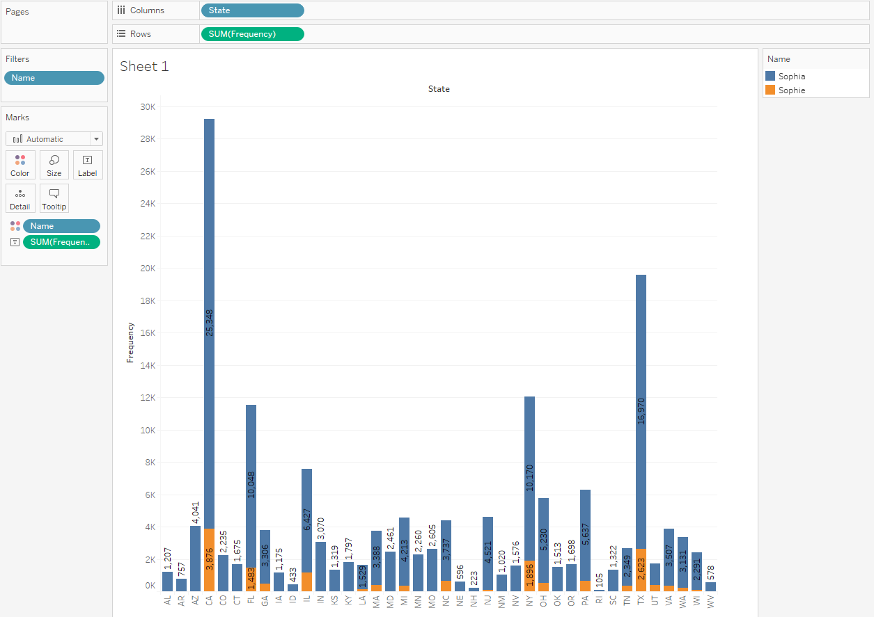
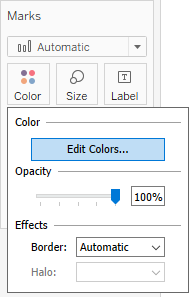
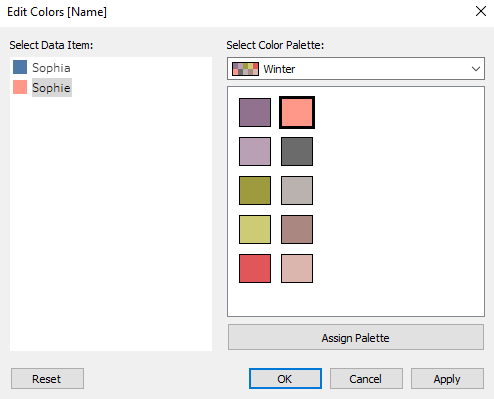
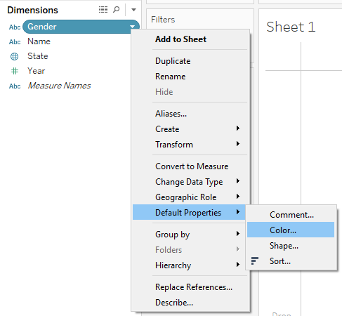
Colors are a very useful way to enrich your visualization. In this recipe, you will learn how to add information to your visualization by selecting Dimension and adding it to Color, which is present in the Marks card.

Getting ready

Connect to your local copy of Baby_names.csv and open a blank worksheet.

How to do it...

  1. Drag and drop State from Dimensions into the Columns shelf.
  2. Drag and drop Frequency from Measures into the Rows shelf.
  3. Drag and drop Name into the Filter shelf.
  4. In the Filter[Name] window, in the General tab, make sure Select from list is selected.
  5. Click on None to deselect all values.
  6. In the search bar at the top of the list, start typing soph.
  7. Tableau will show the results that start with those letters, such as Sophia and Sophie. Select both values:

  1. Click on OK.
  2. Drag and drop Frequency to Label in the Marks card.
  3. We have now created a chart with the summed total frequency of the names Sophie and Sophia per State. But, what if we wanted to know which of the two names is more popular in which state? We will achieve that by adding Name to Color in the Marks card.
  4. Drag and drop Name from Dimensions onto Color in the Marks card:

How it works...

When you add a discrete dimension (Name) to Color, Tableau disaggregates the measure you are using, Frequency, by the categories of Name, and assigns each category a different color. Since we filtered out all names except for Sophia and Sophie, only those two colors appeared in the chart. It's also possible, and often useful, to add a measure to Color. In that case, the value measure will be represented by a color gradient. For an example of adding a measure to Color, you can refer to the Creating a map with a color gradient recipe.

There's more...

It’s possible to customize the colors in your view by performing the following steps:

  1. Click on Color in the Marks card, and then click on Edit Colors…:
  1. In the Edit Colors[Name] window that opens, you can select a color palette from the drop-down menu that appears and click on the Assign Palette button. This will assign colors from the palette that you chose to the categories of your dimension. You can also manually assign specific colors to a category by selecting it in the Select Data Item pane, and by clicking on the desired color on the right-hand side:
  1. When you are satisfied with the colors, click OK to exit. Note that this will only affect the colors in the particular view you created.
  2. You can also hardcode a color palette for a specific measure or dimension. Hover over the field pill under Measures or Dimensions and click on the white arrow that appears on it. In the drop-down menu, navigate to Default Properties | Color...:

This will launch the Edit Colors window, where you can choose the color palette. However, once you assign your desired color palette to a field this way, it will be used by default every time you add this field to Color in a view.

If you plan to use a field in Color in more than one visualization, it's a good practice to hardcode the color palette for it. Using colors in your visualizations consistently makes them cleaner and easier to follow, especially as they get more complex.

See also