Book Image

Excel 2010 Financials Cookbook

By : Andre Odnoha
Book Image

Excel 2010 Financials Cookbook

By: Andre Odnoha

Overview of this book

<p>Excel is one of the mostused software tools in the world and just about every business has a copy somewhere. Despite its power and flexibility it is not always clear how to use it to perform some of the most important tasks in any business: organizing, analysing, and presenting financial information.<br /><br />Excel 2010 Financials Cookbook contains a rich collection of useful techniques for handling financial data in Excel. From integrating data from a variety of different sources, through organazing and analyzing financial data, to presenting it in a variety of graphical forms, this book has you covered.<br /><br />The book deals first with "normalizing" financial data -- that is, bringing data from a number of different sources into a single format where you can analyze them together. Then you'll learn techniques for managing and analyzing the data before discovering ways to present it graphically. The book then looks at Excel's built in features for financial analysis, and even shows how you can combine the built in features to build your own analysis functions.</p>
Table of Contents (14 chapters)
Excel 2010 Financials Cookbook
Credits
About the Author
About the Reviewers
www.PacktPub.com
Preface
Index

Creating a graph overlay for profit and expenses


Often, when displaying information in Excel, one type of graph or chart used exclusively does not always show the full picture. When charting profit and expenses, a column chart will assist in displaying comparison between years, while a line chart will assist in displaying trends. Taking this one-step further, overlaying charts will allow both representations to be displayed within the same graph. Like many other financial graphing requirements, Excel does not have a Chart Overlay or Graph Merge wizard or built-in function for accomplishing this.

In this recipe, you will learn how to use native functions to create a chart overlay.

How to do it...

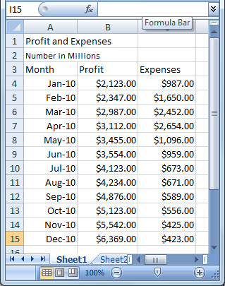
We will start with a simple worksheet displaying profit and expenses for one year with a monthly frequency:

  1. 1. Select cells A3 through C15.

  2. 2. From the Excel Ribbon choose Insert | Column | Clustered Column.

    • Excel now inserts a basic column chart onto the worksheet with a colored bar for each data...