
So, let's install WordPress Mobile Pack and see how it compares to the hugely popular WPtouch:
1. On the plugin's screen, deactivate WPtouch (if it's active) before you start.
2. Install the WordPress Mobile Pack plugin, either by downloading it from http://wordpress.org/extend/plugins/wordpress-mobile-pack/ and uploading it to your plugins folder, or by using the Add plugin screen. Activate the plugin.
3. To access the various settings screens for the plugin, select the required screen from either the Appearance menu or the Installed Plugins screen.
4. Let's start with the switcher screen. Click on Mobile Switcher to access it:

The most useful option on this screen is the Mobile theme chooser. We are given the option to select the base theme, which is largely monochrome, or a blue, green, or red theme. Alternatively, if we have a mobile theme of our own, we can select that instead, meaning we could use this plugin purely as a mobile switcher. This means we could use it to switch to a mobile theme that we design ourselves—something we will do in Chapter 8, Creating a Web App Interface. Spend some time experimenting with the different WordPress Mobile themes and identify which one looks best for your site.
For the Carborelli's site we will stick with the base theme as this is the cleanest and most modern, although it doesn't reflect Carborelli's brand colors.
After making any changes, click on the Save Changes button.
5. Now open the Mobile Theme screen, to make some tweaks to our selected theme:

6. As our site isn't a blog, but has a static home page, uncheck the Show home link in menu option. We will also do the following:
Change the Lists of posts show option to Title only, which will take up less space.
Set the Number of widget items option to at least as high a number as the number of widgets we're using in the site. The Carborelli's site uses two widgets so we will stick with the default value of 5 in case any more are added at a later date.
7. By clicking on the Launch ready.mobi link, we can see a report detailing how our site would perform on mobile devices with the selected theme activated. We can then make any changes needed to improve performance.
8. Make any other tweaks that are appropriate for the site—most of the settings are self explanatory. Click on the Save Changes button.
9. Having set the options for the themes, open the Mobile Widgets screen:

10. The Carborelli's theme uses a framework with a number of widget areas—your theme may not have as many. Select the widgets from your theme that you want to display on the mobile site. For the Carborelli's site we want to display both of the widgets in the Primary Widget Area. When you've made any changes, click on Save Changes.
11. Finally, test your site on a mobile device to see how it looks.
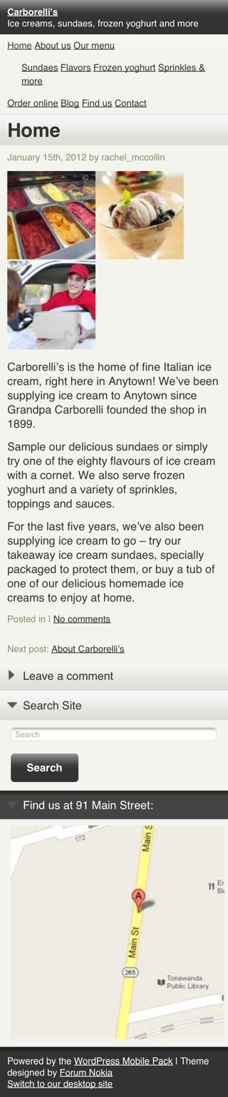
We installed and activated the WordPress Mobile Pack plugin and edited the settings to best suit our site and theme. This was a faster and more straightforward process than with WPtouch, but that was partly because the plugin doesn't include as many options as WPtouch. This is how the site now looks on mobile devices:
So, how did WordPress Mobile Pack fare against our criteria?
The site will be targeting smartphones, in particular iPhones and iPod touches, Android devices, and Blackberries. Access from other phones is not essential.
WordPress Mobile Pack passed this one—it targets a range of smartphones and others, and works well on iOS, Android, and Blackberry.
The logo isn't crucial on mobile devices but there are images which are important.
WordPress Mobile Pack doesn't display the logo but it does display widgets, meaning that our map is visible to mobile users.
The site uses a widget area for the sidebar, making it easier for the client to update this information in the future. So yes, it's important that widget areas are displayed.
WordPress Mobile Pack gives us the option to display as many widgets as we need, so it passes this test.
Fine control over the styles isn't essential as long as the default style provided by the plugin is smart and images are displayed, as they will provide a lot of visual cues.
The mobile site looks smart when using the base theme, but the colors in the other themes aren't very attractive. Unfortunately, this meant we were unable to introduce any brand colors for the Carborelli's site. However, by including images with elements of the brand in, or tweaking the CSS, we could get around this.
Speed and size are important to reduce data transfer.
WordPress Mobile Pack shrinks images, creating an additional copy of them at a smaller resolution and delivering that to mobile devices. The Google page speed test gives this version of the site a score of 50 out of 100, which is better than WPtouch but still not as fast as the desktop site.
To summarize, I think that the WordPress Mobile Pack does a better job than WPtouch of delivering the Carborelli's content to visitors, specifically because it displays widgets and is faster. It's a shame the styles can't be tweaked, but in our example the content is more important.
Did WordPress Mobile Pack meet the criteria for your site?