Book Image

WordPress Mobile Web Development: Beginner's Guide

By : RACHEL MCCOLLIN
Book Image

WordPress Mobile Web Development: Beginner's Guide

By: RACHEL MCCOLLIN

Overview of this book

The chances are that more of your WordPress website visitors are using mobiles, or more clients are demanding responsive or mobile sites. If you can use WordPress to build mobile-friendly sites you can win more business from clients and more traffic for your site. "WordPress Mobile Web Development Beginner's Guide" will benefit you whether you've dabbled in WordPress or worked with it for years. It will help you identify which approach to mobile is most appropriate for your site (responsive, mobile, or web app) and learn how to make each one work, demonstrating a variety of techniques from the simple to the more complex, working through clear practical examples and applying these to your own website. Start by quickly making a WordPress site mobile-friendly, using off the shelf plugins and responsive themes, choosing the best ones for you and customising them. This leads into responsive theme design, with advice on layout, images and navigation. Finally, learn how to build a web app in WordPress, making use of plugins, APIs and custom code. If you need to hit the ground running with mobile WordPress development, then this book is for you. With practical examples and exercises from the beginning, it will help you build your first mobile WordPress site without having to learn aspects of WordPress or mobile development that aren't relevant. It will also help you understand which approaches work and why, so you can apply this knowledge to future projects.
Table of Contents (18 chapters)
WordPress Mobile Web Development Beginner's Guide
Credits
About the Author
About the Reviewers
Acknowledgement
www.PacktPub.com
Preface

Time for action—moving the sidebar below the content for tablets in portrait mode


Let's start by reviewing how the site is now looking on tablets in portrait orientation, as shown in the following screenshot:

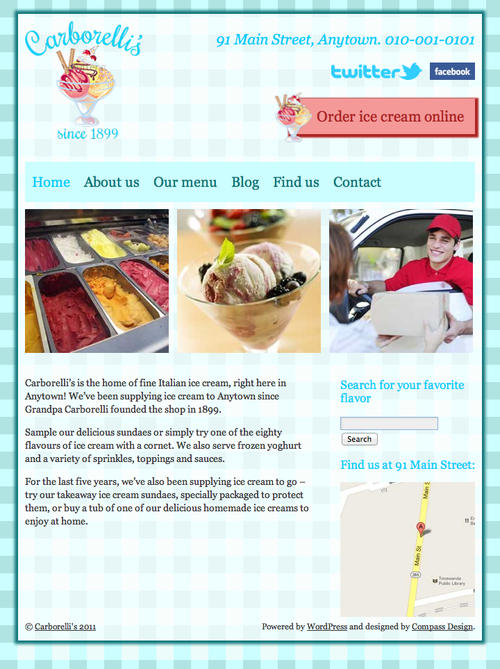
It's looking good, but there's a large empty space below the home page content, which could be filled by rearranging the content and sidebar positioning. Let's get on and write the necessary CSS. Perform the following steps for doing so:

  1. 1. First, we will find our media query for tablets in portrait mode, with the CSS we added for the header:

    /*iPads in portrait mode*/
    @media screen and (max-width: 768px) {
    #site-title img {
    width: 75%;
    }
    #socialmedia img {
    height: 25px;
    margin: 7px 0 7px 10px;
    }
    #header-right .CTA {
    padding: 0.8em;
    padding-left: 40px;
    }
    #access {
    font-size: 18px;
    }
    }
    
  2. 2. As our new code addresses issues further down in the site's document tree, we'll write our new code below the code we've already added, but still inside the media query's curly brackets.

    Note

    For an explanation...