Book Image

WordPress Mobile Web Development: Beginner's Guide

By : RACHEL MCCOLLIN
Book Image

WordPress Mobile Web Development: Beginner's Guide

By: RACHEL MCCOLLIN

Overview of this book

The chances are that more of your WordPress website visitors are using mobiles, or more clients are demanding responsive or mobile sites. If you can use WordPress to build mobile-friendly sites you can win more business from clients and more traffic for your site. "WordPress Mobile Web Development Beginner's Guide" will benefit you whether you've dabbled in WordPress or worked with it for years. It will help you identify which approach to mobile is most appropriate for your site (responsive, mobile, or web app) and learn how to make each one work, demonstrating a variety of techniques from the simple to the more complex, working through clear practical examples and applying these to your own website. Start by quickly making a WordPress site mobile-friendly, using off the shelf plugins and responsive themes, choosing the best ones for you and customising them. This leads into responsive theme design, with advice on layout, images and navigation. Finally, learn how to build a web app in WordPress, making use of plugins, APIs and custom code. If you need to hit the ground running with mobile WordPress development, then this book is for you. With practical examples and exercises from the beginning, it will help you build your first mobile WordPress site without having to learn aspects of WordPress or mobile development that aren't relevant. It will also help you understand which approaches work and why, so you can apply this knowledge to future projects.
Table of Contents (18 chapters)
WordPress Mobile Web Development Beginner's Guide
Credits
About the Author
About the Reviewers
Acknowledgement
www.PacktPub.com
Preface

Time for action—rearranging the sidebar widgets for phones in portrait mode


Once again, let's start by seeing how this part of the site is looking on the screens of this width:

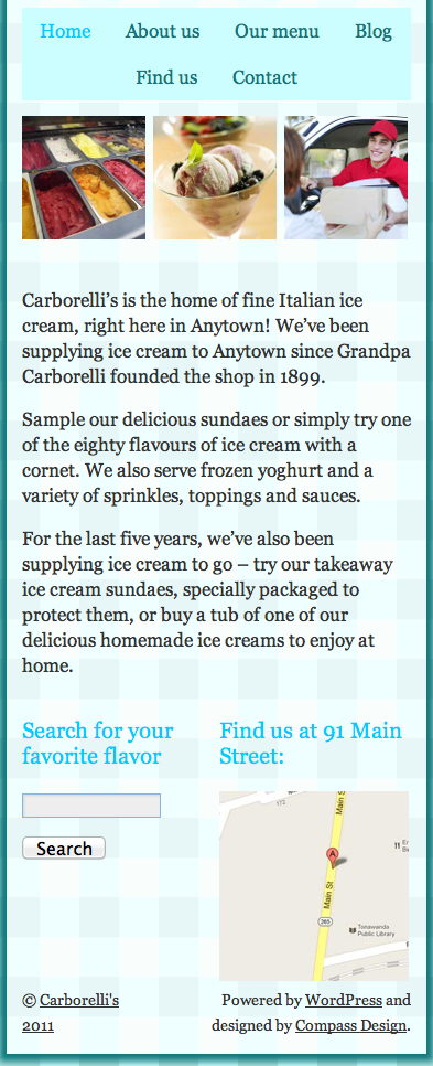
In portrait mode, having the widgets side by side simply makes them too narrow. The search box is too small to tap comfortably and the map is too small to be able to see any detail. Let's make them sit beneath each other. Perform the following steps for doing so:

  1. 1. First, we will find the media query for phones in portrait mode as follows:

    /*smartphones in portrait mode*/
    @media screen and (max-width: 320px) {
    /*make header icons and text larger*/
    #header-right address h2 {
    font-size: 18px;
    }
    #header-right #socialmedia img {
    height: 30px;
    margin: 10px 3%;
    }
    #header-right .CTA {
    font-size: 18px;
    /*padding: 1em 1em 1em 40px;*/
    margin: 10px 3% 10px 0;
    }
    /*increase size of navigation text*/
    #access {
    font-size: 17px;
    }
    #access a {
    padding: 0 7px;
    }
    }
    
  2. 2. Below this, but inside the braces of the media query, we will add the...