

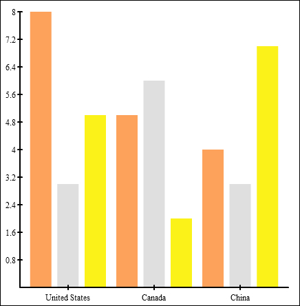
In the previous recipe, we learned how to make a simple bar chart. The relation of the data was one-to-one; one label, one value. Now we will make this a bit more complex by adding one more dimension. We will create a bar chart in which the bars are replaced by bar charts. It can be hard to understand it like this, but it gets clearer if you look at the data. For this recipe we will compare the medals (bronze, silver, and gold) won by three different countries at a sporting event.
A good starting point is to copy over the project from the previous recipe (see the Building vertical bar charts recipe). We will modify it a lot, but the core of it will be similar.