
This section will cover common tools used for editing and enhancing images.
One of the most common adjustments that need to be made with digital photos is fixing the color balance. You might have taken a photo outside and forgot to change the white balance from Tungsten earlier in the day to Daylight. Or you left the white balance on auto and the skin tones are just a little off. Pixelmator has some easy color effects to fix any color balance issues or to make artistic adjustments such as changing a photo to black and white. All of the color adjustments will be done in the Effects browser. If you don't have this window visible, it can be found on the menu under View | Show Effects. Once this window is up, select the Color Adjustments option from the drop-down menu at the top.
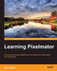
Before we start making adjustments to the image's color, it's always a good idea to duplicate the layer you are working on. This way, if you ever need to easily go back to the original, you can delete the new layer you are working on and always have the main layer still intact. To do this, navigate to Edit | Duplicate. To make adjustments to the overall color of the image, double-click on the Color Balance button. This will open up sliders to change the Cyan/Red, Magenta/Green, or Yellow/Blue color balance within the Shadows, Midtones, and Highlight areas.
Let's start with this image that came straight out of the camera. This image was taken inside and the white balance of the camera was set to Tungsten. Although it was inside, there was hardly any indoor light and the main light on the scene was from a window that has some great sunlight coming in. The white balance should have been set to Daylight or Cloudy on the camera to get the color balance closer to reality. Since the color of the image is very cold, we need to warm it up a bit.
Let's walk through the steps to correct this:
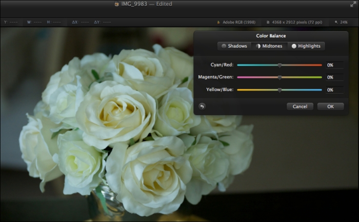
First, start with the Midtones and start to adjust the colors one by one. You can see that this original image has too much green and blue colors in it. So I'll start by moving the Magenta/Green slider over to the magenta side to add more magenta to the midtones of the image.
Next, move over to the Yellow/Blue slider and start to add some yellow shade to the image.
You can also see that there is a slight cyan tint so move the Cyan/Red slider over to the red side slightly to add just a little bit of red shade to the image.
Next, proceed to make the needed color changes to the Shadows and Highlights until you get the perfect image.
Also remember that while there is technically a correct color, you should always color-balance things to fit your exact style of photography. I love to have many of my portraits contain an extra warmth to the image and while I might add more yellow to a portrait than other people would, it fits my creative vision and style for the shot. Here is what the final color of the flowers look like, much more natural!
Cropping can be the key that separates a great image from a decent image. Although as artists we should always try to capture the perfect image in camera while taking the photo, many times it just doesn't work out perfectly. The crop tool can quickly be accessed by using the keyboard shortcut of C.
Once you have the crop tool selected, click-and-drag on the image to make your crop selection. You can set the proportions of the crop to be constrained to a specific ratio or even be a freeform crop by selecting an option from the Constrain menu in the toolbar.
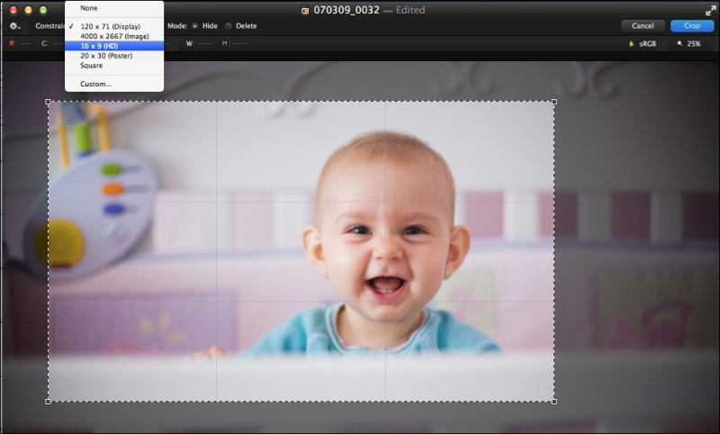
After you have drawn the initial selection on the image, you can refine the selection by moving your cursor to one of the four corners of the selection and using a click-and-drag action to move your selection. You can also rotate the image if you need to straighten a part of the photo. To straighten the image while cropping, move the cursor to just outside of the corners of the selection box; it will turn the cursor to show a 90-degree arrow. Now click-and-drag the image to rotate.
After you have the crop selection perfect and are ready to crop, you first have to select the crop mode. There are just two crop modes to choose from: Hide or Delete. The difference between the two is what happens to the part of the image you are cropping out. With Delete it's pretty straightforward, the image you are cropping out gets deleted. When choosing Hide however, it will crop the image but keep the part cropped out invisible so you can always move the image after it's cropped to bring back those cropped parts. This comes in handy if you need to alter the crop afterwards, since the data is still there, just select the move tool (keyboard shortcut M) and move the image around, anything outside of the frame will appear. After you select the crop mode either double-click within the cropped part or press the Enter key to finish cropping the image.
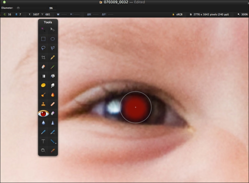
Another common issue with some flash photos is the infamous red eye. Red eye is caused when you have a flash very close to the axis of the camera lens. Because of the position of the flash the light reflects off the back of the persons eyeball and comes back out through the pupil, and since there is ample blood in the back of the eye, it shows through as red to the camera. In Pixelmator, you can fix red eye either automatically or manually. To have it automatically fix red eye, all you have to do is click on the red eye tool in your tool menu and then in the tool settings menu select Auto Fix Red Eye. Just like magic the red eye will be removed. As with many things, an automated process isn't perfect and will not always get the red eye out, so you might want to manually remove the red eye from the photo.
To manually remove the red eye, just perform the following steps:
Adjust the Diameter slider at the top to be approximately the size of the person's pupil.
Then click on the pupil and the red eye will be removed.
Dodging and burning is a term from the old days of printing in a darkroom. Back then, photographers had to use an enlarger to place a focused beam of light through a film negative to expose a light-sensitive piece of photo paper. When you wanted part of the image to be lighter, you would "dodge" that area by covering the light from hitting the sensitive photo paper. Alternatively, if you wanted part of the photo to be darker, you would "burn" parts of the photo by allowing light to only hit a certain part of the photo.
Dodging and burning in the digital realm is pretty much the same concept, you are going to be either adding or removing light from a scene. This can be done as follows:
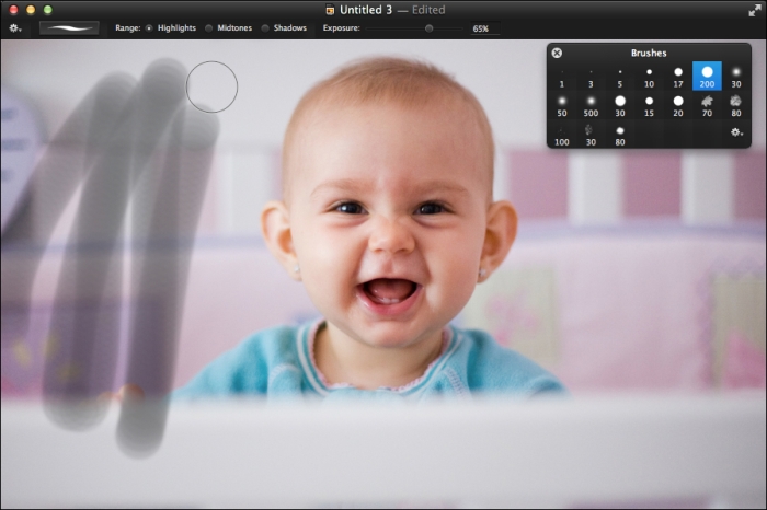
We will start with the burn tool, which looks like a small orange flame in the tools menu.
Once you select the burn tool, you will want to click on the brush image that is on the top of the image window next to the tool settings menu.
When you click on this, it will open up a new pop-up window showing a list of brushes to pick. Having the right brush is essential to making a smooth burn on the image.
Before we get into how to choose the right brush, let's talk a little more about why you want to dodge or burn a photo. Normally, you will want to burn an area of a photo where you don't want people to focus their eye on. If you have a portrait and want people to focus directly on the person, you might want to burn in the edges of the photo so the readers eye is driven right to the main subject. It is natural reaction for someone who is looking at a photo to automatically have their eye first go to the lightest part of the image. The highlights really draw the user's attention, but many times we don't want them to focus on these highlights. You might have some bright areas around the edges of a portrait; however, you don't want the viewer to focus on the edge of the picture but instead to focus on your subject.
Now let's walk through an example on dodging and burning.
Start with a hard brush that has a 200-pixel diameter.
Next, set the exposure to be 65 percent. The exposure will control how much "light" will hit the photo so how dark it will be as you brush it on.
Do a couple of quick swipes back and forth over the top-left area of the photo. You will see when you go over the same area with the burn brush; it will get darker and darker with every pass. When you burn something in too much, it's pretty harsh and really is distracting.
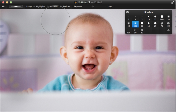
Instead of having these hard lines, let's change the brush up to a 500-pixel diameter brush and also one that has 0 hardness. The hardness controls the edge of the brush, so instead of having a hard line edge this will have a soft edge. The Brushes window menu can be accessed by using the keyboard shortcut Command + 4. This will give you a few preset brushes, but you can also customize these to create your own brushes. To open up the additional brush settings, first click on the gear icon on the bottom-right corner of the Brushes window and select Show Brush Settings.
Here you will see a wide range of options to customize your brush. You can set the size of the brush, hardness of the brush, as well as many other fine-tune adjustments such as the spacing and scatter. As you adjust the brush settings, you will see a preview brush stroke show up at the bottom of the Brush window.
When using the larger and softer brush, you will see that you get a much more natural and smooth transition from the dark areas you are painting into the other areas that you aren't changing.
The blur and sharpen tools are similar, in a way, to the dodge and burn tools. These are tools that help you brush on certain effects of the photo and instead of making the image darker or lighter, you can make it more or less sharp. This also helps to guide the user's eye around the photo and is very important in having your photo tell a story. Just like the viewer's eye in a photo goes to the lightest part of the print, their eye also goes to the sharpest part of the print. So having certain parts be super sharp and others be soft will let you be a visual storyteller and guide the reader's eye throughout the photo.
To use the blur tool, click on the icon that looks like a water droplet in the tools menu. At the top of the image menu, you can adjust the strength of the blur and also click on the brush icon in order to customize the brush size, hardness, and other details. There are many different ways you can use the blur tool, but a common use is to smooth out skin. If you are using the tool to soften skin, you should select a brush that has a very low hardness so the blur effect fades into the rest of the skin in a very natural way. Brush the effect on to the areas you would like to blur. It's also a good idea to start with a lower strength in the blur options and paint the effect over and over to get the most natural look to the effect.
Tip
When adjusting the size of any brush you can use the [ and ] keys to make your brush smaller/larger.
The sharpen tool works exactly in the same manner as the blur tool just giving you the opposite effect. You can click on the cone icon in the tools menu or use the keyboard shortcut of the O key. Sharpening can be important to guide the viewer's eye around your photo. You can give the eyes of a portrait a little sharpening to focus the viewers right into the eyes or sharpen parts of a landscape to give a certain part of the landscape more focus in the image.
Blurring and sharpening the image should be used to fine-tune your photography and help to tell the full artistic story of the shot.