

Interpretation method types and scopes
Now that we have prepared our data and split it into training/test datasets, we can fit the model using the training data and print a summary of the results:
log_model = sm.Logit(y_train, sm.add_constant(X_train))
log_result = log_model.fit()
print(log_result.summary2())
Printing summary2 on the fitted model produces the following output:
Optimization terminated successfully.
         Current function value: 0.561557
         Iterations 6
                         Results: Logit
=================================================================
Model:              Logit            Pseudo R-squared: 0.190
Dependent Variable: cardio           AIC:              65618.3485
Date:               2020-06-10 09:10 BIC:              65726.0502
No. Observations:   58404            Log-Likelihood:   -32797.
Df Model:           11               LL-Null:          -40481.
Df Residuals:       58392            LLR p-value:      0.0000
Converged:          1.0000           Scale:            1.0000
No. Iterations:     6.0000
-----------------------------------------------------------------
               Coef.   Std.Err.    z     P>|z|   [0.025   0.975]
-----------------------------------------------------------------
const         -11.1730   0.2504 -44.6182 0.0000 -11.6638 -10.6822
age             0.0510   0.0015  34.7971 0.0000   0.0482   0.0539
gender         -0.0227   0.0238  -0.9568 0.3387  -0.0693   0.0238
height         -0.0036   0.0014  -2.6028 0.0092  -0.0063  -0.0009
weight          0.0111   0.0007  14.8567 0.0000   0.0096   0.0125
ap_hi           0.0561   0.0010  56.2824 0.0000   0.0541   0.0580
ap_lo           0.0105   0.0016   6.7670 0.0000   0.0075   0.0136
cholesterol     0.4931   0.0169  29.1612 0.0000   0.4600   0.5262
gluc           -0.1155   0.0192  -6.0138 0.0000  -0.1532  -0.0779
smoke          -0.1306   0.0376  -3.4717 0.0005  -0.2043  -0.0569
alco           -0.2050   0.0457  -4.4907 0.0000  -0.2945  -0.1155
active         -0.2151   0.0237  -9.0574 0.0000  -0.2616  -0.1685
=================================================================
The preceding summary helps us to understand which X features contributed the most to the y CVD diagnosis using the model coefficients (labeled Coef. in the table). Much like with linear regression, the coefficients are weights applied to the predictors. However, the linear combination exponent is a logistic function. This makes the interpretation more difficult. We explain this function further in Chapter 3, Interpretation Challenges.
We can tell by looking at it that the features with the absolute highest values are cholesterol and active, but it’s not very intuitive in terms of what this means. A more interpretable way of looking at these values is revealed once we calculate the exponential of these coefficients:
np.exp(log_result.params).sort_values(ascending=False)
The preceding code outputs the following:
cholesterol    1.637374
ap_hi          1.057676
age            1.052357
weight         1.011129
ap_lo          1.010573
height         0.996389
gender         0.977519
gluc           0.890913
smoke          0.877576
alco           0.814627
active         0.806471
const          0.000014
dtype: float64
Why the exponential? The coefficients are the log odds, which are the logarithms of the odds. Also, odds are the probability of a positive case over the probability of a negative case, where the positive case is the label we are trying to predict. It doesn’t necessarily indicate what is favored by anyone. For instance, if we are trying to predict the odds of a rival team winning the championship today, the positive case would be that they own, regardless of whether we favor them or not. Odds are often expressed as a ratio. The news could say the probability of them winning today is 60% or say the odds are 3:2 or 3/2 = 1.5. In log odds form, this would be 0.176, which is the logarithm of 1.5. They are basically the same thing but expressed differently. An exponential function is the inverse of a logarithm, so it can take any log odds and return the odds, as we have done.
Back to our CVD case. Now that we have the odds, we can interpret what it means. For example, what do the odds mean in the case of cholesterol? It means that the odds of CVD increase by a factor of 1.64 for each additional unit of cholesterol, provided every other feature stays unchanged. Being able to explain the impact of a feature on the model in such tangible terms is one of the advantages of an intrinsically interpretable model such as logistic regression.
Although the odds provide us with useful information, they don’t tell us what matters the most and, therefore, by themselves, cannot be used to measure feature importance. But how could that be? If something has higher odds, then it must matter more, right? Well, for starters, they all have different scales, so that makes a huge difference. This is because if we measure the odds of how much something increases, we have to know by how much it typically increases because that provides context. For example, we could say that the odds of a specific species of butterfly living one day more are 0.66 after their first eggs hatch. This statement is meaningless unless we know the lifespan and reproductive cycle of this species.
To provide context to our odds, we can easily calculate the standard deviation of our features using the np.std function:
np.std(X_train, 0)
The following series is what is outputted by the np.std function:
age             6.757537
gender          0.476697
height          8.186987
weight         14.335173
ap_hi          16.703572
ap_lo           9.547583
cholesterol     0.678878
gluc            0.571231
smoke           0.283629
alco            0.225483
active          0.397215
dtype: float64
As we can tell by the output, binary and ordinal features only typically vary by one at most, but continuous features, such as weight or ap_hi, can vary 10–20 times more, as evidenced by the standard deviation of the features.
Another reason why odds cannot be used to measure feature importance is that despite favorable odds, sometimes features are not statistically significant. They are entangled with other features in such a way they might appear to be significant, but we can prove that they aren’t. This can be seen in the summary table for the model, under the P>|z| column. This value is called the p-value, and when it’s less than 0.05, we reject the null hypothesis that states that the coefficient is equal to zero. In other words, the corresponding feature is statistically significant. However, when it’s above this number, especially by a large margin, there’s no statistical evidence that it affects the predicted score. Such is the case with gender, at least in this dataset.
If we are trying to obtain what features matter most, one way to approximate this is to multiply the coefficients by the standard deviations of the features. Incorporating the standard deviations accounts for differences in variances between features. Hence, it is better if we get gender out of the way too while we are at it:
coefs = log_result.params.drop(labels=['const','gender'])
stdv = np.std(X_train, 0).drop(labels='gender')
abs(coefs * stdv).sort_values(ascending=False)
The preceding code produced this output:
ap_hi          0.936632
age            0.344855
cholesterol    0.334750
weight         0.158651
ap_lo          0.100419
active         0.085436
gluc           0.065982
alco           0.046230
smoke          0.037040
height         0.029620
The preceding table can be interpreted as an approximation of risk factors from high to low according to the model. It is also a model-specific feature importance method, in other words, a global model (modular) interpretation method. There are a lot of new concepts to unpack here, so let’s break them down.
Model interpretability method types
There are two model interpretability method types:
- Model-specific: When the method can only be used for a specific model class, then it’s model-specific. The method detailed in the previous example can only work with logistic regression because it uses its coefficients.
- Model-agnostic: These are methods that can work with any model class. We cover these in Chapter 4, Global Model-Agnostic Interpretation Methods, and the next two chapters.
Model interpretability scopes
There are several model interpretability scopes:
- Global holistic interpretation: We can explain how a model makes predictions simply because we can comprehend the entire model at once with a complete understanding of the data, and it’s a trained model. For instance, the simple linear regression example in Chapter 1, Interpretation, Interpretability, and Explainability; and Why Does It All Matter?, can be visualized in a two-dimensional graph. We can conceptualize this in memory, but this is only possible because the simplicity of the model allows us to do so, and it’s not very common nor expected.
- Global modular interpretation: In the same way that we can explain the role of parts of an internal combustion engine in the whole process of turning fuel into movement, we can also do so with a model. For instance, in the CVD risk factor example, our feature importance method tells us that
ap_hi(systolic blood pressure),age,cholesterol, andweightare the parts that impact the whole the most. Feature importance is only one of many global modular interpretation methods but arguably the most important one. Chapter 4, Global Model-Agnostic Interpretation Methods, goes into more detail on feature importance. - Local single-prediction interpretation: We can explain why a single prediction was made. The next example will illustrate this concept and Chapter 5, Local Model-Agnostic Interpretation Methods, will go into more detail.
- Local group-prediction interpretation: The same as single-prediction, except that it applies to groups of predictions.
Congratulations! You’ve already determined the risk factors with a global model interpretation method, but the health minister also wants to know whether the model can be used to interpret individual cases. So, let’s look into that.
Interpreting individual predictions with logistic regression
What if we used the model to predict CVD for the entire test dataset? We could do so like this:
y_pred = log_result.predict(sm.add_constant(X_test)).to_numpy()
print(y_pred)
The resulting array is the probabilities that each test case is positive for CVD:
[0.40629892 0.17003609 0.13405939 ... 0.95575283 0.94095239 0.91455717]
Let’s take one of the positive cases; test case #2872:
print(y_pred[2872])
We know that it predicted positive for CVD because the score exceeds 0.5.
And these are the details for test case #2872:
print(X_test.iloc[2872])
The following is the output:
age             60.521849
gender           1.000000
height         158.000000
weight          62.000000
ap_hi          130.000000
ap_lo           80.000000
cholesterol      1.000000
gluc             1.000000
smoke            0.000000
alco             0.000000
active           1.000000
Name: 46965, dtype: float64
So, by the looks of the preceding series, we know that the following applies to this individual:
- A borderline high
ap_hi(systolic blood pressure) since anything above or equal to 130 is considered high according to the American Heart Association (AHA). - Normal
ap_lo(diastolic blood pressure) also according to AHA. Having high systolic blood pressure and normal diastolic blood pressure is what is known as isolated systolic hypertension. It could be causing a positive prediction, butap_hiis borderline; therefore, the condition of isolated systolic hypertension is borderline. ageis not too old, but among the oldest in the dataset.cholesterolis normal.weightalso appears to be in the healthy range.
There are also no other risk factors: glucose is normal, the individual does not smoke nor drink alcohol, and does not live a sedentary lifestyle, as the individual is active. It is not clear exactly why it’s positive. Are the age and borderline isolated systolic hypertension enough to tip the scales? It’s tough to understand the reasons for the prediction without putting all the predictions into context, so let’s try to do that!
But how do we put everything in context at the same time? We can’t possibly visualize how one prediction compares with the other 10,000 for every single feature and their respective predicted CVD diagnosis. Unfortunately, humans can’t process that level of dimensionality, even if it were possible to visualize a ten-dimensional hyperplane!
However, we can do it for two features at a time, resulting in a graph that conveys where the decision boundary for the model lies for those features. On top of that, we can overlay what the predictions were for the test dataset based on all the features. This is to visualize the discrepancy between the effect of two features and all eleven features.
This graphical interpretation method is what is termed a decision boundary. It draws boundaries for the classes, leaving areas that belong to one class or another. Such areas are called decision regions. In this case, we have two classes, so we will see a graph with a single boundary between cardio=0 and cardio=1, only concerning the two features we are comparing.
We have managed to visualize the two decision-based features at a time, with one big assumption that if all the other features are held constant, we can observe only two in isolation. This is also known as the ceteris paribus assumption and is critical in a scientific inquiry, allowing us to control some variables in order to observe others. One way to do this is to fill them with a value that won’t affect the outcome. Using the table of odds we produced, we can tell whether a feature increases as it will increase the odds of CVD. So, in aggregates, a lower value is less risky for CVD.
For instance, age=30 is the least risky value of those present in the dataset for age. It can also go in the opposite direction, so active=1 is known to be less risky than active=0. We can come up with optimal values for the remainder of the features:
height=165.weight=57(optimal for thatheight).ap_hi=110.ap_lo=70.smoke=0.cholesterol=1(this means normal).gendercan be coded for male or female, which doesn’t matter because the odds for gender (0.977519) are so close to 1.
The following filler_feature_values dictionary exemplifies what should be done with the features matching their index to their least risky values:
filler_feature_values = {
    "age": 30,
    "gender": 1,
    "height": 165,
    "weight": 57,
    "ap_hi": 110,
    "ap_lo": 70,
    "cholesterol": 1,
    "gluc": 1,
    "smoke": 0,
    "alco":0,
    "active":1
}
The next thing to do is to create a (1,12) shaped NumPy array with test case #2872 so that the plotting function can highlight it. To this end, we first convert it into NumPy and then prepend the constant of 1, which must be the first feature, and then reshape it so that it meets the (1,12) dimensions. The reason for the constant is that in statsmodels, we must explicitly define the intercept. For this reason, the logistic model has an additional 0 feature, which always equals 1.
X_highlight = np.reshape(
    np.concatenate(([1], X_test.iloc[2872].to_numpy())), (1, 12))
print(X_highlight)
The following is the output:
[[  1.       60.52184865   1.       158.        62.       130.
   80.        1.           1.         0.         0.         1.     ]]
We are good to go now! Let’s visualize some decision region plots! We will compare the feature that is thought to be the highest risk factor, ap_hi, with the following four most important risk factors: age, cholesterol, weight, and ap_lo.
The following code will generate the plots in Figure 2.2:
plt.rcParams.update({'font.size': 14})
fig, axarr = plt.subplots(2, 2, figsize=(12,8), sharex=True,
                          sharey=False)
mldatasets.create_decision_plot(
    X_test,
    y_test,
    log_result,
    ["ap_hi", "age"],
    None,
    X_highlight,
    filler_feature_values,
    ax=axarr.flat[0]
)
mldatasets.create_decision_plot(
    X_test,
    y_test,
    log_result,
    ["ap_hi", "cholesterol"],
     None,
    X_highlight,
    filler_feature_values,
    ax=axarr.flat[1]
)
mldatasets.create_decision_plot(
    X_test,
    y_test,
    log_result,
    ["ap_hi", "ap_lo"],
    None,
    X_highlight,
    filler_feature_values,
    ax=axarr.flat[2],
)
mldatasets.create_decision_plot(
    X_test,
    y_test,
    log_result,
    ["ap_hi", "weight"],
    None,
    X_highlight,
    filler_feature_values,
    ax=axarr.flat[3],
)
plt.subplots_adjust(top=1, bottom=0, hspace=0.2, wspace=0.2)
plt.show()
In the plot in Figure 2.2, the circle represents test case #2872. In all the plots bar one, this test case is on the negative (left-hand side) decision region, representing cardio=0 classification. The borderline high ap_hi (systolic blood pressure) and the relatively high age are barely enough for a positive prediction in the top-left chart. Still, in any case, for test case #2872, we have predicted a 57% score for CVD, so this could very well explain most of it.
Not surprisingly, by themselves, ap_hi and a healthy cholesterol value are not enough to tip the scales in favor of a definitive CVD diagnosis according to the model because it’s decidedly in the negative decision region, and neither is a normal ap_lo (diastolic blood pressure). You can tell from these three charts that although there’s some overlap in the distribution of squares and triangles, there is a tendency for more triangles to gravitate toward the positive side as the y-axis increases, while fewer squares populate this region:
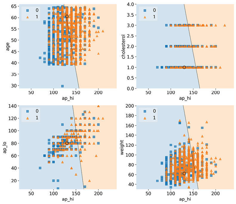
Figure 2.2: The decision regions for ap_hi and other top risk factors, with test case #2872
The overlap across the decision boundary is expected because, after all, these squares and triangles are based on the effects of all features. Still, you expect to find a somewhat consistent pattern. The chart with ap_hi versus weight doesn’t have this pattern vertically as weight increases, which suggests something is missing in this story… Hold that thought because we are going to investigate that in the next section!
Congratulations! You have completed the second part of the minister’s request.
Decision region plotting, a local model interpretation method, provided the health ministry with a tool to interpret individual case predictions. You could now extend this to explain several cases at a time, or plot all-important feature combinations to find the ones where the circle is decidedly in the positive decision region. You can also change some of the filler variables one at a time to see how they make a difference. For instance, what if you increase the filler age to the median age of 54 or even to the age of test case #2872? Would a borderline high ap_hi and healthy cholesterol now be enough to tip the scales? We will answer this question later, but first, let’s understand what can make machine learning interpretation so difficult.