

Appreciating what hinders machine learning interpretability
In the last section, we were wondering why the chart with ap_hi versus weight didn’t have a conclusive pattern. It could very well be that although weight is a risk factor, there are other critical mediating variables that could explain the increased risk of CVD. A mediating variable is one that influences the strength between the independent and target (dependent) variable. We probably don’t have to think too hard to find what is missing. In Chapter 1, Interpretation, Interpretability, and Explainability; and Why Does It All Matter?, we performed linear regression on weight and height because there’s a linear relationship between these variables. In the context of human health, weight is not nearly as meaningful without height, so you need to look at both.
Perhaps if we plot the decision regions for these two variables, we will get some clues. We can plot them with the following code:
fig, ax = plt.subplots(1,1, figsize=(12,8))
mldatasets.create_decision_plot(
    X_test,
    y_test,
    log_result,
    [3, 4],
    ['height [cm]',
    'weight [kg]'],
    X_highlight,
    filler_feature_values,
    filler_feature_ranges,
    ax=ax
)
plt.show()
The preceding snippet will generate the plot in Figure 2.3:
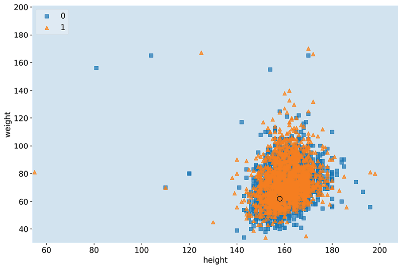
Figure 2.3: The decision regions for weight and height, with test case #2872
No decision boundary was ascertained in Figure 2.3 because if all other variables are held constant (at a less risky value), no height and weight combination is enough to predict CVD. However, we can tell that there is a pattern for the orange triangles, mostly located in one ovular area. This provides exciting insight that even though we expect weight to increase when height increases, the concept of an inherently unhealthy weight value is not one that increases linearly with height.
In fact, for almost two centuries, this relationship has been mathematically understood by the name body mass index (BMI):

Before we discuss BMI further, you must consider complexity. Dimensionality aside, there are chiefly three things that introduce complexity that makes interpretation difficult:
- Non-linearity
- Interactivity
- Non-monotonicity
Non-linearity
Linear equations such as  are easy to understand. They are additive, so it is easy to separate and quantify the effects of each of its terms (a, bx, and cz) from the outcome of the model (y). Many model classes have linear equations incorporated in the math. These equations can both be used to fit the data to the model and describe the model.
However, there are model classes that are inherently non-linear because they introduce non-linearity in their training. Such is the case for deep learning models because they have non-linear activation functions such as sigmoid. However, logistic regression is considered a Generalized Linear Model (GLM) because it’s additive. In other words, the outcome is a sum of weighted inputs and parameters. We will discuss GLMs further in Chapter 3, Interpretation Challenges.
However, even if your model is linear, the relationships between the variables may not be linear, which can lead to poor performance and interpretability. What you can do in these cases is adopt either of the following approaches:
- Use a non-linear model class, which will fit these non-linear feature relationships much better, possibly improving model performance. Nevertheless, as we will explore in more detail in the next chapter, this can make the model less interpretable.
- Use domain knowledge to engineer a feature that can help “linearize” it. For instance, if you had a feature that increased exponentially against another, you can engineer a new variable with the logarithm of that feature. In the case of our CVD prediction, we know BMI is a better way to understand weight in the company of height. Best of all, it’s not an arbitrary made-up feature, so it’s easier to interpret. We can prove this point by making a copy of the dataset, engineering the BMI feature in it, training the model with this extra feature, and performing local model interpretation. The following code snippet does just that:
X2 = cvd_df.drop(['cardio'], axis=1).copy()
X2["bmi"] = X2["weight"] / (X2["height"]/100)**2
To illustrate this new feature, let’s plot bmi against both weight and height using the following code:
fig, (ax1, ax2, ax3) = plt.subplots(1,3, figsize=(15,4))
sns.regplot(x="weight", y="bmi", data=X2, ax=ax1)
sns.regplot(x="height", y="bmi", data=X2, ax=ax2)
sns.regplot(x="height", y="weight", data=X2, ax=ax3)
plt.subplots_adjust(top = 1, bottom=0, hspace=0.2, wspace=0.3)
plt.show()
Figure 2.4 is produced with the preceding code:
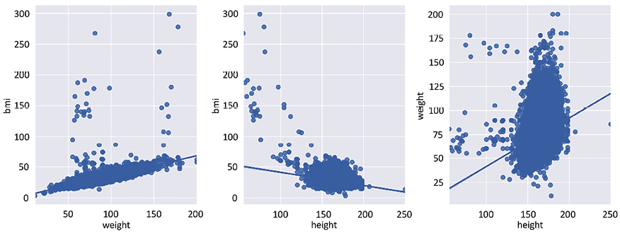
Figure 2.4: Bivariate comparison between weight, height, and bmi
As you can appreciate by the plots in Figure 2.4, there is a more definite linear relationship between bmi and weight than between height and weight and, even, between bmi and height.
Let’s fit the new model with the extra feature using the following code snippet:
X2 = X2.drop(['weight','height'], axis=1)
X2_train, X2_test,__,_ = train_test_split(
  X2, y, test_size=0.15, random_state=9)
log_model2 = sm.Logit(y_train, sm.add_constant(X2_train))
log_result2 = log_model2.fit()
Now, let’s see whether test case #2872 is in the positive decision region when comparing ap_hi to bmi if we keep age constant at 60:
filler_feature_values2 = {
    "age": 60, "gender": 1, "ap_hi": 110,
    "ap_lo": 70, "cholesterol": 1, "gluc": 1,
    "smoke": 0, "alco":0, "active":1, "bmi":20
}
X2_highlight = np.reshape(
    np.concatenate(([1],X2_test.iloc[2872].to_numpy())), (1, 11)
)
fig, ax = plt.subplots(1,1, figsize=(12,8))
mldatasets.create_decision_plot(
    X2_test, y_test, log_result2,
    ["ap_hi", "bmi"], None, X2_highlight,
    filler_feature_values2, ax=ax)
plt.show()
The preceding code plots decision regions in Figure 2.5:
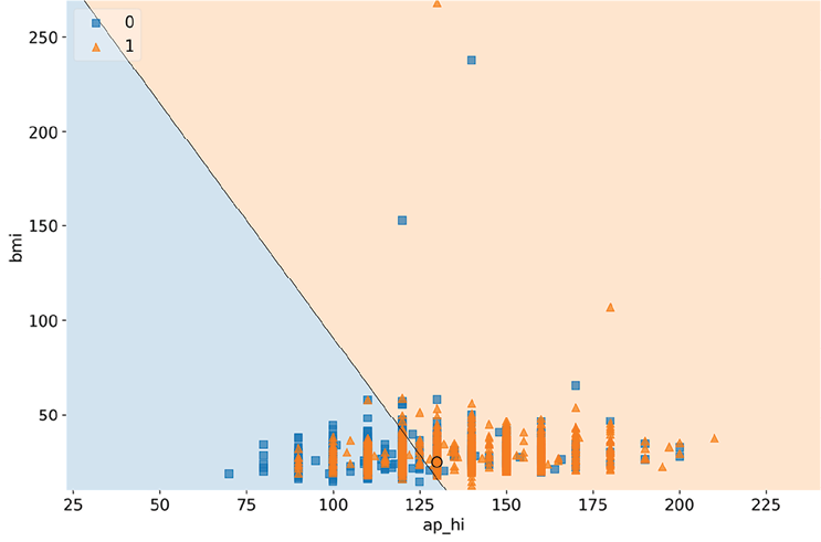
Figure 2.5: The decision regions for ap_hi and bmi, with test case #2872
Figure 2.5 shows that controlling for age, ap_hi, and bmi can help explain the positive prediction for CVD because the circle is in the positive decision region. Please note that there are some likely anomalous bmi outliers (the highest BMI ever recorded was 204), so there are probably some incorrect weights or heights in the dataset.
WHAT’S THE PROBLEM WITH OUTLIERS?
Outliers can be influential or high leverage and, therefore, affect the model when trained with these included. Even if they don’t, they can make interpretation more difficult. If they are anomalous, then you should remove them, as we did with blood pressure at the beginning of this chapter. And sometimes, they can hide in plain sight because they are only perceived as anomalous in the context of other features. In any case, there are practical reasons why outliers are problematic, such as making plots like the preceding one “zoom out” to be able to fit them while not letting you appreciate the decision boundary where it matters. And there are also more profound reasons, such as losing trust in the data, thereby tainting trust in the models that were trained on that data, or making the model perform worse. This sort of problem is to be expected with real-world data. Even though we haven’t done it in this chapter for the sake of expediency, it’s essential to begin every project by thoroughly exploring the data, treating missing values and outliers, and doing other data housekeeping tasks.
Interactivity
When we created bmi, we didn’t only linearize a non-linear relationship, but we also created interactions between two features. bmi is, therefore, an interaction feature, but this was informed by domain knowledge. However, many model classes do this automatically by permutating all kinds of operations between features. After all, features have latent relationships between one another, much like height and width, and ap_hi and ap_lo. Therefore, automating the process of looking for them is not always a bad thing. In fact, it can even be absolutely necessary. This is the case for many deep learning problems where the data is unstructured and, therefore, part of the task of training the model is looking for the latent relationships to make sense of it.
However, for structured data, even though interactions can be significant for model performance, they can hurt interpretability by adding potentially unnecessary complexity to the model and also finding latent relationships that don’t mean anything (which is called a spurious relationship or correlation).
Non-monotonicity
Often, a variable has a meaningful and consistent relationship between a feature and the target variable. So, we know that as age increases, the risk of CVD (cardio) must increase. There is no point at which you reach a certain age and this risk drops. Maybe the risk slows down, but it does not drop. We call this monotonicity, and functions that are monotonic are either always increasing or decreasing throughout their entire domain.
Please note that all linear relationships are monotonic, but not all monotonic relationships are necessarily linear. This is because they don’t have to be a straight line. A common problem in machine learning is that a model doesn’t know about a monotonic relationship that we expect because of our domain expertise. Then, because of noise and omissions in the data, the model is trained in such a way in which there are ups and downs where you don’t expect them.
Let’s propose a hypothetical example. Let’s imagine that due to a lack of availability of data for 57–60-year-olds, and because the few cases we did have for this range were negative for CVD, the model could learn that this is where you would expect a drop in CVD risk. Some model classes are inherently monotonic, such as logistic regression, so they can’t have this problem, but many others do. We will examine this in more detail in Chapter 12, Monotonic Constraints and Model Tuning for Interpretability:
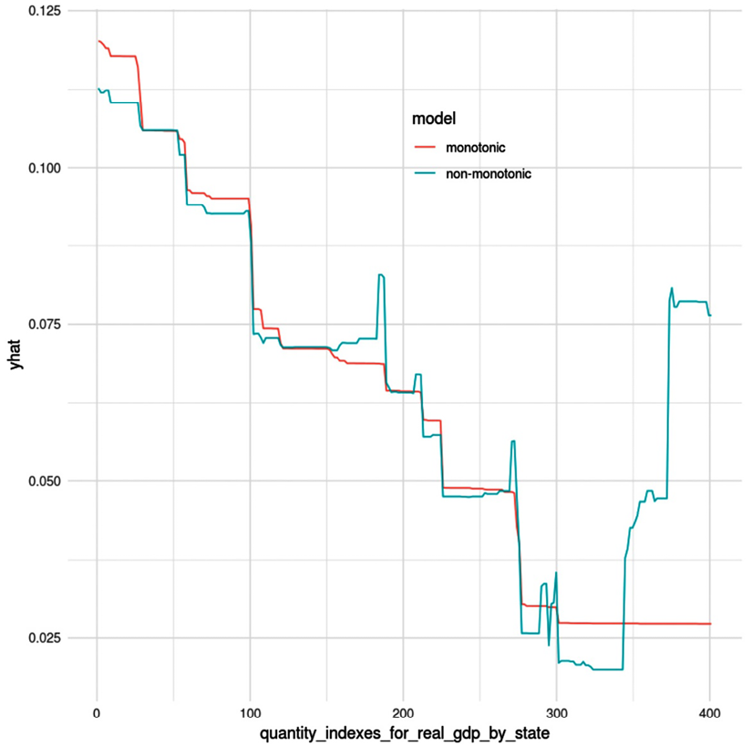
Figure 2.6: A partial dependence plot between a target variable (yhat) and a predictor with monotonic and non-monotonic models
Figure 2.6 is what is called a Partial Dependence Plot (PDP), from an unrelated example. PDPs are a concept we will study in further detail in Chapter 4, Global Model-Agnostic Interpretation Methods, but what is important to grasp from it is that the prediction yhat is supposed to decrease as the feature quantity_indexes_for_real_gdp_by_state increases. As you can tell by the lines, in the monotonic model, it consistently decreases, but in the non-monotonic one, it has jagged peaks as it decreases, and then increases at the very end.