In the previous sections, we have learned some essentials about Julia. In this last section, we will learn how to use Julia for the creation of basic plots. For now, we will use the Plots package and its default backend, GR, but we are going to explore more deeply the Julia plotting ecosystem in the next chapter.
Let's start exploring the Plots syntax by creating a line plot, the default plot type. Line plots represent a series of related points by drawing a straight line between them.
The plot function of the Plots package can take different inputs. Plots usually take data from the positional arguments and attributes that modify the plot in the keyword arguments. The most common way to pass a series of data points is by giving their coordinates using two different vectors or ranges, one for x and the other for y. Let's do our first plot; you can choose whatever development environment you want to follow these steps:
- Let's create some data by running the following code in the Julia REPL:
x = 0:10
y = sqrt.(x)
- Run
using Plots to load the Plots package.
- Execute
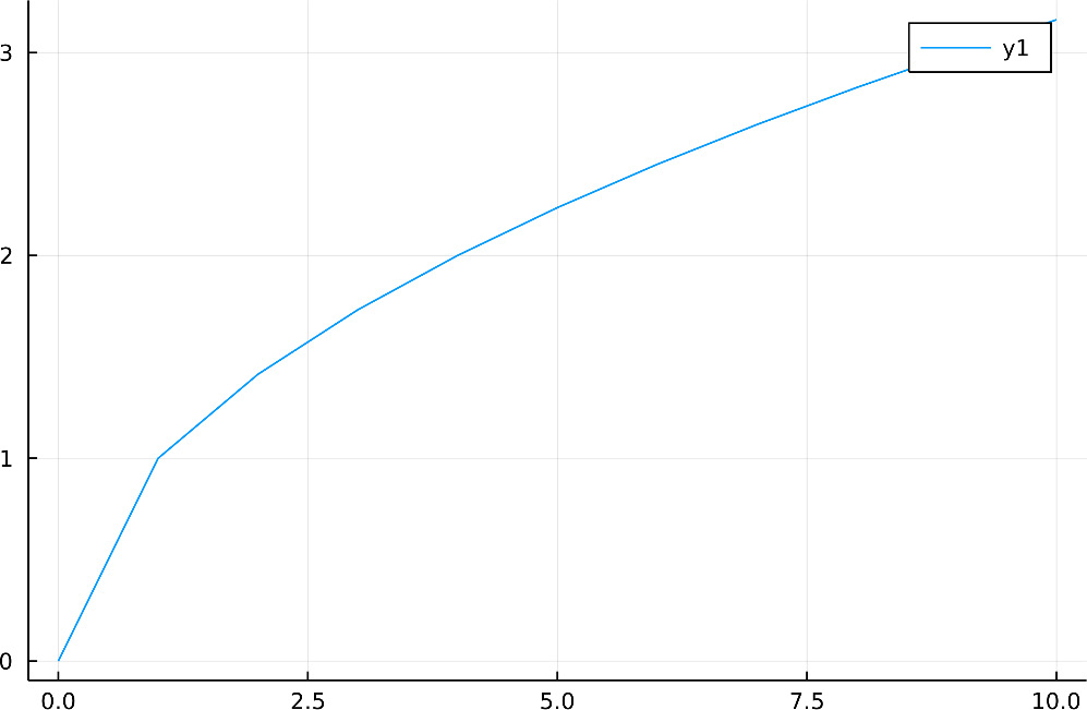
plot(x, y) to create your first line plot. Depending on the development environment, the plot will appear in different ways – in a new window for the Julia REPL, in the plot pane for VS Code, or inline inside the notebook for Jupyter and Pluto. You will see a plot like the one in the following figure:
Figure 1.6 – A line plot
Great, you now have your first Julia plot! It is nice, but as we only took a few points from the sqrt function, the line has some sharp edges, most noticeably around x equal to one. Thankfully, Plots offers a better way to plot functions that adapts the number of points based on the function's second derivative. To plot a function in this way, you only need to give the function as the first argument and use the second and third positional arguments to indicate the initial and last values of x respectively – for example, to create a smooth line, the previous example becomes the following:
plot(sqrt, 0, 10)
Note that you can use your x coordinates by providing them as the second positional argument. That avoids calculating the optimal grid, so plot(sqrt, x) creates a plot identical to the first one shown in Figure 1.6.
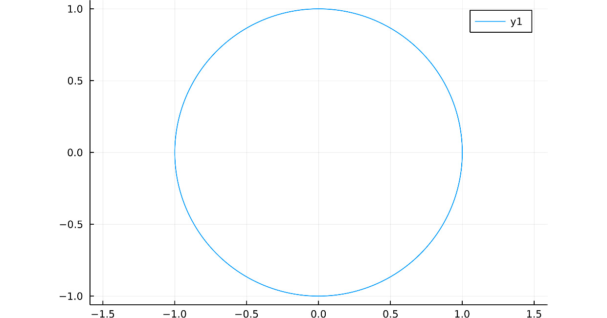
If you give two functions as the first arguments and a domain or vector, Plots will use the latter as input for each function, and the first function will calculate the coordinates of x and the second function the coordinates of y – for example, you can define a unit circle using an angle in radians, from zero to two times pi, by defining x as the cosine of the angle and y as its sine:
plot(cos, sin, 0, 2pi, ratio=:equal)
Note that this code uses the ratio keyword argument, to ensure that we see a circle. Also, we have used Julia's numeric literal coefficient syntax to multiply 2 by the pi constant. The resulting plot is as follows:
Figure 1.7 – A unit circle
In the last example, we indicated the limits of the domain, but as we said, we can also use a vector or range. For instance, try running the following:
angles = range(0, 2pi, length=100)
plot(cos, sin, angles, ratio=:equal)
In this case, we created a range using the range function to indicate the number of points we want in the plot with the length keyword argument.
We have just seen multiple ways to plot a single line, from specifying its points to using a function to let it determine them. Let's now see how to create a single plot with various lines.
Plotting multiple series
In the previous examples, we have plotted only one data series per plot. However, Plots allows you to superpose multiple series with different attributes into each plot. The main idea is that each column, vector, range, or function defines its series. For example, let's create a plot having two series, one for the sin function and the other for the cos function, using these multiple ways:
- Define the values for the x axis, running
X = range(0, 2pi, length=100).
- Execute
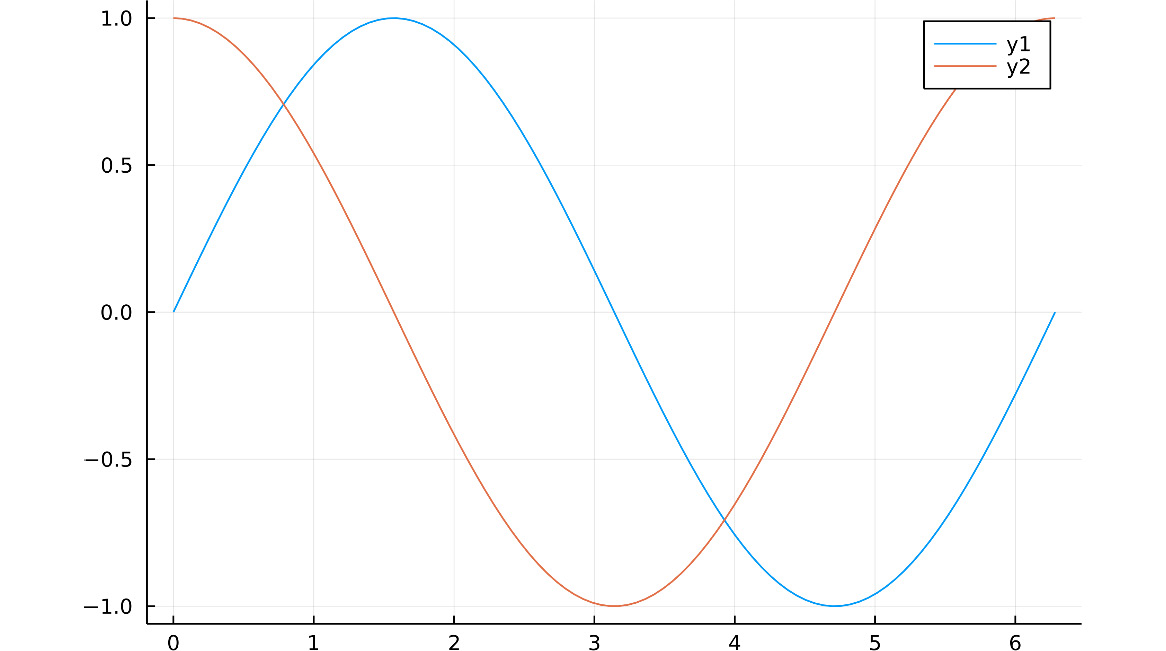
plot([sin, cos], X). Here, we have used a vector containing the two functions as the first argument. Each function on the vector defines a series with different labels and colors. Note that both series use the same values for the x axis.
- Run
plot(X, [sin.(X), cos.(X)]). You will get the same plot; however, we have used different inputs. The first positional argument is the range that indicates the coordinates for x. The second argument is a vector of vectors, as sin.(X), for example, uses the dot broadcasting syntax to return a vector, with the result of applying the sin function to each element of X.
- Execute the following commands:
Y = hcat(sin.(X), cos.(X))
plot(X, Y)
Note that Y is now a matrix with 100 rows and 2 columns. We are using the hcat function to concatenate the two vectors resulting from the broadcasting operations. As we said, each column defines a series. The resulting plot appears in the following figure and should be identical to the previous ones:
Figure 1.8 – A plot of the two data series
In Plots, each column defines a series, as in the last example. When one dimension represents multiple series, Plots repeats the dimension, having only one vector or range to match the series. That's the reason why we didn't need a matrix for x also in those examples.
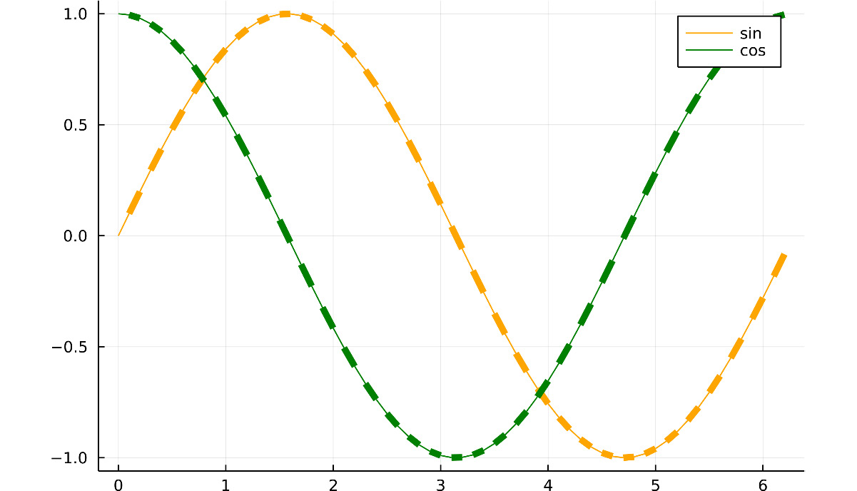
Let's see how to apply different attributes to each series. In Plots, attributes indicated as vectors apply to a single series, while those defined through matrices apply to multiple ones – for example, the following code creates the plot in Figure 1.9:
plot([sin, cos], 0:0.1:2pi,
labels=["sin" "cos"],
linecolor=[:orange :green],
linewidth=[1, 5])
Here, we are using the x-axis domain values from 0 to 2pi, with a step distance of 0.1 units. ["sin" "cos"] defines a matrix with one row and two columns, as spaces rather than commas separate the elements. We can see in Figure 1.9 that the labels attribute has assigned, for example, the string on the first column as the label of the first series. The same happens with linecolor, as we have also used a two-column matrix for it. On the contrary, [1, 5] defines a vector with two elements, and Plots has applied the same vector as the linewidth attribute of each series. So, both lines are getting a thin segment followed by a thick one. Because the number of elements in the vector given to linewidth is lower than the number of line points, Plots warns about this attribute value. The following figure shows the rendered plot:
Figure 1.9 – Different series attributes
We have learned how to create multiple series in a single plot using matrix columns and a vector of vectors, ranges, or functions. While the examples only showed line plots, you can do the same for scatter and bar plots, among others. Before introducing other plots types, let's see how to add a data series to a previously created plot.
Modifying plots
Another way to add series to a plot is by modifying it using bang functions. In Julia, function names ending with a bang indicate that the function modifies its inputs. The Plots package defines many of those functions to allow us to modify previous plots. Plots' bang functions are identical to those without the bang, but they take the plot object to modify as the first argument. For example, let's create the same plot as Figure 1.8 but this time using the plot! function to add a series:
- Execute
plt = plot(sin, 0, 2pi) to create the plot for the first series and store the resulting plot object in the plt variable.
- Run
plot!(plt, cos) to add a second series for the cos function to plt. This returns the modified plot, which looks identical to the one in Figure 1.8.
If we do not indicate the plot object to modify as the first argument of a Plots bang function, Plots will change the last plot created. So, the previous code should be equivalent to running plot(sin, 0, 2pi) and then plot!(cos). However, this feature can cause problems with Pluto reactivity. So, throughout this book, we will always make explicit which plot object we want to modify.
Here, we have used the plot! function to add another line plot on top of a preexistent one. But the Plots package offers more bang functions, allowing you, for example, to add different plots types in a single figure. We will see more of these functions throughout the book. Now, let's see what other basic plot types the Plots package offers.
Scatter plots
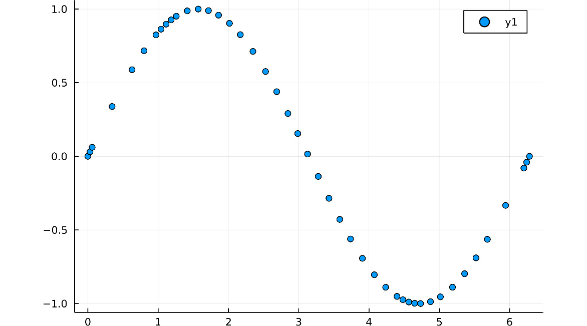
We have created line plots suitable for representing the relationship between continuous variables and ordered points. However, we sometimes deal with points without a meaningful order, where scatter plots are a better option. There are two ways to create scatter plots with Plots – using the plot function and the seriestype attribute, or using the scatterplot function.
The default seriestype for Plots is :path, which creates the line plots. You can check that by running default(:seriestype), which returns the default value of a given attribute, written as a symbol. But we can set seriestype to :scatter to create a scatter plot – for example, let's plot the sin function using a scatter plot:
plot(sin, 0, 2pi, seriestype=:scatter)
Most of the series types define a shorthand function with the same name and the corresponding bang function – in this case, the scatter and scatter! functions. The following code produces the same plot as the previous one, using the seriestype attribute:
scatter(sin, 0, 2pi)
The resulting plot is as follows:
Figure 1.10 – A scatter plot
Note that the density of dots in the figure highlights the grid of x values that Plots created, using its adaptative algorithm to obtain a smooth line.
Bar plots
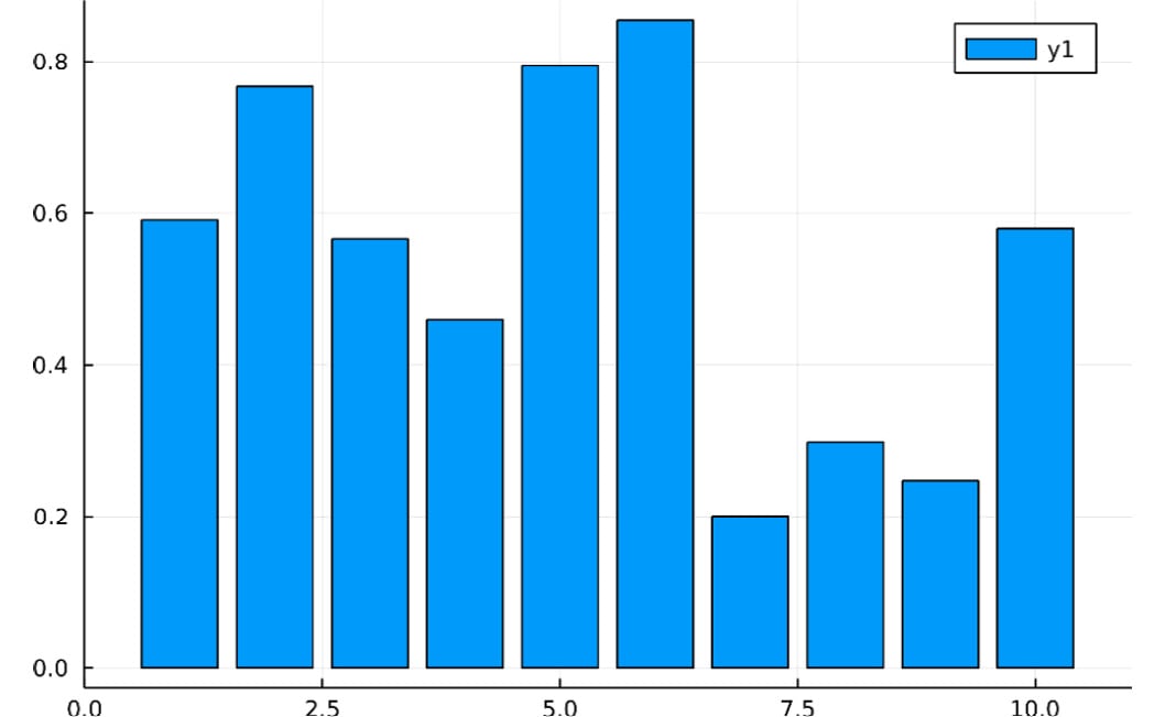
Bar plots are helpful when comparing a continuous variable, encoded as the bar height, across the different values of a discrete variable. We can construct them using the :bar series type or the bar and bar! functions. Another way to input data can come in handy when constructing bar plots – when we call the plot function using a single vector, range, or matrix as the first argument, Plots sets x to match the index number. Let's create a bar plot using this trick:
- Run the following code:
using Random
heights = rand(MersenneTwister(1234), 10)
This creates a vector of random numbers to define the bar heights. We loaded the Random standard library to make a random number generator, with 1234 as a seed to see the same plot.
- Execute
bar(heights) to create a bar plot, where the first value of heights corresponds to x equal to one, the second is equal to two, and so on. Note that the value of x indicates the midpoint of the bar. The resulting plots should look like this:
Figure 1.11 – A bar plot
You can also make x explicit by running bar(1:10, heights) on the last step; the result should be the same.
Heatmaps
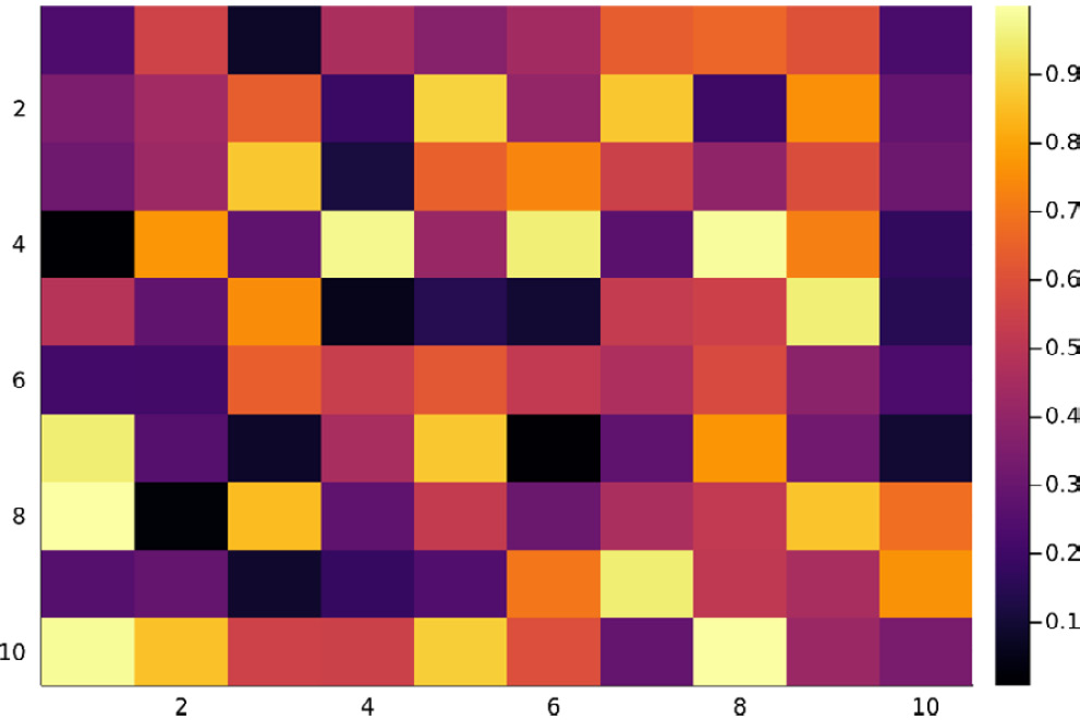
The previous series type plotted a series for each column in an input matrix. Heatmaps are the plot type that we want if we prefer to see the structure of the input matrix. The magnitude of each value in the matrix is encoded using a color scale. Let's create a heatmap that matches the input matrix:
- Execute the following code to create a 10 x 10 matrix:
using Random
matrix = rand(MersenneTwister(1), 10, 10)
- Run
hm = heatmap(matrix) to generate a heatmap. Note that the heatmap function plots the first matrix element at the bottom at (1, 1).
- Execute
plot!(hm, yflip=true) to fix that. Here, the plot! function modifies the value of the yflip attribute. yflip puts the value 1 of the y axis at the top when you set it to true. Now, the order colors match the order of the elements in the matrix:
Figure 1.12 – A heatmap
We have seen how to create the most basic plot types using Plots. Let's now see how to compose them into single figures, taking advantage of the Plots layout system.
Simple layouts
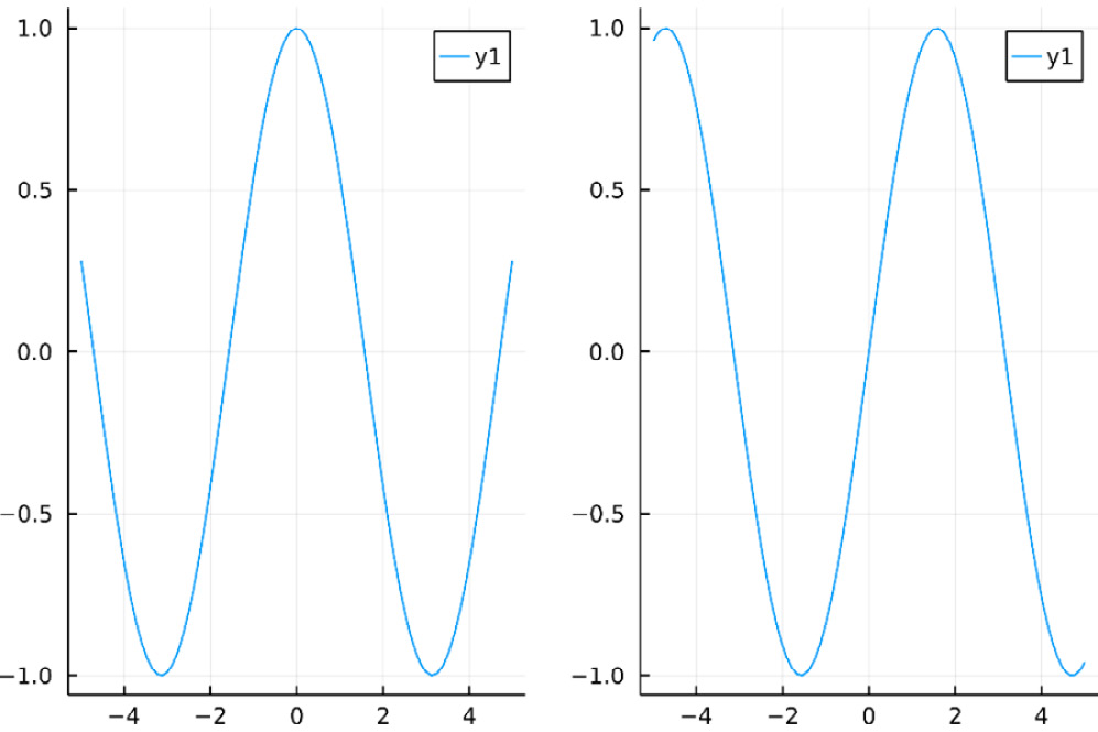
Let's see the easiest way to compose multiple plots into a single figure. You can do it by simply passing plot objects to the plot function. By default, Plots will create a figure with a simple layout, where all plots have the same size. Plots orders the subplots according to their order in the attributes – for example, the following code creates a plot pane with two columns; the first column contains the plot of the sin function, and the second column the cos function plot:
plot(plot(cos), plot(sin))
In the following figure, we can see the plot created by the previous code:
Figure 1.13 – A default subplot grid
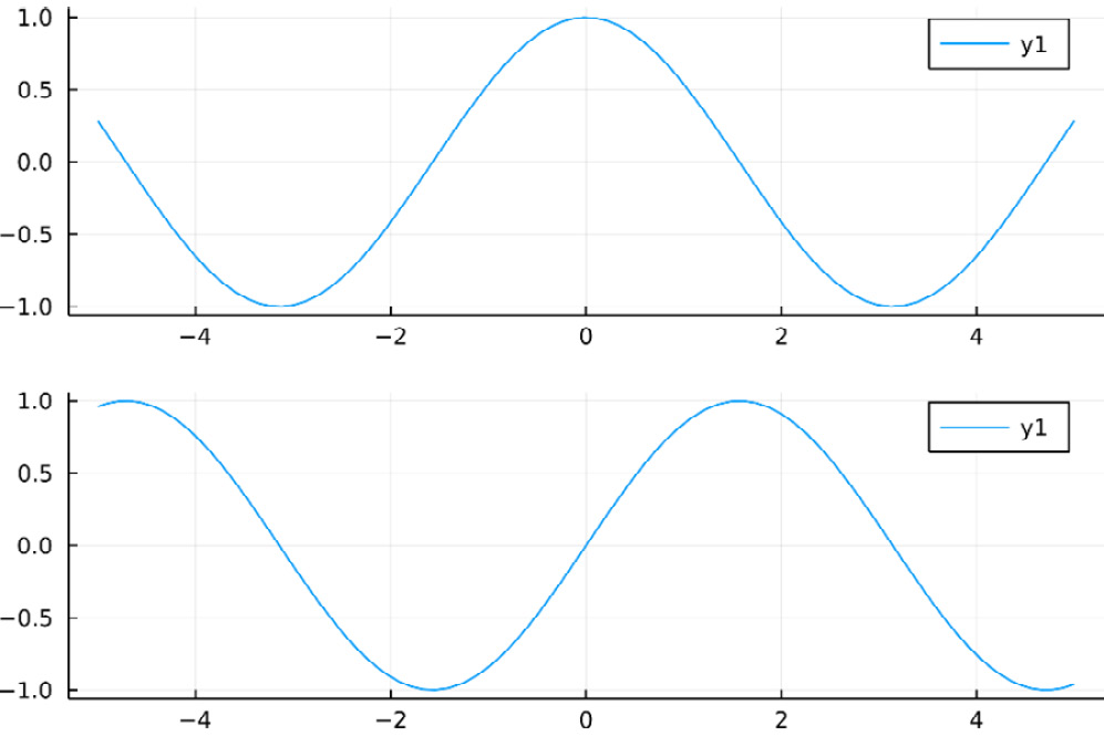
We can use the grid function and the layout attribute of the plot function to customize the behavior – for example, we can have the two plots in a column rather than in a row by defining a grid with two rows and one column:
plot(plot(cos), plot(sin), layout = grid(2, 1))
The resulting plot will look like the one in the following figure:
Figure 1.14 – A single-column layout
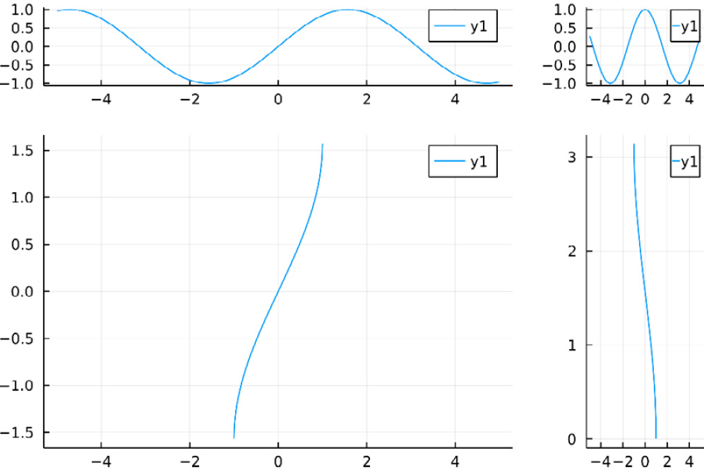
The grid function can take the widths and heights keyword arguments. Those arguments take a vector or tuple of floating-point numbers between 0 and 1, defining the relative proportion of the total width or height assigned to each subplot. Note that the length of the collection for widths should be identical to the number of columns, while the length for heights should match the number of rows in the grid layout – for example, the following code creates a panel with four plots arranged in a matrix of 2 by 2. The first column takes 80% (0.8) of the plot width, and the first row takes only 20% (0.2) of the total plot height:
plot(
plot(sin), plot(cos),
plot(asin), plot(acos),
layout = grid(2, 2,
heights=[0.2, 0.8],
widths=[0.8, 0.2]),
link = :x
)
This code generates the following plots:
Figure 1.15 – A layout with user-defined sizes and linked x axes
Note that we have used the link attribute of a plot to link the x axes of each subplot column. You can use the link attribute to link the :x axes, the :y axes, or :both.
In those examples, we called the plot function inside the outer plot to create each argument, as each subplot is simple. It is better to store each subplot into variables for more complex figures. We will explore layouts in more depth in Chapter 11, Defining Plot Layouts to Create Figure Panels.


 Free Chapter

