
The wizard has created four new GameObjects on the scene for us:
UI Root (2D)
Camera
Anchor
Panel
Let's now review each in detail.
The UIRoot component scales widgets down to keep them at a manageable size. It is also responsible for the Scaling Style—it will either scale UI elements to remain pixel perfect or to occupy the same percentage of the screen, depending on the parameters you specify.
Select the UI Root (2D) GameObject in the Hierarchy. It has the UIRoot.cs script attached to it. This script adjusts the scale of the GameObject it's attached to in order to let you specify widget coordinates in pixels, instead of Unity units as shown in the following screenshot:
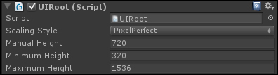
The UIRoot component has four parameters:
Scaling Style: The following are the available scaling styles:
PixelPerfect: This will ensure that your UI will always try to remain at the same size in pixels, no matter what resolution. In this scaling mode, a 300 x 200 window will be huge on a 320 x 240 screen and tiny on a 1920 x 1080 screen. That also means that if you have a smaller resolution than your UI, it will be cropped.
FixedSize: This will ensure that your UI will be proportionally resized depending on the screen's height. The result is that your UI will not be pixel perfect but will scale to fit the current screen size.
FixedSizeOnMobiles: This will ensure fixed size on mobiles and pixel perfect everywhere else.
Manual Height: With the FixedSize scaling style, the scale will be based on this height. If your screen's height goes over or under this value, it will be resized to be displayed identically while maintaining the aspect ratio (width/height proportional relationship).
Minimum Height: With the PixelPerfect scaling style, this parameter defines the minimum height for the screen. If your screen height goes below this value, your UI will resize. It will be as if the Scaling Style parameter was set to FixedSize with Manual Height set to this value.
Maximum Height: With the PixelPerfect scaling style, this parameter defines the maximum height for the screen. If your screen height goes over this value, your UI will resize. It will be as if the Scaling Style parameter was set to FixedSize with Manual Height set to this value.
Even though the UI will look the same on different resolutions, the aspect ratio is still a problem since the rescale is based on the screen's height only. If you want to cover both 4:3 and 16:9 screens, your UI should not be too large—try to keep it square. Otherwise, your UI might be cropped on certain screen resolutions.
On the other hand, if you want a 16:9 UI, I recommend you force this aspect ratio only. Let's do it now for this project by performing the following steps:
Navigate to Edit | Project Settings | Player.
In the Inspector option, unfold the Resolution and Presentation group.
Unfold the Supported Aspect Ratios group.
Check only the 16:9 box.
Now that we have seen the UI Root's different parameters, let's discuss the camera.
Select the Camera GameObject in the Hierarchy view. It has the
UICamera.cs script attached to it. This script must be attached to any camera that needs to interact with your UI.
Its purpose is to send different messages concerning events that happen to UI elements such as colliders attached to a button. Some of the more frequently used events are OnClick() and OnHover().
You may have multiple cameras if you consider it necessary; for example, you can have an orthographic camera for 2D in-game UI elements and a separate perspective camera for a 3D pause menu.
For the purpose of this book, we will stick with only one camera.
The UICamera.cs script has a large number of parameters as shown in the following screenshot:
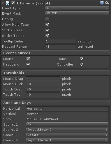
These parameters are as follows:
Event Type: Select which event type this camera will send.
World: This is used for interacting with 3D-world GameObjects
UI: This is used for interacting with the 2D UI
Event Mask: Select which layer will be used to receive events.
In our case, we will set it to GUI2D since our UI will reside on it.
Debug: This consists of the enable or disable debug mode options. This option is useful when you have unwanted behavior.
Enabled: When Debug is enabled, the currently hovered object will be displayed on the top left-hand corner of the screen
Allow Multi Touch: This consists of the enable or disable touch mode options that allow simultaneous touches. This is mandatory if you want to use pinch-to-zoom or other such gestures on mobile platforms.
Sticky Press: This consists of the enable or disable sticky press mode options.
Enabled: If you drag your finger out of a pressed button, it will remain in the pressed state and no other element will receive upcoming events from that finger until it is released
Disabled: If you drag your finger out of a pressed button, it will no longer be pressed and other elements will receive upcoming events from that finger
Sticky Tooltip: It consists of the enable or disable sticky tool tip mode options.
Enabled: The tool tip disappears when the mouse moves out of the widget
Disabled: The tool tip disappears as soon as the mouse moves
Tooltip Delay: It consists of the required stationary time in seconds before the widget's tool tip is displayed.
Raycast Range: A raycast is an invisible ray that is cast from one point towards a specific direction and is stopped if it encounters another object. The camera uses raycasts from the mouse or touch position towards the camera's forward direction to detect collisions and handle events. You may set the range of this raycast if you need to limit the interaction to a certain range. The default -1 value implies that the raycast's range will be as far as the camera can see.
Event Sources: These Booleans let you specify what events this camera listens to.
Mouse: This is used for mouse movements, left/right/middle click, and scroll wheel.
Touch: This is used for touch-enabled devices.
Keyboard: This is used for keyboard input. It uses the
OnKey()event.Controller: This is used for joystick-based devices. It uses the
OnKey()event.
Thresholds: These values come in handy when you want to specify the minimum values before a particular event is triggered. This may vary from one game/app to another.
Mouse Drag: When a mouse button is pressed (the
OnPress()event is triggered), this value determines how far in pixels the mouse must move before it is considered a drag, and sendsOnDrag()events to the dragged objectMouse Click: When a mouse button is pressed (the
OnPress()event is triggered), this value determines how far in pixels the mouse can travel before the button release has no effect (theOnClick()event is not triggered)Touch Drag: This is the same as Mouse Drag, but for touch-based devices
Touch Tap: This is the same as Mouse Click, but for touch-based devices
Axes and Keys: These parameters let you assign Unity input axes and keys to NGUI's input system.
Horizontal: This is the input axis for horizontal movement (the left and right key events)
Vertical: This is the input axis for vertical movement (the up and down key events)
Scroll: This is the input axis for scrolling
Submit 1: This is the primary keycode for validation
Submit 2: This is the secondary keycode for validation
Cancel 1: This is the primary keycode for cancel.
Cancel 2: This is the secondary keycode for cancel.
Ok, we have seen what the main parameters of the UICamera component are. We have to see what the camera's anchor child is.
An anchor is used to attach GameObjects to the same area inside the camera view. For example, you can attach them to borders or corners of the screen, or another widget.
Select the Anchor GameObject in the Hierarchy view. It has the UIAnchor component attached to it. It is configured to center content on the screen based on the parent camera.
Before we create widgets, we must understand how these UIAnchor parameters modify their placement behavior.
The UIAnchor component has seven parameters as seen in the following screenshot:
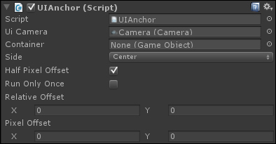
These parameters are as follows:
Ui Camera: This is the reference camera from which our anchor bounds are determined. By default, it is set to the camera used by the UI.
Container: If you drag and drop a GameObject in this field, it will overwrite the camera anchoring. This can be useful if you need to anchor your panels or widgets based on a container GameObject, instead of a camera. Your content will be placed using the assigned container's position.
Side: Do you want your child GameObjects to be centered or attached to one side or corner of your referenced camera/container? You can choose your anchor point here.
Half Pixel Offset: You should leave this Boolean checked. It makes widget positions pixel perfect on Windows machines.
Run Only Once: This Boolean can be checked if your screen resolution never changes, or if you want it to remove it on start. As a result, your anchor will be executed at the start and then removed and no longer be updated.
Relative Offset: This
Vector2class takes two values between -1 and 1 to add a relative offset to the final position. With a value of 0.12 for X and 0.32 for Y, it will result in an offset of 12% horizontally and 32% vertically—it will look the same on any resolution because the offset depends on the screen size.Pixel Offset: This parameter is like Relative Offset, but it is absolute instead of relative. You can enter the offset in pixels—it will look different depending on the resolution because the offset will stay identical in pixels on all screen sizes.
We have explained the different UIAnchor parameters, but what is this last child, Panel? Let's look into that, and we'll be ready to create our first widget!
Select the Panel GameObject in the Hierarchy view. It has a UIPanel component attached.
A panel's purpose is to hold widgets and render geometry in only one draw call. You may create multiple panels to split your UI, but it will add a draw call per new panel.
The
UIPanel.cs script has eight parameters as shown in the following screenshot:
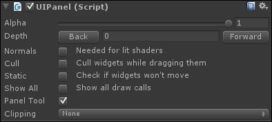
These parameters are as follows:
Alpha: You may change the transparency level of the entire panel. All child widgets will be affected by this alpha value, but nested panels won't.
Depth: This is used to define which panel is rendered over another. A panel with a depth value of 1 will appear in front of a panel with a depth value of 0. You can use either the Back or Forward button to change the Depth or simply enter a number in the field. Panels can also have negative depth.
Normals: This Boolean must be checked if you need it to react to lighting using shaders. It will calculate normals for your UI geometry.
Cull: This Boolean gives you the ability to disable the child widgets rendering while the panel is being dragged, which improves performance.
Static: If all your panel's widgets are static and won't ever move, check this—it will improve performance!
Show All: This will show all draw calls in the Inspector view.
Panel Tool: This is a panel managing tool. You can visualize and select each panel in the scene. You can open it with Alt + Shift + P or navigate to NGUI | Open | Panel Tool. Will this panel show in the Panel Tool parameter? This should be unchecked for dynamically created temporary panels through code, like a warning message or ammo pick-up notification.
Clipping: This will let us hide widgets outside a given rectangle. When turned on, you will be able to choose the clipping rectangle's dimensions with the
CenterandSizeparameters. Anything outside this rectangle will be hidden.None: No clipping—the entire panel will be displayed.
Hard Clip: Clipping enabled—rough clipping of widgets outside the box.
Soft Alpha: Clipping enabled—soft clipping with fade-out / fade-in borders.
We've now taken a look at the parameters of the UIPanel component, which will be used to hold our widgets.