
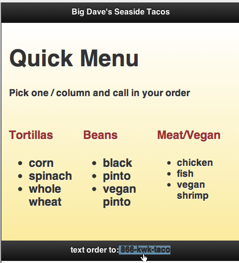
As we have discussed, columns play a greatly diminished role in pages designed for mobile devices. The reason is obvious: there isn't much width in the viewport of a mobile phone, and even tables have a narrower screen than laptops. Nevertheless, there are plenty of situations where it is useful to lay out content in columns in mobile-friendly pages. When that is appropriate, the tool is jQuery grids.
Can we
use the good old <div> tags that served us so well in HTML to lay out page content in columns? Yes. What about using tables for layout? Well, that technique is actually supported within jQuery Mobile pages.
In addition, just to elaborate a bit, the only reason we don't use tables for page layout in jQuery pages is the same reason we don't use them anywhere else: they are clunky, hard to apply global styles to, hard to update, and don't support a lot of the attributes div containers support. That said, table design enthusiasts take note...