
The four CSS3 transitions resize, translate (move), rotate, and skew are applied to selected content as effects. That is to say, they change the display or appearance of objects, but not their underlying properties.
These transformations make it possible to present distortions of text or images that, before the advent of CSS3, normally was done through images using an image of text to present that text skewed, rotated, or scaled.
Rather than pushing my written communication skills beyond their limits, let's take advantage of the following screenshot to illustrate these four transitions:
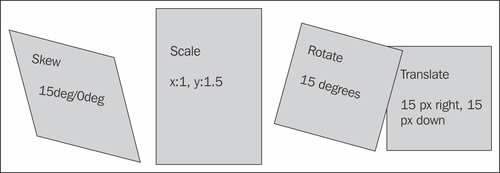
The skew and rotate transforms can be used to present text or images in an intriguing and unique way, while maintaining the user's ability to select (and copy, paste, click on, and so on) text. The translate transform can be used to place one block of content over another (as in the illustration above).
The scale transform can be used to stretch, or resize type or images...