

Following are the important aspects of Visualization that are important for our discussion:
- Stories: After creating a model, you create stories to explore your model data. A story consists of one or more pages to present model data using objects such as charts, geomaps, tables, text, shapes, and images. To create a new story, you go to Create | Story from the main menu. You are asked to select one option from the provided four options that determine how you want to start your story. Usually, you start by adding a canvas page, where you put objects manually. For further details, see Chapter 4, Creating Stories Using Charts.
- Charts: SAP Analytics Cloud comes with a variety of charts, so choose the best chart type to present your analysis. You can add multiple types of charts to a single story page. You will learn how to add charts to your story pages in Chapter 4 to 6.
- Geomap: The models that include latitude and longitude information can be used in stories to visualize data in geomaps. By adding multiple layers of different types of data in geomaps, we can show different geographic features and points of interest enabling us to perform sophisticated geographic analysis. You will create geomaps in Chapter 6, Analyzing Data Using Geo Maps and Other Objects.
- Table: A table is a spreadsheet-like object that can be used to view and analyze text data. You can add this object to either canvas or grid pages in stories. Tables and grids are discussed in Chapter 7, Working with Tables and Grids.
- Static and dynamic text: You can add static and dynamic text to your story pages. Static text is normally used to display page titles, while dynamic text automatically updates page headings based on the values from the source input control or filter. You will add these two types of texts to your story page in Chapter 5, Extending Stories with KPI, Filters and other Handy Objects.
- Images and shapes: You can add images (such as your company logo) to your story page by uploading them from your computer. In addition to images, you can also add shapes, such as line, square, or circle, to your page. These topics are covered in Chapter 5, Extending Stories with KPI, Filters and other Handy Objects.
When you create a story, a new story with a default name appears on your screen, as illustrated in the following split screenshots:
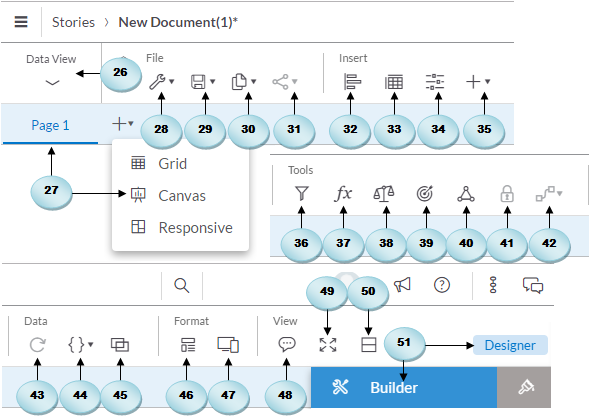
- The Data View option lets you explore your model data. When you click on this option, the canvas hides, and two new panes appear on your screen, where you can see the measures and dimensions of your selected model. For further details, see in Chapter 2, Models in SAP Analytics Cloud, and Chapter 3, Planning Model.
- You can create three types of pages in your stories: grid, canvas, and responsive. A grid is like an Excel sheet. You add a grid page and then add data by typing in numbers or pasting from another application or by adding a table based on an existing model. Grids and tables will be discussed in Chapter 7, Working with Tables and Grids. On canvas pages, you can lay out charts, tables, geomaps, images, and other objects to present your data. You will learn about the use of the canvas page in Chapter 4, Creating Stories Using Charts.
The responsive page allows you to create flexible dashboards that can be presented on any screen size. This responsive page is a new enhancement to the application in which you can arrange your content in up to six lanes. The content is presented in order starting from the leftmost lane and ending at the rightmost lane. You can add or remove lanes using the options provided in the vertical toolbar, which is displayed to the right of every lane. Once you have added objects such as charts or geomaps to the responsive page lanes, click on Device Preview (47) to see how the page will look in different screen sizes. The page that appears lets you choose different screen sizes as follows: small 300 pixel wide displays, medium 768px, laptop 1366px by 768px, HDTV 1920px by 1080px, and 4K UHD 3840px by 2160px.
- The Edit Story menu has two options: Story Details and Preferences. Clicking on the Story Details option presents a dialog where you can change the name of your story and provide a description, which is optional. The name you provide here appears on top of the screen beside the stories breadcrumb. Using the second option, you can change canvas and responsive page sizes and background colors. You can also set Preferences for your charts, geomaps, tables, and other elements in the Story Preferences dialog.
- The Save icon also comes with a number of options. The Save option is generic and is used to save your story. Using the Save As option, you save a story with a different name. The Save As File option lets you save a story as a PDF file. The Save As Template option saves your story as a template, which can be used to create a new story.
- The Copy and Paste icon carries utilities that you have already used in Windows applications. These utilities allow you to copy the selected object(s) to your clipboard, an existing story page, or to a new canvas. You can also duplicate the selected object(s) on the same canvas.
- If you want to share your story with other users, click on the Share icon, and choose whether you want to share the story with all users or only selected users.
- The Chart toolbar option adds a blank chart to the canvas. After adding a chart, use the Designer panel to format and manipulate the data in it.
- This option is similar to the chart option and is used to add a blank table to the canvas. Again, using the Designer panel, you can set properties to show data in the new table.
- Using the Input Controls, you define some values that act as variables in your calculations. By selecting values in an Input Control, a user can influence the result of a calculation without modifying the underlying data or formula. You will use input control in Chapter 4, Creating Stories Using Charts.
- The Add icon lists additional objects, such as geomap, image, shape, text, RSS reader, web page, value driver tree, and symbols that you can add to your story page.
- You can apply two types of filters: story filter and page filter. If you want to apply filters to all charts in a story, use the story filter. The page filter, as the name implies, can be applied to just one page in a story. See this topic in Chapter 5, Extending Stories with KPI, Filters and other Handy Objects.
- Just link an Excel worksheet. You can also add formulas to a table element. The Formula Bar icon is used to see the formula you entered in a table cell. When you click on this icon, a Formula Bar appears under the page tab. You will use the Formula Bar in Chapter 7, Working with Tables and Grids.
- If you use a measure in multiple charts in a story, the measure values are usually scaled differently on these charts, which makes it difficult to compare the values. Using the Chart Scaling option, you can scale these charts so that measures have the same scale across multiple charts.
- The Conditional Formatting option is used when you want to highlight some key information, such as low sales. Thresholds are used to provide visual cues for your information. By defining thresholds on your objects, you can see at a glance what areas are performing well and what areas need improvements. Conditional Formatting will be used in Chapter 4, Creating Stories Using Charts.
- You can add linked analysis to create interaction between charts within a story. When you establish a link and drill through hierarchical data or create filters, multiple charts in your story are updated simultaneously. This topic is discussed in Chapter 5, Extending Stories with KPI, Filters and other Handy Objects.
- Using this icon, you can turn a table cell on or off. For example, if you enter a formula in a table cell and do not want other users to change it, click on the cell and then click on the lock icon. The value in the cell will freeze. To allow modification, click on the lock icon again to unfreeze the value.
- The Cell Reference option creates a link between two cells to show the same value. For example, if you copy a value from a table cell and paste it to a cell in a grid that does not belong to a table, a cell reference is created. Any change you make to one cell is propagated to the other. Use the Show/Hide option to view cell references. To break the link between cells, select the reference cell in the grid, and then select Remove Reference.
- Used to refresh table data.
- When you use variables in a model and then use that model in a table, you are prompted to set values for the variables. The Edit Prompts option allows you to change a variable setting at any other time. When you click on this icon and select a model, you see the Set Variables dialog, where you can modify the values.
- In your stories, you can display data from multiple models in a single chart by linking dimensions in those models. When you click on this icon, the Link Dimensions dialog box appears, where you specify the two models you want to link. This option is used in Chapter 6, Analyzing Data Using Geo Maps and Other Objects.
- With the help of the Layouts option, you can apply formatting to your story by using a template, which provides predefined layouts and placeholders for objects to help you build a story.
- After adding objects to a responsive page lanes, click on Device Preview to see how the page will look in different screen sizes.
- You add comments to a story page to provide some vital information to other users. When you add a comment, other users can see and reply to it. The Comment View icon shows the number of comments to view. Hitting this icon shows the comment number at the top of the relevant page. Clicking on this number displays the comment. You will see Comment View in action in Chapter 6, Analyzing Data Using Geo Maps and Other Objects.
- At any time while designing your story, you can click on the Present icon to see how your story will appear when it's presented or when users with view-only privileges view your story.
- While working on charts in a story, you sometimes want to see the underlying data to evaluate the results being displayed on those charts. Selecting the chart and clicking on the Examine icon opens a table showing values that the chart is based on.
- Use the Designer panel to format and manipulate the data in your canvas elements. The Designer panel consists of two tabs: Builder and Styling. On the Builder tab, you set the data source, measures, dimensions, colors, and more properties for the selected element. On the Styling tab, you specify properties such as background and font colors to change the physical appearance of the selected element.
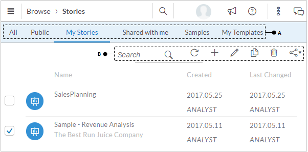
You can access all of your saved stories via main menu | Browse | Stories. When you use this route, the Stories page, as illustrated in the following figure, comes up. The six tabs (A) under the Stories breadcrumb let you see all stories, public stories that are available to everyone, stories you created, other people's stories shared with you, sample stories, and your templates. Using the options provided on the toolbar (B), you can search for stories by name, refresh the stories list, create a new story, modify the name and description of an existing story, copy, delete, or share selected stories: