Book Image

Flutter Projects

By : Simone Alessandria
Book Image

Flutter Projects

By: Simone Alessandria

Overview of this book

Flutter is a modern reactive mobile framework that removes a lot of the complexity found in building native mobile apps for iOS and Android. With Flutter, developers can now build fast and native mobile apps from a single codebase. This book is packed with 11 projects that will help you build your own mobile applications using Flutter. It begins with an introduction to Dart programming and explains how it can be used with the Flutter SDK to customize mobile apps. Each chapter contains instructions on how to build an independent app from scratch, and each project focuses on important Flutter features.From building Flutter Widgets and applying animations to using databases (SQLite and sembast) and Firebase, you'll build on your knowledge through the chapters. As you progress, you’ll learn how to connect to remote services, integrate maps, and even use Flare to create apps and games in Flutter. Gradually, you’ll be able to create apps and games that are ready to be published on the Google Play Store and the App Store. In the concluding chapters, you’ll learn how to use the BLoC pattern and various best practices related to creating enterprise apps with Flutter. By the end of this book, you will have the skills you need to write and deliver fully functional mobile apps using Flutter.
Table of Contents (15 chapters)
12
Assessment

Creating your first Flutter app

A Flutter application is made of widgets, and widgets are the description of a part of the user interface. Every user interaction, and everything that the user sees when navigating your app, is made of widgets. The app itself is a widget!

That's why when you begin using Flutter, one of the concepts that you'll hear most often is that "in Flutter almost everything is a Widget." This is mostly true.

You use Dart to write widgets. If you have some experience in mobile or web programming, then you may find this a bit unsettling. Most of the other mobile frameworks use some form of XML or HTML to describe the user interface, and a full programming language for business logic. In Flutter, you use Dart to describe both—the user interface, as well as the business logic of your app.

The app we'll build in this chapter is a single-screen app, with some text, a picture, and a button that, when clicked, gives the user a message. So, even if the app is extremely simple, you'll get to see many features of Flutter, including the use of widgets, styling text, downloading images from the web, and the creation of alerts.

Running your first Hello World app

For this first project, we'll be using the Flutter CLI to create the app. So, to get started, let's make sure everything's ready in your system:

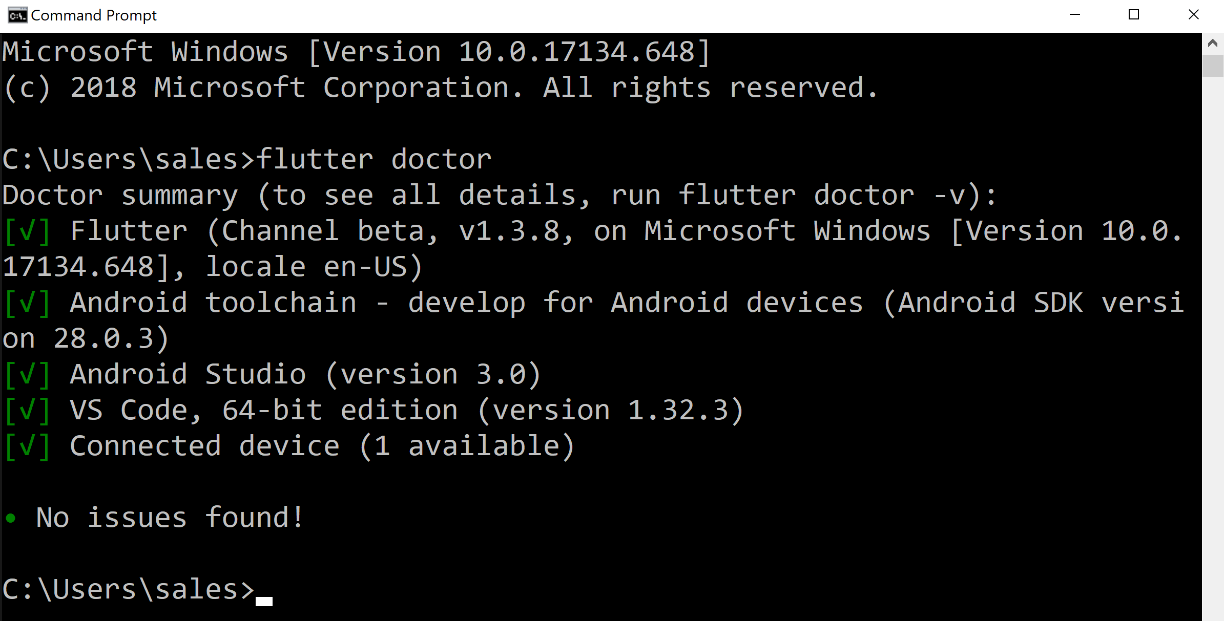
  1. Open your terminal window and type flutter doctor.

You should see a few messages, such as in the following screenshot (this is from a Windows machine that was set up for Android):

If you see some errors here, please make sure that an emulator/simulator is currently loaded, or that a physical device is correctly connected. If that doesn't solve your issues, please review the installation steps in the appendix.

  1. Then, type the flutter create CLI command in order to create a new app:
flutter create hello_world

flutter create creates a new project, called hello_world. The rule for naming projects is lowercase_with_underscores. The flutter create command should have created a new folder, called hello_world, which contains all the default project's files that are required for the execution of your app.

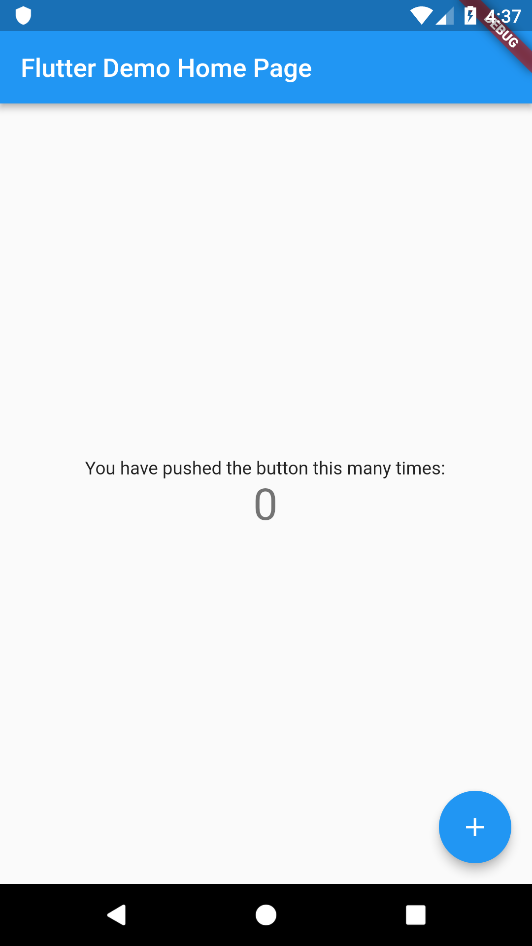
  1. To see the result of this step, from your terminal, type the following code:
cd hello_world 
flutter run

After a few seconds, you should see the Flutter default app, similar to the following screenshot:

Now, we need to change this project so that it serves our Hello World Travel agent. In order to do this, continue with the following steps:

  1. Let's stop the project by typing, Ctrl + C on your terminal, and then Y.
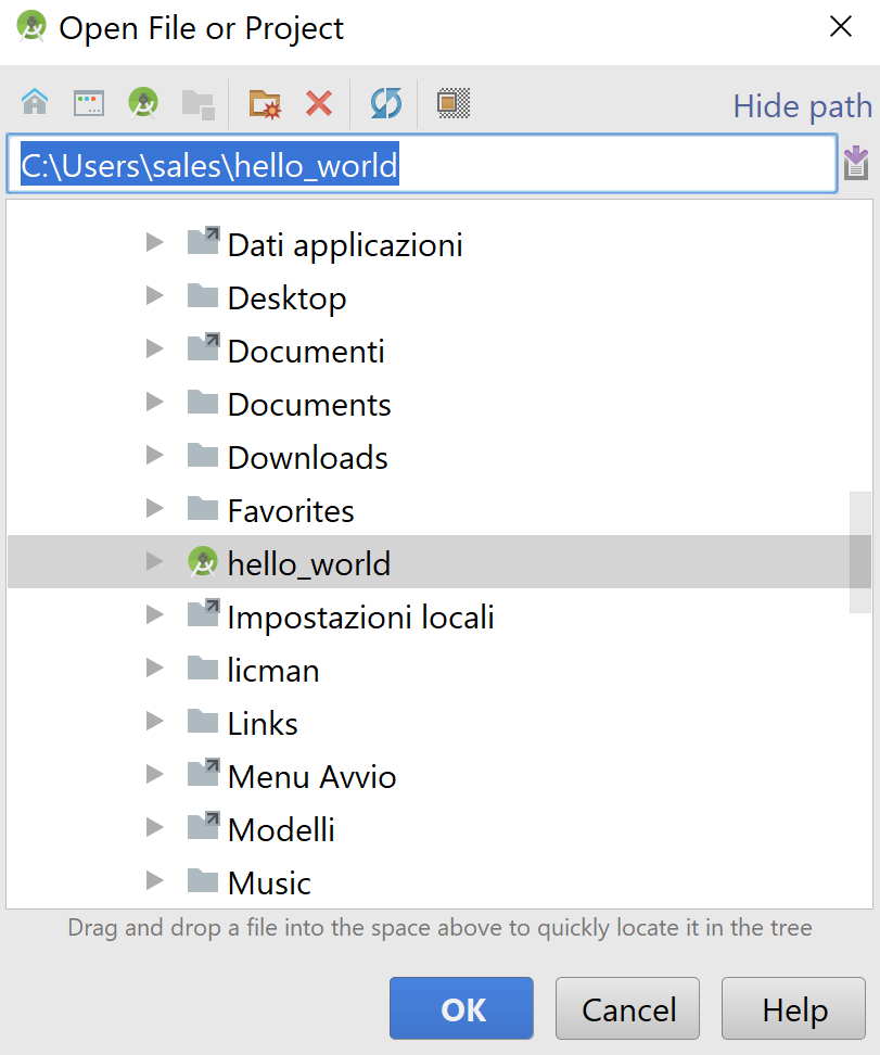
  2. Next, open your editor. For this chapter, we'll use Android Studio.
  3. From the Android Studio File menu, select Open..., then navigate to the project folder and click the OK button:

This will open the Flutter project in the IDE.

  1. In the editor, you should see a file called main.dart, which contains the code of the default app. Let's delete all the content of the main.dart file, and type the following code:
import 'package:flutter/material.dart';

void main() => runApp(MyApp());

class MyApp extends StatelessWidget {
@override
Widget build(BuildContext context) {
return Center(
child: Text('Hello World Travel',
textDirection: TextDirection.ltr,),
);
}
}

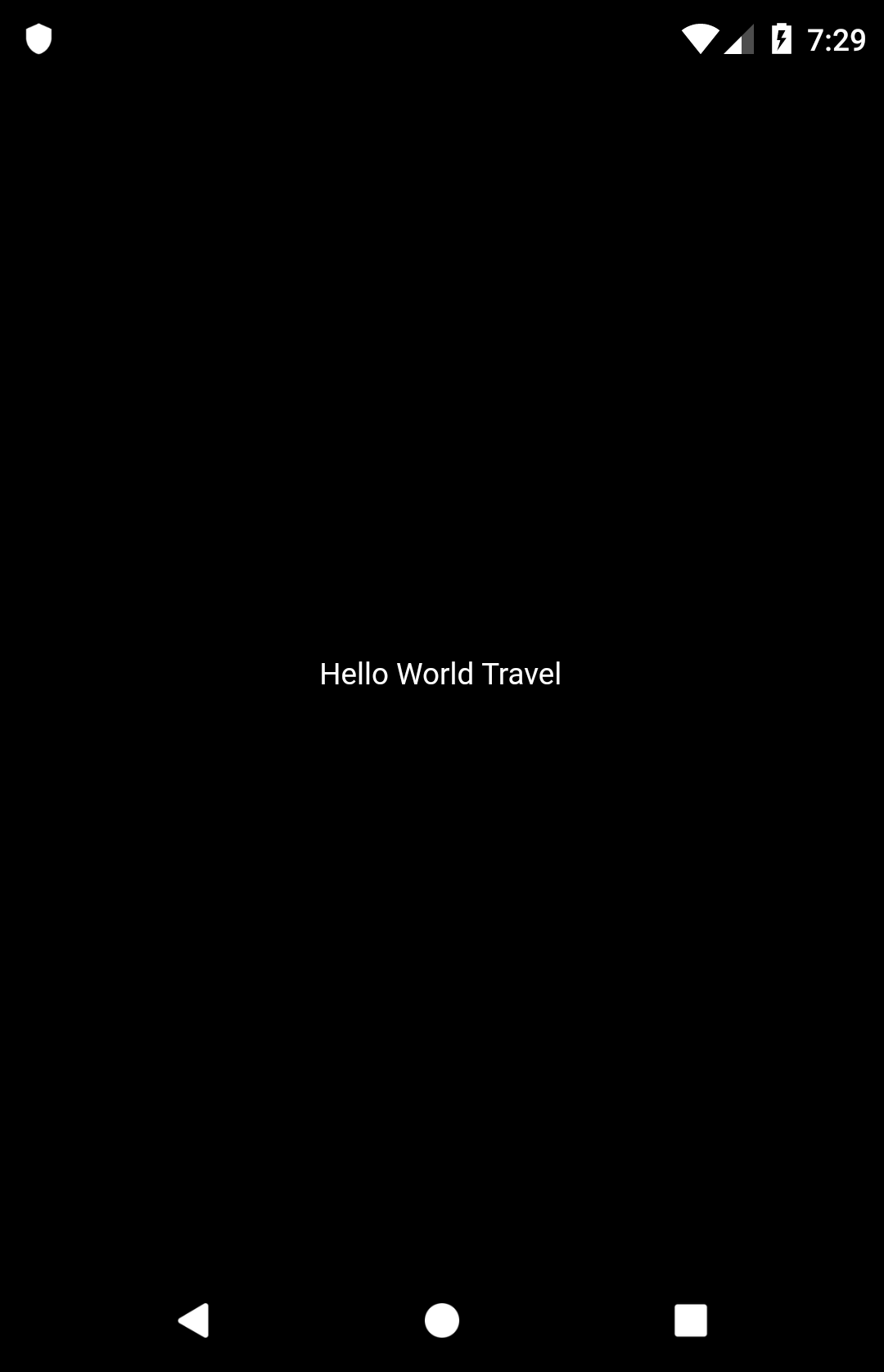
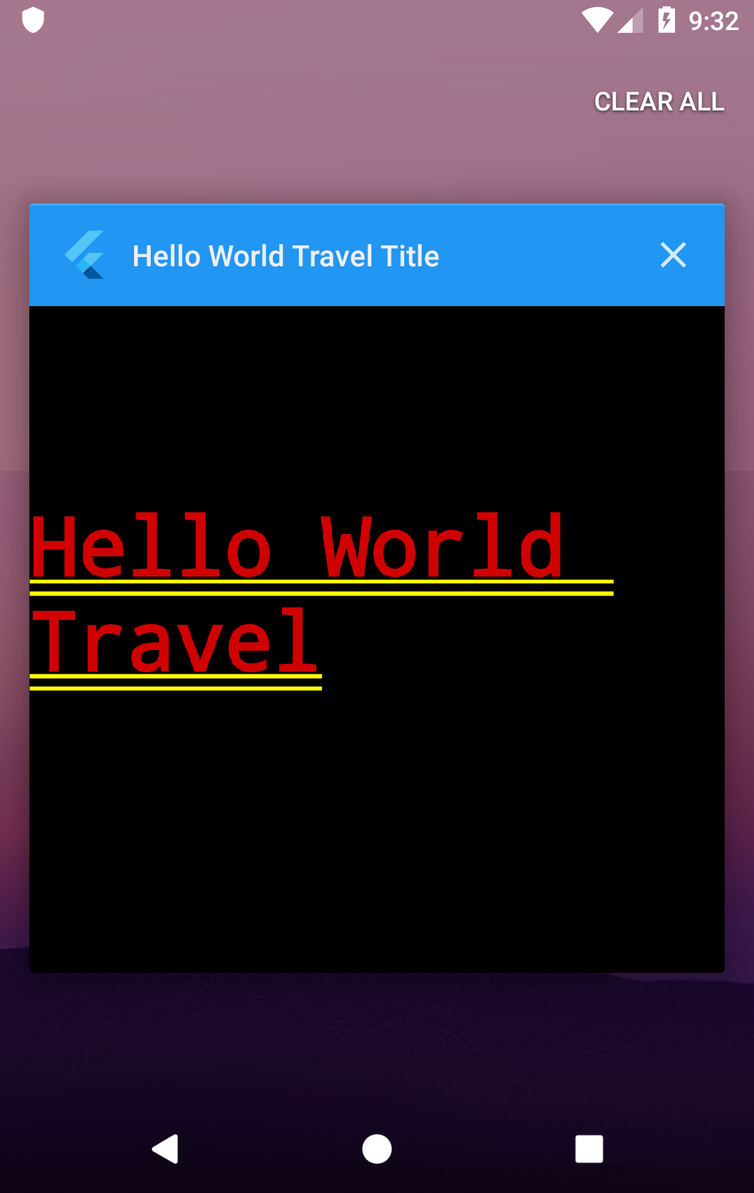
You can try out this code by pressing the Run button on the Android Studio toolbar, or by using the Shift + F10 keyboard shortcut. You should see that the app now looks like the following screenshot:

Let's see the code that we have written, line by line:

import 'package:flutter/material.dart';

In the first line, we import the material.dart package. A package is a library that contains reusable code. The material.dart package is a container of widgets, and in particular, material widgets that implement Material Design. Material Design is a visual design language that was developed by Google.

Next, we create a method, called main:

void main() => runApp(MyApp());

As you've seen in the Dart examples, this is the entry point of any Dart app, and this is the same for Flutter apps.

For the main() method, we use the arrow syntax to call runApp(). The runApp() method inflates a widget and attaches it to the screen. To put it simply, the runapp() method will show the widgets that you have placed inside the app on the screen.

Flutter's widgets aren't views themselves, so they don't draw anything: they are simply a description of the user interface. This description gets “inflated” into an actual view when the objects are built.

The following line states that MyApp is a class that extends StatelessWidget:

class MyApp extends StatelessWidget {

In Flutter, there are two kinds of widgets: stateless and stateful. You use stateless widgets when you do not need to change the widget after its creation. In this case, the text in the screen ("Hello World Travel") will never change during the app lifecycle, so a stateless widget is enough for this app. On the other hand, you'll use stateful widgets when their content (or state) needs to change.

In Flutter, the widget tree is the way that you organize widgets in an app.

While HTML pages have the DOM, or Document Object Model, Flutter calls the hierarchical list of widgets that makes the UI a "widget tree."

The build() method in the following line of code is automatically called by the Flutter framework when a widget is inserted into the widget tree:

Widget build(BuildContext context) {

In our example, the widget tree is made of only two widgets: the Center widget and the Text widget. The build() method returns a widget.

Center is a positional widget that centers its content on the screen:

return Center(

So, whatever you put inside a Center widget will be centered horizontally and vertically.

child is a property that allows you to nest widgets inside other widgets. Text is a widget to show text:

child: Text('Hello World Travel',
textDirection: TextDirection.ltr,),

Note that in this case, you also need to specify a textDirection instruction. ltr means left to right. So, you are using the child property of the Center widget, to put a Text widget in the center of the screen. By default, the background color of the screen is black.

This is probably not the most beautiful app that you've ever seen, but we'll keep working on it, and, most importantly, congratulations! You have written your first Hello World app!

Using MaterialApp and Scaffold

A black screen with small white text doesn't really look like a real app. We'll try to fix that by taking the following steps:

  1. Let's introduce the MaterialApp widget, which is the container that you'll use when creating Material Design apps. Material Design is a design language that Google developed in 2014, based on "materials," such as ink or paper, with an implementation that was even more advanced than physical materials. Flutter fully supports Material Design.
If you are interested in learning more about Material Design, have a look at the material.io (https://material.io/) website. It's full of examples and ideas that you can use for the web, mobile, and of course, your next wonderful app in Flutter!
  1. For most of your apps, you'll probably wrap your content in a MaterialApp widget. This also allows you to give a title to your app. So let's change our code like this:
import 'package:flutter/material.dart';

void main() => runApp(MyApp());

class MyApp extends StatelessWidget {
@override
Widget build(BuildContext context) {
return MaterialApp(
title: "Hello World Travel Title",
home: Center(
child: Text('Hello World Travel')
));
}
}
  1. Instead of returning a Center widget, we are now returning MaterialApp, which has two properties: title and home. Home is what the user will actually see on the screen of the app. You may notice that when you use MaterialApp, you don't need to specify the text direction, as the text direction is chosen based on the device's locale information.
Currently, languages that use the right-to-left text direction are Arabic, Farsi, Hebrew, Pashto, and Urdu. All other languages use left to right.
  1. If you run the app, you'll see that a couple of things changed in it. If you are using Android, you will now see the app title if you scroll through your apps, and the font size has changed:
  1. It looks even worse than before. Let's quickly add a Scaffold widget. A Scaffold widget represents a screen in a MaterialApp widget, as it may contain several Material Design layout widgets, including AppBar, a bottom navigation bar, floating action buttons, and the body of the screen. We'll use those widgets extensively throughout the book.
  2. A Scaffold widget allows you to add an application bar to your app. In the appBar property, we'll place an AppBar widget, which will contain the text that you want to show in the application bar.
  1. Let's set the text to be added to the Hello World Travel App, as shown in the following code block:
class MyApp extends StatelessWidget {
@override
Widget build(BuildContext context) {
return MaterialApp(
title: "Hello World Travel Title",
home: Scaffold(
appBar: AppBar(title: Text("Hello World Travel App")),
body: Center(
child: Text('Hello World Travel')
)));
}
}

The Scaffold widget has two properties that we used: appBar, which contains an application bar, and body, which contains the main content of the screen.

So, our app now definitely looks more like an app, even though it only contains a small amount of text:

Let's now add a few more widgets to make our app more interesting.

Formatting Text and Using Columns

Our customer, Hello World Travel, loves blue and purple, and so we need to change the colors of our app, as well as the formatting of our text. Let's change the MyApp class code as shown here:

class MyApp extends StatelessWidget {
@override
Widget build(BuildContext context) {
return MaterialApp(
title: "Hello World Travel Title",
home: Scaffold(
appBar: AppBar(
title: Text("Hello World Travel App"),
backgroundColor: Colors.deepPurple,),
body: Center(
child: Text(
'Hello World Travel',
style: TextStyle(
fontSize: 26,
fontWeight: FontWeight.bold,
color: Colors.blue[800]),)
)));
}
}

We've added a couple of features to the app. First, we added a background color for the AppBar as shown here:

backgroundColor: Colors.deepPurple,

The Colors class contains several colors that we can use out of the box, including deepPurple, which we used there. In the color, you can also choose a shade, which is generally a number from 100 to 900, in increments of 100, plus the color 50. The higher the number, the darker the color. For example, for the text, we chose a color of blue[800], which is rather dark:

style: TextStyle(   fontSize: 26,
fontWeight: FontWeight.bold,
color: Colors.blue[800]),)

In the Text widget, we used the style property to add a TextStyle class, and there we chose a bigger fontSize, a bold fontweight, and of course, color.

Our app is definitely getting better, but we aren't finished yet. We now need to add a second piece of text below the first one. The problem right now is that the Center widget only takes one child, so we cannot add a second Text widget there. The solution is choosing a container widget that allows more than one child, and as we want to place our widgets on the screen, one below the other, we can use a Column container widget. A Column has the children property, instead of child, which takes an array of widgets. So let's change the body of the Scaffold widget, like this:

body: Center(
child: Column(children: [
Text(
'Hello World Travel',
style: TextStyle(
fontSize: 26,
fontWeight: FontWeight.bold,
color: Colors.blue[800]),
),
Text(
'Discover the World',
style: TextStyle(
fontSize: 20,
color: Colors.deepPurpleAccent),
)
]))

Now, the Center widget still contains a single child, but its child is a Column widget that now contains two Text widgets, 'Hello World Travel' and 'Discover the World.'

Showing images and using buttons

Let's now add an Image widget under the two texts, as follows:

Image.network(
'https://images.freeimages.com/images/large-previews/eaa/the-beach-1464354.jpg',
height: 350,
),

Image is a widget that has a network() constructor, which automatically downloads an image from a URL with a single line of code. The image is taken from FREEIMAGES (https://www.freeimages.com/), which contains a stock of free photos for personal and commercial use.

The height property of an image specifies its height, depending on the pixel density of the screen. By default, the width will be resized proportionally.

In Flutter, when we speak of pixels, we are actually speaking of logical pixels, and not physical pixels.
Physical pixels are the actual number of pixels that a device has. But, there are several form factors, and the resolution of a screen may vary substantially.
For example, the Sony Xperia E4 has a screen size of 5'', and a resolution of 960 * 540 pixels. The Xperia X has the same screen size of 5'', but a resolution of 1920 * 1080. So, if you wanted to draw a square of 540 pixels per side, it would be much smaller on the second device. That's why there's the need for logical pixels. Each device has a multiplier, so that when you use logical pixels, you don't have to worry too much about the resolution of a screen.

Let's also put a button under the image:

RaisedButton(
child: Text('Contact Us'),
onPressed: () => true,),

RaisedButton shows a button that a user can press (or click). Inside Raisedbutton, we have placed Text as the widget child, and in the onPressed property, we have created an anonymous () function with an arrow operator, and in the function, we are just returning true. This is only temporary. When the user presses the button, we want to show a message, and we'll do that later.

Next, you can see the code of the MyApp class so far, and the result on an Android emulator:

We have almost reached the end result that we wanted to achieve, but there are a couple of things that we need to fix. We should add some space between the widgets, and show a message when the user selects the Contact Us button. Let's begin with the message.

Showing an AlertDialog box

AlertDialogs are widgets that you use to give feedback or to ask for some information from your user. It is a small window that stays on top of the current screen, and only covers part of the user interface. Some use cases include asking for confirmation before deleting an item (Are you sure?), or giving some information to the user (Order completed!). In our code, we'll show our user the contact information of the Hello World Travel company.

Showing an AlertDialog widget requires a few steps:

  1. Calling the showDialog() method
  2. Setting context
  3. Setting builder
  4. Returning the AlertDialog property
  5. Setting the AlertDialog properties

Let's write a new method, called contactUs, at the end of the MyApp class:

void contactUs(BuildContext context) {
showDialog(
context: context,
builder: (BuildContext context) {
return AlertDialog(
title: Text('Contact Us'),
content: Text('Mail us at [email protected]'),
actions: <Widget>[
FlatButton(
child: Text('Close'),
onPressed: () => Navigator.of(context).pop(),
)
],
);
},
);
}

We are creating a contactUs method, that takes a context parameter. We then call the showDialog() function, which is required in order to show a message to the user. The showDialog function has a few properties that we need to set. The first one is context, which is basically where the dialog should be shown. This is passed to our method through the context parameter.

Next, we need to set the builder property. This requires a function, so we need to create a function that accepts a single argument of the BuildContext type, and returns a widget—in our example, AlertDialog, as shown here:

builder: (BuildContext context) {
return AlertDialog(

An AlertDialog widget has several properties that set the behavior of the message that you show to the user. The three properties that we are using in this example are title, content, and actions. In the following screenshot, you can see the result of using those properties:

You can see the Contact Us title, the Mail us at [email protected] content, and the actions—the Close button. In the actions, when you have more than one choice, you can place more than one button.

In the following excerpt of the code, the pop() method of the Navigator class will close AlertDialog. We'll talk more about screens and navigation in Flutter in the other projects in this book:

 return AlertDialog(
title: Text('Contact Us'),
content: Text('Mail us at [email protected]'),
actions: <Widget>[
FlatButton(
child: Text('Close'),
onPressed: () => Navigator.of(context).pop(),
)
],

Our AlertDialog is not showing yet. We need to make a couple of changes before you can use it. The first change is that we need to call the contactUs function that we have just created. We'll do that in the onPressed property of the RaisedButton widget:

onPressed: () => contactUs(context),

The second change that we need to perform is enclosing the Center widget in the body of the Scaffold widget in a Builder widget. This allows us to take the context of the Scaffold so that we can pass it to the showDialog method, as shown here:

body: Builder(builder: (context)=>Center(

For your reference, here is the final code that we have written so far:

import 'package:flutter/material.dart';

void main() => runApp(MyApp());

class MyApp extends StatelessWidget {
@override
Widget build(BuildContext context) {
return MaterialApp(
title: "Hello World Travel Title",
home: Scaffold(
appBar: AppBar(
title: Text("Hello World Travel App"),
backgroundColor: Colors.deepPurple,
),
body: Builder(builder: (context)=>Center(
child: Column(children: [
Text(
'Hello World Travel',
style: TextStyle(
fontSize: 26,
fontWeight: FontWeight.bold,
color: Colors.blue[800]),
),
Text(
'Discover the World',
style: TextStyle(fontSize: 20, color:
Colors.deepPurpleAccent),
),
Image.network('https://images.freeimages.com/
images/large-previews/eaa/the-beach-1464354.jpg'
,
height: 350,
),
RaisedButton(
child: Text('Contact Us'),
onPressed: () => contactUs(context),
),
])))));
}

void contactUs(BuildContext context) {
showDialog(
context: context,
builder: (BuildContext context) {
return AlertDialog(
title: Text('Contact Us'),
content: Text('Mail us at [email protected]'),
actions: <Widget>[
FlatButton(
child: Text('Close'),
onPressed: () => Navigator.of(context).pop(),
)
],
);
},
);
}
}

Note that, should you get lost when writing your code while following any project in this book, you can always check the final version of the app at the GitHub repository. In particular, the project for this chapter is available at https://github.com/PacktPublishing/Google-Flutter-Projects.

In the next section, let's see how to use padding to add some space to our app.

Using padding

All the functions of our app are there, but everything seems too crowded on our screen. Let's add some space between the widgets. Generally speaking, you can create space between elements through padding and margin properties. In Flutter, some widgets have a padding and a margin property to deal with the space. Padding is the space between the content and the border of a widget (which may also not be visible), and the margin is the space outside the border, as shown in the following diagram:

Flutter also has a widget that has been specifically created to deal with space: the Padding widget. In order to specify the distance (also called the offset), you use the EdgeInsets class. This class specifies offsets, for the margin or the padding, from left, top, right, and bottom. There are several named constructors for the EdgeInsets class.

The Edgeinsets.all constructor creates an offset on all four sides of a box: top, right, bottom, and left. In the next example, it creates an offset of 24 logical pixels on all sides of a box:

EdgeInsets.all(24)

In order to choose the side, or sides, for the offset, you can use the only() constructor. In the following example, you see on the screen, for instance, that you are creating a margin of 80 pixels on the right of a widget:

EdgeInsets.only(right:80)

The EdgeInsets.symmetric(vertical: 48.5) constructor allows you to create symmetrical vertical and horizontal offsets. All the constructors take double values as parameters:

EdgeInsets.symmetric(vertical:48.5)

So, in our code, let's add some spacing now:

  1. Let's enclose Center itself into a Padding widget, giving it an EdgeInsets.all class with 20 logical pixels on each side:
body: Builder(
builder: (context) => Padding(
padding: EdgeInsets.all(20),
child: Center(
child: Column(children: [
  1. Then, we'll repeat the same process for the two Text widgets—Image and RaisedButton. Let's begin by giving a 10-pixel padding to the 'Hello World Travel' text:
Padding(
padding: EdgeInsets.all(10),
child: Text(
'Hello World Travel',
  1. Next, let's add the padding to the 'Discover the world' text:
Padding(
padding: EdgeInsets.all(5),
child: Text(
'Discover the World',
  1. Next, we add padding to the Image widget:
Padding(
padding: EdgeInsets.all(15),
child: Image.network(
  1. Finally, we add padding to the button:
Padding(
padding: EdgeInsets.all(15),
child: RaisedButton(

If you try the app right now, depending on your device, everything might look okay, but we still have a problem. Let's see what it is in the next section.

Using SingleChildScrollView

Now that we added some space into the screen, we might run into a problem. Try to rotate your device so that you have horizontal view. You should see something like the following screenshot:

We have an error: Bottom overflowed by 250 pixels. This happens because the size of the UI is bigger than the size of the screen.


Always check your app in every orientation when developing for mobile.

There's an easy solution for this. We need to enclose everything in SingleChildScrollView:

builder: (context) => SingleChildScrollView(
child: Padding(

SingleChildScrollView is a widget that scrolls and has a single child, in our example, Padding. This is especially useful when your widget might take more space than the available space on the screen and you want to enable scrolling for the overflowing content.

If you try this now, you'll see that everything is working perfectly, and the user can scroll up and down if needed.

You have completed your first project in this book! Congratulations, you are well on your way to becoming a Flutter developer.