

First, get your paper and pencil out or use your favorite image editor. Like in previous projects, we'll design our views using sketches and wireframes first, then flesh them out a bit more to design the graphical assets.
As in previous projects, the first view is the start view, but since it is the same as all the prior apps, we won't go into detail about it here (refer to the Designing the UI/interactions section of Project 1, Let's Get Local!). Instead, let's go to the documents view, shown in the following screenshot:
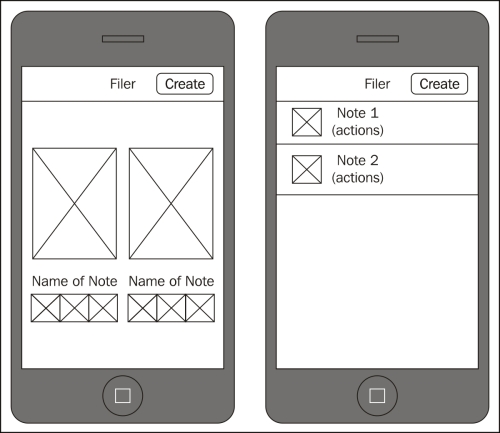
In this view we've actually got two looks; the left is for the iPhone, while the right is for Android. The reason for the two different looks is simply how a lot of apps do things on each platform. You typically see large, horizontal scrolling interfaces on iOS, and on Android you typically see vertical lists representing files.
Let's go over how this view works. The button in the navigation bar, named Create, allows the user...