

This app will be visually simpler than any of our previous apps. We only need one view, and the look of that view has already largely been defined by our Android interfaces for the last two projects. That's right; the view is essentially a list of items, nothing fancy.
There are some things we will change in our list of items. Essentially we will clean up the list by hiding the action icons (delete, share, and so on) and showing them only when we receive a gesture. We will also include Play and Pause buttons in the list item instead of any particular document image. After all, we don't have album art for recordings the user creates themselves.
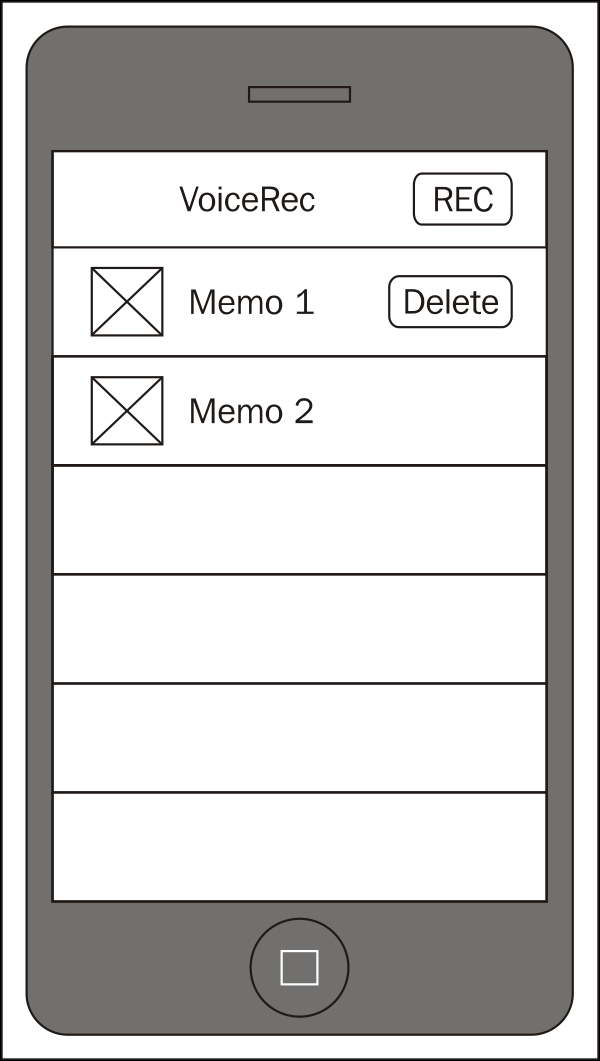
As you can see, this mockup is pretty similar to the Android file listings we've had in our previous projects. It is substantially different than the document-based list on iOS, but the preceding view is common enough that users will know how to use it.
The icons...