

Your users have a number of options when engaging with your app, or better said, your app and the user have a number of ways to engage with each other, both parties being able to initiate that engagement:
The main app
Glances
Complications
Notifications
The main app is the only part of this quartet that is always present in the bundle that gets installed on the watch by the phone app, the other three are optional, and whether to include them or not will depend entirely on what makes sense for your app. This itself adds a new dimension to your app design, as information can be spread across these various channels, partly duplicated, or some combination of both. While the scope and contents of the main app are directly comparable to the equivalent iOS apps, it is worth taking a brief look at what the other three do, how they do it, and what likely use cases they will be associated with.
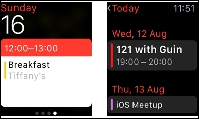
As the name might suggest, the Glance is meant as a brief, and one-way, encounter. The user is presented with a single screen of information, and is offered no interaction other than a single tap, which will take her to the main app. It is an interaction initiated by the user, swiping up from the clock screen. In the images below, you can see that the Glance (left) presents information in a format that is easy to read quickly, containing only essential information, while the main app presents more than just the most immediate data, but requires more than just a casual glance (hence the name) from the user:
Depending on the nature of your app, you may find your users consulting this screen more often than your main app, so it pays to regard the Glance as more than just a stripped down extension of your main app and to give it a level of attention commensurate with its importance. Those who enjoy rising to the challenge of doing a lot with limited resources will likely find this a most pleasing area of design and implementation.
It might seem strange to give the name Complication to a UI element, particularly given the emphasis Apple give to the simplicity of using the Watch, but the term actually stems from the tradition of watch-making, and refers to any information, typically dates and weekdays, presented by a watch beyond simply the time of day.
We can see in these images how some watch faces offer different numbers of Complications:
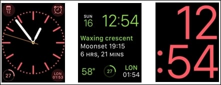
A Complication, as implemented on the Apple Watch, is your chance to present a very small amount of information on the watch face itself, if the user has selected your app from a list of those that offer information in this format. If implemented by yourself and activated by the user, this is also the most direct route to your app, since it involves just a solitary tap on the complication to launch your main app.
This is the one interface that can initiate an exchange between the user and your app. Modelled on and similar in many ways to what we already know from iOS Notifications, your app can draw attention to itself and present to the users a number of options, including launching your main app, or choosing from a set of actions to be undertaken.
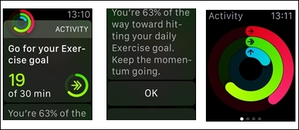
The Notification view (left) can be a scrollable view (center) and may offer the user the chance to choose actions, tapping the app icon launches the main app (right).
Once again, depending on your app's functionality, this may be the interface that your user sees and touches the most. Apple's own Messages app is such a case, in which a user may read all of his messages as they come in, but only react to a limited number of them.