
Now that we have produced some visualizations from the data, let's turn them into a useful interactive dashboard that we can use to gain more insight from the data.
Producing a useful interactive dashboard
Coloring
In our example, the right-hand bar chart is colored by sex. The colors assigned by Spotfire are not immediately indicative of the sex of a Titanic passenger, so let's fix that:
- Locate the legend for the bar chart.
- Click on the dot for the female data and choose a more appropriate color. I suggest a pale pink or similar:

- Do the same for male—click on the dot and choose a color suitable for male—I suggest a pale blue. For those viewing this in black and white, I apologize—you'll have to take my word for it...
Proportionality with bar charts and pie charts
It's all very well looking at the absolute numbers of female and male survivors, but this doesn't tell us the relative proportion of female and male passengers that survived.
Let's compare the use of bar charts and pie charts:
- Open the data panel again by clicking the Data button on the left-hand side of the Spotfire window.
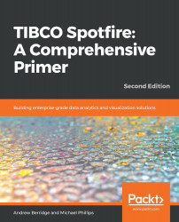
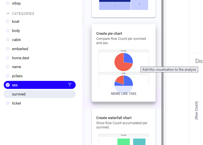
- If the recommendations panel isn't shown, click the double arrow (>>) to display it. Now let's select the sex column as the target and scroll to see the relationship between sex and survived (analyst client). Choose the bar chart and add it to the analysis:
If you are using the web clients, you'll need to select both sex and survived and click MORE LIKE THIS on the bar chart for survived and sex to get to the bar chart for sex and survived. Note that the order is important here, as it determines which column goes on each axis of the bar chart. We need the sex column to be on the x (categorical) axis.
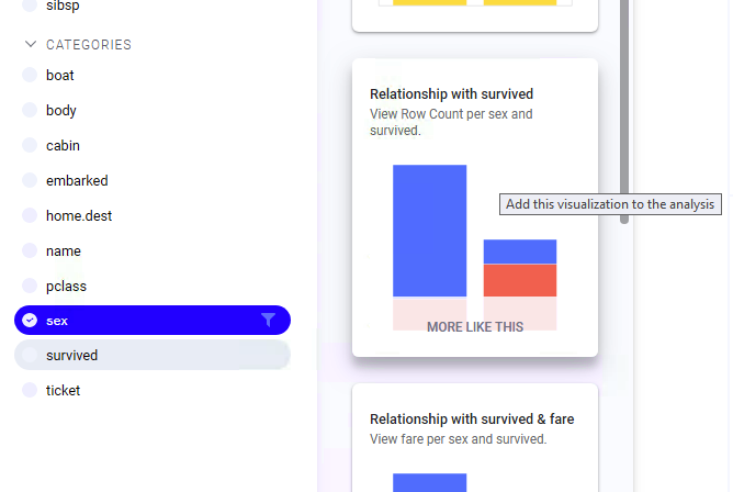
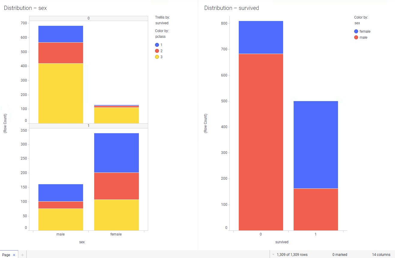
- Now, apply some coloring to the resultant bar chart to indicate that surviving is good and not surviving is bad! You should end up with something that looks roughly like this:
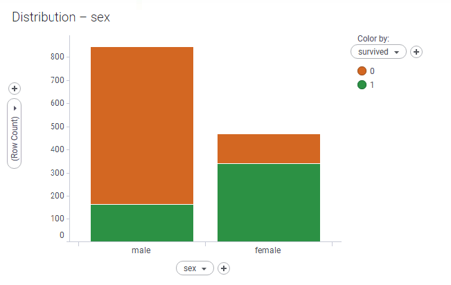
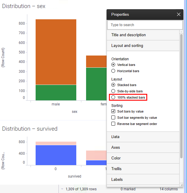
- That visual tells us the exact numbers of males and females that survived. How about proportionality? Right-click the visual and select 100% Stacked Bars (or in web clients, right-click to get access to the visualization Properties dialog and change the setting there):
- Let's return to the data panel once more in order to add a pie chart by showing the data panel and finding a pie chart that shows the same. In analyst clients, click MORE LIKE THIS to get to other representations of the relationship between sex and survived. In web clients, make sure sex and survived are selected in the data panel:
- Color the pie chart using the same color scheme as the last bar chart—doing that ties the visualizations nicely and visually.
- Your analysis should now look something like this. I have moved my visualizations around a bit by dragging their title bars:
A quick note on pie charts. There's a long-standing joke in the analytics community that the world's most accurate pie chart is this one:
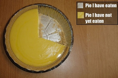
The truth of the matter is that pie charts are not a good way of representing many categories of information—the human brain cannot easily interpret the chart if many slices of the pie are shown. The brain cannot distinguish between the different amounts of the area of the circle. So, in general, I would discourage you from using pie charts, or at least to think very carefully before doing so!
- The bar chart tells us a lot more than the pie chart and is indicative of several dimensions of data. You can see the total number of passengers of each sex and the proportion of each that survived at a glance.
- Experiment with the settings of the bar chart by right-clicking on it and selecting the various options. For example:
- Change the bars to horizontal, stacked bars (the default), 100% stacked bars (as we just did), or side-by-side bars
- Change the Sort bars by value setting of the bar chart
Bar chart modes
There's no right or wrong way to represent the bars—each setting is useful in different circumstances.
Stacked bars are useful if you want to represent the absolute numbers and proportions, or have a large number of values on the categorical (x) axis.
100% is useful if you want to represent the proportions in a similar fashion to (but better than) pie charts.
Side-by-side gives a clearer view of the absolute numbers in each category of data.
Drilling in to the data – details visualizations
The visualizations we've explored so far allows us to understand what is happening—in our case, we've understood the proportions of male and female survivors. That's great, but what about drilling into the details of the data? Drilling in can help us explore why something is happening in the main dataset.
Spotfire makes it really easy to drill in to the data:
- Right-click on any of the visualizations you created earlier and highlight Create Details Visualization. A second menu will pop up:

- For the purposes of this exercise, let's use a bar chart (again!), so click Bar chart....
Bar charts are some of the most often used visualizations in Spotfire as they can represent data in so many different ways. I find them to be very useful! - Spotfire will create an auto-configured visualization that in itself isn't useful. It's also empty:

- Never fear—we can fix both these issues with a few clicks! Note that a new item has been added to the legend Data limiting: Marking. This means that, by default, no data will be shown on the visualization unless some data is marked in another visualization. In order to show some data, hover the mouse over some data in another visualization, click and drag it to create a rectangle, and select some data:
- The details bar chart will now update to show the selected data. It's still not terribly useful as it's currently just showing the same as the original visualization chart. To configure the x-axis (the bottom one), hover over the visualization, then click the down arrow on the x-axis selector (it appears when you hover over the visualization):

- From the resultant dropdown, choose age. That's more like it!
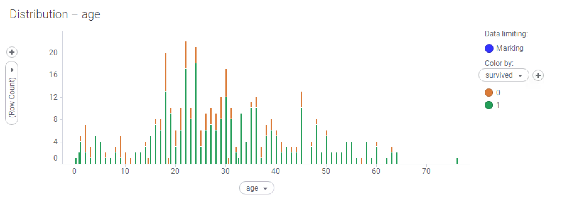
- However, it's not yet quite as useful as it should be—notice that the overall shape of the graph is indicative of a distribution of the data (move on to see more), but the tall bars are often interspersed with very short bars between them. This is an example of a real-world data issue that prevents us from visualizing the trend in the data properly. The cause is that some people have been recorded with fractional ages. Babies under one year old have ages recorded as a fraction of a year; there are also some adults recorded as being x.5 years old. Why? I don't know, but let's fix it!
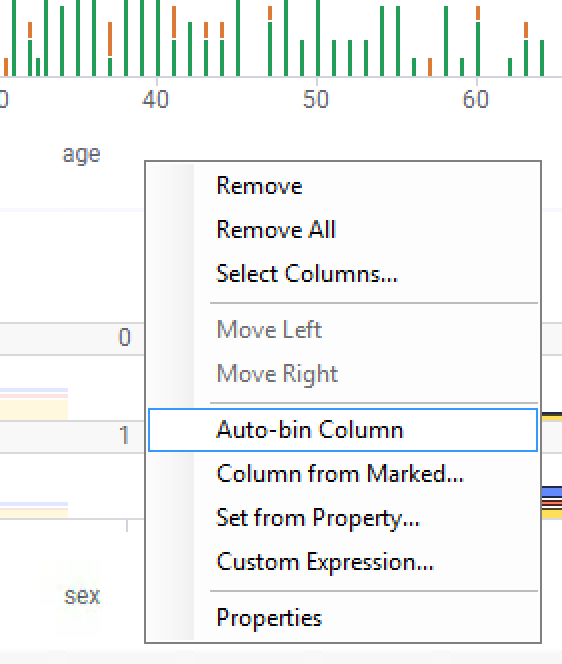
- If you're using an analyst client, right-click on the x-axis selector (showing age) and choose Auto-bin Column:
- In a web-based client, follow these steps:
- Right-click on the x-axis column selector and choose Custom Expression....
- Enter the following custom expression:
AutoBinNumeric([age],80)
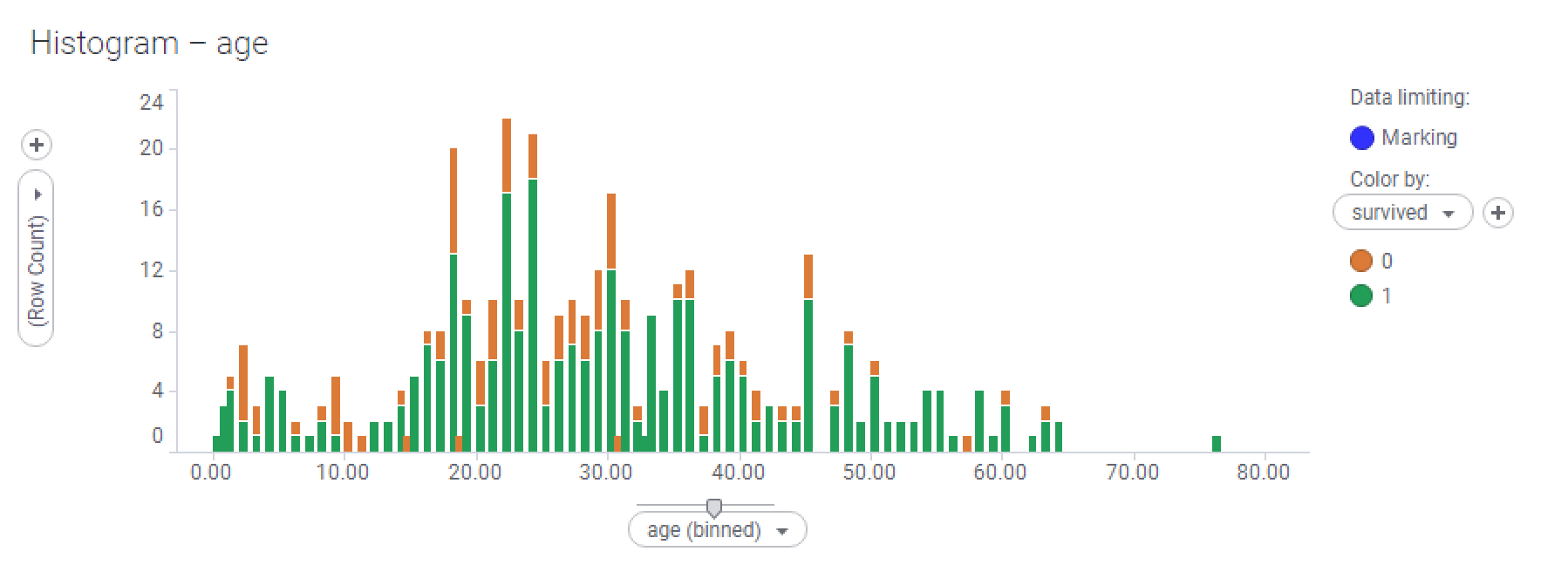
- You'll notice that the visualization will change to look more blocky. What's happening is that Spotfire is binning the data, or grouping close values together to reduce the number of categories on the x-axis. In analyst clients, you can slide the little slider up and down on the axis slider to change the number of bins (this affects the granularity of the x-axis), or you can edit the custom expression, just like we did on the web clients. I surmise that 80 bins is a good number because that gives one bin per year of age in our data:
- I have also rearranged the visualizations on the page slightly in order to give more room to this bar chart—you can do that by dragging the title bars of the visualizations and dragging the dividing lines between them.
- Experiment with marking (selecting) different parts of the rest of the visualizations on the page in order to drill in to different parts of the data. Try selecting all male passengers, all female passengers, all females that survived, and so on.
- As we described previously, the default behavior of a details visualization is for it to be empty if no data is marked elsewhere. That might not be what you want—you might want all data to be shown if nothing is selected. You can't change this behavior in the Spotfire web clients, but you can do it using Analyst. Right-click on the visualization and choose Properties, or click the cog wheel in the top right-hand corner of the visualization. The cog wheel isn't shown by default, so you'll need to hover over the corner of the visualization to make it visible.
- Select the Data property page and open the setting under If no items are marked in the master visualizations, show:
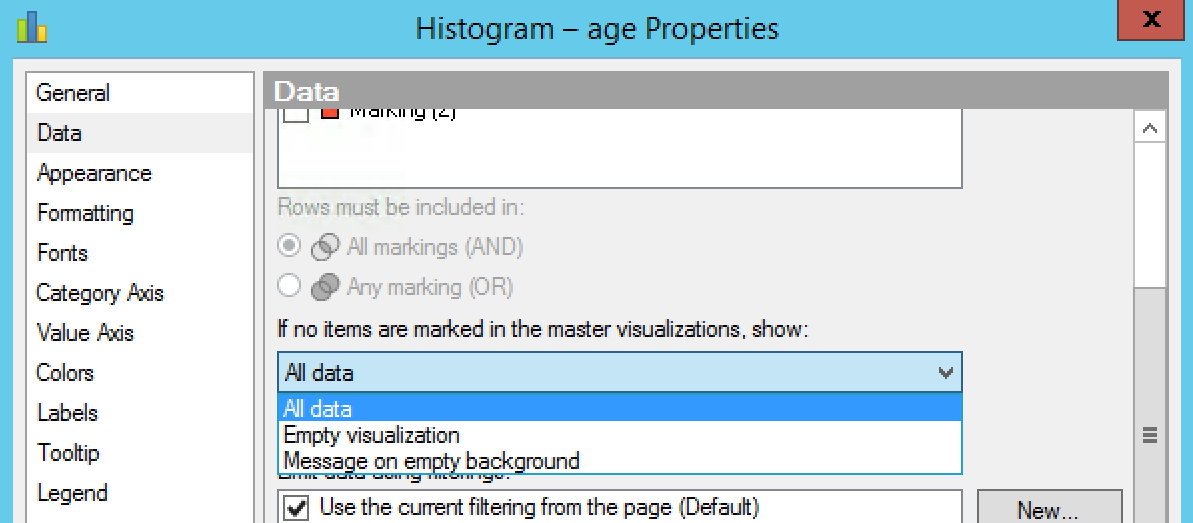
- Change the setting to All data.
- Now, if you go back to the analysis and unmark any marked data by clicking outside of the marked items, you'll see that all data will be shown on the details visualization.
Insights from details visualizations
Now that we have created a useful details visualization, what conclusions, insights, and findings can be drawn from it? I'll share some of mine with you—see if you can find more of your own:
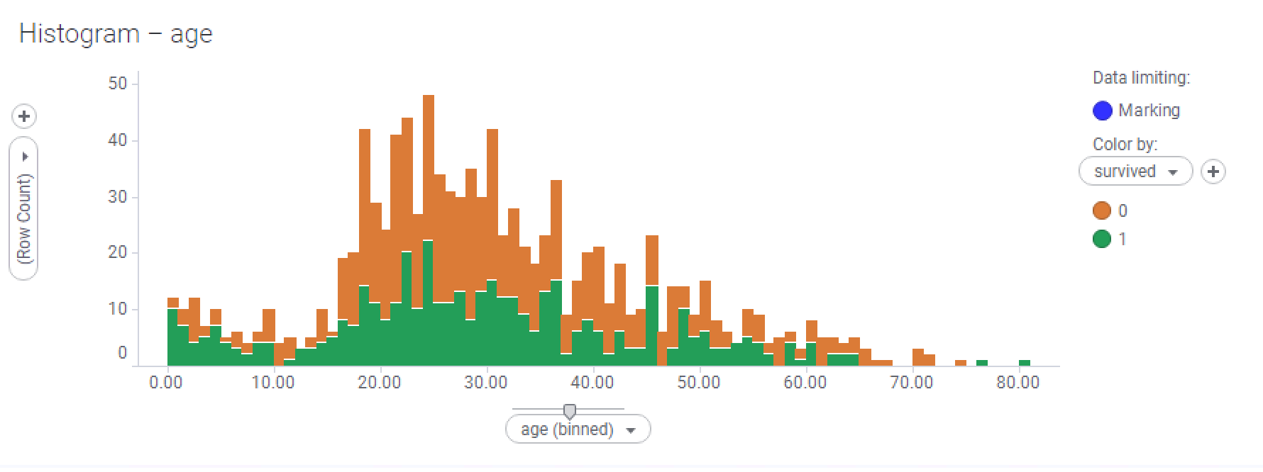
- Here, I have selected all the data. The age of the passengers is mostly normally distributed, but with a peak at the lower age range (there seemed to be a lot of babies on board):
Normal distribution
A lot of data is normally distributed, particularly measured data—that is, data that has been recorded as a result of measured observation of real-world events or phenomena. Measuring the age of a population will nearly always result in some form of normal distribution. Blood pressure data in a patient population is usually normally distributed. I'm sure you can think of many other examples.
The normal distribution has informally been called the bell curve. This is because the curve looks like it's bell-shaped, with an enlarged middle, tailing off at each end.
- Very young babies stood a good chance of survival, as did most young children, with the exception of about 3-year-old children.
- Children from about 9 years old to 14 years old didn't fare too well, sadly.
- There were very few passengers aged 60-80, but most of them did not survive. There is a lone exception—an 80-year-old male that did survive—good for him!
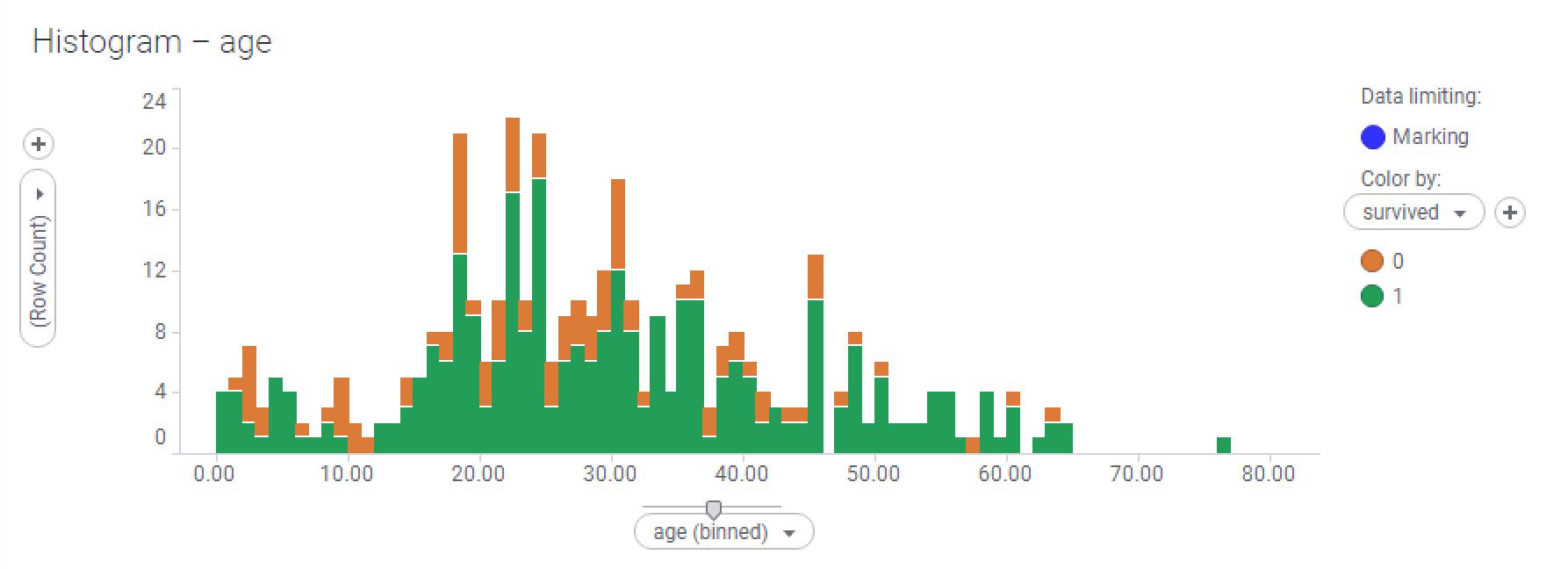
- Compare the visualization for males versus females by selecting all the males, and then selecting the females.
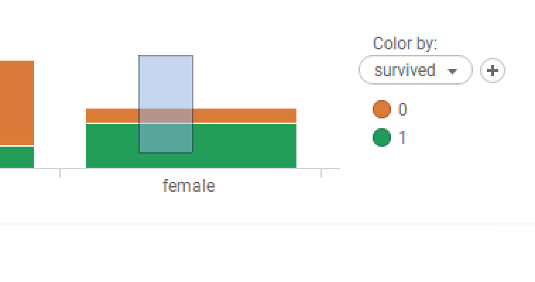
This visualization shows the female passengers:
This histogram shows the survival rates of the male passengers only:
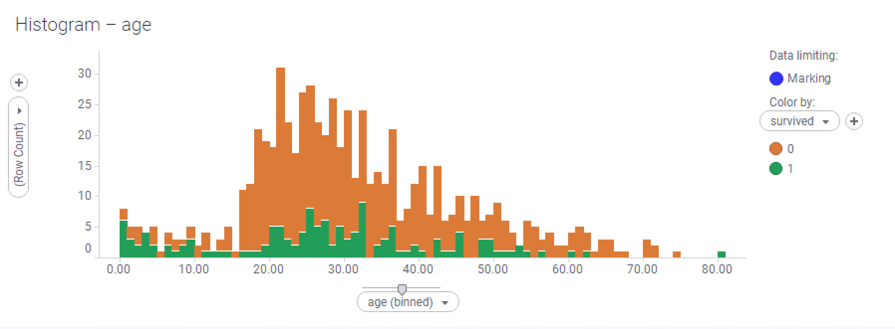
- How much more depressing is the male survival histogram than the female? We already know that a much higher proportion of men didn't survive the disaster, but this visualization is very telling. With the exception of a few peaks at various age ranges, your chances of survival as an adult male were very slim.
Feel free to experiment by selecting other parts of the data in the original bar chart and seeing how it affects the histogram—see if you can gain any additional insights—I have just named a few!
Using filters
Spotfire's inbuilt filters offer a very powerful and immediate way to start analyzing your data. Every time you add a data table to an analysis file, Spotfire creates a filter for each column. Just reflect on this for a minute: if we are going to try to filter or screen our data in some way, we have to do so on the basis of the values in one or more of the data table's columns. That is why a filter always corresponds to a table column and its values to whatever data currently populates that column through the rows in the table.
You can access filters from the data panel (by clicking the button on the left-hand side of the Spotfire window) or the filters panel. The filters panel shows all current filters and their current settings. You can show and hide the filters panel from the View menu (View | Filters) or by clicking on the filtering icon on the toolbar. The following example will use the data panel, but it’s just as valid to use the filter panel:
- As we mentioned previously, the data panel is divided into numbers and categories. If we had date or time columns, location, identity, or other types of columns, these would be categorized as such.
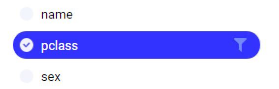
- Let's filter to first-class passengers only. Locate the pclass column and click on it to highlight it. You'll notice that a funnel icon will be shown:
- Click the funnel—you'll see a pop-out filter appear, so unselect pclass 2 and 3. Watch how the visualizations change as you do this—they'll all update together as they are showing the same data:

- Let's look at how this leads to fresh insights. Select all the females in a main visualization chart—the histogram should look like this:
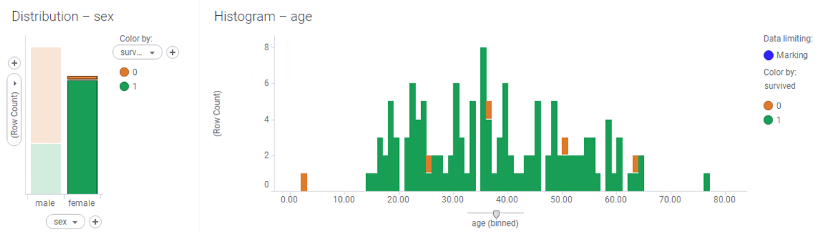
- Look at that! If you were a first-class female passenger, you were almost guaranteed to survive.
- Reset the filters by clicking the Reset all filters button at the bottom of the data panel. Feel free to play with the other filters in the meantime to see how they affect the data:

An important point to stress at this juncture is that we haven't removed any data from the underlying table. Our visualizations have changed and "lost" some rows, but as you saw, when you reset the filtering, the visualizations adjusted dynamically and displayed all the data.
Trellising
Filtering is very powerful as it allows you to filter out values from the dataset so that you can focus on what's important at any particular point. However, it's not very useful for comparing different subsets of the data. In the preceding example, we were comparing histograms by marking (selecting) different parts of the data and filtering out various rows of data. We can look at much more at a single glance by using trellising. Trellising splits visualizations into panels so that you can see subsets of the data all at the same time.
I suggest trellising by pclass—this is so that we can compare the survival rates of passengers in the various classes on board the Titanic:
- Reset the filters as described in Step 6 in the Using filters section.
- From the data panel, click the pclass column and drag it onto the age histogram. You'll see a pop-up panel appear:

- Drop pclass onto Use 'pclass' on the vertical trellis axis.:

- Notice what happens to the visualization (presuming we have selected all the data in the main bar chart):
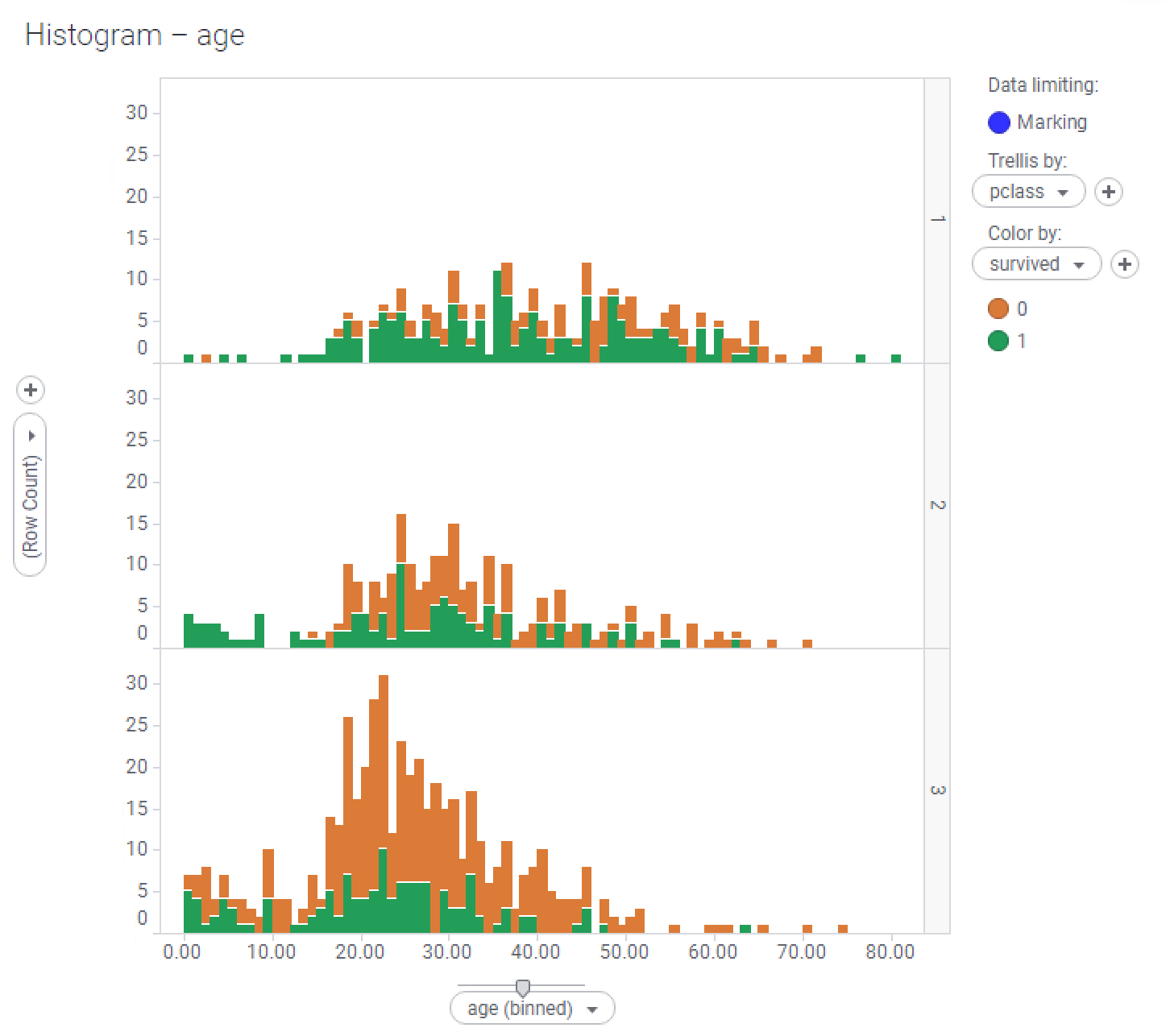
- We have some fresh insights!
- Unsurprisingly, but rather unfortunately, your chance of survival was much better as a first-class passenger than if you were from any other class. Notice the 80-year-old first-class passenger all on his own.
- Third-class passengers were much more numerous than second-class ones, but their survival rate was much, much worse than the other classes'.
- All second-class children survived.
- Experiment with marking different subsets of the data in the main bar chart and observe how the trellised histogram behaves - see if you can gain additional insights!