


Every plot should have a title, and the axes should be properly labeled. For plots displaying multiple sets of data, legends are a good way to help the reader quickly identify the marker, the line, and the color of different datasets. In this recipe, we will add axes labels and a title to a plot, and then add a legend to help distinguish between the different sets of data. To keep the code simple, we will plot the data from the previous recipe.
How to do it...
Follow these steps to add labels and a legend to your plots to help distinguish the sets of data that they represent:
- We first recreate the plot from the previous recipe using the following plot command:
fig, ax = plt.subplots()
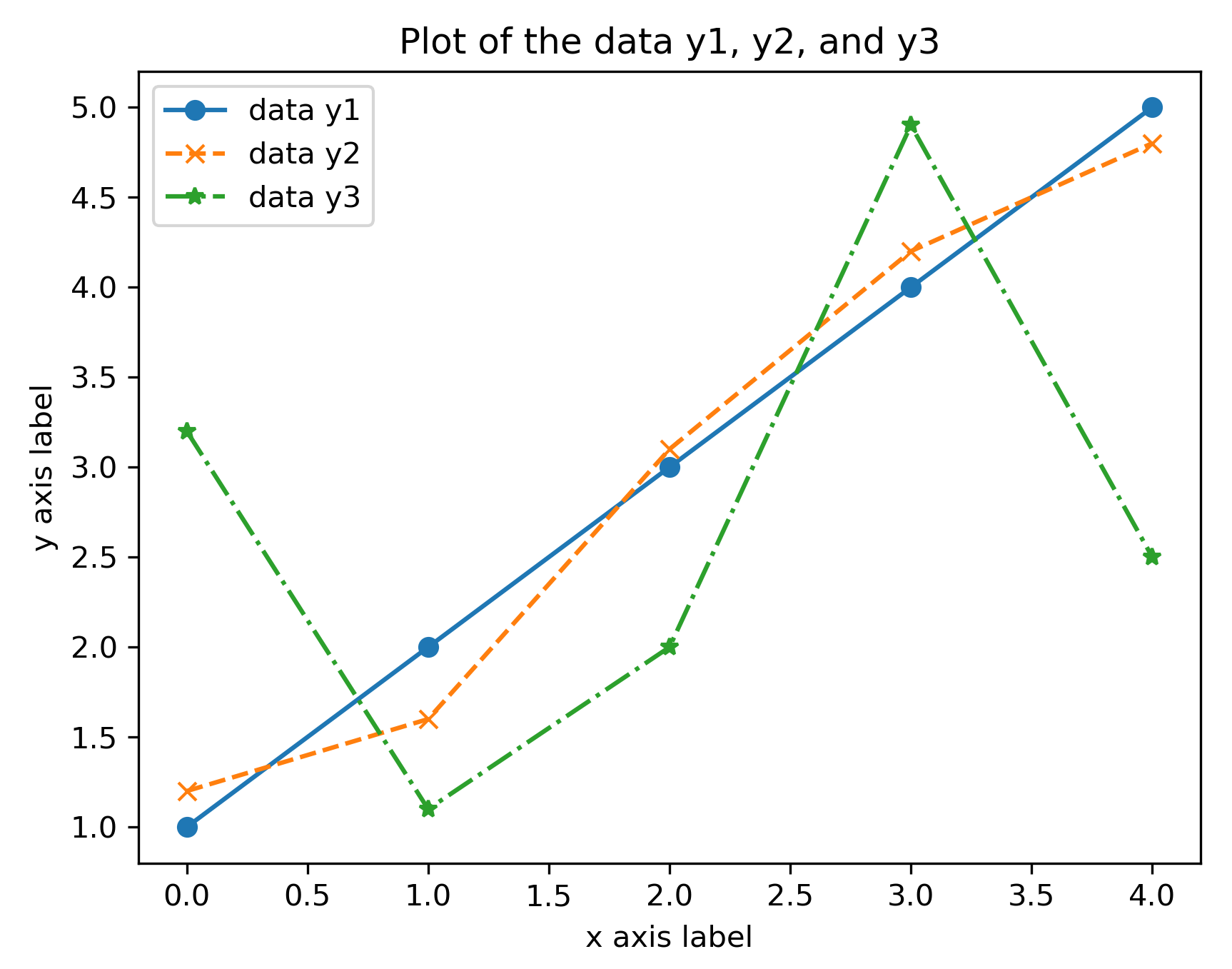
ax = ax.plot(y1, "o-", y2, "x--", y3, "*-.")
- Now, we have a reference to the Axes object on which our data is plotted, and so we can start to customize these axes by adding labels and titles. The title and axes labels can be added to a figure by using the set_title, set_xlabel, and set_ylabel methods on the ax object created by the subplots routine. In each case, the argument is a string that contains the text to be displayed:
ax.set_title("Plot of the data y1, y2, and y3")
ax.set_xlabel("x axis label")
ax.set_ylabel("y axis label")
Here, we plot the three datasets with a different style. The marker style is the same as in the previous recipe, but we have added a solid line for the first dataset, a dashed line for the second, and a dash-dot line for the third.
- To add a legend, we call the legend method on the ax object. The argument should be a tuple or list containing the description to be placed in the legend for each set of data:
ax.legend(("data y1", "data y2", "data y3"))
The result of the preceding sequence of commands is shown here:
How it works...
The set_title, set_xlabel, and set_ylabel methods simply add the text argument to the corresponding position of the Axes object. The legend method, as called in the preceding code, adds the labels to the datasets in the order that they were added to the plot—in this case, y1, y2, and then y3.
There are a number of keyword arguments that can be supplied to the set_title, set_xlabel, and set_ylabelroutines to control the style of the text. For example, the fontsizekeyword can be used to specify the size of the label font in the usual ptpoint measure. The text argument can also be rendered using TeX for additional formatting by supplying usetex=Trueto the routine. The TeX formatting of labels is demonstrated in Figure 2.5. This is especially useful if the title or axis label contains a mathematical formula. Unfortunately, the usetexkeyword argument cannot be used if TeX is not installed on the system—it will cause an error in this case. However, it is still possible to use the TeX syntax for formatting mathematical text within labels, but this will be typeset by Matplotlib, rather than by TeX.
We can use a different font by using the fontfamily keyword, the value of which can be the name of a font or serif, sans-serif, or monospace, which will choose the appropriate built-in font. A complete list of modifiers can be found in the Matplotlib documentation for the matplotlib.text.Text class.
To add separate text annotations to a plot, you can use the annotate method on the Axes object. This routine takes two arguments—the text to display as a string and the coordinates of the point at which the annotation should be placed. This routine also accepts the previously mentioned styling keyword arguments.


