Book Image

Building Dynamics CRM 2015 Dashboards with Power BI

By : Steve Ivie
Book Image

Building Dynamics CRM 2015 Dashboards with Power BI

By: Steve Ivie

Overview of this book

<p>Dynamics CRM 2015 holds a wealth of information about customers and the sales pipeline, but sometimes leaves users with basic end-user reporting and dashboard options. Power BI is a great new tool for analyzing and presenting data, giving us the ability to dig deeper into the information. With the increased requests for real-time sales analytics, Power BI when connected to Dynamics CRM offers a self-service approach to build, shape, and present data through an easy-to-use interface. The set of features within Power BI will give all users a tool to generate real-time sales productivity reports and dashboards to enhance their sales performance.</p> <p>This book will provide you with the skills you need to learn how to build and present Dynamics CRM 2015 sales dashboards using Power BI. It follows a step-by-step process to build an interactive dashboard by organizing and consolidating datasets, improving the look and feel of graphs, charts, and maps, and enhancing data clarity with filters and slicers.</p> <p>By sequentially working through the steps in each chapter, you will learn how to use the Power BI Q/A functionality to query data in the dashboard, extend the dashboards to the mobile apps for the iPad and Surface, and leverage the pre-built workbook template provided by Microsoft for Dynamic CRM 2015 sales, service, and marketing dashboards.</p>
Table of Contents (18 chapters)
Building Dynamics CRM 2015 Dashboards with Power BI
Credits
About the Author
About the Reviewers
www.PacktPub.com
Preface
Index

The clustered bar chart


Depending on how you want to look at the data, sometimes turning the chart in a horizontal position can uncover new information or at least expose an alternative method to a salesperson.

For our sales productivity dashboard, we need to display Actual Revenue, and Estimated Revenue by Customer in a single stacked bar chart. Combining two aggregated revenue fields to a single bar chart can help sales see a single view of their top customer and potential sales:

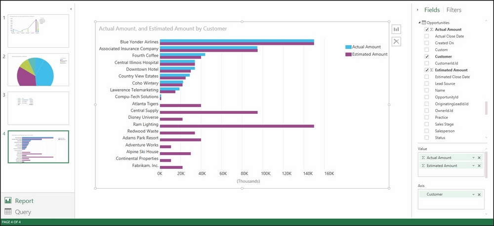
Clustered Bar Chart Estimated vs. Actual Amounts

For our sales productivity dashboard, we need to add a new report with a stacked bar chart that shows Estimated Revenue and Actual Revenue by Customer.

Here is how it is done:

  1. Add a new page to your report for Table, navigate to the top main menu, and select New Page.

  2. Navigate to the Fields and Filters area on the left-hand side of the form window and select Actual Amount, Customer, and Estimated Amount from the Opportunities queried dataset:

  3. Change the chart type using...