
Being able to filter data is essential to any dashboard. With Power BI, data can be filtered in a variety of different ways with data columns, report pages, individual charts, tables, and/or maps. We can also add data slicers to all the report pages that will allow even more real-time interaction.
The best thing about Power BI is that it has a lot of features built-in already to filter the report data. If you simply select a chart or map on a report page, the values and visualizations on the rest of the page will change, as shown in the following screenshot:
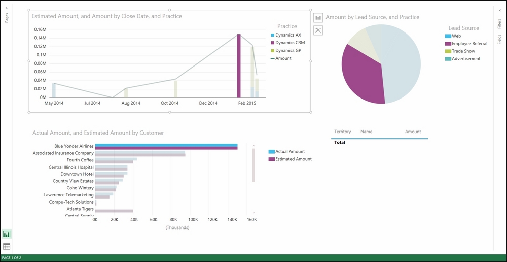
Filtered Sales Productivity Report
This works in Power BI because all the visualizations are already connected based on either the automatic relationship detection and/or the merged and combined relationship that we created in Chapter 2, Organizing and Consolidating Dynamics CRM 2015 Datasets. How cool is that?