

Modifying preferences
It is possible to modify the behavior and appearance of some Photoshop features and tools through the Preferences settings, from the brightness of the user interface (UI) to painting cursors and auto-save. In the following steps, I’ll highlight settings that could offer high value to your editing workflow:
- Preferences can be found on macOS via Photoshop → Settings → General, or on Windows, via Edit → Preferences → General. Alternatively, you can press Ctrl + K (Windows) or Cmd + K (macOS) to launch the Preferences settings and reveal General settings.
- Turn on the checkboxes for Auto-Update Open File-based Documents and Preset Syncing.
Contrary to the option’s name, Auto-Update won’t automatically update your active document, but it will inform you that someone else has edited and saved changes to the file you are working on. Photoshop will then give you the option to keep editing your active version or dispense with your edits and update to reflect the other user’s latest saved changes. This is handy when editing project files on a server that are accessible to several users simultaneously:
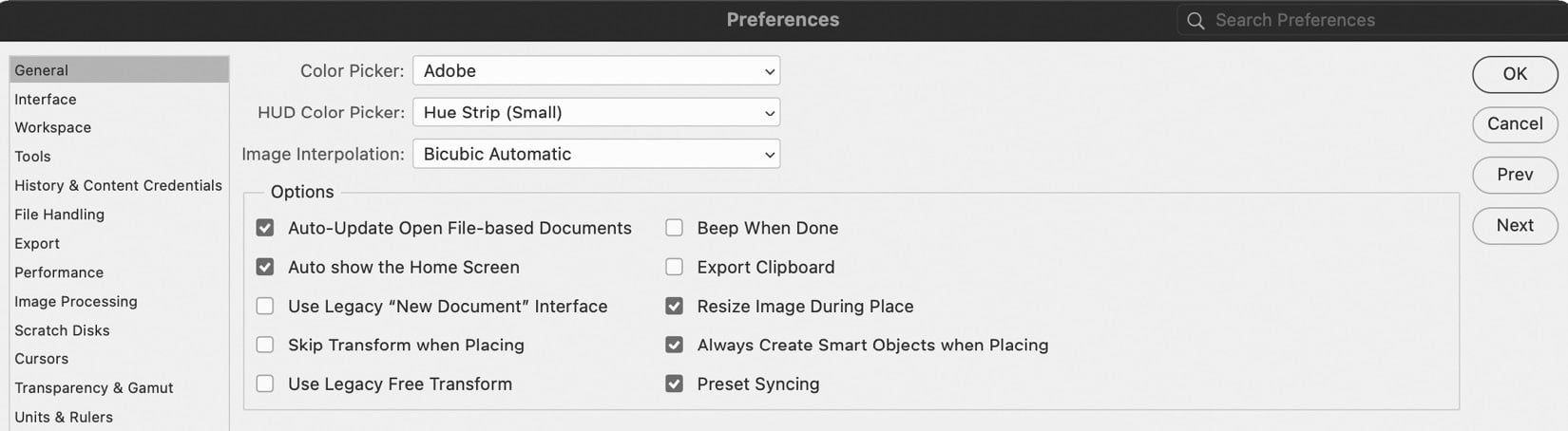
Figure 1.16: General preferences
Syncing presets
Preset Syncing was introduced in February 2021 and uploads your brush, pattern, gradient, shape, and swatch libraries to Creative Cloud. So, wherever you log in with your Adobe ID and use Photoshop in the future, your library assets download from the cloud and become available to use.
- Next, click on Interface from the list on the left-hand side. You can change the UI Color Theme option from the default of Medium Dark to three other variations. You can also alter the style of the image border shown in the image window as well as the background color that surrounds your images.
I find that if the UI brightness is high, this often contributes to eye strain. As such, I tend to set the UI theme to Dark or leave it set to Medium Dark to compensate. Turning on the Neutral Color Mode checkbox removes distracting color from interface buttons and icons. I don’t find lines or shadows around images’ edges helpful; these I set to None. You may wish to alter the brightness of the image window background to Black, Dark, Medium, Light Gray, or a Custom color of your choice. I prefer the less distracting Default of mid-tone gray:
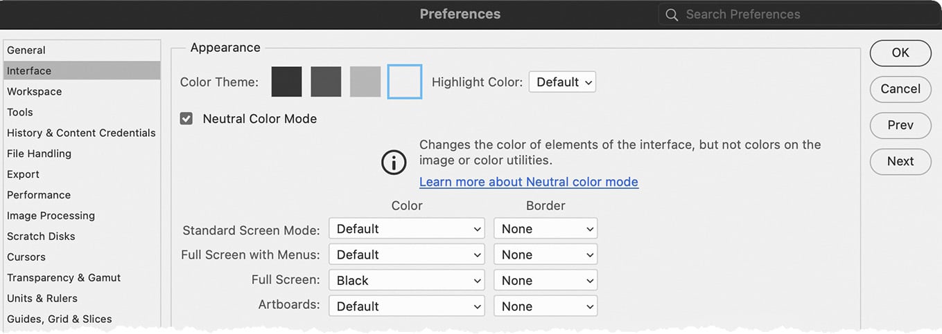
Figure 1.17: Interface preferences
- Click on Tools from the list on the left-hand side. With the exception of Show Rich Tooltips, you can turn on all checkboxes in this section:
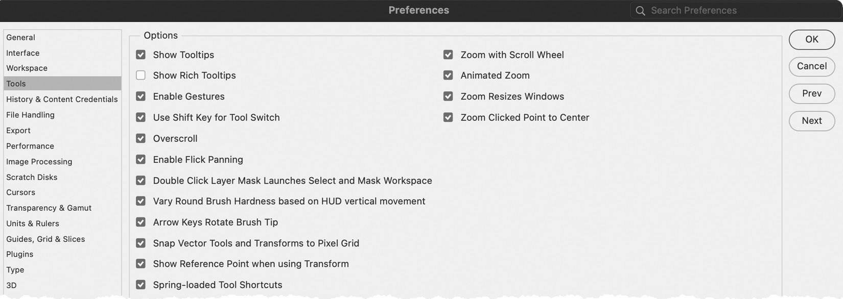
Figure 1.18: Tools preferences
Tool preferences
Rich Tooltips is the animated video explainer that appears every time you hover your cursor over a tool in the Tools panel, which can become tedious very quickly. Other features in this section generally enhance the usability of a tool or the ease with which you accomplish tasks. Zoom with Scroll Wheel allows you to avoid activating the Zoom tool altogether, while Animated Zoom and Flicked Panning make the motion of panning and zooming less jarring on the eye. Overscroll allows you to position the edges of an image anywhere in the image window, making edge editing easier to accomplish.
- Click on File Handling from the list on the left-hand side. Under File Saving Options, I would recommend that Image Previews is set to Always Save, and turn on all checkboxes with the exception of Enable legacy “Save As” and Do not append “copy” to filename when saving a copy. Finally, decide how much work you want to risk losing by defining the Automatic Save Recovery interval dropdown to either
5, 10, 15, 30, or60minutes.Saving an image preview and a thumbnail will allow you to quickly check the contents of an image before opening through Finder on macOS or Explorer on Windows. The ability to save as a background task means you can edit a different Photoshop document while another is saving.
I prefer to set the save recovery increment to every 5 minutes so that when I do experience a crash, I lose a maximum of 5 minutes’ work. Photoshop will reboot and ask if you want to open each document from your previous session at its last saved point. If you experience a lag in performance each time Photoshop saves a recovery file, you might have to balance the pros and cons of setting the interval to 10 minutes.
I still prefer to save my Photoshop documents in a dedicated network folder along with related project assets. However, you can set the default save location to Creative Cloud. There are many benefits to saving on Creative Cloud, which include a file history and, not least, a backup of your file. The option to save to Creative Cloud is also available each time you save a document.
- Turn on the Prefer Adobe Camera Raw for Supported Raw Files checkbox and Use Adobe Camera Raw to Convert Documents from 32 bit to 16/8 bit. Turn on the Ask Before Saving Layered TIFF Files checkbox and set Maximize PSD and PSB File Compatibility to Always:
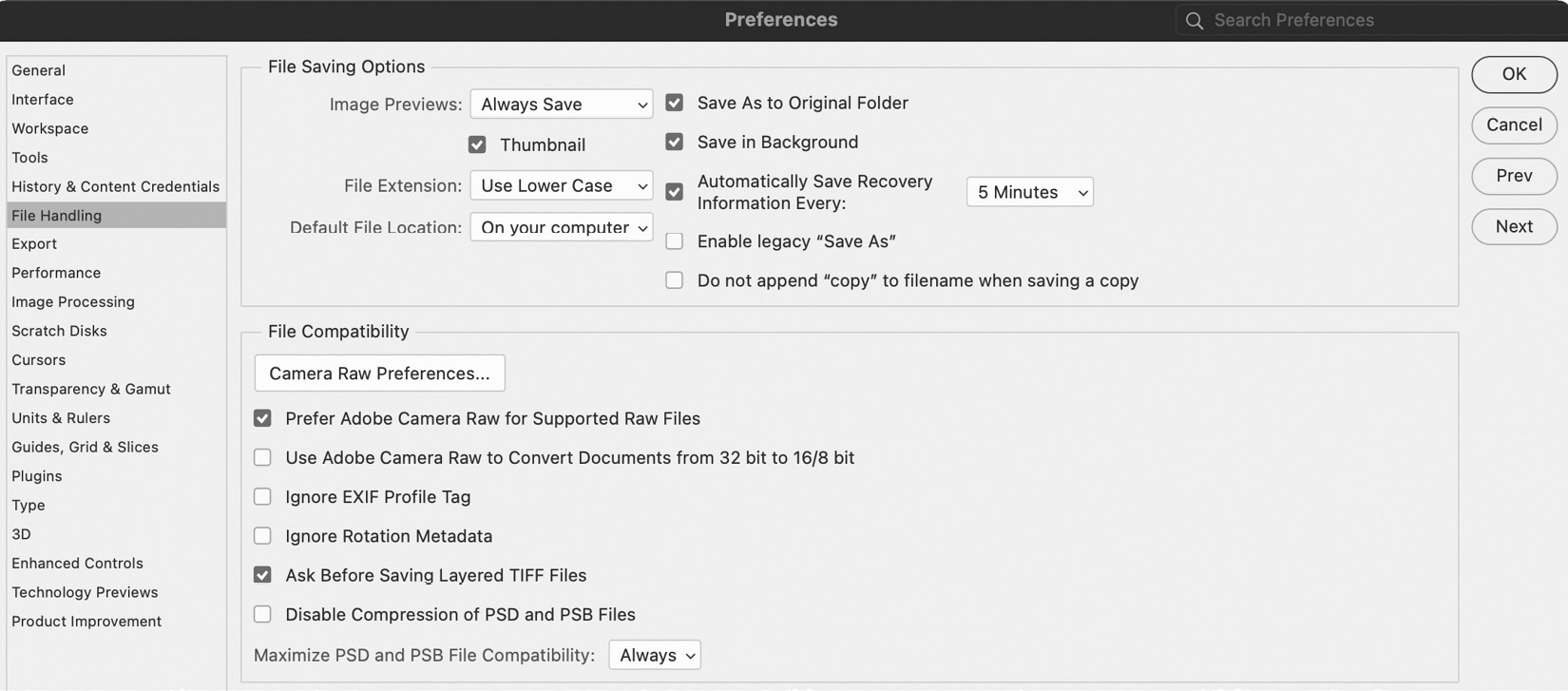
Figure 1.19: File Handling preferences
Camera Raw
Adobe Camera Raw offers fantastic tools and features for editing digital negatives; as such, I would recommend utilizing it for such tasks rather than Photoshop. Maximizing the compatibility of your Photoshop Document (PSD) files means that when you share files with colleagues who have older versions of Photoshop, they will be able to open and edit them.
- Click on Cursors from the list on the left-hand side. Set Painting Cursors to Normal Brush Tip and turn on the Show Crosshair in Brush Tip checkbox. Set the Other Cursors option to Precise. Preview images in the dialog update accordingly to visualize changes to brush tips and icons:
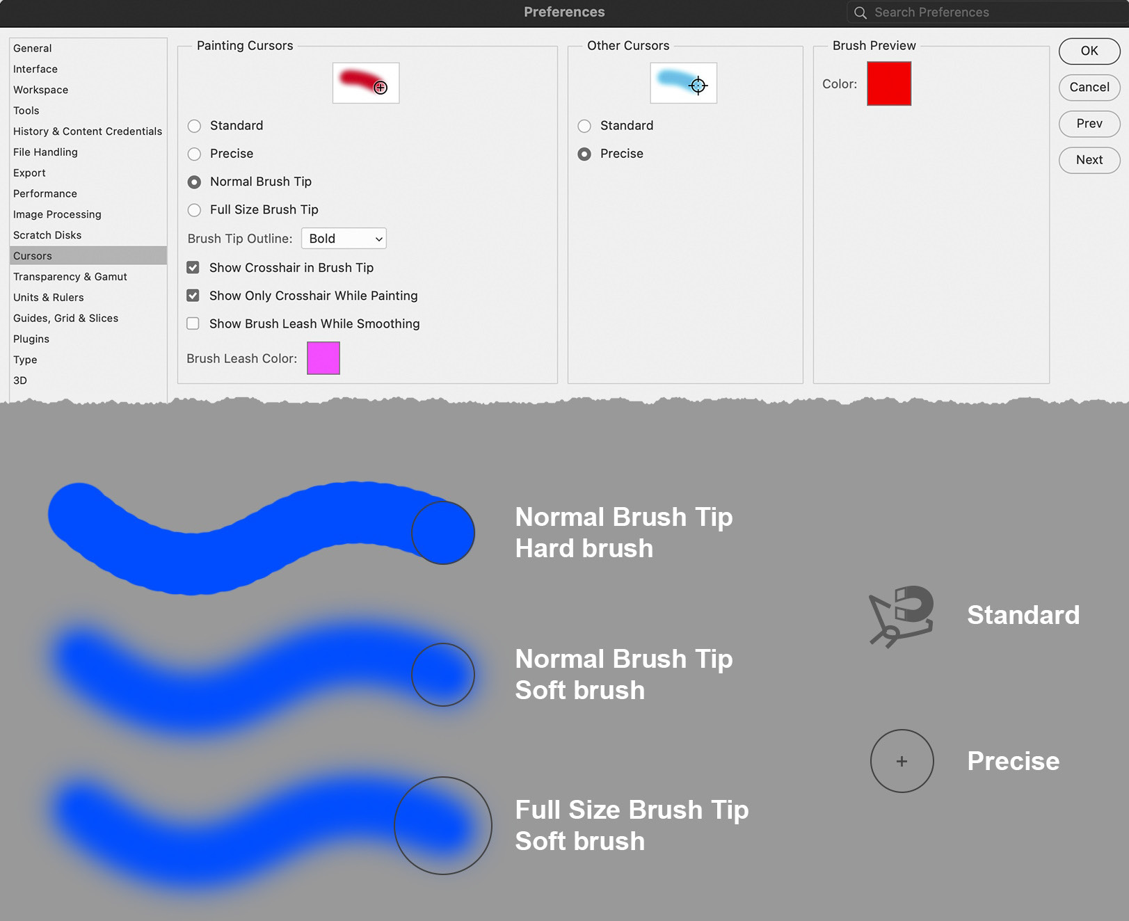
Figure 1.20: Cursors preferences
Painting tools
Painting cursors are integral to editing in Photoshop, so it’s important to understand how each of the cursor appearances might affect the way you use them. The size of a brush tip is indicated by an outline, shown in the preferences as a circle for simplicity, with a red paint stroke. A normal brush tip indicates only the area that receives a full coverage of red, while a full-size brush tip indicates full coverage of red and soft brush marks. I find the normal brush tip size more intuitive to work with. The crosshair inside a brush tip is mainly used for alignment. The section labeled Other Cursors includes selection tools. Standard will make the cursor appear as the icon of the tool itself, while the far more intuitive precise version includes features that make the Magic Wand selection tool far easier to use.
- Click on Type from the list on the left-hand side. Turn off all checkboxes apart from Show Font Names in English and Use ESC key to commit text.
Smart Quotes look terrible and resemble inch marks. I would highly recommend that you deactivate Smart Quotes.
Photoshop now automatically replaces missing fonts or glyph characters with the most suitable match available on your computer. The trouble is that you might not notice this. By turning off Glyph Protection, this issue should highlight missing characters, allowing you to manually correct the issue with a font of your choice:
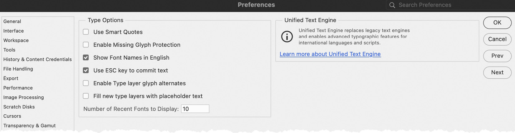
Figure 1.21: Type preferences
You can now exit type editing mode in Photoshop by pressing the Esc key, matching the behavior of Illustrator and InDesign.
Photoshop will now highlight alternative characters when editing text; however, the pop-out tooltip to use this feature appears on the text frame and can make editing smaller text frames frustrating. For this reason, I deactivate it and go to the Glyphs panel instead (Window → Glyphs).
When you create new text frames in Photoshop, it fills it with copy using the last known type settings. I find this a hindrance and deactivate it.
- Finally, click on Technology Previews from the list on the left-hand side. I would suggest that you turn on all checkboxes.
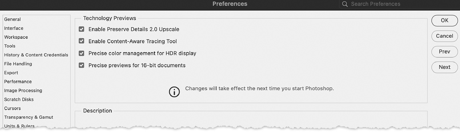
Figure 1.22: Technology preferences
I have found all of the features in this section enhance my experience of Photoshop. Preserve Details 2.0 Upscale allows for better-quality enlargements of images. The Content-Aware Tracing tool detects edges when creating a path; this can save valuable time rather than creating a vector path manually with the Pen tool.
Preference settings are only saved when you close Photoshop, so as soon as you complete your preference changes, close Photoshop and launch it once more.
If you experience persistent Photoshop crashes, it could be related to a corrupt preference file. To resolve this, delete preferences and redo them by going to General from the list on the left-hand side of the Preferences dialog and choosing Reset Preferences on Quit.
Defining color settings
For us humans, color is processed by the wonders of biology as we observe the world around us, almost without being conscious of it. Sadly, the same cannot be said for digital technology, where data is captured on digital single-lens reflex cameras (DSLRs) and smartphones and then passed from one application to another before ultimately being viewed in print and on screen.
To ensure that each device and application recreates color consistently, we need a method by which our technology talks the same language of color. Rather like traveling to a country where language differs, we communicate in the same tongue to understand one another. And so, we use color management to achieve this. It’s relatively simple to set up, can be synchronized across all Adobe Creative Cloud desktops, and only takes a few moments – a small price to pay for relatively consistent color across our projects. Here’s how to do it:
- You define a color management policy for your artwork by going to Edit → Color Settings. Click on the Settings drop-down menu in the upper left-hand corner of the dialog. Depending on which region of the world you’re based, the default setting displayed will differ.
- If you are based in the US, choose North American Prepress 2, which is often recommended for creating artwork intended for onscreen, web, and consumer-level printing (for example, a USB-connected printer) and professional printing at a third-party provider. In Europe, the equivalent is European Prepress 3.
- If you want to avoid warning messages popping up on a regular basis, turn off the three checkboxes under Color Management Policies. Photoshop will still do all of the color synchronizing required; it just won’t tell you about it every time it does!
- Once you have defined the appropriate settings, click on the Save button located at the top right of the dialog. You should be prompted to save the file in the
Settingsfolder presented to you. This is where Adobe looks for the settings file (CSF). Enter a filename ofMyColorand click on the Save button.A message in the middle of the Color Settings dialog reads Not synchronised. This indicates that your other Adobe applications are not using the same settings. We will resolve this in the next step. Click OK to exit. You will need to install Adobe Bridge from the Creative Cloud desktop application to complete the final stage.
- To sync the color settings across Creative Cloud desktop apps, we need to open Adobe Bridge. In Photoshop, go to File → Browse in Bridge. Once Bridge opens, go to Edit → Color Settings. Select MyColor from the list of available color settings and click on Apply. Bridge will apply the same settings across any desktop applications you have already installed:
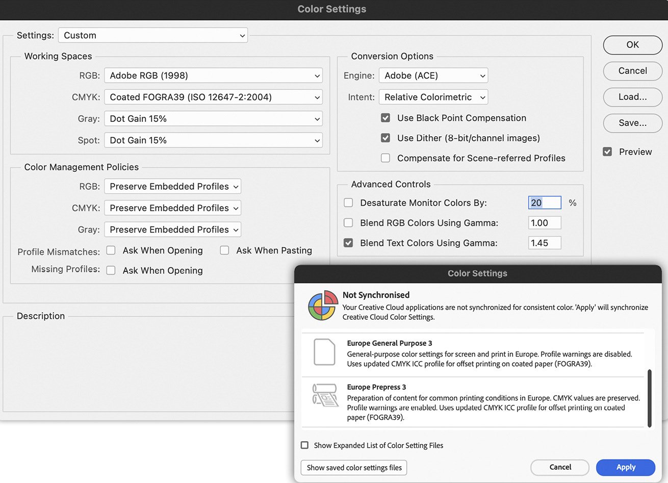
Figure 1.23: Color settings, defined in Photoshop and synchronized in Adobe Bridge
In this section, we’ve modified preference settings and color management. As the heading suggests, some edits are simply down to your personal preference, such as the interface brightness. However, some tools will now become more intuitive to use, simply by modifying the cursor appearance when active. Color management helps ensure color consistency across Creative Cloud applications. The final part of the chapter explores the building blocks of digital images. The better we understand how images are composed, the easier it will be to deconstruct them and attain the best possible quality.