
A dialog is a window derived from the Window class, thus it can participate in whatever routine a window can, but it can also do more. Dialogs are generally used to present information to the user, information for which feedback is expected, hence it has specialized button combination configurations that can be provided and used to get user feedback.
A dialog window can be generated using the following code:
@Override
public void onModuleLoad() {
Dialog dialog = new Dialog();
dialog.setBodyBorder(false);
dialog.setClosable(false);
dialog.setHideOnButtonClick(true);
dialog.setButtons(Dialog.OKCANCEL);
dialog.setScrollMode(Scroll.NONE);
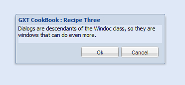
dialog.setHeading("GXT CookBook : Recipe Three");
dialog.addText("Dialogs are descendants of the Window class, so they are windows that can do even more.");
dialog.show();
SelectionListener<ButtonEvent> listener = new SelectionListener<ButtonEvent>() {
@Override
public void componentSelected(ButtonEvent evt) {
String text = evt.getButton().getText();
String format = "You clicked the {0} button";
Info.display("Recipe Three", format, text);
}
};
Button okBtn = dialog.getButtonById(Dialog.OK);
okBtn.addSelectionListener(listener);
Button cancelBtn = dialog.getButtonById(Dialog.CANCEL);
cancelBtn.addSelectionListener(listener);
}
First, we instantiate a Dialog object from the constructor and assign it to the dialog variable. The dialog.setBodyBorder(false) ensures that the default blue border around the body of our content is not shown, while dialog.setCloseable(false) ensures that we don't have the standard window close button shown, because we want the user to interact and give feedback with the specialized buttons we'll be providing. This is why dialog.setHideOnButtonClick(true) is used to automatically hide the dialog (equivalent of an explicit dialog.hide() call) when any of the buttons are clicked.
dialog.setButtons(DialogOKCANCEL) specifies that our dialog will be configured to use the OK and Cancel buttons combination, allowing the user to accept or decline the action presented by the dialog. The dialog.setScrollMode(Scroll.NONE) is used to prevent scrolling within the content the dialog presents; this means that it must be properly sized else its contents may be clipped.
The setHeading() method from the Window class is used to specify the title shown on the header of the dialog, just as it does in standard windows, from which it inherits, while its specialized dialog.addText() method populates its content area with the text to be shown to the user. Once these are done, we are ready to show the dialog using the now familiar show() method.
The last segment of the code creates an instance of SelectionListener — which is a special listener that can be used with buttons — and attaches it to the buttons on our dialog, so that we can handle click actions (or selections) on them. When the button is clicked, the componentSelected() method of the listener gets called; although this is not required to display or render a dialog, it is very unlikely that you would have a dialog with dummy buttons. Saving the explanation of events and listeners for later, you can see that dialog.getButtonById() uses the special button ID of our configured buttons (Dialog.OK and Dialog.CANCEL button ID constants in the Dialog class) to return a reference to them. As we chose the Dialog.OKCANCEL combination, dialog.getButtonById(Dialog.OK) returns the OK button from the button set, allowing us to tweak it in whatever way we want, such as attaching our listener, which just shows a message stating which button was actually clicked. It does this with the help of the Info class, which displays a message in the bottom-right region of the browser for a specified amount of time.