
GXT themes are mechanisms for controlling how UI components are presented to the user and they can be used as-is or customized with CSS and images. Therefore, one can decide to use the standard Blue theme but alter the way certain components look by styling them with CSS and changing some of their images.
Building a custom theme from scratch offers a good level of control; however it may suffice to just modify certain aspects of an already satisfying theme with images and CSS.
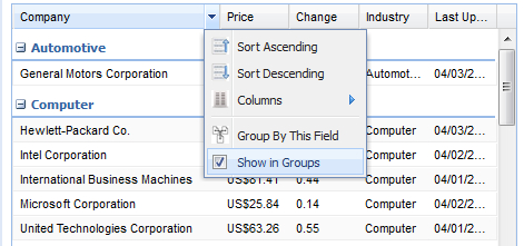
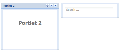
We will demonstrate such styling by altering the default presentation of panels and portlets in GXT using CSS and then switch the images used in by the Grid component with a set of custom images specified with a XImage implementation.
The following screenshot shows a re-styled Portlet component with CSS overrides:
Here we show a re-styled Grid component with custom images: