
Understanding the user interface and its menus
Before diving in too deep when picking up any new application, it's always good practice to get familiar with the broad landscape or "lay of the land" somewhat. To start with, in this section, we're going to take an overall look at the User Interface (UI) and learn where the important menu commands, panels, and toolbars are located. This way we can get a sense of how the application is set up and start to get acquainted and take advantage of some of its unique UI conventions.
Skipping ahead
Try to resist the urge to skip ahead if you can in these first few sections. Believe me, I understand the desire to get creating – it's what drove me to pick up the application to begin with, but you really don't want to miss out on something here that may prove invaluable down the road and a good grounding of the interface will help build your confidence when you do start creating that masterpiece.
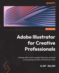
Let's get started exploring the UI by opening up a new file. Launch Affinity Designer and go to File | New. Choose any page size from the available options (I chose letter size but for this, it really doesn't matter) and then click Create. You should be presented with a centered blank white page. Now if you have already opened the application and have been playing around and moving various panels about, you may want to set up your layout to look like mine, shown in the user interface screenshot in Figure 1.1, to follow along. To change to the same layout seen here, go up to the top menu, click and hold on View, navigate to Studio, and select the last option at the bottom of the flyout, RESET STUDIO. This will reset the Affinity Designer interface to its default layout and it should look pretty much the same as mine.
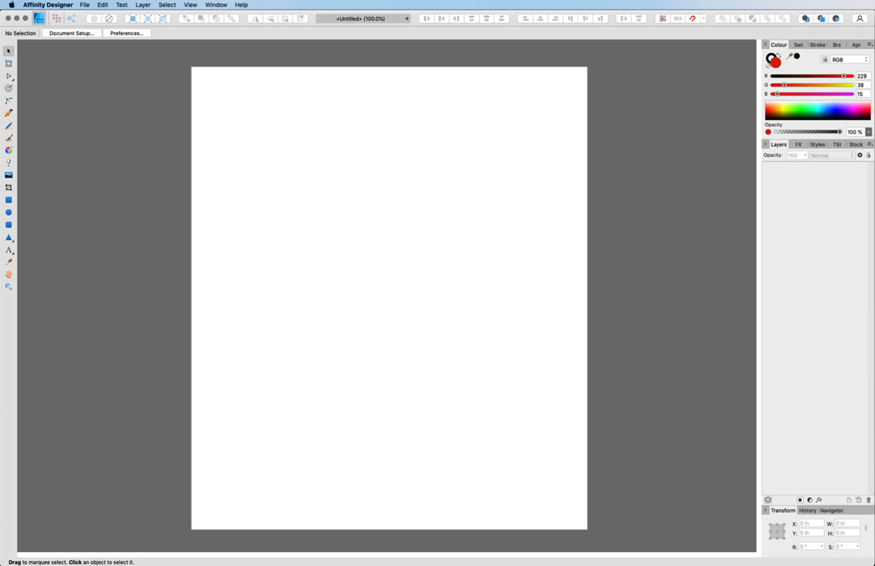
Figure 1.1 – Affinity Designer light interface
The preceding screenshot shows the light interface version while the next is the dark interface version. Both are screenshots of the Affinity Designer default interface.
A note about the screenshots in this book
Screenshots that don't need to be printed in color are printed in black and white. Screenshots that are best shown in color will be in color. In some screenshots the UI type will be too small to read, however if the information or concept being discussed requires readability every attempt at enlarging it will be made. That being said, there are limitations to resolution and the size of some UI elements.
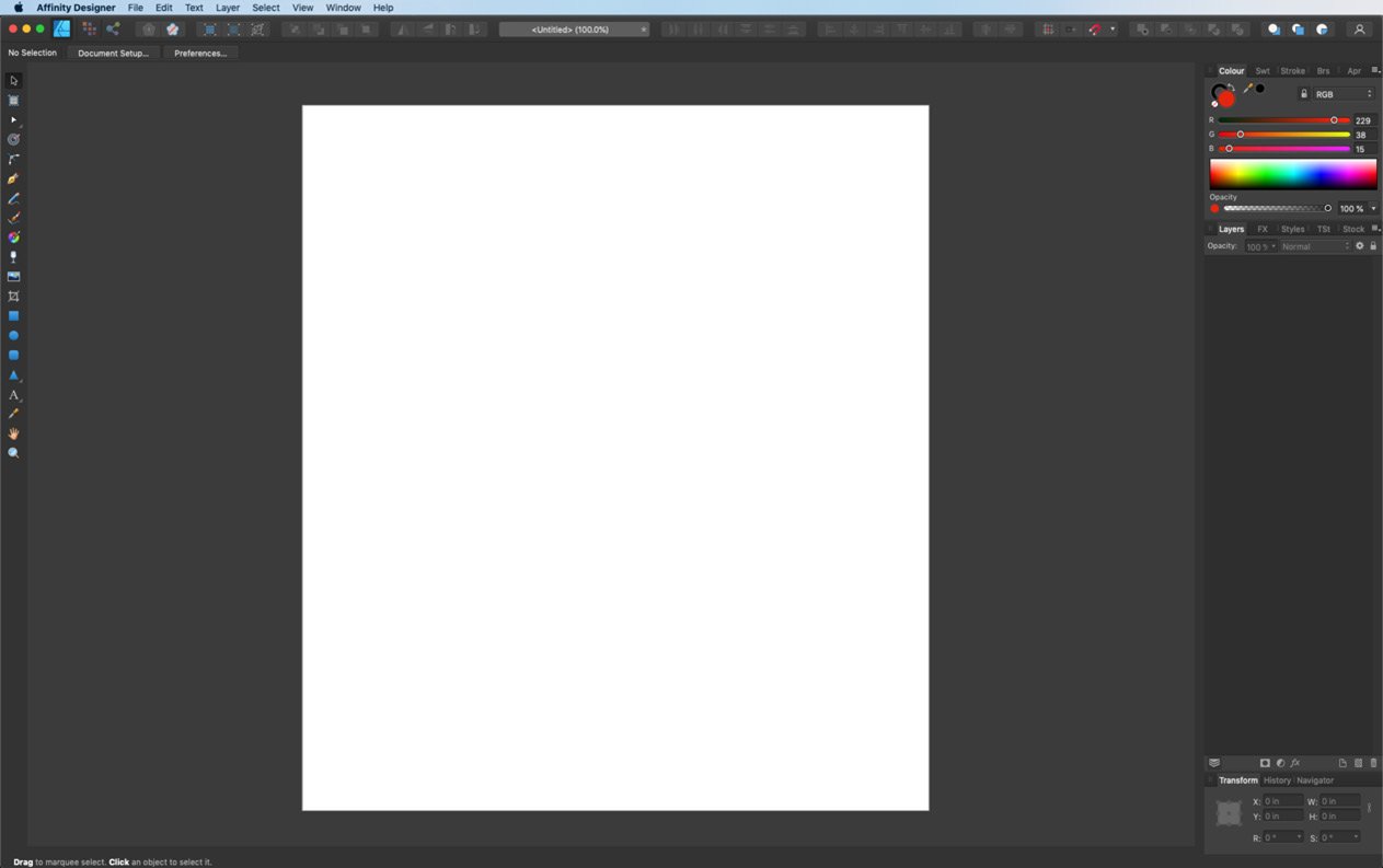
Figure 1.2 – Affinity Designer dark interface
In practice in my day-to-day work, I find the light version a bit too bright for working with so I normally work in the dark interface mode. However, we will be using the light interface for all of the screenshots in this book for the main reason that they are easier to read at the sizes they are reproduced here. If you would like to change your interface to the light or dark interface option, go to Affinity Designer | Preferences (Mac) or Edit | Preferences (PC), locate the UI Style option, and select Light:
Figure 1.3 – Preferences panel – user interface
We will be discussing many of the user interface areas in more detail in Chapter 3, How to Customize Your Affinity Designer Workspace, but for now, let's just get familiar with the overall footprint of Affinity Designer's default setup. Let's begin with a quick tour of the interface.
The menu bar
Looking around the screen, we can see in the top left a horizontal bar containing a typical application menu bar with drop-down menu items: Affinity Designer, File, Edit, Text, Layer, Select, View, Window, and Help. We will cover these in more depth in the An overview of the menu bar section.

Figure 1.4 – Menu bar
The Persona toolbar
Just below the top menu bar and still on the left-hand side of the layout, you will see the three Persona icons for the Designer, Pixel, and Export Personas. This is called the Persona toolbar. See The Persona toolbar section for a more in-depth look at the Persona toolbar.

Figure 1.5 – Persona toolbar with the Designer Persona active
Toolbar
Continuing along the same horizontal bar and just to the right of the three Persona icons is an area known simply as the Toolbar. See the The Toolbar section for a more in-depth look at the Toolbar.

Figure 1.6 – Toolbar
The context toolbar
Just below the Toolbar is the context toolbar. See the The context toolbar section for a more in-depth look at the context toolbar.

Figure 1.7 – The context toolbar
The Tools panel
Moving over to the left-hand side of the layout, we find the Tools panel. See the Navigation tools – overview section for a more in-depth look at the Tools panel.

Figure 1.8 – Tools panel (Designer Persona)
The document view
The central workspace area containing my white page is known as the Document View. The dark gray area around my page also contained within the document view is called the Pasteboard. See The document view and artboards – overview section for a more in-depth look at the document view and pasteboard.

Figure 1.9 – Document view and pasteboard
The Right Studio
The last area of the default interface to cover is the wide column along the right side of the layout. The area is known as the Right Studio. See the Studio panels – overview section and Chapter 5, Main Studio Panels and Managers, for a more in-depth look at the Right Studio.
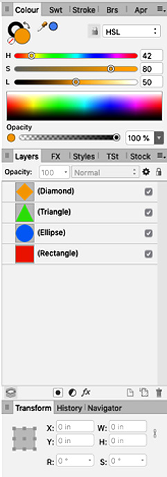
Figure 1.10 – Right Studio
Now that we have seen where the main areas of the interface are located in the default layout, let's begin to take a look at some of these individual areas a little more closely, starting with the top menu bar.