
Toolbars – overview
In the default interface layout, the toolbars are located directly below the menu bar as two horizontal bars containing commonly used options, settings, and functions depending on what Persona you are currently in, what is currently selected, and what tool is currently active. They consist of the Persona toolbar, the Toolbar, and the Context Toolbar.

Figure 1.22 – The Persona toolbar, the Toolbar, and the Context Toolbar
The Persona toolbar
As touched on earlier, the Persona toolbar allows you to select between the Designer, Pixel, and Export Persona workspaces. The ability to work in a dedicated vector, pixel, and export environment in one application is a definite advantage and is one of the strengths of this application. The seamless integration between Personas allows you to concentrate on creating instead of jumping in and out of different applications to achieve results. In some cases, the pairing of pixels and vectors together permits you to do things that are simply not available in other similar applications, such as pixel painting inside a vector shape with ease.
The type of project you are creating will determine which Persona you will want to work in. You will most likely be spending most of your time in the Designer Persona or the Vector Persona, which take advantage of Affinity Designer's excellent vector toolset. If you prefer more of a painting working style, you may spend more of your time in the Pixel Persona. If your work involves web design, UI/UX, or icon work, then chances are you'll be spending more time in the Export Persona. Generally, a combination of all three will come into play over the course of your work in Affinity Designer.
The Toolbar
Along with the Tools panel, the Toolbar just to the right of the Persona toolbar is full of settings and functions you will use consistently over the course of a project. Most or all of these options can also be assigned hotkeys. Here you will find the options outlined in the following sections.
Synchronize default settings
The ability to synchronize object defaults allows you to change your default stroke or fill. The first icon when selected will adopt the current selected object's stroke and fill. The second icon will revert to the application default.

Figure 1.23 – Synchronize default settings
Viewing modes
You are able to toggle your viewing mode from Pixel to Retina or Outline views. Pixel and Retina will display your vector artwork as pixels. This is handy when you want to see what your work will look like as pixels without having to export it. The Outline view will display all vector artwork as paths only, which is very handy when you need to see just the raw vector paths for precise adjustments.
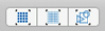
Figure 1.24 – Viewing mode options
Order
Each object or element in Affinity Designer is placed on its own separate layer (layers are covered in detail in Chapter 9, Workflow: Layers and Objects). When an object is created or placed into your document, it can be positioned in front or behind an existing object, commonly referred to as the stacking order. The Order toolbar options allow you to reposition an element's stacking order or where it's positioned in relation to other objects' positions. To reposition an object, the object must be selected and more than one object can be repositioned at a time.
The options are as follows – left to right:
- Move to back – the selected object moves to the bottom of the layer stack.
- Back one – the selected object moves back one layer.
- Forward one – the selected object moves forward one layer.
- Move to front – the selected object moves to the front layer.
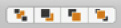
Figure 1.25 – Order options
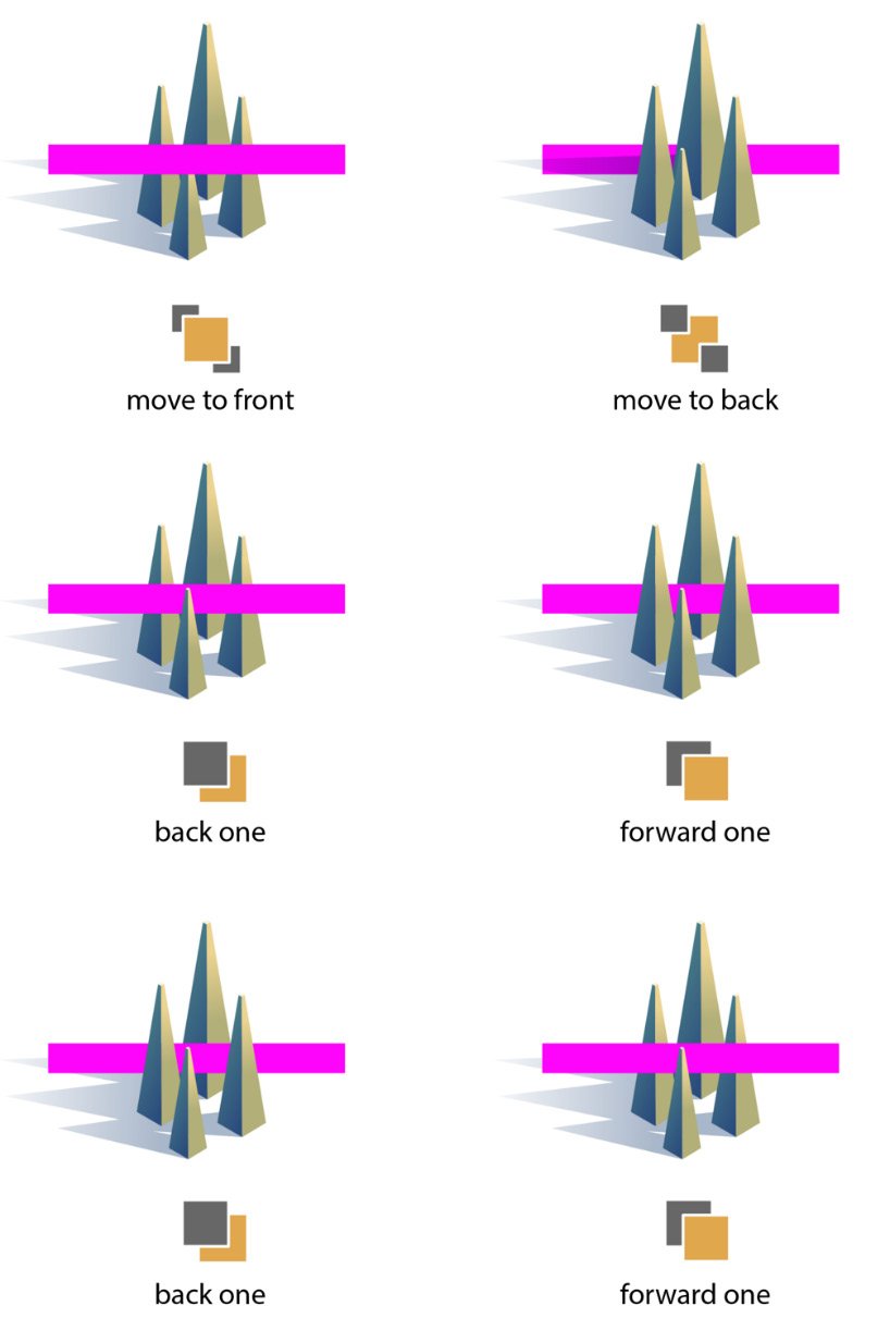
Figure 1.26 – Order options show the pink rectangle moving front to back, backward, and forward
Transforms
These four options allow you to quickly transform a selected object or objects by flipping it horizontally, flipping it vertically, rotating it counter-clockwise, or rotating it clockwise.
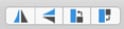
Figure 1.27 – Transform options
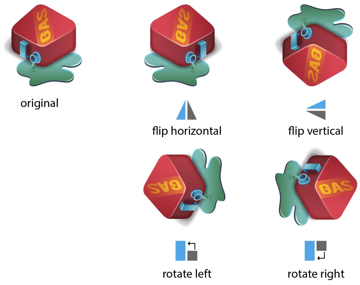
Figure 1.28 – Transform options – flipping horizontally and vertically and rotating left and right
Document title
This is where your saved document title is located and the current zoomed view percentage. An asterisk will appear to the right if the file has not been saved.

Figure 1.29 – Document title
The next set of icons along the right of the Toolbar are Distribute, Align, and Space. They allow you to reposition multiple objects quickly and in predictable ways that might be difficult to achieve one at a time or only by sight. I encourage you to create and experiment with multiple shapes to really grasp these concepts.
Distribute
The options in this group of icons allow three or more selected objects to be distributed as follows – left to right:
- Left edges – the selected objects are distributed equally to the left.
- Horizontal centers – the selected objects are horizontally distributed centrally.
- Right edges – the selected objects are distributed equally to the right.
- Top edges – the selected objects are distributed equally to the top.
- Vertical centers – the selected objects are vertically distributed centrally.
- Bottom edges – the selected objects are distributed equally to the bottom.
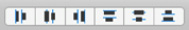
Figure 1.30 – Distribute options
Align
The options in this group of icons allow two or more selected objects to be aligned as follows – left to right:
- Left edges – the selected objects are aligned to the left.
- Horizontal centers – the selected objects are horizontally aligned centrally.
- Right edges – the selected objects are aligned to the right.
- Top edges – the selected objects are aligned to the top.
- Vertical centers – the selected objects are vertically aligned centrally.
- Bottom edges – the selected objects are aligned to the bottom.
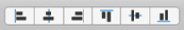
Figure 1.31 – Align options
In order to provide some clarity between the distribute and align functions, here are two instances of each that may help to visually explain how they are slightly different from one another. Compare the original element positions on the left to those on the right.
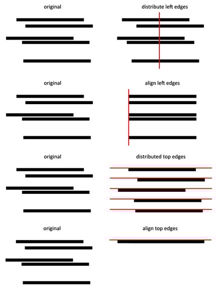
Figure 1.32 – Distribute and Align function comparisons – two examples
Spacing
These two options in the default Toolbar setup work similar to Distribute Horizontal Centers and Distribute Vertical Centers by adjusting the Vertical or Horizontal spacing between two or more selected objects.

Figure 1.33 – Spacing options
Snapping
Affinity Designer's robust and extensive snapping options come in handy when the type of work you are doing requires precise movement, sizing, or positioning. The options are as follows – left to right:
- Force Pixel Alignment: Snaps vector objects by full pixels as opposed to half pixels, when moving, creating, or editing.
- Move by Whole Pixels: Constrains the movement of objects, nodes, or vector handles to full pixels.
- Snapping: When enabled, objects will snap to the settings specified in the snapping drop-down panel. See Figure 1.35 for the many options available.
Figure 1.34 – Snapping and pixel alignment options
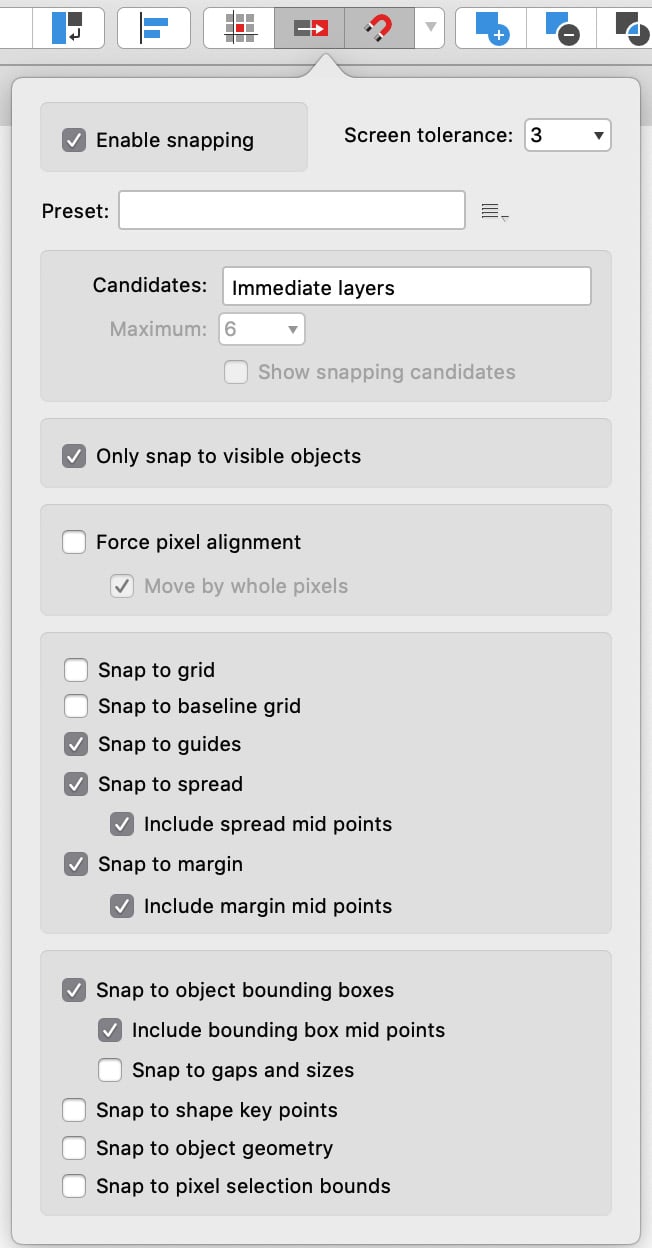
Figure 1.35 – Snapping options drop-down panel
Boolean operations
Affinity Designer offers a standard range of Boolean operations. These options allow you to combine, slice up, or make holes in overlapping objects in order to make new objects. See Figure 1.37 for a simple visual depiction of Boolean operations. The options are as follows – left to right:
- Add: Objects are combined to make one new object.
- Subtract: The objects in front or higher in the stack will cut out the object on the bottom.
- Intersect: A new object is created where objects overlap or intersect.
- Xor: Creates holes in objects where two objects overlap.
- Divide: Slices up all objects into separate pieces where they overlap.
Figure 1.36 – Boolean operation options
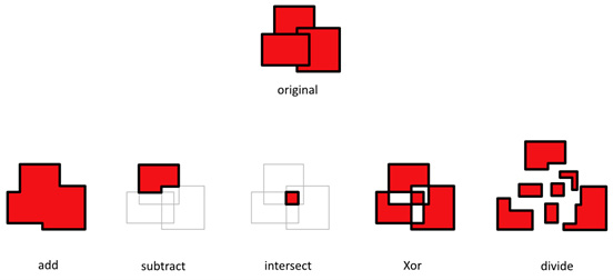
Figure 1.37 – Three objects displaying the Boolean operation options
Insert Target
Earlier, we discussed the stacking order and how we can re-order or re-arrange objects with the Order options in the Toolbar. With Insert Target, when you create a new object, it's possible to target where your new object will be placed in the stacking order or even whether you would like to nest that new object inside of another object. The options in Figure 1.38 are as follows – left to right:
- Insert behind selection: Objects are placed behind the selected object when created.
- Insert at the top of the layer: Objects are placed at the top of the layer when created.
- Insert inside selection: Objects are placed inside the selected object when created.
Figure 1.38 – Insert Target options
My Account
This icon will open the Register your App splash screen. It allows you to register, or if you are already registered, it will allow you to sign in and offer you further options or app-related news.

Figure 1.39 – My Account link
With the Toolbar covered, let's take a look at Affinity Designer's Context Toolbar.
The Context Toolbar
The Context Toolbar sits just below the Toolbar and as its name implies, it displays options based on the context of whatever is selected. Text or shape options will differ from path or placed image options, for example. One thing to note: most of these options may be accessible in other panels as well, depending on what is selected.
The Context Toolbar is really just a convenient spot for quick access to the most commonly used options for the currently selected object and may not display all of the available options for each item. To access those, you will need to further navigate to the selected object's relevant panels or related menu items. For example, to add an Effect to a selected object, you will need to use the Effects panel.
In order to demonstrate the basic options presented by the Context Toolbar, I created a simple document with a variety of typical shapes you will likely use at one time or another inside of Affinity Designer. The document contains the word type, a couple of shapes, and an open path and a placed image.
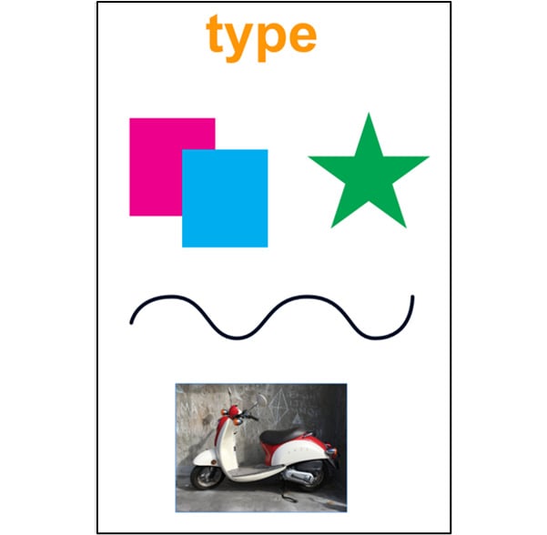
Figure 1.40 – Simple elements to demonstrate the Context Toolbar
Type options
When type is selected, the Context Toolbar editing options, available from left to right, are: font family, font weight and size, color, style – if applicable, paragraph justification, bullet or numbered listing options, line spacing or leading amount, and ligature information.
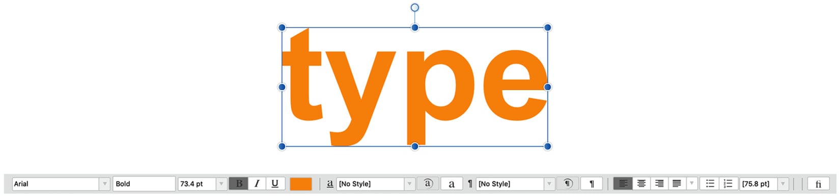
Figure 1.41 – type selected with type options in the Context Toolbar
Shape options
When a shape is selected, the editing options in the Context Toolbar, available from left to right, are: fill and stroke color; if it has a stroke or border, the stroke weight option will be available; for shapes that have corners like this rectangle, you will have options to have a single type of corner radius or different types for each corner, as well as size as a percentage of the overall shape's size or absolute-sized corners based on the measurement system you have set up (inches, centimeters, or pixels, and so on…). There are also options for the type of corner – square, rounded, straight, concave, or cutout. The next batch of icons from left to right are enable transform origins, hide selection while dragging, show alignment handles, transform objects separately, cycle selection box, and convert to curves.
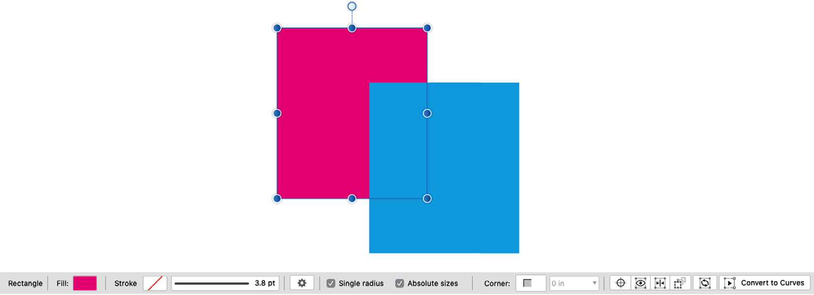
Figure 1.42 – A selected pink rectangular shape with options in the Context Toolbar
Some shapes will have special options depending on the underlying parametric structure of the shape. Refer to Figure 1.21, the Tool Panels for a look at the current lineup of Affinity Designer's 18 different parametric shapes in the Designer Persona. For example, the Star Tool options, from left to right, are fill and stroke color, stroke width, icon for different star shape presets dropdown, curved edges, number of points on the star, inner radius size, outer and inner circle sizes, the same transform icons from the previous rectangular shapes options, and convert to curves.
Convert to curves
Convert to curves will convert a Shape tool to its base curve paths, losing the ability to change some of the above options, such as the number of points on a star. Unless you absolutely need to edit the paths of a shape, it's usually best to not convert it to curves so you can go back at any time and make shape adjustments if you need to. However, if you want to create a custom shape based on a Shape tool, you will have to convert it first to have access to the base curve paths.
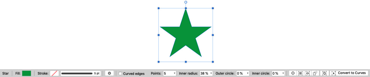
Figure 1.43 – A selected star shape with options in the Context Toolbar
Curve options
When a curve, also referred to as a path, is selected, the Context Toolbar displays the editing options available. Depending on whether you have used the Move tool (black arrow) from the Tools panel or the Node tool (white arrow), different options will present themselves.
With the Move tool, the options from left to right are fill and stroke color and stroke weight.
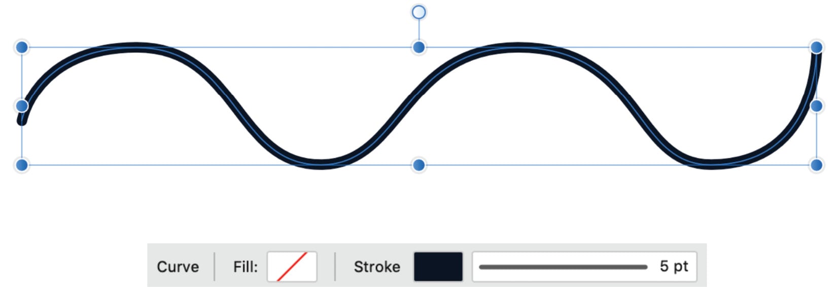
Figure 1.44 – A selected path (with the Move tool) options in the Context Toolbar
With the Node tool, the options from left to right are fill and stroke color and stroke weight, convert the node type (sharp, smooth, and smart), and actions options to edit the curve (break curve, close curve, smooth curve, join curves, and reverse curve). The final option is transform. If two or more nodes are selected and the transform node icon is selected, a transform widget will be activated and will allow you to edit the node's position and rotation independent of the unselected nodes.
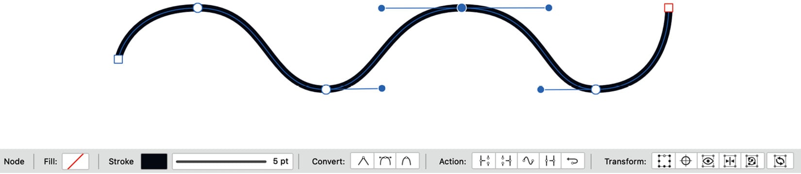
Figure 1.45 – A selected path (with the node tool) options in the Context Toolbar
Image options
When a placed image is selected, the Context Toolbar displays the image name, the image size, a button to replace the image, whether the image has a fill or a stroke, and if it has a stroke, there will be stroke options presented in the dropdown.
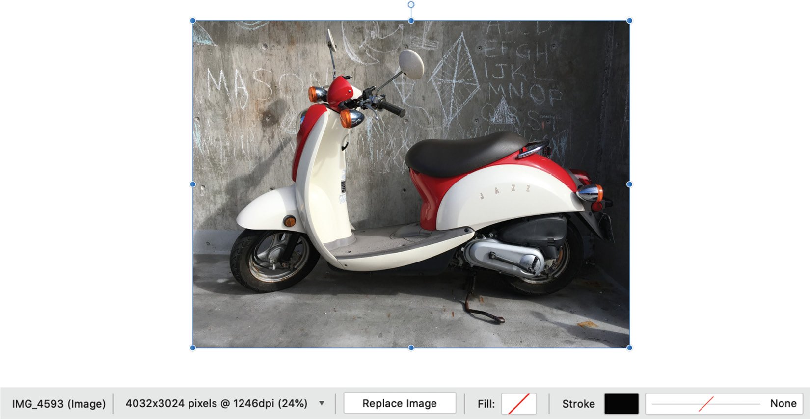
Figure 1.46 – A selected placed image with options in the Context Toolbar