
A key element contributing to the entertainment and enjoyment of most games is the quality of the visual experience, and an important part of this is the User Interface (UI). UI elements involve ways for the user to interact with the game (such as buttons, cursors, text boxes, and so on), as well as ways for the game to present up-to-date information to the user (such as the time remaining, current health, score, lives left, or location of enemies). This chapter is filled with UI recipes to give you a range of examples and ideas for creating game UIs.
Every game is different, and so this chapter attempts to fulfill two key roles. The first aim is to provide step-by-step instructions on how to create a wide range of the Unity 5 UI elements and, where appropriate, associate them with game variables in code. The second aim is to provide a rich illustration of how UI elements can be used for a variety of purposes, so that you can get good ideas about how to make the Unity 5 UI set of controls deliver the particular visual experience and interactions for the games that you are developing.
The basic UI elements can provide static images and text to just make the screen look more interesting. By using scripts, we can change the content of these images and text objects, so that the players' numeric scores can be updated, or we can show stickmen images to indicate how many lives the player has left, and so on. Other UI elements are interactive, allowing users to click on buttons, choose options, enter text, and so on. More sophisticated kinds of UI can involve collecting and calculating data about the game (such as percentage time remaining or enemy hit damage; or the positions and types of key GameObjects in the scene, and their relationship to the location and orientation of the player), and then displaying these values in a natural, graphical way (such as progress bars or radar screens).
Core GameObjects, components, and concepts relating to Unity UI development include:
Canvas: Every UI element is a child to a Canvas. There can be multiple Canvas GameObjects in a single scene. If a Canvas is not already present, then one will automatically be created when a new UI GameObject is created, with that UI object childed to the new Canvas GameObject.
EventSystem: An EventSystem GameObject is required to manage the interaction events for UI controls. One will automatically be created with the first UI element.
Panel: UI objects can be grouped together (logically and physically) with UI Panels. Panels can play several roles, including providing a GameObject parent in the Hierarchy for a related group of controls. They can provide a visual background image to graphically relate controls on the screen, and they can also have scripted resize and drag interactions added, if desired.
Visual UI controls: The visible UI controls themselves include Button, Image, Text, Toggle, and so on.
Interaction UI controls: These are non-visible components that are added to GameObjects; examples include Input Field and Toggle Group.
The Rect Transform component: UI GameObjects can exist in a different space from that of the 2D and 3D scenes, which cameras render. Therefore, UI GameObjects all have the special Rect Transform component, which has some different properties to the scene's GameObject Transform component (with its straightforward X/Y/Z position, rotation, and scale properties). Associated with Rect Transforms are pivot points (reference points for scaling, resizing, and rotations) and anchor points. Read more about these core features below.
Sibling Depth: The bottom-to-top display order (what appears on the top of what) for a UI element is determined initially by their sequence in the Hierarchy. At designtime, this can be manually set by dragging GameObjects into the desired sequence in the Hierarchy. At runtime, we can send messages to the Rect Transforms of GameObjects to dynamically change their Hierarchy position (and therefore, the display order), as the game or user interaction demands. This is illustrated in the Organizing images inside panels and changing panel depths via buttons recipe in this chapter.
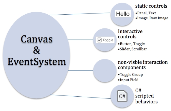
The following diagram shows how there are four main categories of UI controls, each in a Canvas GameObject and interacting via an EventSystem GameObject. UI Controls can have their own Canvas, or several UI controls can be in the same Canvas. The four categories are: static (display-only) and interactive UI controls, non-visible components (such as ones to group a set of mutually exclusive radio buttons), and C# script classes to manage UI control behavior through logic written in the program code. Note that UI controls that are not a child or descendent of a Canvas will not work properly, and interactive UI controls will not work properly if the EventSystem is missing. Both the Canvas and EventSystem GameObjects are automatically added to the Hierarchy as soon as the first UI GameObject is added to a scene.
UI Rect Transforms represents a rectangular area rather than a single point, which is the case for scene GameObject Transforms. Rect Transforms describe how a UI element should be positioned and sized relatively to its parent. Rect Transforms have a width and height that can be changed without affecting the local scale of the component. When the scale is changed for the Rect Transform of a UI element, then this will also scale font sizes and borders on sliced images, and so on. If all four anchors are at the same point, then resizing the Canvas will not stretch the Rect Transform. It will only affect its position. In this case, we'll see the Pos X and Pos Y properties, and the Width and Height of the rectangle. However, if the anchors are not all at the same point, then Canvas resizing will result in a stretching of the element's rectangle. So instead of the Width, we'll see the values for Left and Right—the position of the horizontal sides of the rectangle to the sides of the Canvas, where the Width will depend on the actual Canvas width (and the same for Top/Bottom/Height).
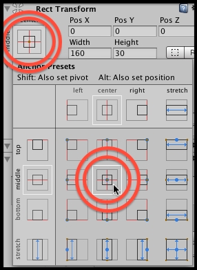
Unity provides a set of preset values for pivots and anchors, making the most common values very quick and easy to assign to an element's Rect Transform. The following screenshot shows the 3 x 3 grid that allows you quick choices about left, right, top, bottom, middle, horizontal, and vertical values. Also, the extra column on the right offers horizontal stretch presets, and the extra row at the bottom offers vertical stretch presets. Using the SHIFT and ALT keys sets the pivot and anchors when a preset is clicked.
The Unity manual provides a very good introduction to the Rect Transform. In addition, Ray Wenderlich's two-part Unity UI web tutorial also presents a great overview of the Rect Transform, pivots, and anchors. Both parts of Wenderlich's tutorial make great use of animated GIFs to illustrate the effect of different values for pivots and anchors:
There are three Canvas render modes:
Screen Space – Overlay: In this mode, the UI elements are displayed without any reference to any camera (there is no need for any Camera in the scene). The UI elements are presented in front of (overlaying) any sort of camera display of the scene contents.
Screen Space – Camera: In this mode, the Canvas is treated as a flat plane in the frustum (viewing space) of a Camera scene —where this plane is always facing the camera. So, any scene objects in front of this plane will be rendered in front of the UI elements on the Canvas. The Canvas is automatically resized if the screen size, resolution, or camera settings are changed.
World Space: In this mode, the Canvas acts as a flat plane in the frustum (viewing space) of a Camera scene—but the plane is not made to always face the Camera. How the Canvas appears is just as with any other objects in the scene, relative to where (if anywhere) in the camera's viewing frustum the Canvas plane is located and oriented.
In this chapter, we have focused on the Screen Space – Overlay mode. But all these recipes can equally be used with the other two modes as well.
Be creative! This chapter aims to act as a launching pad of ideas, techniques, and reusable C# scripts for your own projects. Get to know the range of Unity UI elements, and try to work smart. Often, a UI element exists with most of the components that you may need for something in your game, but you may need to adapt it somehow. An example of this can be seen in the recipe that makes a UI Slider non-interactive, instead using it to display a red-green progress bar for the status of a countdown timer. See this in the Displaying a countdown timer graphically with a UI Slider recipe.