
Views and controls
Views and controls make up the things you add to your layouts and presentations. In the book, we focus on just learning what you can do and some of the things you cannot do with SwiftUI, instead of comparing them to UIKit.
Text
Text is a view that displays one or more lines of read-only text:
struct ViewsAndControlsTextI: View {
    var body: some View {
        Text('This is Text')
    }
}
Try tapping the Resume button on the right:
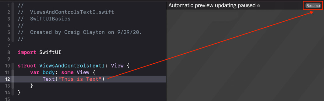
Figure 1.1
After doing so, you should see the following:
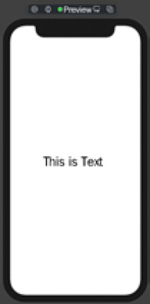
Figure 1.2
Text views display using the default font, font size, and the default color of black. In SwiftUI, we can style our views by adding modifiers. Open ViewsAndControlsTextII to see how we can add modifiers:
struct ViewsAndControlsTextII: View {
    var body: some View {
        Text('This is Text')
            .fontWeight(.bold)
            .font(.system(size: 24))
            .foregroundColor(.red)
    }
}
If you tap the Resume button on the left, you will see the following:
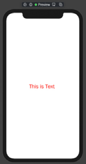
Figure 1.3
After adding modifiers to the Text view, the text is now red and bold with a font size of 24. Modifiers are used to modify and style a view. Text views are used for read-only text; if you want to add a text field that can accept the user's input, you will use TextField. Let's take a look at this next.
TextField
In this example, we look at TextField. TextField is a control that displays an editable text view. Open ViewsAndControlsTextFieldI. You will notice we are using @State in this example. Since @State is a bigger topic, please ignore it for now; we will cover this topic in detail later in the book:
struct ViewsAndControlsTextFieldI: View {
    @State private var username = ''
    var body: some View {
        TextField('Username', text: $username)
    }
}
If you tap the Resume button on the left, you will see the following:
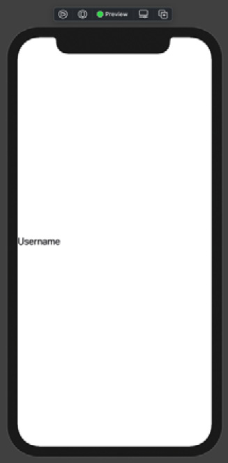
Figure 1.4
The TextField we created in this example uses the default look. Let's move to the next example to see how we can modify the TextField with a border. Open ViewsAndControlsTextFieldII and again ignore @State:
struct ViewsAndControlsTextFieldII: View {
    @State private var username = ''
    var body: some View {
        TextField('Username', text: $username)
            .textFieldStyle(RoundedBorderTextFieldStyle())
    }
}
If you tap the Resume button on the left, you will see the following:
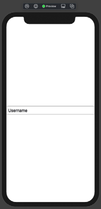
Figure 1.5
By using the .textFieldStyle modifier, we can give the TextField a rounded border. TextField views are useful for getting user information such as their username for logging into your app. For a more secure field, such as entering a password, you would use SecureField. Let's take a moment to examine SecureField.
SecureField
SecureField and TextField are the same things except that the first one is better for handling sensitive data" if they're both good but the first one is better. The styling is the same for both as well. Open ViewsAndControlsSecure and ignore @State:
struct ViewsAndControlsSecureField: View {
    @State private var password = ''
    var body: some View {
        SecureField('Password', text: $password)
            .textFieldStyle(RoundedBorderTextFieldStyle())
    }
}
If you tap the Resume button on the left, you will see the following:
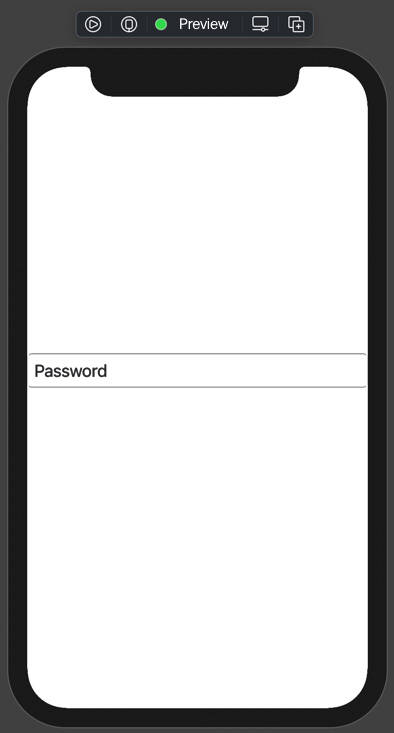
Figure 1.6
Visually, TextField and SecureField look the same, but as soon as you start to type inside SecureField, you immediately see a difference. Now, let's take some time to look at how we can display images in SwiftUI.
Image
We move to our next SwiftUI view, Image. Let's look at how we can display local images in SwiftUI:
struct ViewsAndControlsImage: View {
    var body: some View {
        Image('lebron-james-full')
    }
}
If you tap the Resume button on the left, you will see the following:
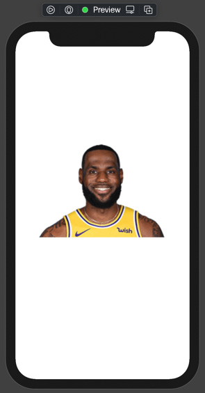
Figure 1.7a
We just looked at how you can display local images in either the Assets Catalog or the project folder. If you need to download the image from a URL, this process takes a bit more code. We do not cover downloading photos from URLs as that is out of scope for this book, mostly because I do not have a place to store them. There are plenty of online resources that cover this topic in detail.
Let's look at how we can modify the size of images.
Modifying an image
In SwiftUI, when you need to resize an image, you have to use the .resizeable modifier. Let's look at how this works in SwiftUI. Open ViewsAndControlsResizableImage:
struct ViewsAndControlsResizableImage: View {
    var body: some View {
        Image('lebron-james-full')
            .resizable()
            .frame(width: 124, height: 92)
    }
}
Tap the Resume button; you'll see the following:
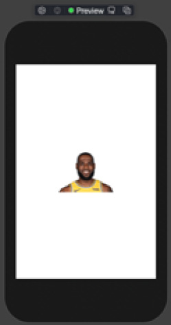
Figure 1.7b
In this example, we use the .resizable and .frame modifiers to adjust the size of the image. If you are working with images that come from a URL, you will have a different setup. You still have to use the .resizable and the .frame modifier even if the image comes from a URL. Let's turn our attention to SF Symbols.
In iOS 13, Apple introduced SF Symbols, and with the release of iOS 14, we got even more. These symbols work with accessibility requirements and grow in size when the user changes their system font size. In the following code, we are displaying a rain cloud:
struct ViewsAndControlsSFSymbol: View {
    var body: some View {
        Image(systemName: 'cloud.heavyrain.fill')
    }
}
Tap the Resume button; you'll see the following:
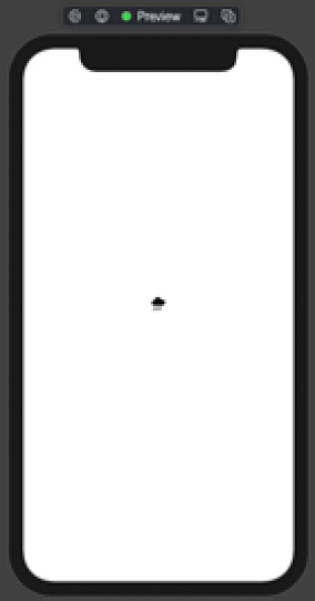
Figure 1.8
If you would like to see the entire library of SFSymbols v1 and v2, you can download the app from https://developer.apple.com/sf-symbols/. A screenshot of the app looks as follows:
Figure 1.9
With SF Symbols, you have access to over 2,400 configurable symbols that you can use in your Apple apps. We use SF Symbols throughout the book, and you should become familiar with them. Moving to the next example, let's look at how to create buttons.
Buttons
A basic SwiftUI button provides an action and a label. We can use closure blocks or execute a method inside of this action. Let's look at a default SwiftUI button by opening up ViewsAndControlsButtonI:
struct ViewsAndControlsButtonI: View {
    var body: some View {
        Button(action: { print('Button tapped') }) {
            Text('Button Label')
        }
    }
}
If you tap the Resume button on the left, you'll see the following:
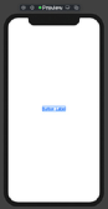
Figure 1.10
SwiftUI default buttons use a default label that has no style attached. You can add any type of view inside of the label. You can also use modifiers to give a button a certain look and feel.
Let's move to the next example. Open ViewsAndControlsButtonII and let's see how we can style a button:
struct ViewsAndControlsButtonII: View {
    var body: some View {
        Button(action: { print('Button tapped') }) {
            Text('Button Label')
        }
        .padding(10)
        .background(Color.red)
        .foregroundColor(.white)
    }
}
If you tap the Resume button on the left, you'll see the following:
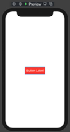
Figure 1.11
Our button now has a red background with white text and a padding of 10 pixels around the text. You can turn a default button into any design you may need. We'll learn how to create custom buttons and custom button styles that we can share with other buttons in this book. For now, let's move to the next set of examples, shapes.