
You may not expect it, but the legacy Unity GUI has evolved over time, adding new features and improving performance. However, because it has kept evolving based on the its original implementation, it has been hampered with many constraints and the ever pressing need to remain backwards compatible (just look at Windows, which even today has to cater for programs written in BASIC (http://en.wikipedia.org/wiki/BASIC)). Not to say the old system is bad, it's just not as evolved as some of the newer features being added to the Unity 4.x and Unity 5.x series, which are based on newer and more enhanced designs, and more importantly, a new core.
The main drawback of the legacy GUI system is that it is only drawn in screen space (drawn on the screen instead of within it) on top of any 3D elements or drawing in your scenes. This is fine if you want menus or overlays in your title but if you want to integrate it further within your 3D scene, then it is a lot more difficult.
Note
For more information about world space and screen space, see this Unity Answers article (http://answers.unity3d.com/questions/256817/about-world-space-and-local-space.html).
So before we can understand how good the new system is, we first need to get to grips with where we are coming from. (If you are already familiar with the legacy GUI system, feel free to skip over this section.)
Note
A point of reference
Throughout this book, we will refer to the legacy GUI simply as GUI.
When we talk about the new system, it will be referred to as UI or Unity UI, just so you don't get mixed-up when reading.
When looking around the Web (or even in the Unity support forums), you may hear about or see references to uGUI, which was the development codename for the new Unity UI system.
The legacy GUI controls provide basic and stylized controls for use in your titles.
All legacy GUI controls are drawn during the GUI rendering phase from the built-in OnGUI method. In the sample that accompanies this title, there are examples of all the controls in the Assets\BasicGUI.cs script.
Note
For GUI controls to function, a camera in the scene must have the GUILayer component attached to it. It is there by default on any Camera in a scene, so for most of the time you won't notice it. However, if you have removed it, then you will have to add it back for GUI to work.
The component is just the hook for the OnGUI delegate handler, to ensure it has called each frame.
Tip
Like the Update method in scripts, the OnGUI method can be called several times per frame if rendering is slowing things down. Keep this in mind when building your own legacy GUI scripts.
The controls that are available in the legacy GUI are:
Label
Texture
Button
Text fields (single/multiline and password variant)
Box
Toolbars
Sliders
ScrollView
Window
So let's go through them in more detail:
Note
All the following code is implemented in the sample project in the basic GUI script located in the Assets\Scripts folder of the downloadable code.
To experiment yourself, create a new project, scene, and script, placing the code for each control in the script and attach the script to the camera (by dragging it from the project view on to the Main Camera GameObject in the scene hierarchy). You can then either run the project or adorn the class in the script with the [ExecuteInEditMode] attribute to see it in the game view.
Most GUI systems start with a Label control; this simply provides a stylized control to display read-only text on the screen, it is initiated by including the following OnGUI method in your script:
void OnGUI() {
  GUI.Label(new Rect(25, 15, 100, 30), "Label");
}
This results in the following on-screen display:

The Label control supports altering its font settings through the use of the guiText GameObject property (guiText.font) or GUIStyles. (See the following section on GUIStyles for more detail.)
Note
To set guiText.font in your script, you would simply apply the following in your script, either in the Awake/Start functions or before drawing the next section of text you want drawn in another font:
public Font myFont = new Font("arial");
guiText.font = myFont;
You can also set the myFont property in Inspector using an imported font.
The Label control forms the basis for all controls to display text, and as such, all other controls inherit from it and have the same behaviors for styling the displayed text.
The Label control also supports using a Texture for its contents, but not both text and a texture at the same time. However, you can layer Labels and other controls on top of each other to achieve the same effect (controls are drawn implicitly in the order they are called), for example:
public Texture2D myTexture;
void Start() {
  myTexture = new Texture2D(125, 15);
}
void OnGUI() {
  //Draw a texture
  GUI.Label(new Rect(125, 15, 100, 30), myTexture);
  //Draw some text on top of the texture using a label
  GUI.Label(new Rect(125, 15, 100, 30), "Text overlay");
}
Note
You can override the order in which controls are drawn by setting GUI.depth = /*<depth number>*/; in between calls; however, I would advise against this unless you have a desperate need.
The texture will then be drawn to fit the dimensions of the Label field, By default it scales on the shortest dimension appropriately. This too can be altered using GUIStyle to alter the fixed width and height or even its stretch characteristics.
Not specifically a control in itself, the GUI framework also gives you the ability to simply draw a Texture to the screen Granted there is little difference to using DrawTexture function instead of a Label with a texture or any other control. (Just another facet of the evolution of the legacy GUI). This is, in effect, the same as the previous Label control but instead of text it only draws a texture, for example:
public Texture2D myTexture;
void Start() {
  myTexture = new Texture2D(125, 15);
}
void OnGUI() {
  GUI.DrawTexture(new Rect(325, 15, 100, 15), myTexture);
}
Note
Note that in all the examples providing a Texture, I have provided a basic template to initialize an empty texture. In reality, you would be assigning a proper texture to be drawn.
You can also provide scaling and alpha blending values when drawing the texture to make it better fit in the scene, including the ability to control the aspect ratio that the texture is drawn in.
Tip
A warning though, when you scale the image, it affects the rendering properties for that image under the legacy GUI system.
Scaling the image can also affect its drawn position. You may have to offset the position it is drawn at sometimes.
public Texture2D myTexture;
void Start() {
  myTexture = new Texture2D(125, 15);
}
void OnGUI() {
  GUI.DrawTexture(new Rect(325, 15, 100, 15), myTexture, ScaleMode.ScaleToFit,true,0.5f);
}
This will do its best to draw the source texture with in the drawn area with alpha blending (true) and an aspect ratio of 0.5. Feel free to play with these settings to get your desired effect.
This is useful in certain scenarios in your game when you want a simple way to draw a full screen image on the screen on top of all the 3D/2D elements, such as pause or splash screen. However, like the Label control, it does not receive any input events (see the Button control for that).
There is also a variant of the DrawTexture function called DrawTextureWithTexCoords. This allows you to not only pick where you want the texture drawn on to the screen, but also from which part of the source texture you want to draw, for example:
public Texture2D myTexture;
void Start() {
  myTexture = new Texture2D(125, 15);
}
void OnGUI() {
  GUI.DrawTextureWithTexCoords (new Rect(325, 15, 100, 15), myTexture ,
  new Rect(10, 10, 50, 5));
}
This will pick a region from the source texture (myTexture) 50 pixels wide by 5 pixels high starting from position 10, 10 on the texture. It will then draw this to the Rect region specified.
Note
However, the DrawTextureWithTexCoords function cannot perform scaling, it can only perform alpha blending! It will simply draw to fit the selected texture region to the size specified in the initial Rect.
DrawTextureWithTexCoords has also been used to draw individual sprites using the legacy GUI, which has a notion of what a sprite is.
Unity also provides a Button control, which comes in two variants. The basic Button control which only supports a single click, whereas RepeatButton supports holding down the button.
They are both instantiated the same way by using an if statement to capture when the button is clicked, as shown in the following script:
void OnGUI() {
  if (GUI.Button(new Rect(25, 40, 120, 30), "Button"))
  {
    //The button has clicked, holding does nothing
  }
  if (GUI.RepeatButton(new Rect(170, 40, 170, 30), "RepeatButton"))
  {
    //The button has been clicked or is held down
  }
}
Each will result in a simple button on screen as follows:

The controls also support using a Texture for the button content as well by providing a texture value for the second parameter as follows:
public Texture2D myTexture;
void Start() {
  myTexture = new Texture2D(125, 15);
}
void OnGUI() {
  if (GUI.Button(new Rect(25, 40, 120, 30), myTexture))
  {  }
}
Like the Label, the font of the text can be altered using GUIStyle or by setting the guiText property of the GameObject. It also supports using textures in the same way as the Label. The easiest way to look at this control is that it is a Label that can be clicked.
Just as there is a need to display text, there is also a need for a user to be able to enter text, and the legacy GUI provides the following controls to do just that:
Using the TextField control is simple, as it returns the final state of the value that has been entered and you have to pass that same variable as a parameter for the current text to be displayed. To use the controls, you apply them in script as follows:
string textString1 = "Some text here";
string textString2 = "Some more text here";
string textString3 = "Even more text here";
void OnGUI() {
  textString = GUI.TextField(new Rect(25, 100, 100, 30), textString1);
  textString = GUI.TextArea(new Rect(150, 100, 200, 75), textString2);
  textString = GUI.PasswordField(new Rect(375, 100, 90, 30), textString3, '*');
}
Tip
A note about strings in Unity scripts
Strings are immutable. Every time you change their value they create a new string in memory by having the textString variable declared at the class level it is a lot more memory efficient.
If you declare the textString variable in the OnGUI method, it will generate garbage (wasted memory) in each frame. Worth keeping in mind.
When displayed, the textbox by default looks like this:

As with the Label and Button controls, the font of the text displayed can be altered using either a GUIStyle or guiText GameObject property.
In the midst of all the controls is a generic purpose control that seemingly can be used for a variety of purposes. Generally, it's used for drawing a background/shaded area behind all other controls.
The Box control implements most of the features mentioned in the controls above controls (Label, Texture, and Text) in a single control with the same styling and layout options. It also supports text and images as the other controls do.
You can draw it with its own content as follows:
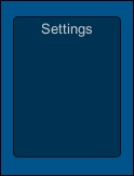
void OnGUI() {
GUI.Box (new Rect (350, 350, 100, 130), "Settings");
}
This gives you the following result:
Alternatively, you can use it to decorate the background of other controls, for example:
private string textString = "Some text here";
void OnGUI() {
  GUI.Box (new Rect (350, 350, 100, 130), "Settings");
  GUI.Label(new Rect(360, 370, 80, 30), "Label");
  textString = GUI.TextField(new Rect(360, 400, 80, 30), textString);
  if (GUI.Button (new Rect (360, 440, 80, 30), "Button")) {}
}
Tip
Note that using the Box control does not affect any controls you draw upon it. It is drawn as a completely separate control. This statement will be made clearer when you look at the Layout controls later in this chapter.
The example will draw the box background and the Label, Text, and Button controls on top of the box area and looks like this:
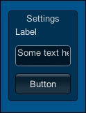
The box control can be useful to highlight groups of controls or providing a simple background (alternatively, you can use an image instead of just text and color).
As with the other controls, the Box control supports styling using GUIStyle.
If checking on / checking off is your thing, then the legacy GUI also has a checkbox control for you, useful for those times when you need to visualize the on/off state of an option.
Like the TextField control, you pass the variable that manages Togglestate as a parameter and it returns the new value (if it changes), so it is applied in code as follows:
bool blnToggleState = false;
void OnGUI() {
blnToggleState = GUI.Toggle(new Rect(25, 150, 250, 30),
blnToggleState, "Toggle");
}
This results in the following on-screen result:

As with the Label and Button controls, the font of the text displayed can be altered using either a GUIStyle or guiText GameObject property.
The basic GUI controls also come with some very basic automatic layout panels: the first handles an arrangement of buttons, however these buttons are grouped and only one can be selected at a time.
As with other controls, the style of the button can be altered using a GUIStyles definition, including fixing the width of the buttons and spacing.
There are two layout options available, these are:
The Toolbar control
The Selection grid control
The Toolbar control arranges buttons in a horizontal pattern (vertical is not supported).
Tip
Note that it is possible to fake a vertical toolbar by using a selection grid with just one item per row. See the Selection grid section later in this chapter for more details.
As with other controls, the Toolbar returns the index of the currently selected button in the toolbar. The buttons are also the same as the base button control so it also offers options to support either text or images for the button content.
To implement the toolbar, you specify an array of the content you wish to display in each button and the integer value that controls the selected button, as follows:
private int toolbarInt;
private string[] toolbarStrings ;
Void Start() {
  toolbarInt = 0;
  toolbarStrings = { "Toolbar1", "Toolbar2", "Toolbar3" };
}
void OnGUI() {
  toolbarInt = GUI.Toolbar(new Rect(25, 200, 200, 30), toolbarInt, toolbarStrings);
}
The main difference between the preceding controls is that you have to pass the currently selected index value in to the control and it then returns the new value.
The Toolbar when drawn looks as follows:
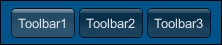
As stated, you can also pass an array of textures as well and they will be displayed instead of the text content.
The SelectionGrid control is a customization of the previous standard Toolbar control, it is able to arrange the buttons in a grid layout and resize the buttons appropriately to fill the target area.
In code, SelectionGrid is used in a very similar format to the Toolbar code shown previously, for example:
private int selectionGridInt ;
private string[] selectionStrings;
Void Start() {
  selectionGridInt = 0;
  selectionStrings = { "Grid 1", "Grid 2", "Grid 3", "Grid 4" };
}
void OnGUI() {
  selectionGridInt = GUI.SelectionGrid(
  new Rect(250, 200, 200, 60), selectionGridInt, selectionStrings, 2);
}
The main difference between SelectionGrid and Toolbar in code is that with SelectionGrid you can specify the number of items in a single row and the control will automatically lay out the buttons accordingly (unless overridden using GUIStyle).
The preceding code will result in the following layout:
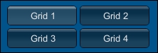
On their own, they provide a little more flexibility than just using buttons alone.
When you need to control a range in your games. GUI or add a handle to control moving properties between two values, like moving an object around in your scene, this is where the Slider and Scrollbar controls come in. They provide two similar out-of-the-box implementations that give a scrollable region and a handle to control the value behind the control.
Here, they are presented side by side:
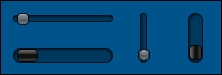
The slimmer Slider and chunkier Scrollbar controls can both work in either horizontal or vertical modes and have presets for the minimum and maximum values allowed.
In code, the Slider control code is represented as follows:
private float fltSliderValue = 0.5f;
void OnGUI() {
  fltSliderValue = GUI.HorizontalSlider(new Rect(25, 250, 100,30), fltSliderValue, 0.0f, 10.0f);
  fltSliderValue = GUI.VerticalSlider(new Rect(150, 250, 25, 50), fltSliderValue, 10.0f, 0.0f);
}In code, the Scrollbar control code is represented as follows:
private float fltScrollerValue = 0.5f;
void OnGUI() {
  fltScrollerValue = GUI.HorizontalScrollbar(new Rect(25, 285,100, 30), fltScrollerValue, 1.0f, 0.0f, 10.0f);
  fltScrollerValue = GUI.VerticalScrollbar(new Rect(200, 250, 25,50), fltScrollerValue, 1.0f, 10.0f, 0.0f);
}
Like Toolbar and SelectionGrid, you are required to pass in the current value and it will return the updated value. However, unlike all the other controls, you actually have two style points, so you can style the bar and the handle separately, giving you a little more freedom and control over the look and feel of the sliders.
Normally, you would only use the Slider control; The main reason the Scrollbar is available is that it forms the basis for the next control, the ScrollView control.
The last of the displayable controls is the ScrollView control, which gives you masking abilities over GUI elements with optional horizontal and vertical Scrollbars. Simply put, it allows you to define an area larger for controls behind a smaller window on the screen, for example:
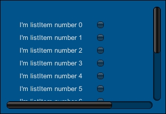
Example list implementation using a ScrollView control
Here we have a list that has many items that go beyond the drawable area of the ScrollView control. We then have the two scrollbars to move the content of the scroll viewer up/down and left/right to change the view. The background content is hidden behind a viewable mask that is the width and height of the ScrollView control's main window.
Styling the control is a little different as there is no base style for it; it relies on the currently set default GUISkin (see the following GUIStyles section). You can however set separate GUIStyles for each of the sliders but only over the whole slider, not its individual parts (bar and handle). If you don't specify styles for each slider, it will also revert to the base GUIStyle.
Implementing a ScrollView is fairly easy, for example:
Define the visible area along with a virtual background layer where the controls will be drawn using a
BeginScrollViewfunction.Draw your controls in the virtual area. Any GUI drawing between the ScrollView calls is drawn within the scroll area.
Complete it by closing the control with the
EndScrollViewfunction. For example, the previous example view was created with the following code:private Vector2 scrollPosition = Vector2.zero; private bool blnToggleState = false; void OnGUI() { scrollPosition = GUI.BeginScrollView(new Rect(25, 325, 300, 200), scrollPosition, new Rect(0, 0, 400, 400)); for (int i = 0; i < 20; i++) { //Add new line items to the background addScrollViewListItem(i, "I'm listItem number " + i); } GUI.EndScrollView(); } //Simple function to draw each list item, a label and checkbox void addScrollViewListItem(int i, string strItemName) { GUI.Label(new Rect(25, 25 + (i * 25), 150, 25), strItemName); blnToggleState = GUI.Toggle(new Rect(175, 25 + (i * 25), 100, 25), blnToggleState, ""); }
In this code, we define a simple function (addScrollViewListItem) to draw a list item (consisting of a label and checkbox). We then begin the ScrollView control by passing the visible area (the first Rect parameter), the starting scroll position, and finally the virtual area behind the control (the second Rect parameter). Then we use that to draw 20 list items inside the virtual area of the ScrollView control using our helper function before finishing off and closing the control with the EndScrollView command.
The ScrollView control also has some actions to control its use like the ScrollTo command. This command will move the visible area to the coordinates of the virtual layer, bringing it into focus. (The coordinates for this are based on the top-left position of the virtual layer; 0,0 being top-left.)
To use the ScrollTo function on ScrollView, you must use it within the Begin and End ScrollView commands. For example, we can add a button in ScrollView to jump to the top-left of the virtual area, for example:
public Vector2 scrollPosition = Vector2.zero;
void OnGUI()
{
  scrollPosition = GUI.BeginScrollView(new Rect(10, 10, 100, 50),scrollPosition, new Rect(0, 0, 220, 10));

  if (GUI.Button(new Rect(120, 0, 100, 20), "Go to Top Left"))
    GUI.ScrollTo(new Rect(0, 0, 100, 20));

  GUI.EndScrollView();
}
You can also additionally turn on/off the sliders on either side of the control by specifying the BeginScrollView statement using the alwayShowHorizontal and alwayShowVertical properties; these are highlighted here in an updated GUI.BeginScrollView call:
Vector2 scrollPosition = Vector2.zero;
bool ShowVertical = false; // turn off vertical scrollbar
bool ShowHorizontal = false; // turn off horizontal scrollbar
void OnGUI() {
scrollPosition = GUI.BeginScrollView(new Rect(25, 325, 300, 200), scrollPosition,new Rect(0, 0, 400, 400),  ShowHorizontal,  ShowVertical);
  GUI.EndScrollView ();
}Now having just plain text everywhere would not look that great and would likely force developers to create images for all the text on their screens (granted a fair few still do so for effect). However, Unity does provide a way to enable richer text display using a style akin to HTML wherever you specify text on a control (only for label and display purposes; getting it to work with input fields is not recommended).
In this HTML style of writing text, we have the following tags we can use to liven up the text displayed.
This gives text a Bold format, for example:
The<b>quick</b>brown<b>Fox</b>jumped over the<b>lazy Frog</b>
This would result in:
The quick brown Fox jumped over the lazy Frog
Using this tag will give text an Italic format, for example:
The<b><i>quick</i></b>brown<b>Fox</b><i>jumped</i>over the<b>lazy Frog</b>
This would result in:
The quick brown Fox jumped over the lazy Frog
As you can probably guess, this tag will alter the Size of the text it surrounds.
For reference, the default size for the font is set by the font itself.
For example:
The<b><i>quick</i></b><size=50>brown<b>Fox</b></size><i>jumped</i>over the<b>lazy Frog</b>
This would result in:
The
quick  jumped
over the
lazy Frog
Lastly, you can specify different colors for text surrounded by the Color tag. The color itself is denoted using its 8-digit RGBA hex value, for example:
The <b><i>quick</i></b> <size=50><color=#a52a2aff>brown</color> <b>Fox</b></size> <i>jumped</i> over the <b>lazy Frog</b>
Note
Note that the color is defined using normal RGBA color space notation (http://en.wikipedia.org/wiki/RGBA_color_space) in hexadecimal form with two characters per color, for example, RRGGBBAA. Although the color property does also support the shorter RGB color space, which is the same notation but without the A (Alpha) component, for example,. RRGGBB
The preceding code would result in:
The quick 
jumped over the
lazy Frog
(If you are reading this in print, the previous word brown is in the color brown.)
Note
You can also use a color name to reference it but the pallet is quite limited; for more details, see the Rich Text manual reference page at http://docs.unity3d.com/Manual/StyledText.html.
For text meshes, there are two additional tags:
<material></material><quad></quad>
These only apply when associated to an existing mesh. The material is one of the materials assigned to the mesh, which is accessed using the mesh index number (the array of materials applied to the mesh). When applied to a quad, you can also specify a size, position (x, y), width, and height to the text.
The legacy GUI system does also have some features for controlling flow, control selection, and targeted behavior. When it was introduced in Unity V2, it was a huge step up from the previous component-based system.
The legacy GUI allow you to group controls together on the screen, making all positions for the group relative to the group's position. This means that if you started a group at position X 50 and Y 50, then all child control positions within the group would start at 50,50 when they define their position as 0,0.
Like the ScrollView control, each group has a beginning and an end to define the scope of all the controls within the group, for example:
void OnGUI() {
  //Start a group at position 50, 50. 150 width and 60 heightGUI.BeginGroup(new Rect (50,50,150,60));
  //Draw a label with a 10, 10 offset in the group
  GUI.Label(new Rect (10, 10, 100, 30), "Label in a Group");
  GUI.EndGroup();
}
Here the label is drawn within the group bounds, and as the group starts at X 50, the Labels screen position will be at X 60 (50 + 10). Anything positioned or overflowing the group's bounds will not be drawn.
The group, like other controls, can also specify content within the group as text or a texture with appropriate GUIStyles.
Note
What is odd is that unlike the rest of the controls, if you specify text content in the function, the default color of text is white, whereas if you specify text in the content parameter for the BeginGroup function, the text in the group is black by default. It's also left justified instead of centered.
Additionally, by default the group does not support Rich Text Formatting unlike the other controls, so you will need to apply GUIStyle to change that.
With each control that you implement through script, you can name them as you place them; this is essential if you want to control flow and access to each field from the keyboard or to derive logic based on the currently selected/focused control.
Now unlike most other Unity functionality, you cannot directly name controls, there is no Name field on the properties of the controls as they are just commands to the GUI system to draw things to the screen, kind of like a rendering pipeline.
So to name GUI controls in Unity, we simply need to tell the GUI system that the next control we are going to draw has a name, as follows:
string login = "Would you like to play a game?";
void OnGUI() {
  GUI.SetNextControlName("MyAwesomeField");
  login = GUI.TextField(new Rect(10, 10, 200, 20), login);
}With names defined on controls, you could then define which control you were focusing on. To focus on a specific control, you would simply need to call:
GUI.FocusControl("MyAwesomeField");This would then change the user's input focus or selection to the specific GUI control with that name.
Once you have a control in focus, you then discover the name of the specific control in focus by calling:
string selectedControl = GUI.GetNameOfFocusedControl();
If the control in focus has a name, it will return the name you set for that control. If no control is in focus or the control in focus has no name, it will return an empty string.
As an example of using the previous naming and focus capabilities, you can build a simple logon GUI for a user to enter with validation behavior and some usability features.
To demonstrate, we will create a user registration form where the user can enter a username and password to register with your game. The password however will have to be more than six characters long for security reasons (no weak passwords here).
To start, create a new script called IntermediateGUI in your project (the full sample can be found in the project available with this book in the code download) and replace its contents with the following:
using UnityEngine;
[ExecuteInEditMode]
public class IntermediateGUI : MonoBehaviour {

  public string username = "Enter username";
  public string password = "Enter password";
  private bool passwordInError = false;
  private string passwordErrorMessage = "<color=red>Password too short</color>";
}
This gives a basic class with some of the parameters you might expect in a logon or registration form.
To this we'll add a simple function to validate the password entered to ensure it meets our stringent security policy:
void CheckUserPasswordAndRegister()
{
  if (password.Length < 6)
  {
    //If the password is not long enough, mark it in error
	//and focus on the password field
    passwordInError = true;
    GUI.FocusControl("PasswordField");
  } else
  {
    passwordInError = false;
GUI.FocusControl("");
    //Register User
  }
}
With that in place, now we can add our GUI controls:
void OnGUI() {
  //A tidy group for our fields and a box to decorate it
  GUI.BeginGroup(new Rect(Screen.width / 2 - 75,Screen.height / 2 - 80, 150,160));
  GUI.Box(new Rect(0,0,150,160), "User registration form");

  GUI.SetNextControlName("UsernameField");
  username = GUI.TextField(new Rect(10, 40, 130, 20), username);
  GUI.SetNextControlName("PasswordField");
  password = GUI.PasswordField(new Rect(10, 70, 130, 20), password,'*');
  if (passwordInError)
  {
    GUI.Label (new Rect (10, 100, 200, 20), passwordErrorMessage);
  }
  if (Event.current.isKey && Event.current.keyCode == KeyCode.Return &&  GUI.GetNameOfFocusedControl() == "PasswordField")
  {
    CheckUserPasswordAndRegister();
  }
  if (GUI.Button(new Rect(80, 130, 65, 20), "Register"))
  {
    CheckUserPasswordAndRegister();
  }
  GUI.EndGroup();
}
Note
Note that the Event keyword here relates to the legacy GUI event system for handling user input. See the Event section later in this chapter for more information.
This is NOT to be confused with the UnityEvent system introduced with the new UI system.
These results are shown in the following GUI screen:
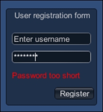
In this example, we draw a box, a text field, and a password field together with a simple button within a group, which is then centered on the screen.
We check whether the user hits the Enter key and whether they are on the password field (checked using the GUI.GetNameOfFocusedControl() function) and we try to register them. The same happens if the user clicks on the Register button.
If the user's password is longer than six characters, then they are registered; if not, then the passwordInError flag is set to True, which causes the additional label to be drawn, this then warns the user that their password could be broken easily by a 6-year-old.
Each of the GUI controls can also have a tooltip associated with it to display some additional text when it is either in focus or the mouse is hovering over the control.
Adding a tooltip is simple; you just need to replace the content of the control when it is being drawn using the GUIContent class. For example, we can update the Register button in the previous script as follows:
if (GUI.Button(new Rect(80, 130, 65, 20), new GUIContent("Register", "My Tooltip")))
{
  CheckUserPasswordAndRegister();
}
With the tooltip defined, we just then need to display the current tooltip somewhere on the screen, usually as a label, but it can be any control that can display text (input fields are not recommended however), so add the following after the button block but before EndGroup():
GUI.Label (new Rect (10, 120, 65, 20), GUI.tooltip);
This simply gets the content of the current tooltip in focus and returns the tooltip text for that control.
The last weapon in the legacy GUI arsenal is the Window control. As the name suggests, this defines a separate drawable window for your controls.
Note
The window behavior is similar to ScrollView; however, it is just one layer. Any controls drawn outside the bounds of the window are simply not drawn.
Tip
But there is nothing to stop you using a ScrollView control inside a Window to achieve the same thing however.
With this separate Window, we can control many things, including:
The modal nature of the Window
The drag state of Window; as in, the window can be dragged by holding on with a mouse or touch
The draw order of each Window; this allows sorting of draw windows on top of each other
The specific Window in focus, if there are multiple side-by-side windows or a modal window
This opens lots of possibilities with a GUI Window.
Note
The full Window example can be found in the BasicGUI script in the sample project, displaying all the same controls as before but within a single separate Window control.
To create a Window control, you first need to define a new method callback for the Window using the following signature:
void DoMyWindow(int windowID)
{
}
This method is where you will add all your GUI code using the previous examples; each control is positioned is based off the top-left position of the window when it is displayed (same as the Group and ScrollView controls described earlier).
Additionally, you can specify any of the previous options for the window, for example:
void DoMyWindow(int windowID)
{
  GUI.Label(new Rect(25, 15, 100, 30), "Label");
  // Make the window Draggable
  GUI.DragWindow();
}
With your Window method in place, you just need to call the GUI.Window function to open it along with the property to track the Window's location:
private Rect rctWindow1;
void OnGUI()
{
  Rect rctWindow1;
  rctWindow1 = GUI.Window(0, rctWindow1, DoMyWindow, "Controls Window");
}
This calls Window control into view using:
If you want a modal window, then you would need to instantiate the window with the GUI.ModalWindow function instead of the Window function:
rctWindow1 = GUI.ModalWindow(0, rctWindow1, DoMyWindow, "Modal Controls Window");
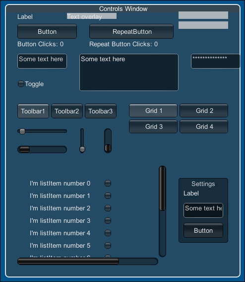
If we take all the controls together (that we have created so far in this chapter), it would create a Window view, as shown in the following screenshot:
Note
For a complete end-to-end example, please see the code download package, which has all this defined.
Recognizing that not everyone likes plain backgrounds and the same font throughout their projects, Unity provided options to define a style for the layout and general look and feel of the legacy GUI system, these are defined as GUIStyles.
Note
These styles can either be applied globally using a GUISkin (see GUISkin in the following section), or they can be applied individually to each control (as detailed in the previous screenshot).
Each style has options to define:
A
NameA texture or text color for the different states of the control it's attached to (
Normal,Hover,Active, andFocused)The border, margin, padding, and overflow sizes for the control (for each edge)
A
Font(with suitable size, style, alignment, word wrapping, and rich text support options)A text clipping size
Image position within the control
Offset settings for the content within the control
A fixed width and height
Stretching options for the width and height
I recommended configuring a public GUIStyle property in a class and then modifying it in Editor Inspector when setting up a GUIStyle, for example:
using UnityEngine;
[ExecuteInEditMode]
public class GUIStyles : MonoBehaviour {
  public GUIStyle;
  void OnGUI() {
//Create a label using the GUIStyle property above
    GUI.Label(new Rect(25, 15, 100, 30), "Label",myGUIStyle);
  }
}
Tip
You can also configure a GUIStyle in code, however it's not recommended as the editor is just better at it.
Note
It is worth noting that having too many different GUIStyles all over the place can become very inefficient and hard to maintain. If you find you are using a lot of GUIStyles then I'd recommend you create a single script attached to a common object (say Main Camera) in your scene with all your GUIStyle's defined and have each script take GUIStyle references from there.
When you attach the preceding script with the GUIStyle property to a GameObject in your scene, it will look like this in Inspector:
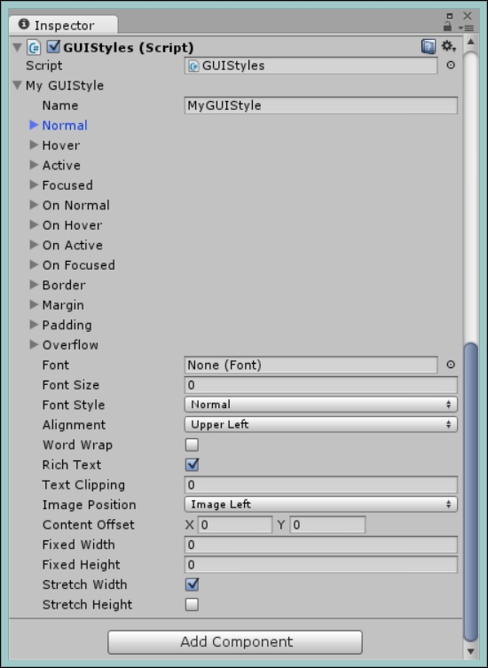
Note
Note that the first time you open it in the editor you will get NullReferenceException in the console window; this is just because you haven't configured GUIStyle yet.
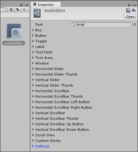
If you don't want to apply a style to each and every control directly, you can then optionally create GUISkin, which contains all the styles for each control type. This is then applied using the GUI class prior to drawing any controls.
A GUISkin also has some additional options that apply to the GUI, which include:
Setting whether a double-click action selects
Setting whether a triple-click action selects
The color of the cursor
The cursor flash speed
The default selection color
Custom styles (an array of
GUIStyleproperties you can then reuse on controls)
To demonstrate, click on the Create button in the project folder view and select GUISkin, which will give you a new GUISkin asset in the project view. By selecting it, you will see the following window in Inspector.
As you can see, it contains all the options for altering the style globally for each control. To use GUISkin, create a new script called GUISkins, then replace its contents with the following:
using UnityEngine;
[ExecuteInEditMode]
public class GUISkins : MonoBehaviour {

  public GUISkin MySkin;
  void OnGUI()
  {
    GUI.skin = mySkin;
    GUI.Label(new Rect(25, 15, 100, 30), "Label");
    //Draw the rest of your controls
  }
}
Then attach the GUISkins script to Main Camera in your current scene (disabling any other scripts currently attached) and drag the GUISkin you have created and apply it to the My Skin property of the script in the inspector:
By setting the skin at the beginning of any GUI drawing, any and all controls drawn will now use your custom skin instead of the Unity default. If you wish, you can use several skins by just changing the skin before drawing more controls.
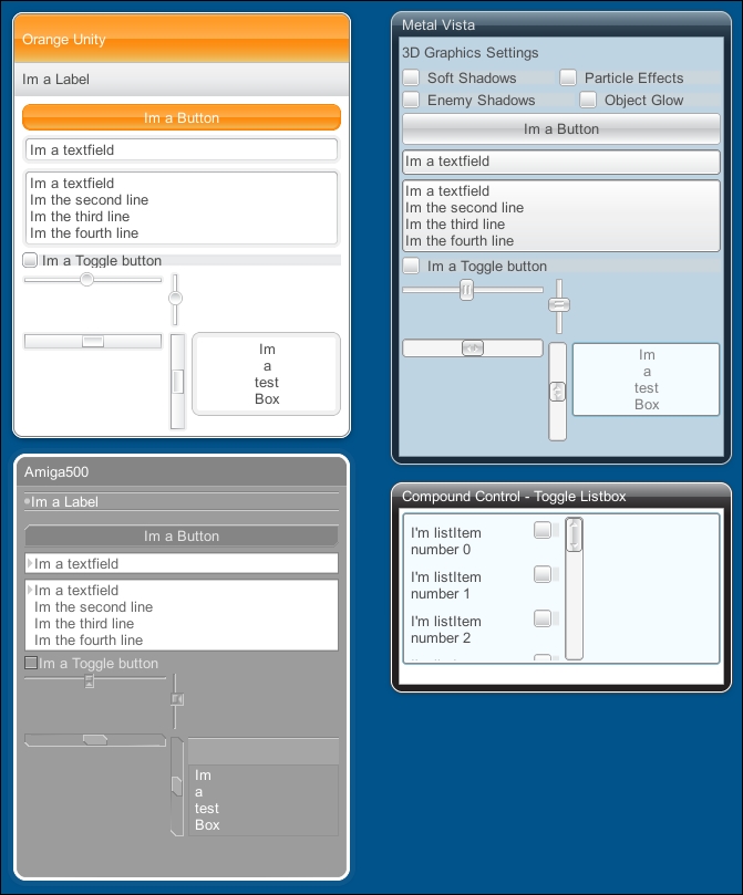
For some of the best examples of GUISkins, try installing the Unity Extra GUI Skins asset (http://bit.ly/UnityExtraGUISkins), which is a collection of skin samples built by Unity themselves (and it's free).
Note
Note that if you want to reuse your own skins in other projects (or sell more skins through the asset store), then you can export them using Unity's Export Package option under Assets in the menu. For more details, check out http://docs.unity3d.com/Manual/HOWTO-exportpackage.html
Here's an example of what the GUISkins asset gives you:
To support events in the legacy GUI area, Unity added an entire event handler specifically for GUI interactions. This class is aptly named the Event class.
Note
Remember, this section refers to the legacy GUI Event classes, which has nothing to do with the new UnityEvent system introduced in the new Unity UI system. See Chapter 6, Working with the UI Source, for more details of the UnityEvent system.
These events center on user and device input, varying from:
To access the events you simply need to query the Event.current property to get the current Event state. (The Event state updates when there is a change, until then you will get the last/previous state.)
The logon example earlier shows an example for using events, where we detect if the user has pressed a key and if that key is the Enter key as shown in this script:
if (Event.current.isKey && Event.current.keyCode == KeyCode.Return && GUI.GetNameOfFocusedControl() == "PasswordField")
  {
    CheckUserPasswordAndRegister();
  }
Along with the events, the GUI class also provides some additional properties you can query or set in the OnGUI method, namely:
enabled: Is the GUI enabled and displayed on the screen. Can it be used to turn on or off controls that are to be drawn to the screen.changed: This returns true if any controls' values have changed since the last call ofOnGUI.contentColor: This is the global text color tint for the GUI.depth: This is the depth order for the currentGUIscript. This is useful if you have GUI elements in more than one script and want to layer them.
All of these elements can be used to override all controls or individual controls by setting them in between controls.
If you prefer not to hand draw the position of every single control in your GUI, Unity does offer some automatic layout controls from the GUILayout class.
The Layout controls (using GUILayout instead of just GUI) have the same set of controls as the normal GUI class (hence I'm not going to describe them all over again), the main difference is that you do not need to specify a Rect area to draw the control, as it will just be drawn at the first suitable location; any further controls added will be laid out appropriately with enough spacing between the controls.
You can also control the spacing and even if you want, any empty space between the controls using the Width, Height, and Spacing properties (Space/FlexibleSpace) of GUILayout, following the same rules as for GUI controls (setting up the GUILayout before drawing a control).
If you don't want the layout to take up the maximum space for a control, you also have the settings for Width (MaxWidth/MinWidth) and Height (MaxHeight/MinHeight).
The main differences are as follows:
BeginGroup becomes BeginArea
Horizontal and vertical groups (sub groups)
Instead of defining Groups, you define Areas. Apart from the name, they behave exactly the same. This is the only layout control that takes a Rect parameter to specify where you want to draw the controls (excluding Windows of course); all GUILayout controls are then aligned to Area in the same way they are in Group.
To control the layout of controls, you can define a set of controls to draw in a particular direction, either horizontally or vertically. You start these in the same way as areas by setting a GUILayout.BeginHorizontal() and GUILayout.EndHorizontal() command. Like the Area, you can specify additional content for the new sub-area such as text or textures.