

Learning about contrast
Contrast is what allows us to see different elements easily, such as text on a colored background, or various shapes close to one another. We all have some favorite colors that we would like to use or corporate colors we must respect but, in the end, it always comes down to making sure our audience will be able to see and understand our content.
Some online tools can help you calculate the contrast ratio between the background color and text color, especially now that many countries have put together rules that organizations should follow to make their content more accessible. You can simply do an online search with contrast checker as keywords, and you will get a list of various sites that offer the tool. But you can also just apply this basic rule:
- If you’re using a light background, use text as dark as possible
- If you’re using a dark background, use text as light as possible
To test contrast in presentations, I usually start my slideshow and move away from my computer screen to assess the readability of the text. I also try different lighting conditions to see whether it changes how the text shows. Even though the contrast example in Figure 2.4 is in grayscale, we can easily see that the best contrast is with the first line of text, whether the background is light or dark:
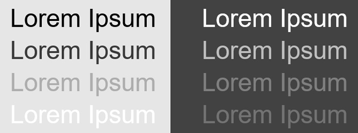
Figure 2.4 – Contrast examples with light and dark backgrounds
Tip
When choosing background and text colors, always make sure to use the darkest and lightest shades possible between the background and the text. If you use this rule of thumb, you will be able to quickly choose contrasting colors by simply testing their readability at different reading distances. If you want less contrasting colors, I would suggest you take some time to use a contrast checker tool.
Another element you need to consider when assessing contrast is the use of background graphics or textures. As shown in Figure 2.5, using texture behind the text decreases readability even though the color is the same for both backgrounds:
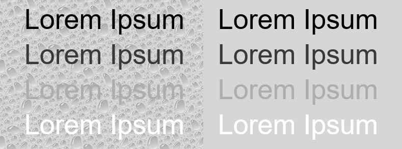
Figure 2.5 – A textured background reduces the readability of text
If the background of your slides must have a graphic of some sort because of a corporate template, make sure it is very subtle. The important element on your slide is your content, not a background texture or graphic.
Choosing colors wisely
Human beings react to colors. It can even influence how your audience will react to your content. Through the years, I have referred many times to the Colormatters.com and Colorcom.com websites for guidance (see the Further reading section) because of the valuable information we can find on their respective sites. In fact, that is where I found research-based information mentioning that color is so important in our lives that our subconscious mind judges many things based on color alone. This is the main reason why you should choose colors wisely for your presentations.
To help you, here is a sample of what meanings or emotions colors can convey (see Figure 2.6). It should guide you when choosing what colors should be used for your presentations. As an example, businesses that want to be perceived as trustworthy often use blue, and nature-oriented businesses might want to use green and brown.
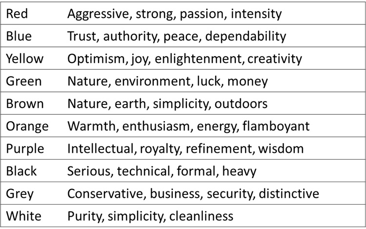
Figure 2.6 – A sample list of some of the color meanings
Digging a little deeper into color meaning would be worth it if you need to present in various countries. Indeed, the symbolism of color might have a totally different meaning from one culture to another.
Whatever the meaning conferred to colors, you also need to keep in mind that certain color combinations need to be avoided at all costs. Here is a short list of pairs to avoid and the reason why:
- Red and green: They are hard to read and are problematic for people suffering from color blindness.
- Red and blue: They lack contrast and don’t project well together.
Red, blue, and green are not the only problematic colors. It would take many more pages of color research information to discuss them all, which is not the main goal of this book. But with the information you have now, you can create presentations that avoid using the most problematic colors together and use the ones that are the most meaningful for your content.
Let’s now move on to the next topic, covering how to remove unnecessary content on your slides for your audience to understand your message quickly and remember more.