
Exploring animatable properties
In this section, we will explore some of the animatable properties. Here is a list of the ones that we will look at:
- Offset
- Hue rotation
- Opacity
- Scale
- Stroke
- Trim
- Corner radius
Let’s take a look at them in more detail.
The offset property
The first property we will look at that is animatable is the offset property. This property is responsible for offsetting a view on the x- and y-axes, basically giving you control to place that view anywhere on the screen. The following is an example of animating the offset modifier that has been placed on a rectangle shape:
struct Offset_Example: View {
    @State private var moveRight = false
    var body: some View {
       //MARK: - ANIMATE OFFSET
        VStack {
            RoundedRectangle(cornerRadius: 20)
                .foregroundColor(.blue)
                .frame(width: 75, height: 75)
                .offset(x: moveRight ? 150 : 0, y: 350 )
                .animation(Animation.default, value: moveRight)
            Spacer()
            Button("Animate") {
                moveRight.toggle()
            }.font(.title2)
        }
    }
}
After you put that code into your ContentView file, your preview will look like Figure 2.3. When you press the Animate button, the blue rectangle will move to the right, and when you press it again, it will return to its original starting position.
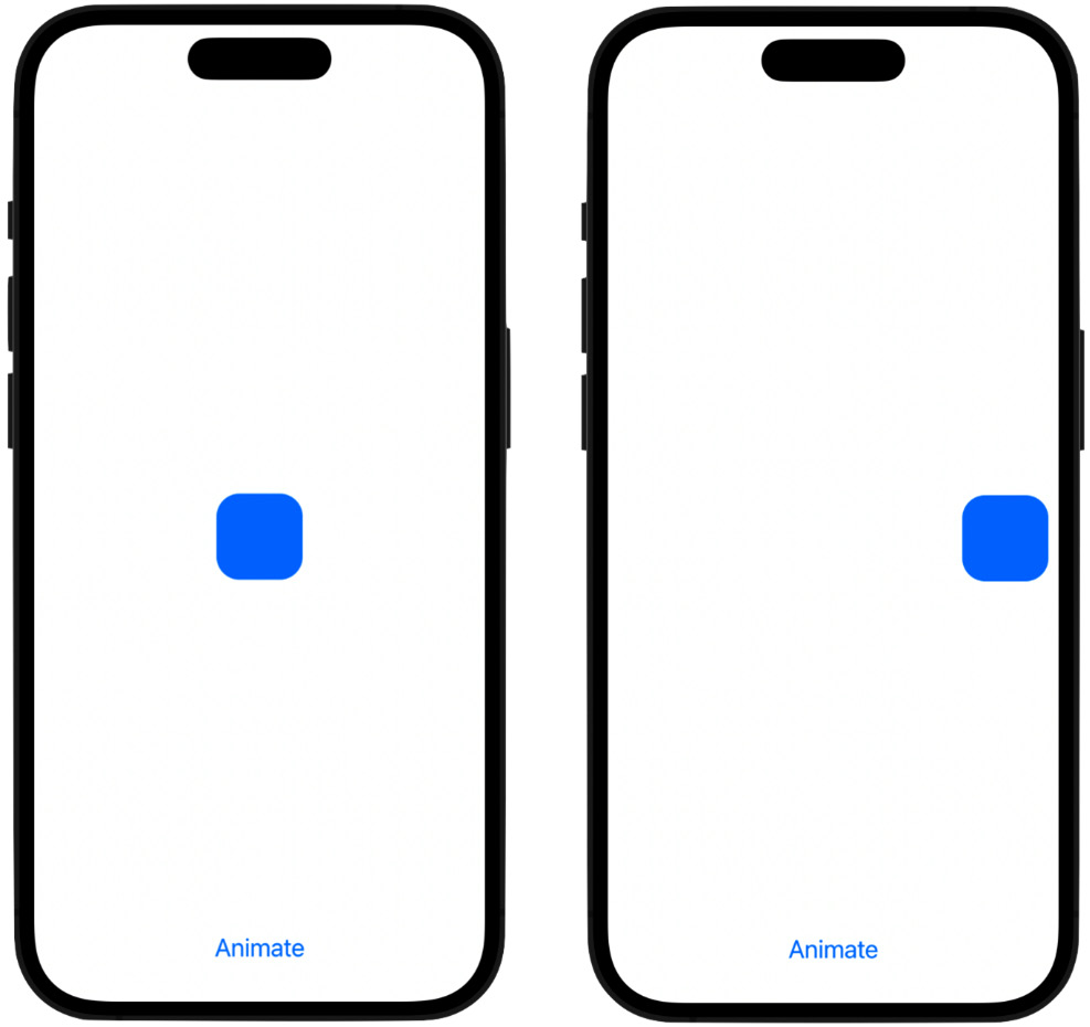
Figure 2.3: Animating the offset
This is how the code works. When the Animate button is pressed, the moveRight variable has its value toggled or changed to true, and the offset modifier has a ternary operator in there for its x parameter.
A ternary operator is an operator that accepts a Boolean variable and checks to see whether it’s true or false. If the variable is true, the value to the left of the colon is used, but if the variable is false, the value to the right of the colon is used. This makes it similar to an if statement but different because an if statement can check for multiple conditions.
So, if moveRight is true, then the rounded rectangle is placed 150 points to the right; otherwise, if false, it is left where it is (the 0 value means do nothing). The animation modifier also picks up on any change because it has the moveRight variable in there for the value parameter. This value parameter takes the variable that you are using for the animation. The animation modifier will then interpolate over the values from the start to the finish point and move the object smoothly, creating a nice, fluid animation.
Here’s a way to really see how the animation modifier is working. If you comment out the animation statement in the code and press the button, you will see that the object still moves 150 points to the right, but it does so instantly; there is no gliding across the screen now; the object just appears at its new location 150 points to the right. To create smooth, fluid animations, we need that animation modifier and its behind-the-scenes interpolating magic. This is part of the reason why we use less code in SwiftUI versus coding animation in UIKit; much of the heavy lifting is already done for us in the background with SwiftUI.
This was an example of animating an object from one point to another by changing the numerical value for the x parameter in the offset modifier. Let’s look at another property that’s animatable: HueRotation.
Hue rotation
Hue rotation is a type of color effect that can be applied to views and other components. It’s a modifier that allows you to adjust the hue of a color by adding or subtracting a fixed angle from its hue value. You can use hue rotation to create a range of related colors.
The modifier has an angle parameter that takes a value in radians or degrees. That value is based on a circle, which is 360 degrees and represents a wheel of all the colors that we can think of.
Let’s look at an Xcode example:
struct Hue_Rotation_Example: View {
    @State private var hueRotate = false
        var body: some View {
        //MARK: - ANIMATE HUE ROTATION
        VStack(spacing: 20) {
            Text("ANIMATE HUE ").font(.title2).bold()
            // rotate the colors and stop halfway around the               color wheel
            RoundedRectangle(cornerRadius: 25)
                .frame(width: 200, height: 200)
                .foregroundColor(.red)
                .hueRotation(Angle.degrees(hueRotate ? 180 :                   0))
                .animation(.easeInOut(duration: 2), value:                   hueRotate)
            // rotate the colors around the color wheel one               full revolution (360 degrees)
            Divider().background(Color.black)
            Text("ANIMATE HUE WITH GRADIENT").font(.title2).              bold()
            AngularGradient(gradient: Gradient(colors: [Color.              red, Color.blue]), center: .center)
                .hueRotation(Angle.degrees(hueRotate ? 360 :                   0))
                .animation(.easeInOut(duration: 2), value:                   hueRotate)
                .mask(Circle())
                .frame(width: 200, height: 200)
            Button("Animate") {
                hueRotate.toggle()
            }
            .font(.title)
        }
    }
}
When you add the code into Xcode, your previews will look like Figure 2.4:
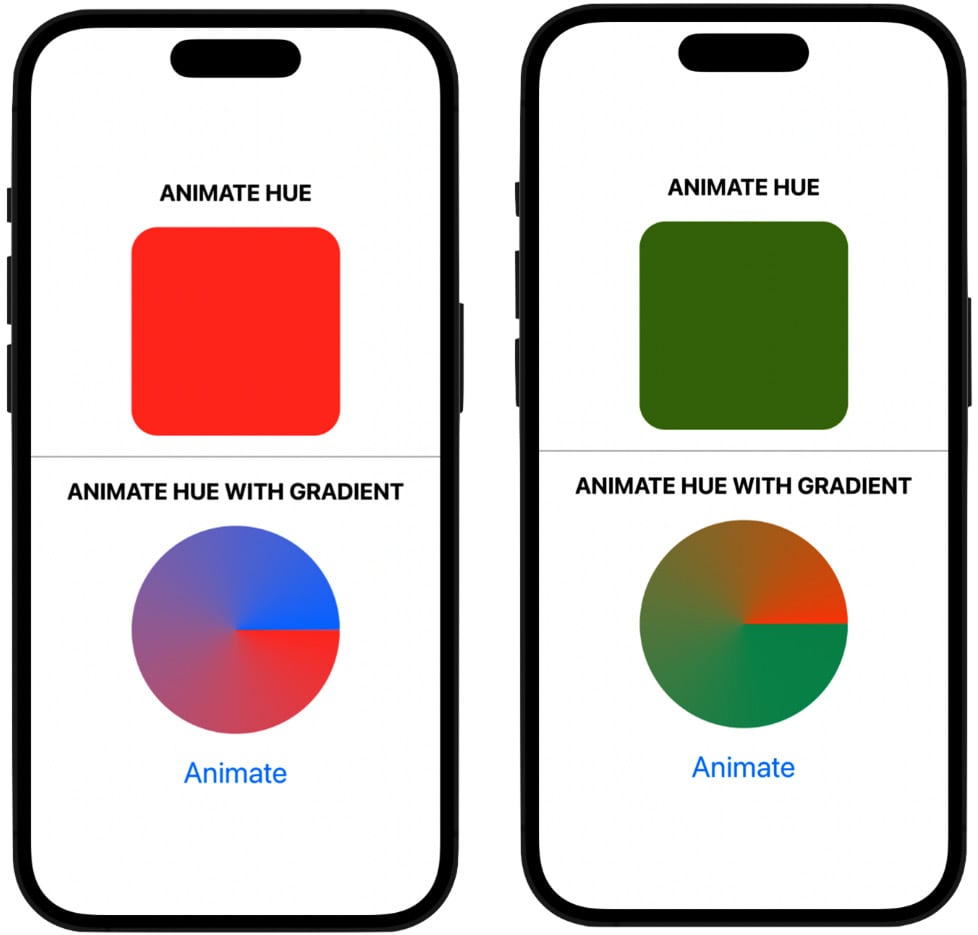
Figure 2.4: Animating the hue rotation
I created two objects in this example: a rounded rectangle and an angular gradient circle.
In the rounded rectangle, I used a ternary operator to check whether the hueRotate variable is true. When it becomes true via the Animate button being pressed, the value to the left of the colon inside the ternary operator is used, 180 degrees. Then the animation starts going through the color spectrum and stops halfway through to display that color.
Notice the use of the duration function just after the timing curve. This function allows us to set the duration of the animation; do we want it to happen fast, or do we want the animation to happen over a longer period? It has one parameter, and that is the amount of time we want the animation to take to complete; for that, we use an integer value. I set the value to 2, so it can slow things down a little, taking the animation 2 seconds to complete.
Looking at the angular gradient example, I’m using a value of 360 degrees. When we press the Animate button, the code animates through the entire color wheel and stops where it started (360 degrees is one revolution of a circle), thus displaying the original color.
Taking a look at the hueRotate variable inside the body of the button, we have two ways that we can start the animation. The first is by explicitly setting hueRotate to true, like this:
hueRotate = true
Or by using the toggle method like we’re doing in the code:
hueRotate.toggle()
The difference between these two ways of starting the animation is that firstly, the animation starts and then finishes, but it never reverses itself with subsequent button presses. If you’d like the animation to start and finish, and on the next button press reverse itself, then use the toggle method.
What’s also very interesting is that we can animate the colors of shapes and other objects, but also animate the colors that make up images, as we will see in the upcoming projects.
You can also use the hueRotation() modifier in combination with other modifiers, such as brightness() or saturation(), to create some complex and interesting color adjustments.
Let’s continue looking at the different properties to animate and at a very common property, opacity.
Opacity
Opacity refers to the transparency of a view, whether you can see it clearly, whether it is partially visible, or maybe you can’t see it at all. We can use the opacity modifier to make views appear and disappear. When we add animation to the opacity, the transition from shown to hidden is interpolated over, so it smoothly fades in and out.
Here's an example of adding opacity to an animation:
struct Opacity__Example: View {
    @State private var appear = true
    var body: some View {
//MARK: - ANIMATE OPACITY
        VStack{
            Text("Appear/Disappear")
                .font(.title).bold()
            Circle()
                .foregroundColor(.purple)
                .opacity(appear ? 1 : 0)
                .animation(.easeIn, value: appear)
                .frame(height: 175)
            Button("Animate") {
                appear.toggle()
            }.font(.title2)
            //MARK: - OVERLAPPING OPACITY
            VStack{
                Text("Overlapping Opacity").bold()
                    .font(.title)
                Circle()
                    .foregroundColor(.yellow)
                    .frame(height: 100)
                    .opacity(0.5)
                Circle()
                    .foregroundColor(.red)
                    .frame(height: 100)
                    .opacity(0.5)
                    .padding(-60)
            }.padding(60)
        }
    }
}
The preceding code will produce the following results, as shown in Figure 2.5:
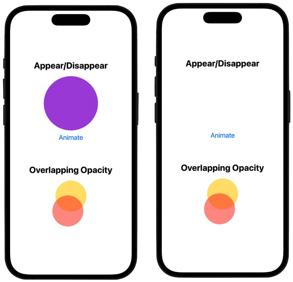
Figure 2.5: Animating the opacity
In our first example, the animation variable is called appear, and it’s set to true as its default value, which shows the circle. When the Animate button is pressed, the variable gets toggled to false, and the circle animates itself until it completely disappears. And when the button is pressed again, the animation gets set to true, and the circle becomes visible again. Again, using the animation modifier initiates the interpolation over the start and end values, so the circle doesn’t just appear or disappear instantly; there is a gradual change of state until the end of the animation is reached.
The second example of the two circles overlapping at the bottom of the screen demonstrates a unique component of opacity in SwiftUI. When we apply the opacity modifier to a view that already had its opacity transformed, the modifier will multiply the overall effect. For example, the yellow and red circles have their opacity set at 50%, overlapping each other. The top red circle allows some of the bottom yellow circle to show through, thus multiplying the opacity effect so that area is a little darker, and at the same time, mingling the two colors, creating orange.
Next, let’s take a look at animating the size or scale of a view, which we can do with the scaleEffect modifier.
Scale
Every view has a specific size, and we can change that size by scaling it up or down with animation. We can do this with the scaleEffect modifier. Here’s an example of how we can animate the scale of a view:
struct Scale_Example_One: View {
    @State private var scaleCircle = false
    var body: some View {
            //MARK: - ANIMATE THE SCALE OF A CIRCLE SHAPE
            VStack {
                Text("SCALE SHAPE").font(.title).bold()
                Circle()
                    .frame(width: 150)
                    .foregroundColor(.green)
                    .scaleEffect(scaleCircle ? 0.1 : 1)
                    .animation(.default, value: scaleCircle)
                Button("Scale Shape") {
                    scaleCircle.toggle()
                }
            }.font(.title2)
        }
    }
The preceding code will produce the following results, as shown in Figure 2.6:
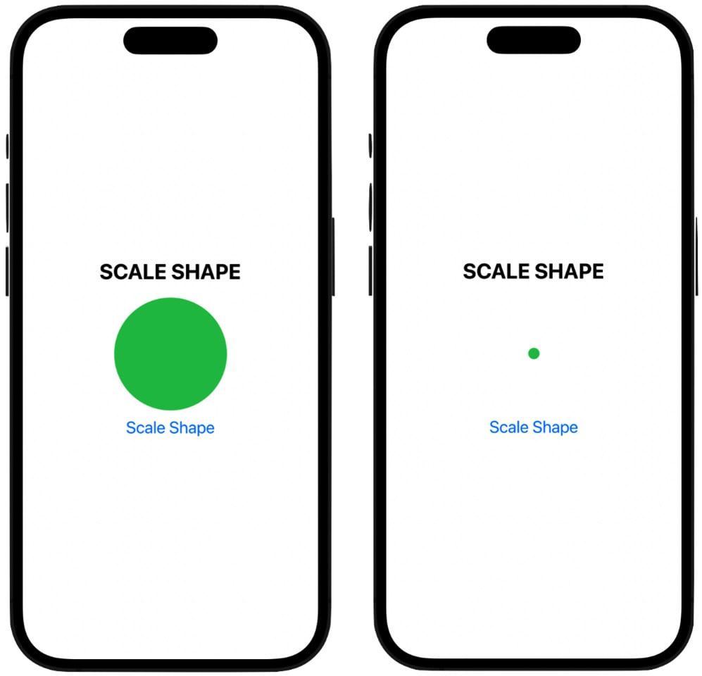
Figure 2.6: Scaling a shape
You should be starting to recognize much of the code that we’re using; for example, we use a VStack to hold our views, so they get stacked vertically, and we can use the button control as a way to start the animation.
In the example, I’m creating a simple green circle and using the scaleEffect modifier, passing in our animating variable. When the state changes to true, the circle scales down to one-tenth of its size, and when false, it goes back to its original size.
We’re using the animation modifier again with the default timing curve. The default curve is an easeInOut curve, which we discussed earlier in the chapter. An easeInOut curve will cause the animation to start slowly, then ramp up to its top speed, and then finish by easing out slowly again.
Let’s look at another example of scaling up and down, but instead of scaling a shape that we created using the circle initializer, we’re using a system image to show you that you can also scale images:
struct Scale_Example_Two: View {
    @State private var scaleBug = false
    var body: some View {
        //MARK: - ANIMATE THE SCALE OF A SYSTEM IMAGE
        VStack{
            Text("SCALE IMAGE").font(.title).bold()
            Image(systemName: "ladybug.fill")
                .renderingMode(.original) //allows multicolor                   for SF Symbols
                .resizable()
                .frame(width: 150, height: 150, alignment:                   .center)
                .scaleEffect(scaleBug ? 0.1 : 1)
                .animation(.default, value: scaleBug)
                .padding(10)
            Button("Scale Image") {
                scaleBug.toggle()
            }
        }.font(.title2)
    }
}
The preceding code will produce the following results, as shown in Figure 2.7:
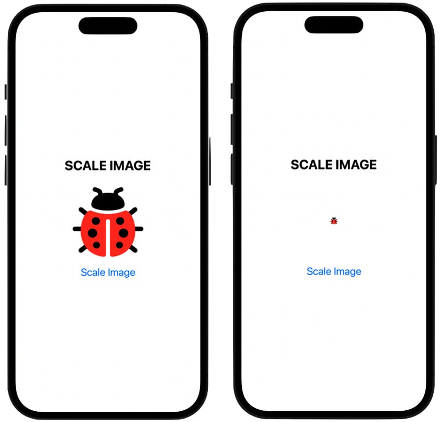
Figure 2.7: Scaling an image
This particular image is a system image from the SF Symbols app. If you don’t have this app yet, I highly recommend it. You can download it for free at the Apple Developer portal. In it, Apple has given us thousands of images we can use in our code. And what’s new in the latest release is that now, many of the images can be rendered in multicolor: we have to set the rendering mode to .original so the image gets shown with colors, instead of just black or white.
Note
Not all images can be colored. Look in the SF Symbols app to see which ones can be colored.
Finally, in this third example of a scaling animation, we use the anchor method, which scales the view by the given amount in both the horizontal and vertical directions relative to an anchor point:
struct Scale_Example_Three: View {
    @State private var scaleFromAnchor = true
    var body: some View {
                VStack{
            Text("SCALE FROM ANCHOR ").font(.title).bold()
            Image(systemName: "heart.fill")
                .renderingMode(.original) //allows the use of                   multicolor for SF Symbols
                .resizable()
                .frame(width: 150, height: 125, alignment:                   .center)
                .scaleEffect(scaleFromAnchor ? 1 : 0.2, anchor:                   .bottomTrailing)
                .animation(.default, value: scaleFromAnchor)
                .padding(10)
            Button("Scale from Anchor") {
                scaleFromAnchor.toggle()
            }
        }.font(.title2)
    }
}
The preceding code will produce the following results, as shown in Figure 2.8:
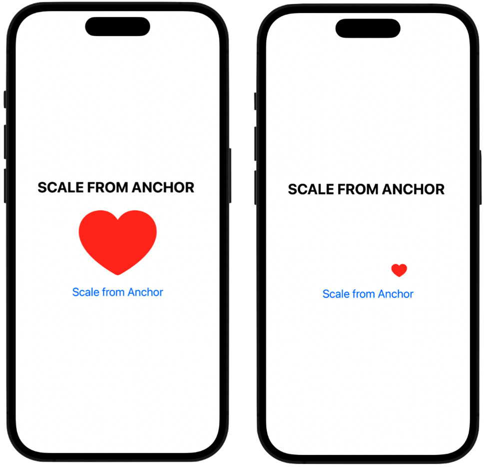
Figure 2.8: Scaling from an anchor point
All views have an anchor point, which is usually in the middle of the view. But we can change that anchor point, and have the animation scale the object based on where that anchor point is. In the code, I used the .bottomTrailing option as the anchor point, so when we press the button, the heart image scales down and toward the trailing edge (the right side of the screen), rather than scaling from the center of the object. However, SwiftUI also gives us the following anchor points to choose from:
bottomTrailingtrailingbottomcentertopbottomLeadingtopLeadingtopTrailingleading
In this final section, we will look at three more properties that can be animated: stroke, trim, and cornerRadius.
Stroke, trim, and corner radius
Let’s now look at three more properties we can animate: the stroke of a line, the trim of a circle, and the corner radius of a rectangle.
The stroke of a shape is the outline or border of the shape. It has a particular color and width and can have various attributes such as line cap style or line join style. Let’s animate the stroke of a rectangle, so it gets thicker or thinner with each button press:
struct Stroke_Example: View {
    @State private var animateStroke = false
    var body: some View {
        //MARK: - ANIMATE THE STROKE OF THE ROUNDED RECT
        VStack{
            Text("ANIMATE STROKE").font(.title).bold()
            RoundedRectangle(cornerRadius: 30)
                .stroke(Color.purple, style:                   StrokeStyle(inewidth: animateStroke ? 25 :                   1))
                .frame(width: 100, height: 100)
                .animation(.default, value: animateStroke)
            Button("Animate Stroke") {
                animateStroke.toggle()
            }
        }.font(.title2)
    }
}
Either a thick or thin stroke line is created around the rectangle, as shown in Figure 2.9:
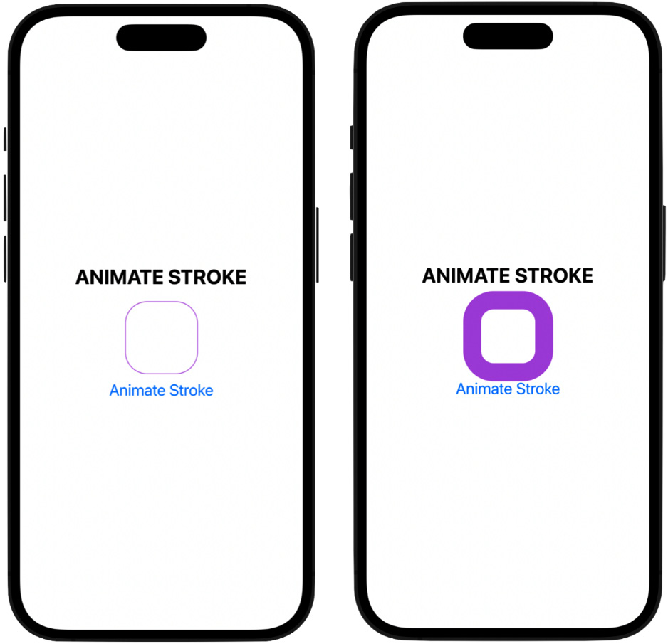
Figure 2.9: Animating the stroke
The first thing we do is define our animation variable, setting its initial value to false. Looking inside the stroke modifier, I pass the animateStroke variable as an argument to the line width parameter, so when it does become true, it changes stroke to 25 points (otherwise, it will be 1 point). Again, we also use the default timing curve inside the animation modifier, and when we run this, stroke is smoothly modified from a thickness of 25 points, then back to 1 point when the button is pressed again.
Here is another example where we are using the trim modifier this time:
struct Trim_Example: View {
    @State private var animateTrim = false
    @State private var circleTrim: CGFloat = 1.0

    var body: some View {
        //MARK: - ANIMATE THE TRIM MODIFIER OF A CIRCLE
        VStack {
            Text("ANIMATE TRIM").font(.title).bold()
                .padding(.top, 10)
            Circle()
                .trim(from: 0, to: circleTrim)
                .stroke(Color.red, style: StrokeStyle(inewidth:                   30, lineCap: CGLineCap.round))
                .frame(height: 150)
                .rotationEffect(.degrees(180))
                .animation(.default, value: animateTrim)
                .padding(.bottom, 20)
            Button("Animate Trim") {
                animateTrim.toggle()
                circleTrim = animateTrim ? 0.25 : 1
            }
        }.font(.title2)
    }
}
The trim modifier takes two parameters: from (meaning what part of the circle we want to start trimming from) and to (meaning where we want to end the trimming). The from parameter is set to 0, which means there will be a complete circle on the screen as we are not trimming yet. The code produces the following results, a circle that has its line trimmed off and restored when the button is pressed, as shown in Figure 2.10:
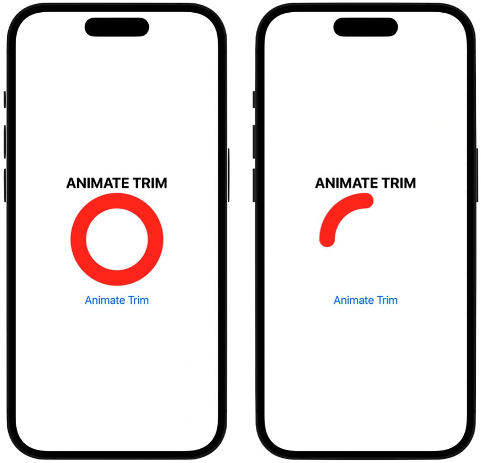
Figure 2.10: Animating the trim
Also, notice we use two @State variables to work with the trim modifier, one called animateTrim, to trigger the animation, and one called circleTrim, which is a numerical value of the CGFloat type. This variable will hold the amount of circle we want to trim off. Initially, it gets set to 1, so the whole circle is visible.
Note
A CGFloat type is a floating-point number. CG stands for Core Graphics, which is an older coding paradigm was used in Apple’s graphic framework, but is still used in SwiftUI.
Looking inside the button code, then within the circleTrim variable, we’re storing one of two values using the ternary operator: either .25, or 1. This means that when animateTrim toggles to true, the code trims off 75% of the circle and leaves 25%; when animateTrim toggles to false, the value of 1 is used, which represents 100% of the circle. So, the values in the ternary operator represent how much of the circle to keep.
If we run the code, we see we have a nice trimming animation of this circle. The line of code called CGLineCap.round refers to the shape of the line that’s drawn at the end points, and it can be round, square, or butt line cap.
And just to have a little fun here, if we go into the trim modifier and change the from parameter to 0.5 instead of 0, we now start the drawing halfway through the circle. Run the code, and it looks like we’re animating or painting a smile and then removing the smile when we press the button again.
Note
If this code seems a bit confusing, where you see the trim modifier being set for the circle, and the circleTrim variable being set in the button body, then think of the trim modifier as the “where” part of the trimming. This means where do we want to start and end the trimming? Then, think of the ternary operator inside the button as the “how much,” meaning how much do we want to trim off the circle and how much of it do we want to keep?
Let’s now move on to the final example. In this example, we will take a look at how you can animate the corner radius of a rectangle. The corner radius refers to how sharp you want to make the corners of a rectangle; you can go all the way from a 90° angle up to a much higher value to create a smooth, rounded corner.
All the code is similar to what we’ve used so far except for the use of the cornerRadius modifier. The following is an example of the code:
struct Corner_Radius_Example: View {
    @State private var animateCornerRadius = false

    var body: some View {
        //MARK: - ANIMATE THE CORNER RADIUS
        VStack{
            Text("ANIMATE CORNER RADIUS").font(.title).bold()
                .padding(.top, 30)
            Rectangle()
                .foregroundColor(.green)
                .frame(width: 150, height: 150)
            .cornerRadius(animateCornerRadius ? 0 : 75)
            .animation(.default, value: animateCornerRadius)
            .padding(.bottom, 20)
            Button("Animate Corner Radius") {
                animateCornerRadius.toggle()
            }
        }.font(.title2)
    }
}
This code produces the following results: a rectangle with its corner radius changed from a 90° angle all the way up to create a circle. So, we’re changing a rectangle into a circle and back again when the button is pressed, as shown in Figure 2.11:
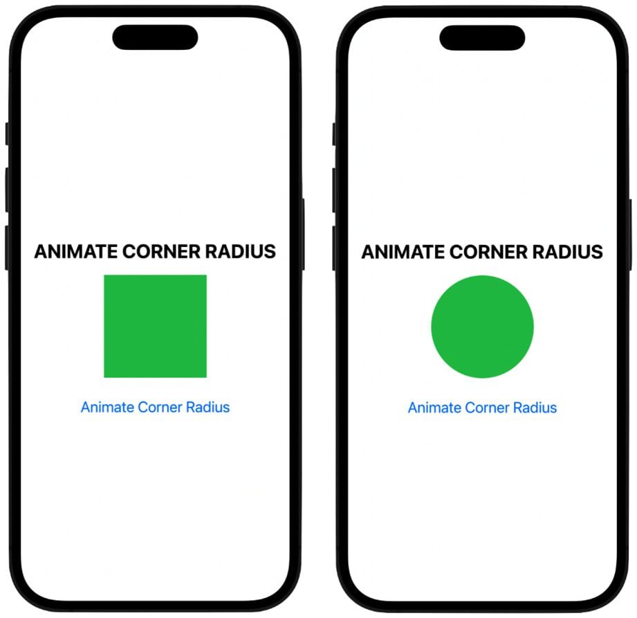
Figure 2.11: Animating the corner radius
In the code, the line that’s doing most of the work is this one:
.cornerRadius(animateCornerRadius ? 0 : 75)
The animateCornerRadius variable gets passed into the cornerRadius modifier, which then gets checked for the true or false values; if it is false, it gets a value of 75 placed into it, which will make the size of this rectangle animate into a perfectly round circle. And when toggled back to true, the circle animates into a rectangle with 90-degree corners by having its corner radius changed to 0.
Note that the reason why the code creates a perfect circle is that we set the frame of the rectangle’s width and height to 150 points, thus creating a square, and anytime you set a corner radius to half the width or height of a square, you will always get a perfect circle.
SwiftUI gives us more ways to animate objects in addition to these, and we will explore them in the coming chapters when we start building projects.